CP metalworks B22
- Thread starter ScorpioUprising
- Start date
You are using an out of date browser. It may not display this or other websites correctly.
You should upgrade or use an alternative browser.
You should upgrade or use an alternative browser.
You mean you went with rotational symmetry? It was already mirrored.
Ack, yes thats what I meant.
McNuggetFiend
L3: Member
- Jun 22, 2009
- 147
- 51
B10 is out. Primarily made some adjustments off a lobby demo.
Changelog:
- Adjusted spawn times for the second forward spawn, reducing it by one. Also, moved the spawn closer to the middle point, forcing the attacking team to push through the choke to attack or support the captured second.
- Brought back the bridge at last. Also, added a heightened ledge for defending the point from afar. Added a small sniper ledge at last.
- Moved the health pack behind the second point. Should be out of the way of most combat now.
- Moved the first forward spawn so players have a better idea of where to go when spawning. Moved the medium health pack underneath the point, and added some window exits.
- Altered the entrance to the area above the middle point. Should allow for better roll outs, with health pack support.
- Added more stairs for the middle point. Should make it easier to move around there.
- Changed the displacement texture to a desert texture.
Couldn't very well post this as feedback since it's in the skybox:

Floating particle effect is floating.
Hah! I really do need to go back and rework the skybox a bit. The blue side is fine, but when I resymmetrized the map, the red side got a bit out of proportion.
B11 is out. Primarily some tiny changes, as well as some new geometry.
Changelog:
- Significant changes to last. The bridge is now broken in half, with a rock prop inbetween. Moved the point up a bit, and changed the layout behind the point a bit.
- Moved the medium health behind the second point, with new geometry.
- Made the geometry beneath the second point glass, so you can see enemies below the point. Made the health beneath the point a small, and moved it into a corner. Brightened the room so you can see lurking soldiers ( :> ).
- Added railing to bridges throughout the map. Also made some stairs into ramps to help with rocket splash damage.
- Removed the metal houses at the far choke between second and middle, replacing it with a gatehouse, to help with bombing runs and sticky traps.
- Altered the position of the dropdown to try and make it more clear what the fastest path to middle is.
B12 Changelog:
* Changed the doorways used throughout to work better for area portals. Also, removed the prop doorways, to cut down on the prop count, and to make sure I can adjust the door sizes for sticky traps and so forth.
* Changed the layout of the second a bit. Moved a doorway to make for better rollouts, added a metal plank to give medics a way to get onto the bridge for that rollout. Increased the displacement area to make for more solid transitions from lower areas to higher areas. Added windows on the ledge doorway, to help with choke spam visibility and to give players a view of stickies to the sides of the door.
Stv and mumble recordings: http://dl.dropbox.com/u/21561105/New Map PUGS/revenenant.7z
Not really a problem, but you can do a 2 stick jump over this wall and to the other side of the map basically all the way across mid. It Was fun to watch Walka do it in pregame.

You get stuck on this corner, it's apparently only on one side of the map.

I kept sort of clipping into this point, I don't know if it's the map's fault or mine because I'll get it sometimes on other maps, too. But, anyway, I was standing on the point and I sort of stutter between being lower than a crouch and standing again, it's rather odd.

Not really a problem, but you can do a 2 stick jump over this wall and to the other side of the map basically all the way across mid. It Was fun to watch Walka do it in pregame.

You get stuck on this corner, it's apparently only on one side of the map.

I kept sort of clipping into this point, I don't know if it's the map's fault or mine because I'll get it sometimes on other maps, too. But, anyway, I was standing on the point and I sort of stutter between being lower than a crouch and standing again, it's rather odd.

ClandestinePz
L1: Registered
- Aug 16, 2009
- 36
- 9
I nearly cried when I found out this map wasn't shaped like a horseshoe anymore.
Other than that it plays pretty well.
The biggest problem with this map is optimization. I get lower than usual fps everywhere, but I get particularly sharp drops in mid fights and attacking second.
Mid was pretty chaotic and unfocused and right now it feels like its missing something. I'm not sure what though. It just seems a bit too basic.
I really like last, but I wish that you could walk along the right side when attacking. It seems like you have to just bomb to avoid getting caught on the low ground. also no one ever used that hallway/dropdown on from the right side of second to the right side of two (left for defenders. You can either get rid of it or make more useful.
Sorry I'm typing this up kinda quickly.
Appreciate the feedback!
I know people miss the horseshoe, but custom maps already have a pretty hefty disadvantage when it comes to getting played in comp settings. Having a slightly nonsymmetrical layout would probably be all the incentive someone needs to reject it wholesale. (though I'm surprised viaduct hasn't had this issue raised vehemently).
As far as framerate issues, I'm a bit spoiled computer wise so its hard for me to tell where the poorly optimized sections are. I think the map is a bit prop heavy, so I'll see about lowering prop counts throughout, as well as putting in more hint brushes as stuff.
The double stick leap across the map doesn't seem that troublesome to be honest, but I'll keep that in mind for later versions. The medium health in the house could give you a boost once you get around for the flank, but other than that it seems like you could get trashed by any scouts quickly moving back.
I'm trying to figure out what to do with mid. I was experimenting with extending it a bit, but it didn't really work out he way I wanted it to (screwed up some of the symmetry, but didn't really lead to any play benefits). I'm going to keep it in mind for later, so far I'm liking how combat flows into and out of it, but not how it fares at initial mid battles.
Can't quite visualize where this is, can you toss me a screenshot?I really like last, but I wish that you could walk along the right side when attacking. It seems like you have to just bomb to avoid getting caught on the low ground. also no one ever used that hallway/dropdown on from the right side of second to the right side of two (left for defenders. You can either get rid of it or make more useful.
Oh one last announcement. The name revenant is giving me some problems. Obviously, spelling it is a bit of an issue, and having it be very similar in kind to resonance (the map its based off of) can also give some people trouble.
Any new name suggestions would be great. I'm aiming for something industrial or warehouse related. cp_production is the one I have in mind right now, but let me know what you guys think.
Any new name suggestions would be great. I'm aiming for something industrial or warehouse related. cp_production is the one I have in mind right now, but let me know what you guys think.
Oh one last announcement. The name revenant is giving me some problems. Obviously, spelling it is a bit of an issue, and having it be very similar in kind to resonance (the map its based off of) can also give some people trouble.
Any new name suggestions would be great. I'm aiming for something industrial or warehouse related. cp_production is the one I have in mind right now, but let me know what you guys think.
What? This is one of the easier names to spell out.
Revenant, there done.
*There, i hope nobody saw that
Last edited:
ClandestinePz
L1: Registered
- Aug 16, 2009
- 36
- 9
Be a rebel and stick with revenant.
cp_production is incredibly unoriginal. So much so, in fact, that I'd be very surprised if there weren't already a bunch of maps with that name.
The most important criteria of a map name are
1. Is it memorable?
2. Is it easy to say or type? (has to be 3 syllables or less. Bonus points if the name rolls off the tongue or has an easily used abbreviation)
3. I is interesting?
Ironically, I just realized the name of my latest map doesn't do too well in any of these categories.
Anyway, people tend to overestimate the importance of a name being relevant to the theme of your map (I've never found any bad water in Badwater or any water at all for that matter). Revenant is a badass sounding name which lends character to the map. If you do want a more theme oriented name at least choose something better than production, factory, industry, etc... It has to be at least a little less basic like cp_foundry or cp_forge (cp_furnace is a good one, but that is taken). Or you could use the old compound naming system like cp_ironside, cp_steel city or maybe even cp_coketown (for the literary reference.
That wasn't meant to be an essay lol. Now back to the map itself
This is what I was talking about earlier.
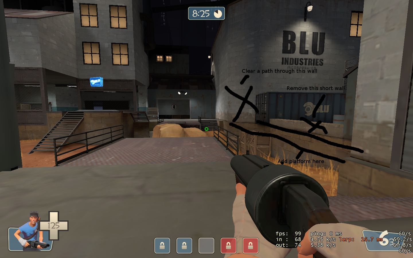
You get shut down if you try and get up the stairs. Its also nearly impossible to jump up on that rock and there are no good vantage points from which to spam. So as a soldier you have to bomb and as a result it isn't possible to back out after a failed push. Putting that walkway on the right is also necessary because I don't think in that whole pug I ever saw anyone go through that side. In fact I barely noticed that hallway or that little dropdown lip. You need to give players a reason to go that way.
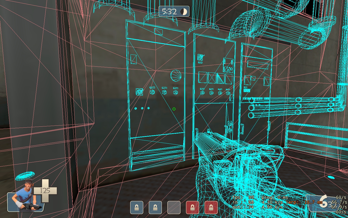
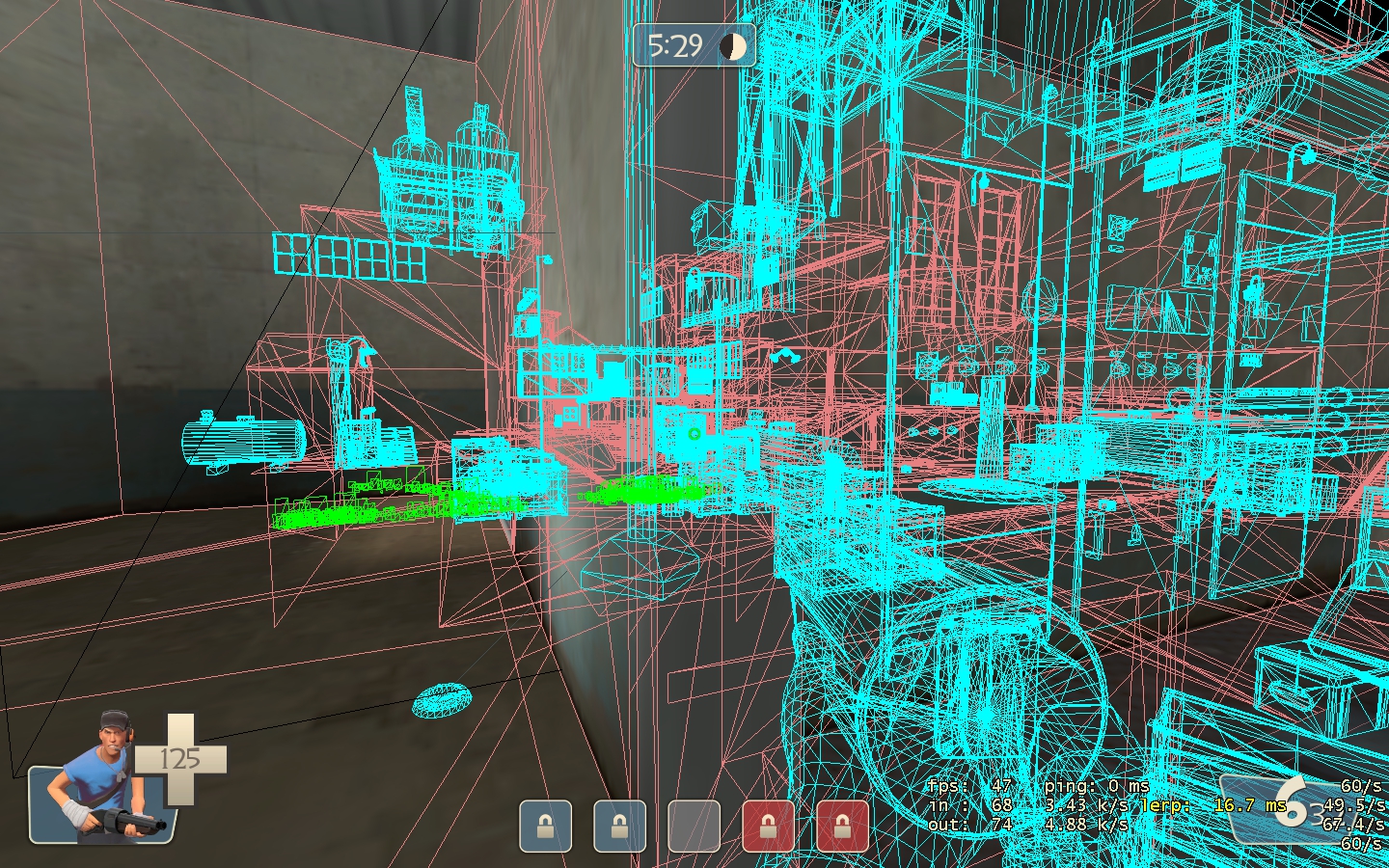
also I'm no expert on optimization but this is the exact spot where my frames dropped at mid
Go Revenant!
cp_production is incredibly unoriginal. So much so, in fact, that I'd be very surprised if there weren't already a bunch of maps with that name.
The most important criteria of a map name are
1. Is it memorable?
2. Is it easy to say or type? (has to be 3 syllables or less. Bonus points if the name rolls off the tongue or has an easily used abbreviation)
3. I is interesting?
Ironically, I just realized the name of my latest map doesn't do too well in any of these categories.
Anyway, people tend to overestimate the importance of a name being relevant to the theme of your map (I've never found any bad water in Badwater or any water at all for that matter). Revenant is a badass sounding name which lends character to the map. If you do want a more theme oriented name at least choose something better than production, factory, industry, etc... It has to be at least a little less basic like cp_foundry or cp_forge (cp_furnace is a good one, but that is taken). Or you could use the old compound naming system like cp_ironside, cp_steel city or maybe even cp_coketown (for the literary reference.
That wasn't meant to be an essay lol. Now back to the map itself
This is what I was talking about earlier.

You get shut down if you try and get up the stairs. Its also nearly impossible to jump up on that rock and there are no good vantage points from which to spam. So as a soldier you have to bomb and as a result it isn't possible to back out after a failed push. Putting that walkway on the right is also necessary because I don't think in that whole pug I ever saw anyone go through that side. In fact I barely noticed that hallway or that little dropdown lip. You need to give players a reason to go that way.
also I'm no expert on optimization but this is the exact spot where my frames dropped at mid


Go Revenant!
The broken bridge with the rock in the middle was a bit of an experiment. Not liking how it plays, cuz it forces defenders way back instead of giving them the chance to preengage people coming out the door. I'll probably put the entire bridge back, but slightly altered.
Middle seems to have way to many props. I'll see if I can reduce them.
Middle seems to have way to many props. I'll see if I can reduce them.
Lol, I'm looking at the notepad I use to keep track of maps, I have Revenant spelled differently each time I have it entered somewhere (probably just misspelled it, as well  ). Must be some combination of fatigue and inability to properly copy and paste.
Anyway, if you really want to change it:
Sulfur
Smoke Stack
Metal Works
Assembly
I really liked the name Resonance, though, and, other than me failing at spelling it every time, I like Revenant too.
Anyway, if you really want to change it:
Sulfur
Smoke Stack
Metal Works
Assembly
I really liked the name Resonance, though, and, other than me failing at spelling it every time, I like Revenant too.


