You don't need to delete the thread to change it's name, you can basiacly change everything of the download with an update.
So i've gone trough this map and noticed multiple issiues
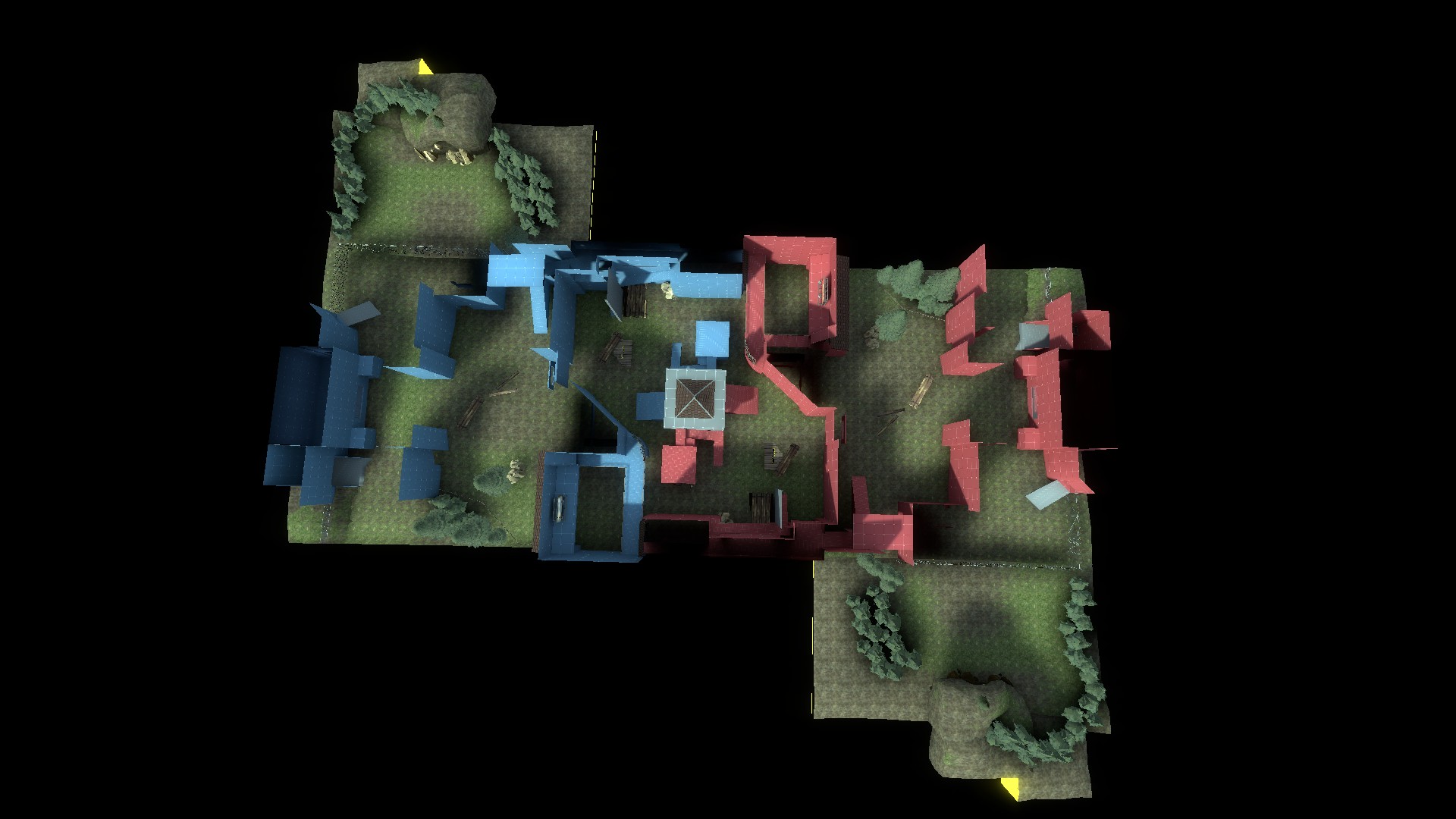
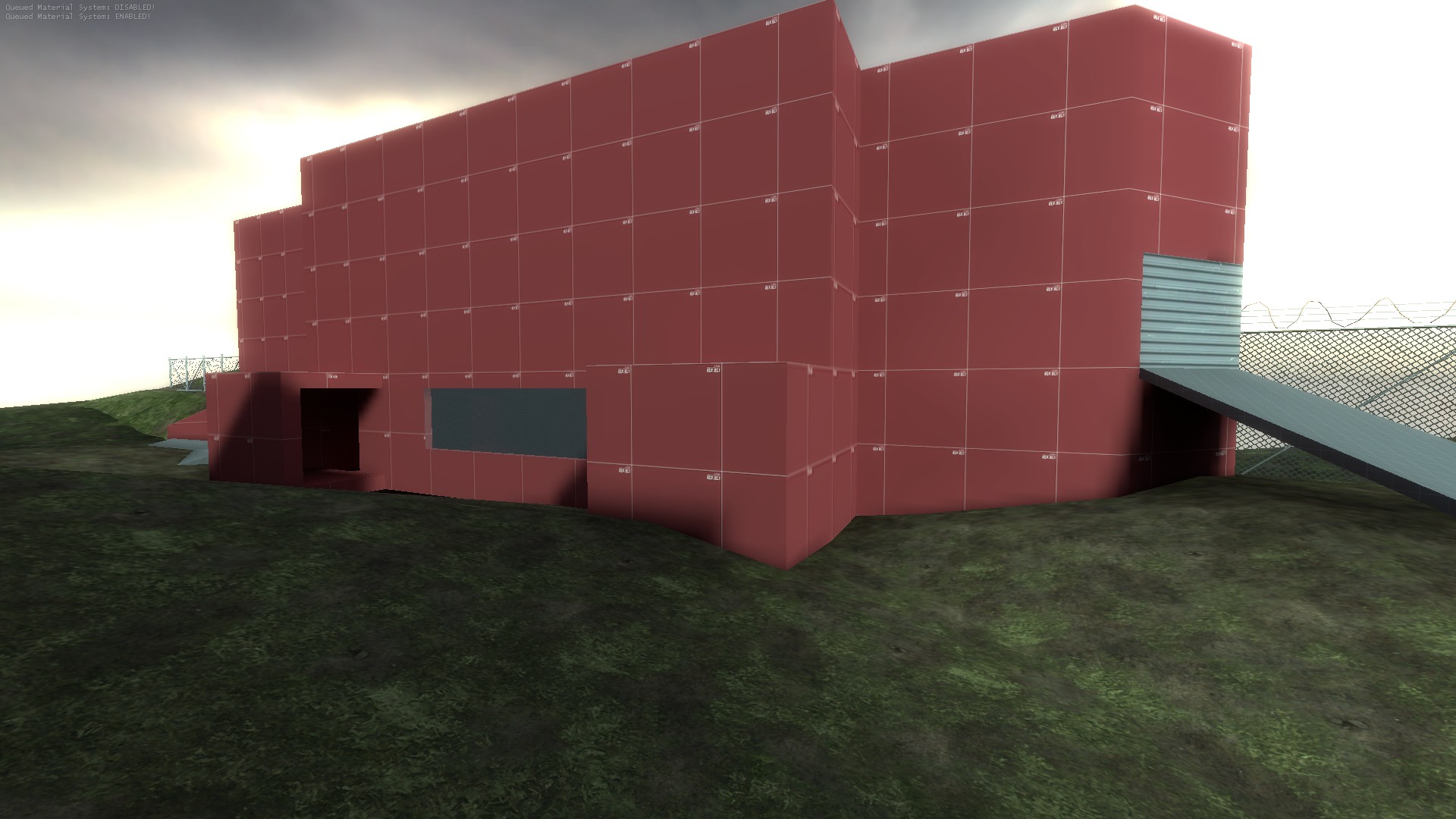
- I feel like the map is pretty overscaled for being a koth map
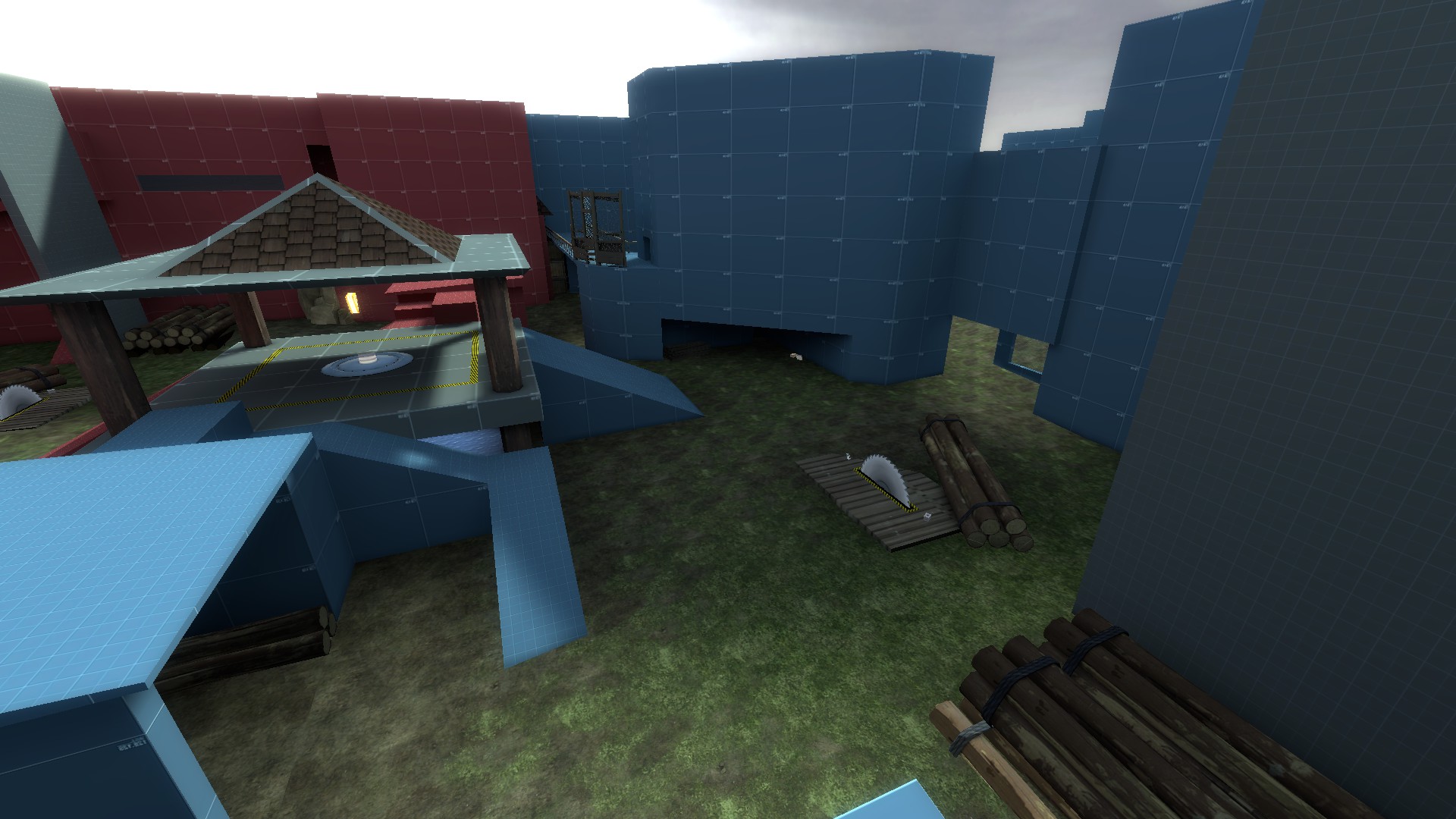
- The saws aren't animating, you must have them as a prop_dynamic and set their "Default animation" (for the sawblade_moving prop it's "idle")
- The skybox texture is from half life, it is suggested you use one from tf2.
- I see you've compiled the map with HDR which will cause longer compile times and will just make the skybox texture unecessarly bright (same with other textures) You just uncheck it inside the compile box that appears before you run the map.
There are no light entities inside the map except of blu's spawn, also no cubemaps.
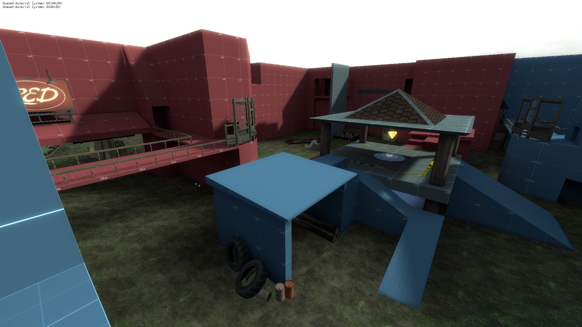
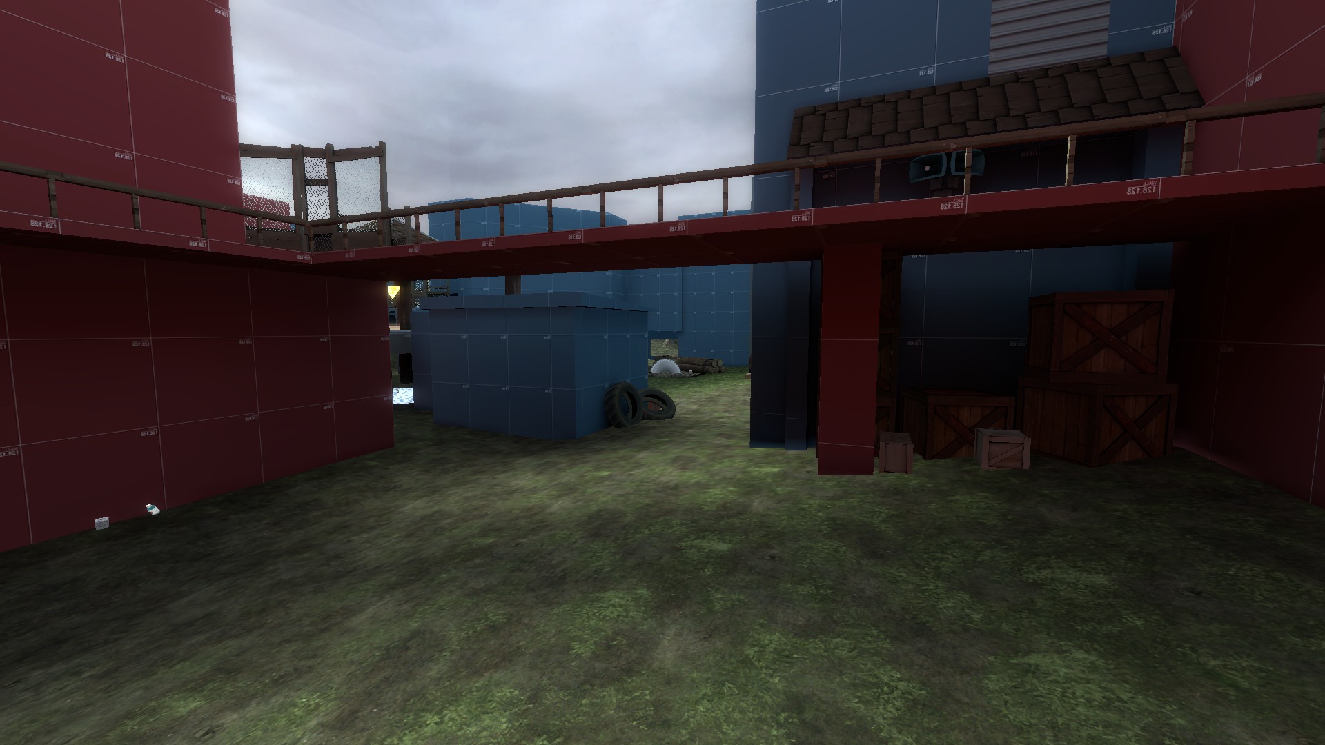
The spawns front don't have any doors, they're just open which will cause multiple issiues, as demos and soldiers can just spam these and get free damage
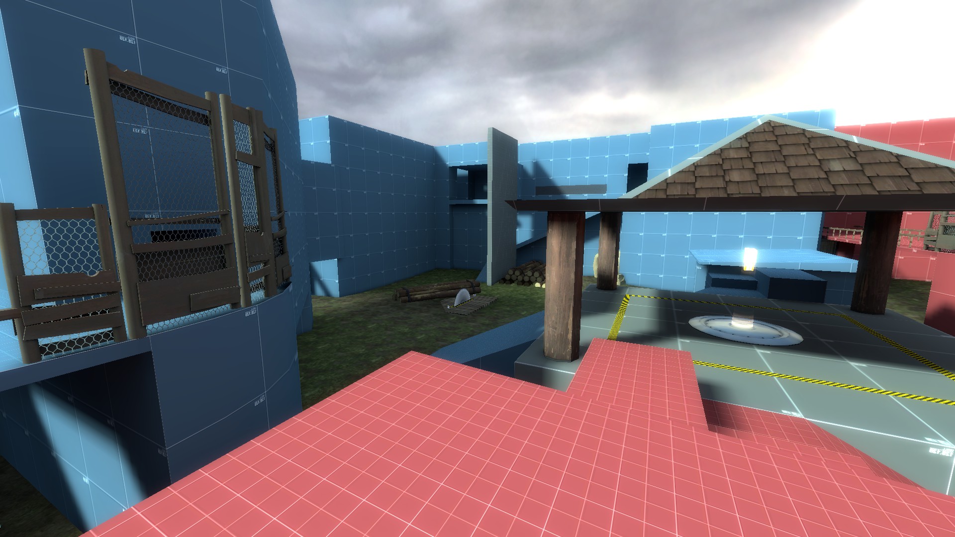
You can apparently see this from both spawns
You really shouldn't have displacements with more than 1 or 2 sides applied to them if they're supposed to be on the ground, also nodraws on them is no good, you're supposed to put nodraws under them *not on their faces*
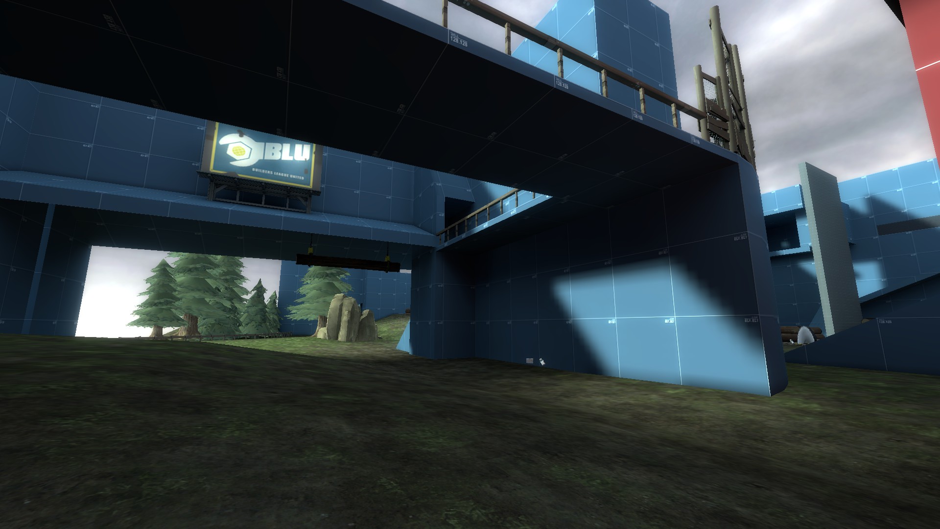
This part looks pretty wierd and it's a bit too high in my opinion, plus there's no lights inside it either.
Also not a fan of those one-way doors that exits on the other side, scouts touches the door before it opens completely.
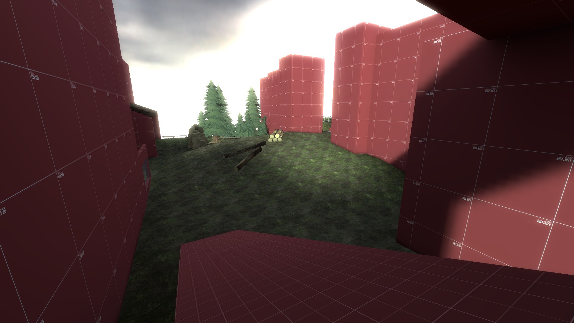
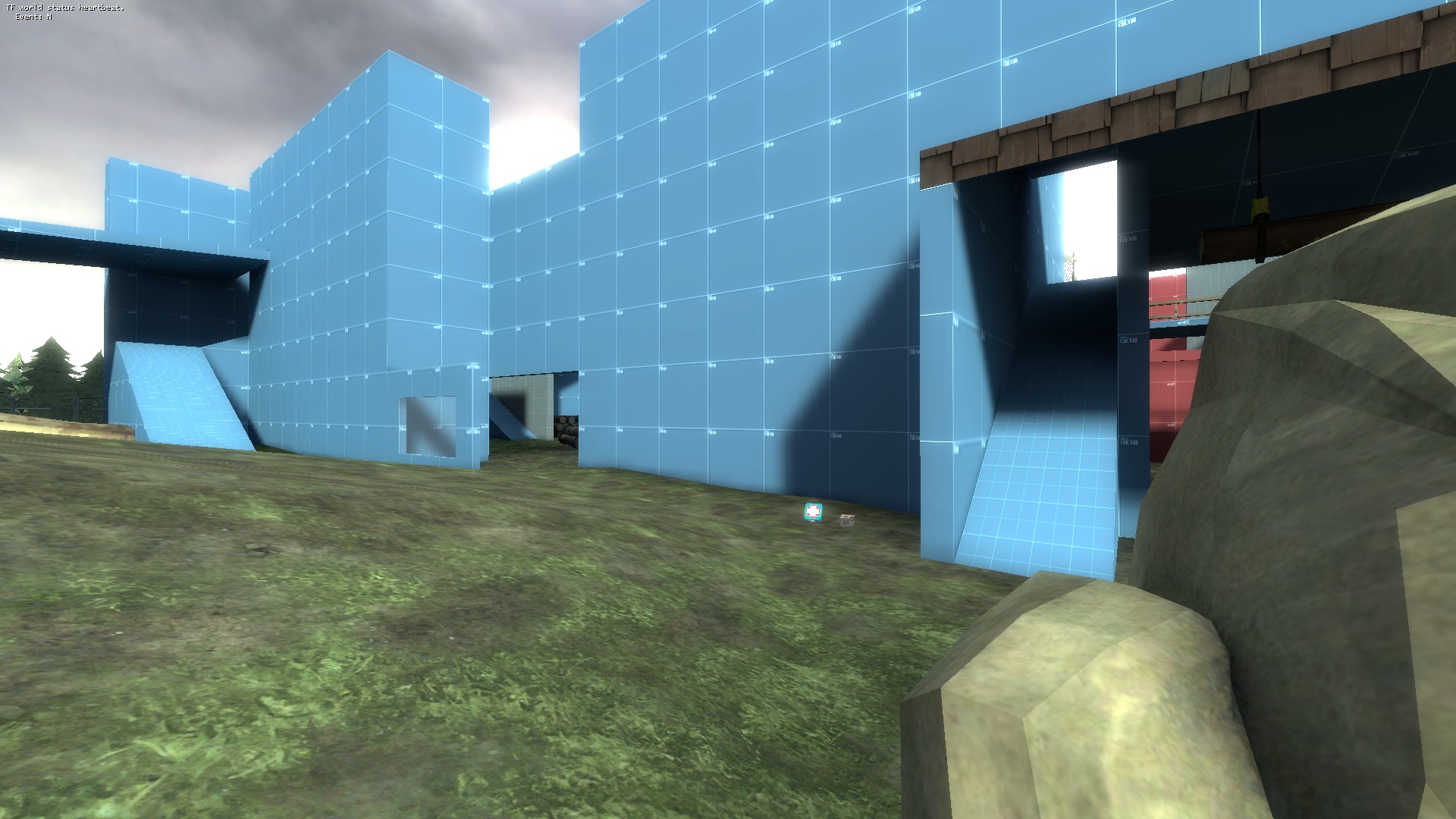
Naaasty sightline from this point.
I feel like this map has some brushwork that doesn't feel natural and i don't see a real flow to it as its generaly overscaled.
But it's a start, these problems are all possible to fix so best of lucks to you!
