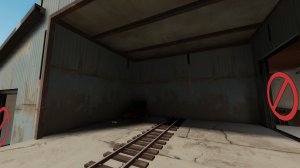
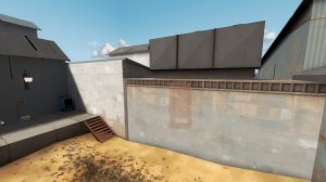
I should have done this in the first place but here's feedback with pictures. Dunno why I didn't.

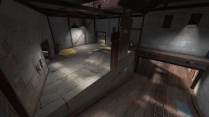
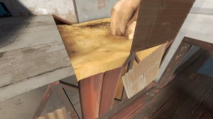
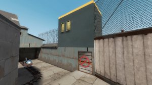
-It's really weird how there's that line on the upper blue texture from where the height changes. Why not just move it down to the low brush? Having a clean blue texture like that right under a dirty one seems off.

-The concrete texture you use here for the floor and a bit of a wall has too much in depth detail for how much you use it in an area. Using it so much makes it very obvious that it repeats. It also doesn't make sense as a wall texture to have that much wear and tear in my opinion.

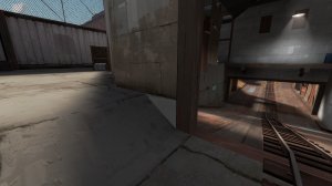
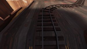
-some people may have a different opinion about this but you use these 2 Half-Life 2 textures a lot (the metal wall and railing)
HL2 textures are fine to use in TF2 if done so sparingly but the more often they are used and the closer to the gameplay space they are the more obvious it is that they don't fit the art style. I know 2fort uses that metal wall but it only does so in one specific area of the map and is careful about what stylized textures it uses near it as to not be super noticeable. I'm not saying you can't use hl2 textures, just saying you have to be careful with HOW you use them.

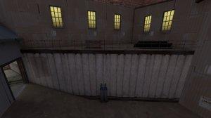
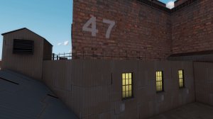
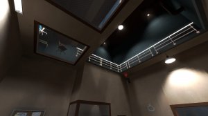
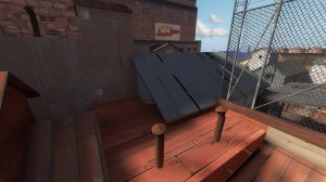
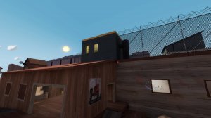
-there is no top to the railing on this roof

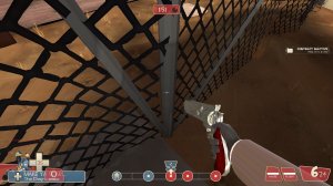
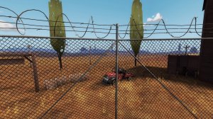
-This fence feels like it should have a horizontal beam over top of it or something. The main texture of the fence makes it look unnatural and like it wouldn't work if someone tried to build something like this in reality. For TF2, things don't have to be 100% realistic BUT they do need to look like they would work in reality, even if they actually wouldn't.

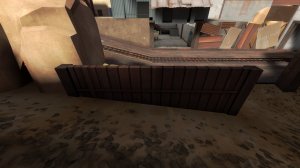
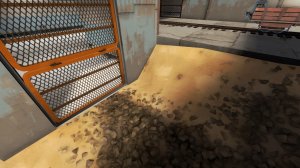
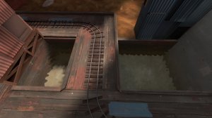
-Dirt doesn't work like this. There's little to nothing holding up this dirt wall behind the corrugated metal plates let alone something to make it a flat wall.

-A lot of your displacements are very....pointy. This makes them look unnatural. Smooth em out a bit.

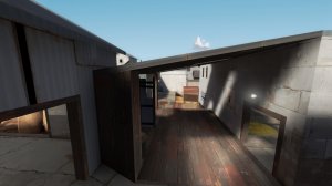
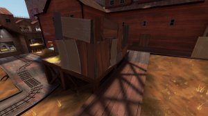
-Haywire has a lot of very thick roofs and not a lot of supports for them in areas like this. The only thing holding up this roof is that thick wooden brush which is way too chunky and just doesn't look like it would exist at all. Again, TF2's design is more about having things look like they would be like that in real life opposed to actually being like that in real life. Just because something like this may work in the real world or you may have seen something like it before doesn't make it look commonplace. Detailing in TF2 is very selective and this just looks too "video gamey"

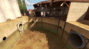
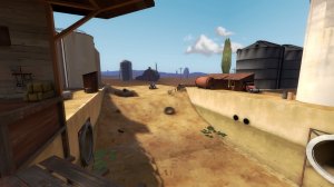
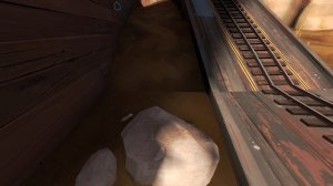
-I had no idea this was a deathpit till I fell into it. I thought it was some kind of water route or something. Water in TF2 negates fall damage so you really gotta make it look like it'll kill you for it to make sense. Some maps do this by having a very long fall distance or by keeping the water far enough away from the basic play-space so it doesn't look like it's part of it.

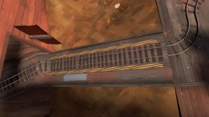
-It's very obvious here where the map ends and the skybox starts. I know that 2fort also uses this ground for it's skybox but it manages to hide it better in my opinion.

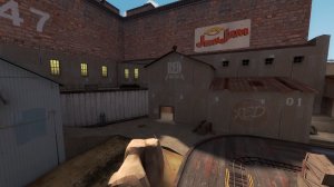
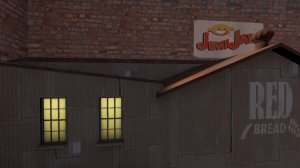
-There's no real neutral area between this red building and the blue buildings. Is this a red area or a blue area? I can't really tell since the textures and building design are smashed right up next to each other plus the specific RED signs. Most maps have a neutral area between themes for both textures and detail design. Since this map uses 2fort as an inspiration for themeing, think of the bridge area. It's a good buffer area between both bases that gives enough space before things change from industrial designed blue buildings to wooden farm designed red buildings.

-shiny props. Also the fence is longer than the area it's in and goes onto the glass which looks weird.

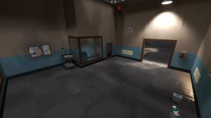
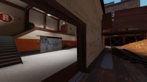
-This area is odd. Not by it's looks but by it's placement. Everything around it is detailed either with a farm theme or an industrial theme and yet this one room is all spytech. It looks more like something that would be in a spawn area but instead it's just a random room in the map.

-Why is this water here? It doesn't add anything to the map. It just kinda seems like you didn't know what to do with this area so threw some water in. It's not for any kind of water route and really feels squeezed in. There's also no reason for it from a detail perspective. There aren't any pipes leading to it and it's not connected to the other water area in the map.

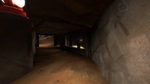
-The displacements in this tunnel feel very unnatural. They feel too specifically angled to be realistic without some kind of supports guiding them. Also why is the ceiling made of dirt when the building above is made of wood?

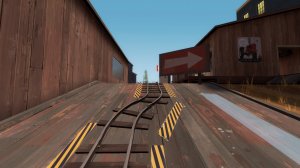
-Throughout the map, all the hazard overlays are stretched. Turn off texture lock when stretching out repeating overlays like this one so they don't look weird.

-There is no buffer between the outside wood farm theme and the indoor spytech theme at all. It just goes straight from one to the other and doesn't make any sense. Is the wood supposed to be built onto the concrete the inside of the building is made of? Nothing about the inside of this building matches the outside and it just doesn't make sense.

-You use these corrugated metal pieces a lot throughout the map and it makes things look really messy in my opinion. An area like this 90% wall just seems overly busy and could be made a lot nicer with brushes. The shadows also don't take the metal pieces into account which makes them look really weird.

-It's extremely obvious where the map ends and the skybox starts here.

-I have the same feeling about these wooden fences as the one before but also the top texture is misaligned.

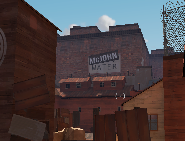
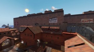
--This large brick building that seems to be the main focal point of haywire is really really boring. It's just a huge brick texture with some large signs on it. It doesn't match the rest of the detailing of the map due to it's over simplicity and could really be done without.

-This is a mess of angles and textures. It doesn't look this bad from ground level but is still rather noticeable and looks very "video gamey" (what I mean by that is something that looks like it would only exist in a game and not make sense in reality)

-The props under the steps way in the back behind the farthest door are faded out.

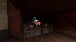
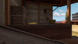
-This may be nitpicky but how did this truck get here? There's no way for it to have come in from the rest of the building and it wouldn't have fit through the tiny door behind it. All that would be needed would be some kind of garage door or something like that behind it to make sense instead of that small wooden one.

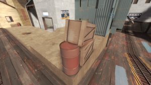
-the barrel and crate clip into each other.

-The big blue concrete structure on top of the metal structure doesn't make sense and really looks off. Would a metal structure like that even be able to hold a large concrete block on top of it? I don't know, I'm not an architect but it doesn't look right in the least.

-doesn't look as weird on the other side but still seems off for that lil bit of blue building to shine through to this side.

-The angle of these rooves doesn't make any sense. Think about how water would act on a roof when making it to see if it would make sense. Also rooves are really thick throughout the map.

-The tree in the background just begins to fade in at this distance away. Any farther away and it's not there. Since it's right in the middle of the path and it's green color shows up well against the blue sky, it's very noticeable.

-The displacement textures all around this area are misaligned which puts a nasty and obvious line between where one starts and ends.

-misaligned textures.

-These stairs look terrible and unrealistic. I can't imagine any place having something like this in reality and there's gotta be a simpler and better way to do what you want in this room. This is the kind of thing I would imagine seeing for concrete steps leading up to a school building or something like that, not inside a wooden barn.

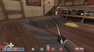
-There's no way to access this ledge without jumping, which isn't necessarily a bad thing, but there also isn't any kind of door on the upper ledge area to give the impression of another way to access it. Without that, an area like this would be very awkward and mostly unusable in reality.

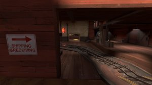
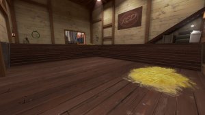
-Kinda dark near the walls here.

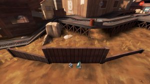
-This wall looks like I could explosive jump over it and yet I can't. Needs something to look less like a play space considering the other side of the wall IS a play space.
That's all I got for now. I hope it helps. I'm no master of mapping or detailing so take all of this with a grain of salt and they are all my own opinions and are far from gospel. TF2 is all about selective detailing and it's not an easy thing to figure out.
