General art thread
- Thread starter jpr
- Start date
You are using an out of date browser. It may not display this or other websites correctly.
You should upgrade or use an alternative browser.
You should upgrade or use an alternative browser.
Nice picture but the ship looks too flat. It should have more deep.
I agree, sailing in a duck pond is stupid
Deodorant
L6: Sharp Member
- Oct 31, 2011
- 263
- 214
Hnnngh.
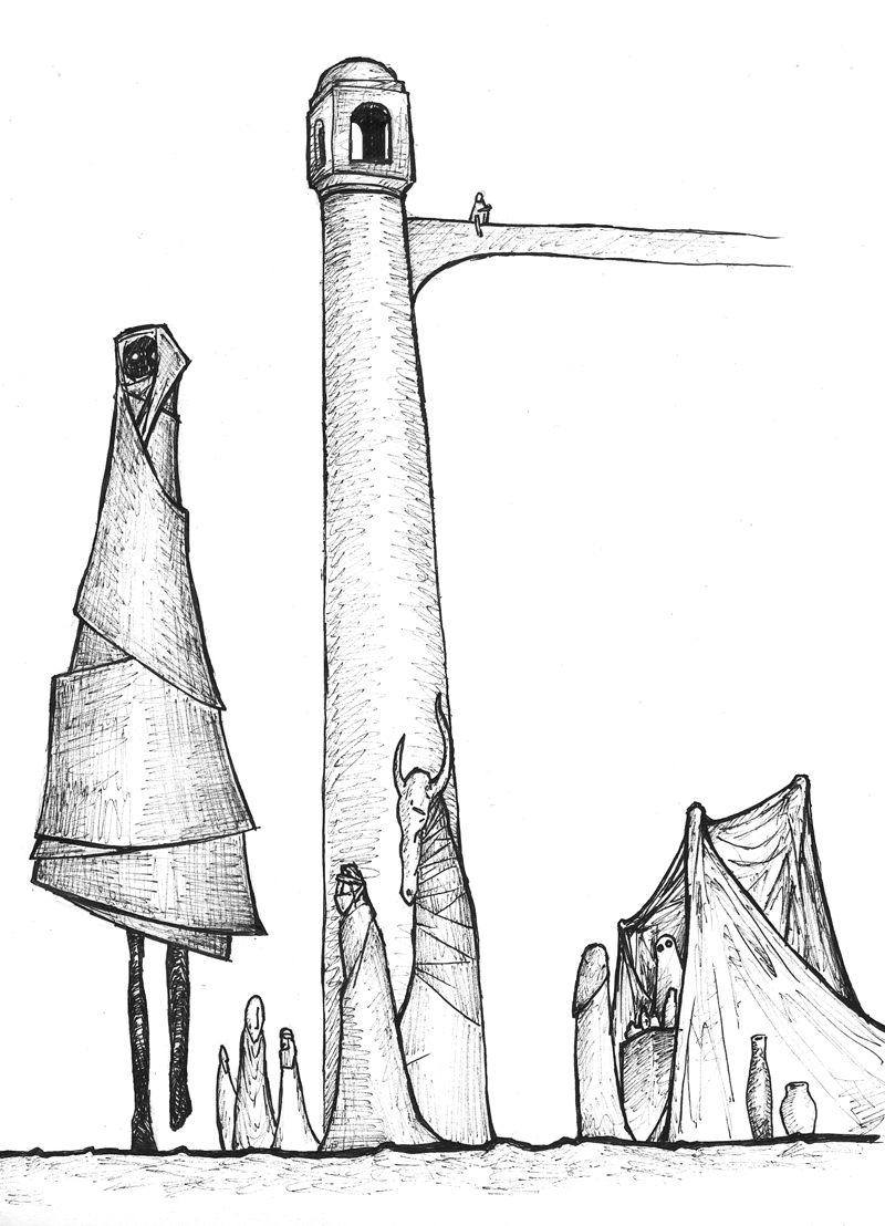
I got a horrifyingly bad page placement with my last post and I'm an attention craving bastard, so I feel compelled to make a repost. Furthermore, I just finished and uploaded a brand new drawing, so I have an excuse to do so. However, my previous picture looks much better than the last one.
Soo... Here look oh my god it's a new drawing whee yay and jubilations aplenty. Now go to the bottom of the previous page to see a decent-looking one.
And again, if you want to see the rest of my inky scribbles that I've deemed ok enough to show the internet, click here.

Nice picture but the ship looks too flat. It should have more deep.
It's SUPPOSED to be a silhouette. It's just not as dark as it probably should be.
- Jul 31, 2011
- 872
- 1,021
- Mar 20, 2012
- 391
- 806
- Mar 20, 2012
- 391
- 806
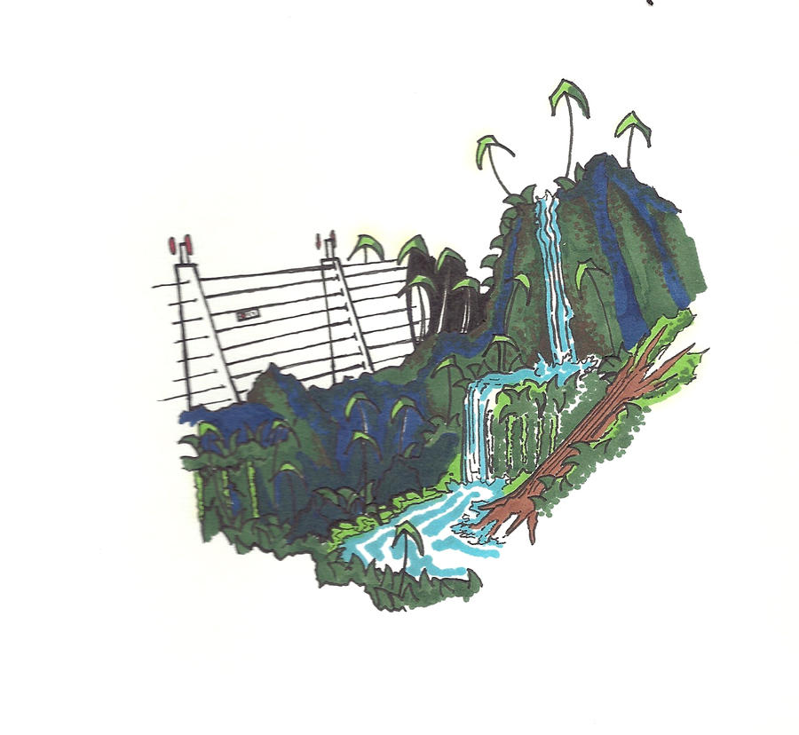
Having taken courses in veil landscape painting (which isn't digital as you done it, but the concepts are the same), you'll want to flatten and straighten out the layers that head off into the linear perspective horizon. (You can still have cliffs on the first layer (the furthest one), but the bumps need to be a lot smoother as the human eye cannot perceive detail at that distance)
That layer also needs to be brought down a bit. You can tell it is awkward by the steep incline your power polls and its associated connectors need to take between layers 1 and 2.
Otherwise, it looks great. Love the TF2 symbol sun. Good show, sir!
That layer also needs to be brought down a bit. You can tell it is awkward by the steep incline your power polls and its associated connectors need to take between layers 1 and 2.
Otherwise, it looks great. Love the TF2 symbol sun. Good show, sir!


