You are using an out of date browser. It may not display this or other websites correctly.
You should upgrade or use an alternative browser.
You should upgrade or use an alternative browser.
- Jul 10, 2017
- 620
- 556
Ok, I'm gonna preface by saying this map is actually pretty good layout and even visual wise. It still has some consistant problems, but I'll just go over em ;P
So, this map is definitely over scaled in a few indoor place, but that's ok for now. I must warn against just using models to build cover, I made the same mistake for a while. its not a good mistake.
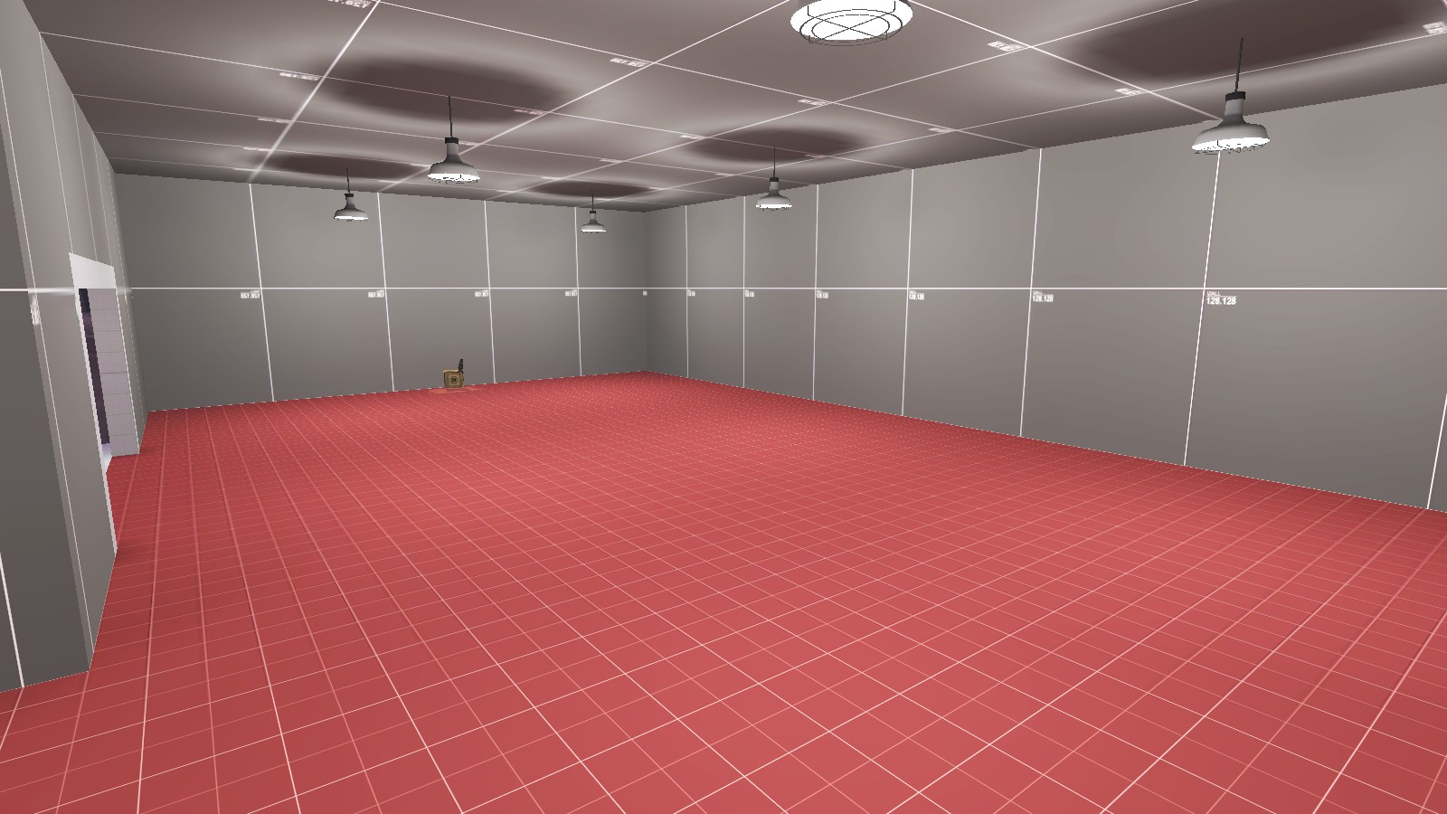
Here's an example of an indoor place that could use something in it to make it more exciting. like stairs or some sort of height variation:

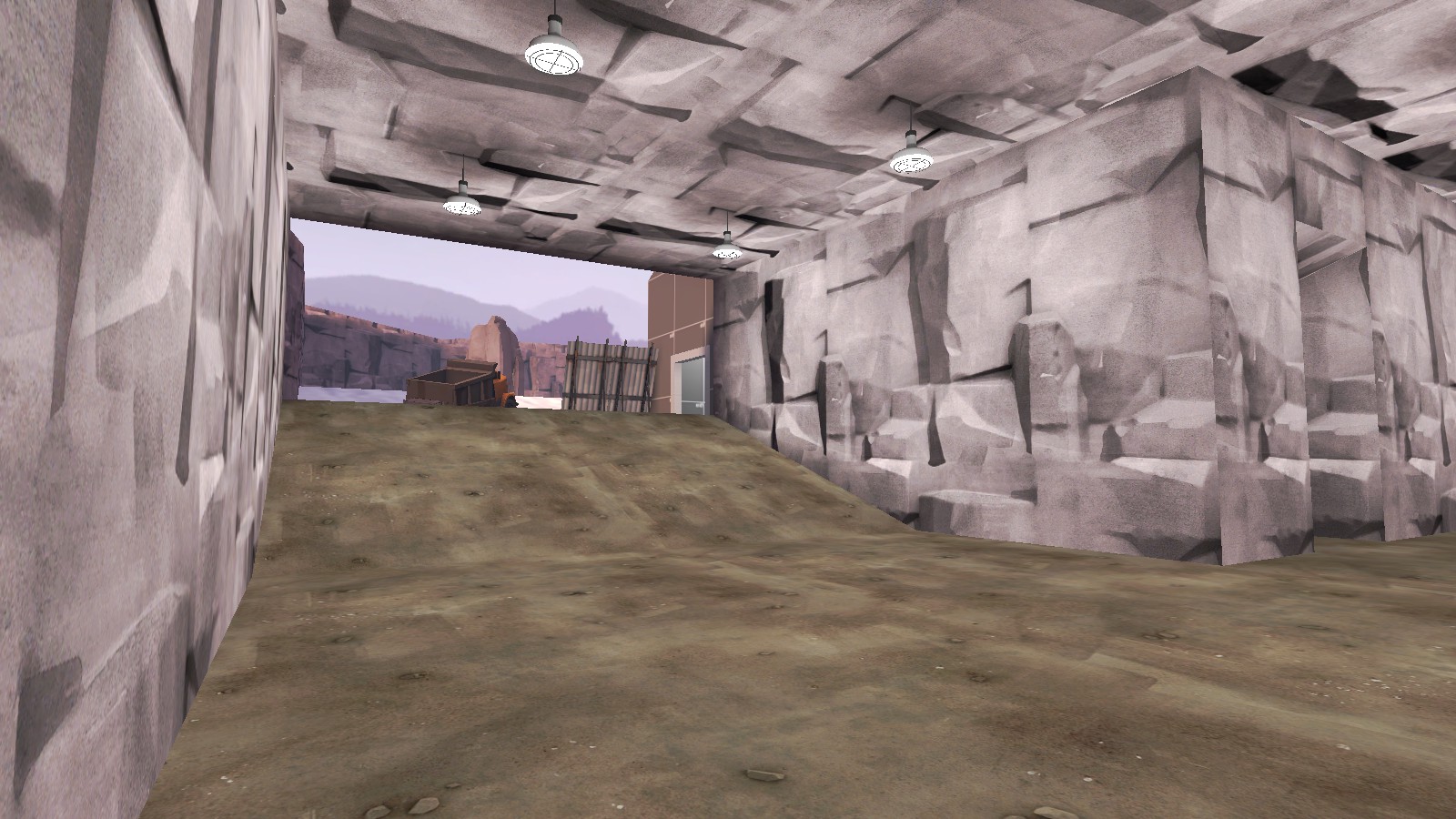
And in this cave, you could put some kinda natural or geometrical thing to give the offense cover and really spice up the area:

Another issue in those two screenshots is the lighting. remember to turn off the shadow for all the light props, to give it a better transition, and the cave tunnel system is just wayyy too bright. look at dust bowl, its kinda dark and murky in there. you don't necessarily have to make it that dark, but maybe not have so many light there.
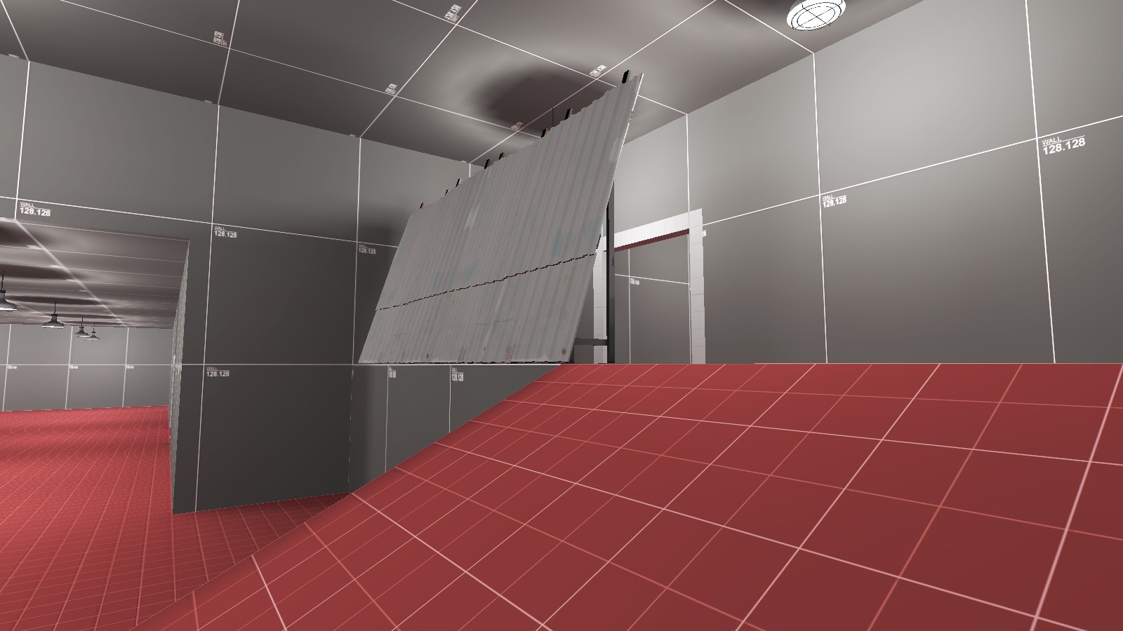
This is kinda my personal opinion, but this is an example of a prop that probably would be better done with brush work. It just doesn't ft with it's weird angles.

Hope this helps! ;P
So, this map is definitely over scaled in a few indoor place, but that's ok for now. I must warn against just using models to build cover, I made the same mistake for a while. its not a good mistake.
Here's an example of an indoor place that could use something in it to make it more exciting. like stairs or some sort of height variation:
And in this cave, you could put some kinda natural or geometrical thing to give the offense cover and really spice up the area:
Another issue in those two screenshots is the lighting. remember to turn off the shadow for all the light props, to give it a better transition, and the cave tunnel system is just wayyy too bright. look at dust bowl, its kinda dark and murky in there. you don't necessarily have to make it that dark, but maybe not have so many light there.
This is kinda my personal opinion, but this is an example of a prop that probably would be better done with brush work. It just doesn't ft with it's weird angles.
Hope this helps! ;P
Wyvern
Certified TF2 Cartographer
- Feb 16, 2018
- 105
- 152
To build off of what yo said, I believe that the map is really open. Add some more forest rocks, or some sort of large prop to take up more space. Side note, I really like the final, I had second thoughts on the nucleus reactor, but it’s grown on me. Keep working, zyclon! I really like this map!
Whats new?
Special thanks to: YOYOYO, Wyvern
Read the rest of this update entry...
- added some cover on stage 3 last
- added more health in stage 1
- added some hight variation in a big room on stage 1, first point
- enlarged a door on stage 1, last
- raised a building at blu's first spawn to prevent soldiers and demos from shooting over it
- replaced some props with brushes
- removed some lights in the cave (stage 2)
- removed shadows on all light props
- blocked a sightline at stage 2, first point
Special thanks to: YOYOYO, Wyvern
Read the rest of this update entry...
Whats new?
Read the rest of this update entry...
- added a building on stage 2, next to the first point
- changed all cap times to 5 sec for first point and 10 sec for the second point
- removed fence gate on stage 2, point 2
- replaced a rock prop on stage 2 with a building
- removed cabinet prop that players would mistake for a resupply cabinet
- blocked sightlines on final by extending out a building
- shortened respawn time for red to 10 seconds instead of 20
- increased distance between points by 272hu on stage 2
- increased distance between points by 256hu on stage 3
- moved a sightline blocking building on stage 2
- removed a weird black texture
Read the rest of this update entry...
Whats new?
Read the rest of this update entry...
- added new door on stage 2 leading to point 2
- switched a healthkit and an ammokit on stage 2
- added some stuff to make big rooms in stage 2 and stage 3 more interesting
- turned blu's first spawn into an indoor area
- turned blu/red spawns on stage 2 and 3 into indoor areas
- replaced textures on setup gates to shutters with windows
- changed respawn time for red to 10 seconds instead of 20 seconds (for real this time)
- blocked a sightline on stage 3, final
- deleted a func_brush on stage 1 and 3 that has no use anymore
Read the rest of this update entry...
Whats new?
Updated screenshots:
Read the rest of this update entry...
- added more health and ammo overall
- added block bullet brushes on all doors to prevent items like the mad milk or jarate from splashing players threw the set up gates
- added spectator cams
- redesigned stage 1 point 1
- redesigned stage 3 point 1
- increased distance between points on stage 1
- moved all respawn visualizers to the setup gates
- extended respawn trigger to fill the entire setup area for blu
- changed cap times from 5 - 10 to 15 - 12
Updated screenshots:
Read the rest of this update entry...
Whats New?
Read the rest of this update entry...
- Added some arrows to show people where to go
- Added a ramp on stage 2 in one of the rooms
- Added more health on stage 1 point 1
- Added a building on stage 2 point 2 instead of barrels
- Increased distance between the point and blu spawn on stage 3
- Removed a truck on the point on stage 2 point 2
- Removed a now pointless route on stage 2 blu spawn
- Fixed blu engineers being able to build in the setup area
Read the rest of this update entry...
Whats New?
Read the rest of this update entry...
- Added more health and ammo overall on stage 1 and 3
- Elevated floor in lobby area on stage 1 point 2
- Raised a roof to block a sightline on stage 1 point 1
- Blocked some sightlines on stage 1 and 3
Read the rest of this update entry...


