cp_silvertrail

Ravidge

Grand Vizier
aa
May 14, 2008
1,544
2,818
Any impressions from gameday?

player clipping and nobuild zone work has barely been started so I know about those problems already.

I'll start looking at adding more health around the map, but compared to gravel pit my map already have a lot more health pickups placed. Maybe I should rethink the locations of them more...

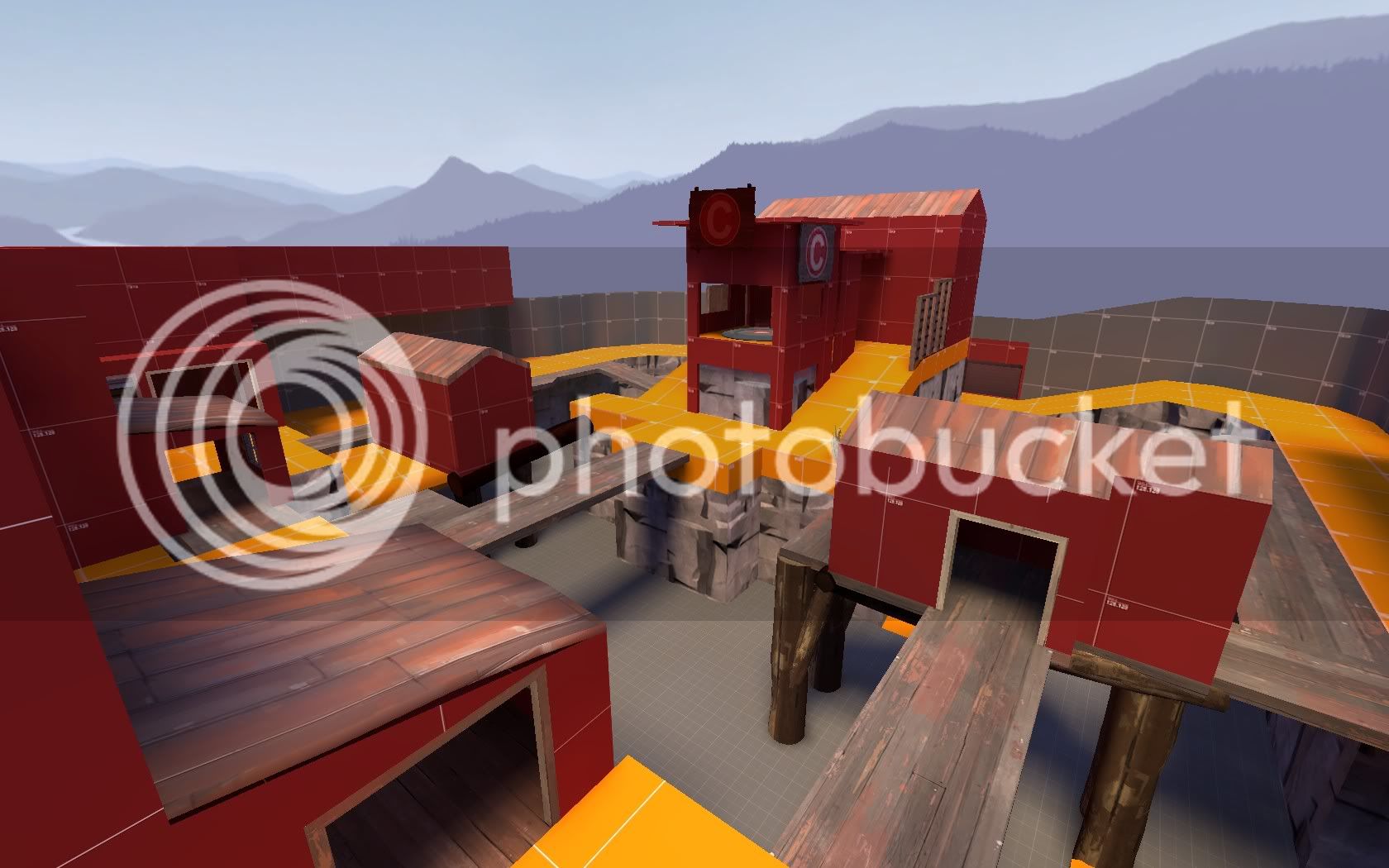
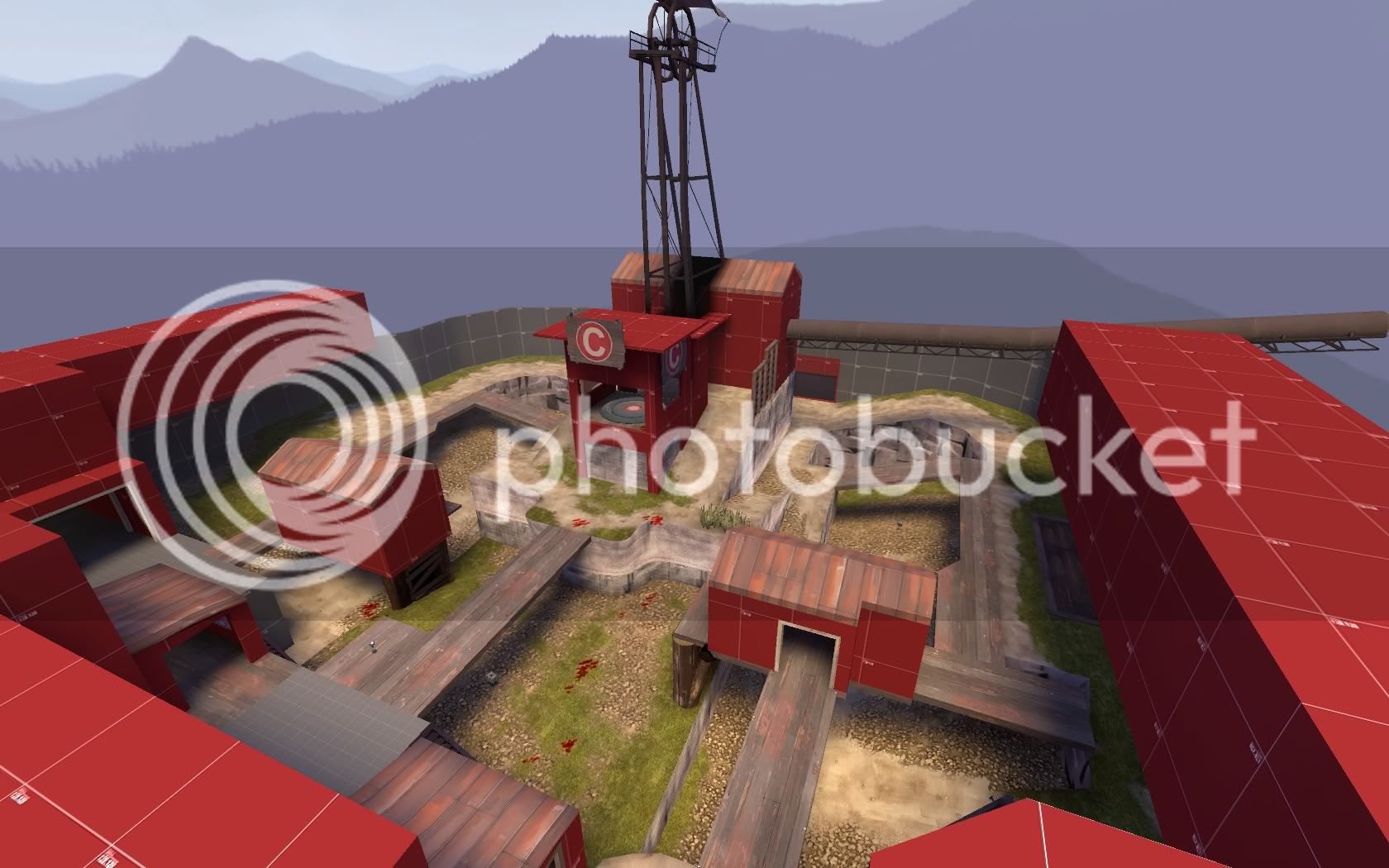
I know there's a lot of issues about C and im working on that.
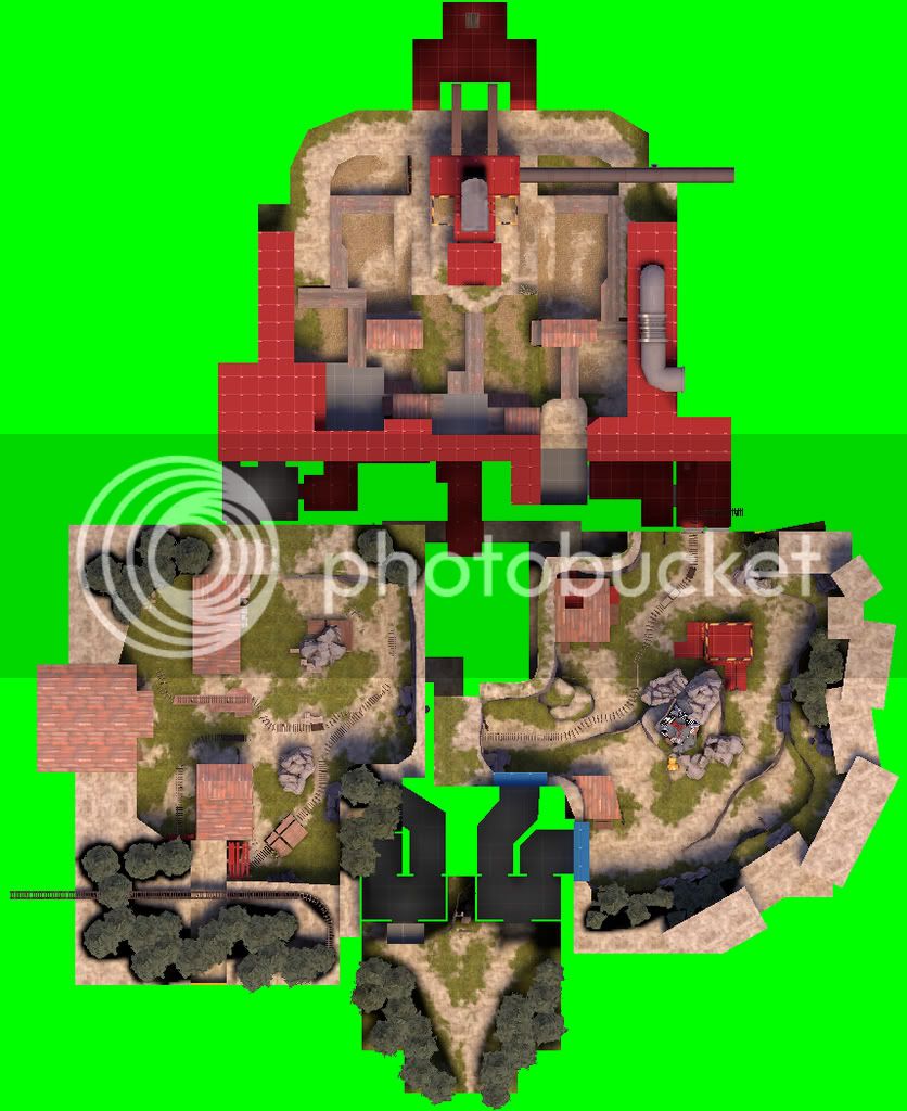
I'm much more interested to hear what you think about the A and B areas and what I could improve there. (gameplay wise, I just added basic detailing to make it more a more attractive environment than dev_textures)

Hope you had fun atleast :)
 
Last edited:

Walliard

L1: Registered
Jan 5, 2009
45
3
1. BLU spawn feels cramped. You have the one-way gates; let those be the ones that open when setup ends.

2. The point at A is very vulnerable to snipers in the tunnels.

3. C's capture zone needs to be bigger.

4. The tunnels leading to C are very mazelike. They need direction signs at the very least.

I like the overall layout, though. IMO we need more gravelpit-type maps.
 

Ravidge

Grand Vizier
aa
May 14, 2008
1,544
2,818
1. BLU spawn feels cramped. You have the one-way gates; let those be the ones that open when setup ends.

2. The point at A is very vulnerable to snipers in the tunnels.

3. C's capture zone needs to be bigger.

4. The tunnels leading to C are very mazelike. They need direction signs at the very least.

I like the overall layout, though. IMO we need more gravelpit-type maps.

1. Temporary solution. It was the last part I build the hours before the gameday deadline.

2. I kinda want the snipers to be effective there... But I guess I could extend the cap area a little to the sides, behind the walls.

3. C is getting an overhaul in a3, don't know how yet but expect major changes in the entire area.

4. Thanks, ill try to make them more easily navigated. I think the dev_textures are to blame for some of the confusion too, everything (walls, floor, ceiling) look the same so it's not easy to memorize the different paths and where they lead.
 

Sgt Frag

L14: Epic Member
May 20, 2008
1,443
710
Was pretty fun and is looking pretty good.

I think the tower should be a no build zone. An engi must've climbed the rocks and got up there, I tried and failed but didn't put alot of effort into it.
Basically if it's a struggle to get up there it should either be easier or blocked I think.
And it looks really busy, not enough room to be there.

C is very small cap point.

I think someone had built a sentry on top of a roof above maybe B and it was almost impossible to get out there through the small doorway. Maybe nobuild the roofs.
 

GrimGriz

L10: Glamorous Member
Jan 2, 2009
774
133
I really like the look and feel of A.

There's a spot just in front of point A, towards blue-base side, where a demo jumped up and got on the ledge of the building with stilts. It looked like maybe he wasn't supposed to.
 

tenaciousg

L1: Registered
Jan 8, 2008
44
7
i remember this map, C had quite a few problems.. take more examples from gravelpit imo, make the blue spawn larger, it will also give you more creativity in what you want it to look like rather then a clustered indoors spawn. about C, it was so small a scout could double jump in there from the ground easy and even with players on cap i think it would still continue capping. eh this map just needs a layout redesign and to take more examples of gravelpit..
 

Ida

deer
aa
Jan 6, 2008
2,289
1,372
Your points need indicators of where you must stand to cap. Like some hazard stripes. I found myself standing right next to A, yet I didn't cap because I was slightly outside the cap area. For A, you should actually extend the cap area into the small nooks next to the point, so that attackers have a better chance of capping it.
 

Ravidge

Grand Vizier
aa
May 14, 2008
1,544
2,818
Thanks for the great feedback! looks like my major recontruction of the map was worth it after all, but there is still much work to be done. Hopefully, less drastic next time :)
 

Ravidge

Grand Vizier
aa
May 14, 2008
1,544
2,818
BUMMMP! (from page 4)

I have been busy for the past week(s) and haven't done any mapping at all since the release of a2a. But now I am back in business!

I have gathered feedback from my previous release and it seems people DO want the final capture point to be "more like gravel pit" or "a little higher up" and "not so damn flat!" :)
While I also want to make a cool ending for my map I do not want to create "Gravel pit 2" but it's very hard to come up with a creative design that both works and looks completely different. I have thought of making it a hole, a tunnel, indoors, upsidedown and almost anything (except underwater) but the 'people' are right.. an elevated final cap is the way to go to make it balanced and fun.

Here is what I came up with:
cp_silvertrail_a30000.jpg

I moved the cap just a little higher, but I also lowered most of the floor (greatly) so the player gets the impression of it being a high mountain/hill while the fighting still goes on at the same height as before (before as in "in alpha 2").

Been wondering "Is it too much like Gravel pit?" There are similarities but I hope to make this map stand on its own. The cap is actually quite easy to reach for all classes, but narrow wooden bridges make it a little trickier if the defence is on alert. Soldier, demo and scout can utilize their skills to shortcut to the point.

another angle: http://i305.photobucket.com/albums/nn220/Ravidge/cp_silvertrail/a3/cp_silvertrail_a30001.jpg

the same area from alpha 2: http://i305.photobucket.com/albums/nn220/Ravidge/cp_silvertrail/a2/cp_silvertrail_a2a0002.jpg (this is what is currently playable)

What can I do to make it better? because it's never perfect and I know it needs work, just need a helping hand that points out all the problems.
 

Ravidge

Grand Vizier
aa
May 14, 2008
1,544
2,818
Okay, that looks pretty good. But the floor is now ridiculously low... falling to that ground will instill a huge disadvantage... maybe make the area around hte point hte lowest, with gradient displacements sloping u phigher around the edges?

Nice, I didn't think about the relative height when I moved the floor. Right now it's just about exactly the height to -not- recieve any fall damage when walking off the edge (Jumping is another story). Clearly that needs to be fixed, people will after all be knocked around and fall down all the time.. extra fall damage will be like a slap in the face.

I got some plans for what to do down there, but I like the gradient idea a lot. Hopefully I can combine them into perfection :)
 

Ravidge

Grand Vizier
aa
May 14, 2008
1,544
2,818
still working on it:
cp_silvertrail_a30002.jpg


thats enough for today. Also I think the roof of the cap is a little empty but I can't figure out what to put there :unsure:
 
Last edited:

Dustoxx

L6: Sharp Member
Jan 9, 2009
304
43
I like the layout :)

Maybe you can put a dish on it?
 

Ravidge

Grand Vizier
aa
May 14, 2008
1,544
2,818
I rebuilt the blue spawnroom. It's the opposite of cramped now, but I made a fatal mistake. In my quest to make a pretty spawn area I forgot about the importance of optimization, so.... there's now some vis rendering from A -> blue spawn and B-> blue spawn. Can be fixed easily, If I sacrifice some of my beatiful new spawn :mellow:

In other exciting news, Explosion!

KA-
BOOM!!

hmm, it looks much better in motion...
It's the first version of the explosion, I will make it look nicer as the map progress. But for now, that is enough for a alpha map.
 

Ravidge

Grand Vizier
aa
May 14, 2008
1,544
2,818
Sep 12, 2008
1,272
1,141
The explosion looks epic!
The map looks nice!
So I don't have much critique!
But doing something about the ugly shadow, is my advice!

Mapping Poetry! :D
 

trainRiderJ

L5: Dapper Member
Mar 14, 2008
203
31
I just ran through a3 on my machine and I gotta say, I love the layout. Pretty much the only good gravelpit-style map is...gravelpit, so this makes me really excited! I can't wait when this is finished! (or at least textured fully :) )
 

Ravidge

Grand Vizier
aa
May 14, 2008
1,544
2,818
I have played a3 on a few different servers with everything between 10-32 players and it's starting to feel like a proper map.

Let me show you what I mean :)
Here is the current layout. Alpha 3
cp_silvertrail_a3overview.jpg


And here is the original idea:
http://i305.photobucket.com/albums/nn220/Ravidge/cp_silvertrail/a1/cp_silvertrail_a10003.jpg (linked for hideousness).

The only part of the original layout that is still mostly intact is the B area. Every change in layout so far has taken the map in a positive direction (I believe) but it's by no means perfect.

Atm. Im trying to fix the annoying bug where red can't block captures at C. And im also trying to balance the respawntimers a little, right now they are horribly skrewed in blu favor.

Got any feedback I would gladly like to hear it as soon as possible. Even small things like "Your silver texture looks like porridge" are helpful ;)