that looks sooooo muuuuuuch better
")
i love how your stuff finally comes together. was kinda sceptic after the first round of updates but now you're at it ! but oh boy, you have an assload of work to do
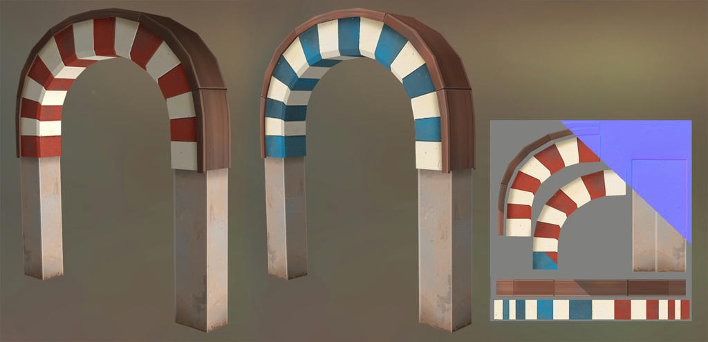
what i was wondering. is only the red/white stripes of the arch a model and the bottom parts brushwork ? cause either it has weird shadows casting where the 2 parts connect. or it's stained texturework
either way, it look some shadow error, so i'd fix that anyways !
oh and there's this weird texture stretch on the left side of the arch, whereas the right side looks perfectly fine. Fix this
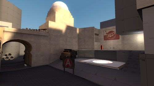
one thing that bugs me is the stuff you have going on on the upper part of the scenery. you've got that stuff at player height nailed wonderfully but as soon as my eyes move up it's like, messy, busy randomness
I'd rather have some more open view to the scenery behind it (some nifty skybox action) or if that's not what you're aiming for - less detail, it should more fade out and not be that dense in detail, e.g. not 6 different textures on the buildings but only 2-3. I think you get the point
edit: oh and, what is up with that weird moved sideways doublearch on this picture ?
http://www.skysilcox.com/dev-blog/wp-content/uploads/2010/09/market_backup20007.jpg
that can't be how people build their stuff in these years