CP artpass_beamos

coagulated

L1: Registered
Aug 12, 2010
26
13
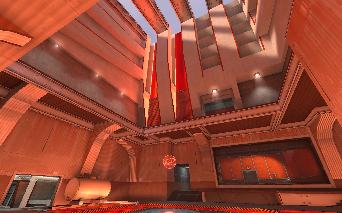
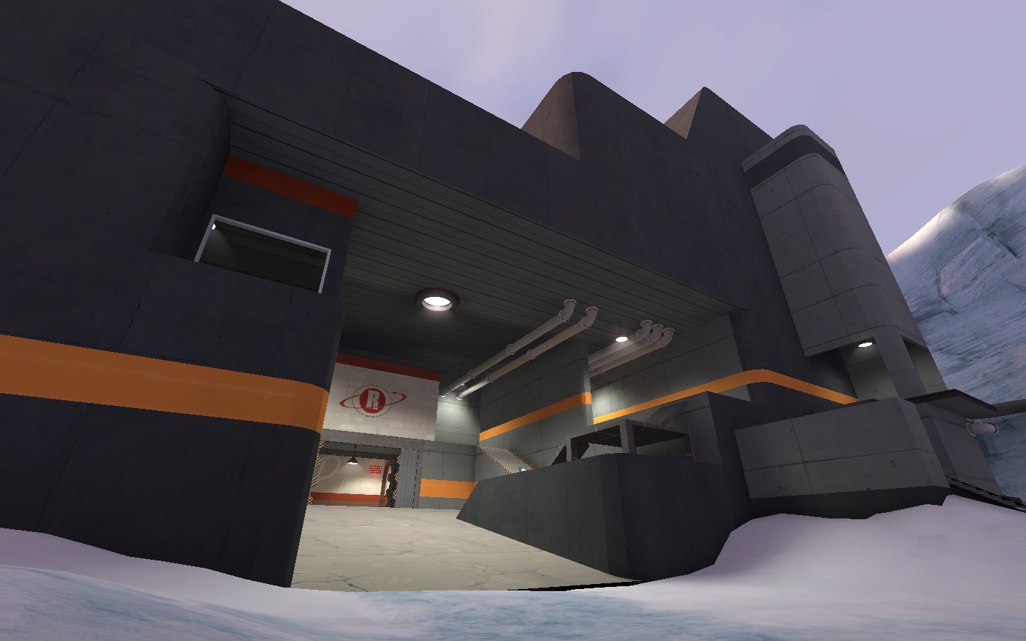
If you're going for a look which involves exposed lava, I'd advise that you go for a more clean metal look than grungy because it gives off a better evil lair aesthetic. Having grunge and lava together is reserved only for industrial metal music videos.

And yeah, I fecking love how this theme is coming along.
 
Last edited:

Beamos

L2: Junior Member
May 14, 2008
80
43
Well, BLU was going to have that more sterile aesthetic, which is why RED's a little bit on the dirty side. Since I really can't use any non-decorative wood, I need to differentiate between RED and BLU somehow. Sterility, angular/curved are how I'm going about doing that.

Speaking of angular:

tfYnH.jpg


Hahaha, idk if I'll stick with this. I wonder if it's going too far. If I don't stick with this, if it's going too far, I'll merge the various panels on the left into one large panel (or restyle them so they convey some kind of utility) and rework the ceiling into... uh... I'll keep the ceiling rails, but remove the metal panes covering them and maybe stick some lights onto the railings.

Or maybe I ought to stop listening to techno + house when I'm mapping. :p

edit: Now that it's morning, I've decided to drop the ceiling panels and edit the left side. Looks teh ugz.
 
Last edited:

Beamos

L2: Junior Member
May 14, 2008
80
43
N98gl.jpg


F6UjR.jpg


If I get a chance after the rest of the map is pretty much done, I'll tweak the lighting more. The hall feels a bit fullbright-ish, but it's not that bad that it warrants me to go back right now and fix up that lighting.

Now to work on the rest of point C, and then the fun part, area B and the B-C transition! That'll be fun. That and RED spawn. Implementing ideas is always fun <3
 

Keonyn

L2: Junior Member
Mar 27, 2010
56
17
I kind of like how you did the original ceiling, it was quite unique. The wall on the left definitely looks much better this way though.
 

Beamos

L2: Junior Member
May 14, 2008
80
43
Thanks for the feedback. I ended up ditching the first ceiling since I was getting a few comments that it was like something from portal.

Anyways, three hammer screenshots~ I would have posted ingame screenshots, but frankly, I won't DARE compile this until I've got everything func_detailed that should be. Also, please don't mind any texture/overlay oddities you might see, like rotated and shrunken textures. Just a little bug that can occur in hammer when I have glass on the map.

Working on detailing the second floor walkway's underside:
tw1sw.jpg


Red spawn window (I couldn't resist the sewer cap window looking into spawn! ><):
gxsFr.png


Inside red spawn:
BXUTn.png


For red spawn, I will be changing the right exit so you have to go through a 90o turn to access the respawn room. As it is right now, players can look directly into spawn from the right door, which isn't what I want.
 

Beamos

L2: Junior Member
May 14, 2008
80
43
Point C building nearing completion, then to work on point B:

R9wzm.jpg
 

Goombac

L4: Comfortable Member
Mar 27, 2010
172
84
Oh my, that is red. Maybe a bit too red. But it looks amazing. Although the angled overhangs along the wall next to the lava waterfalls looks like the textures should be angled as well, instead of just standard.
 

Tinker

aa
Oct 30, 2008
672
334
It looks good, but rather clean and sterile so far - and TF2 isn't very clean and sterile, ever. Consider putting more spytech around the place to break up the concrete a little. (Maybe you already did, but I can't see it from the screenshot.) That said, that's one impressive building, whatever it's for.
 

grazr

Old Man Mutant Ninja Turtle
aa
Mar 4, 2008
5,441
3,814
You really need to work on making those arches smoother/cleaner curves. The amount of red light also worries me about how much it will impact team recognition.
 

Beamos

L2: Junior Member
May 14, 2008
80
43
Thanks for the responses everyone.

I'll go ahead and tweak the red lighting saturation.

Regarding the curves, I must be misunderstanding how smoothing groups work, since I keep having issues getting them to function properly. For some reason, any 45o angle is a hard face instead of smoothed, even if it's flagged for the same smoothing group as the other faces for that column. Any non-45o angled face apart of a single smoothing group smooths properly. I'll have to figure out what's going on later.

Edit: A picture of one of the columns in hammer, since the problem might be with brush geometry:

a4zcW.png
 
Last edited:

Draco18s

L9: Fashionable Member
Sep 19, 2009
622
136
I've had some trouble with smoothing groups too, I've got some...16? sided cylinders (logs) that won't smooth.

Looking up on the wiki it says that the lightmap scale needs to be dense enough that at least one light luxel fits on each surface.
 

Beamos

L2: Junior Member
May 14, 2008
80
43
Thanks, I'll try that out as well as check out the wiki page on smoothing groups.
 

Beamos

L2: Junior Member
May 14, 2008
80
43
Oh wow, thanks for the links. I'll go ahead and try that different methodology of making arches. Before I was just clipping a single brush until a semi-curved region could be deleted from the brush to form an arch.
 

grazr

Old Man Mutant Ninja Turtle
aa
Mar 4, 2008
5,441
3,814
Vertex Manipulation all the way. Learn it well.

Also, you might wanna update your OP's images with your latest screen shots. It doesn't set a good example of your progress, those two icey cavern like wall pics.
 

Beamos

L2: Junior Member
May 14, 2008
80
43
I decided to test out (and ultimately abuse) the links grazr gave me

GSaCU.jpg


Sooooo ugly, but I don't really care at this point. If I think up anything better, I'll implement it.
 

J4CK8

L11: Posh Member
Mar 4, 2009
820
243
Those textures make it look like it should be BLU's building. Point C is nice, but very red, which might give players trouble when trying to make out whether a player is on BLU or RED.
 

Goombac

L4: Comfortable Member
Mar 27, 2010
172
84
I think those orange stripes (although pretty) would look better as red stripes.
 

Draco18s

L9: Fashionable Member
Sep 19, 2009
622
136
I agree. The orange does look nice, but it has a "dev texture" feel to it, and honestly, should be red.