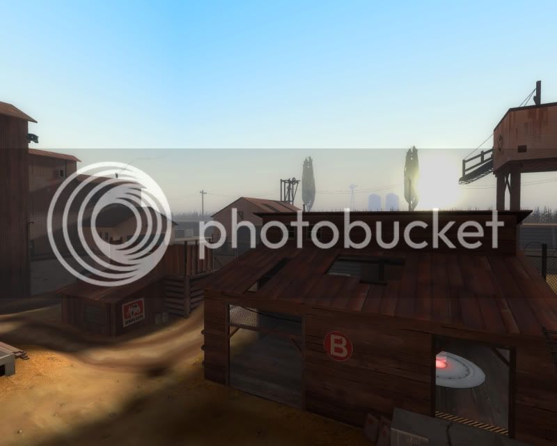
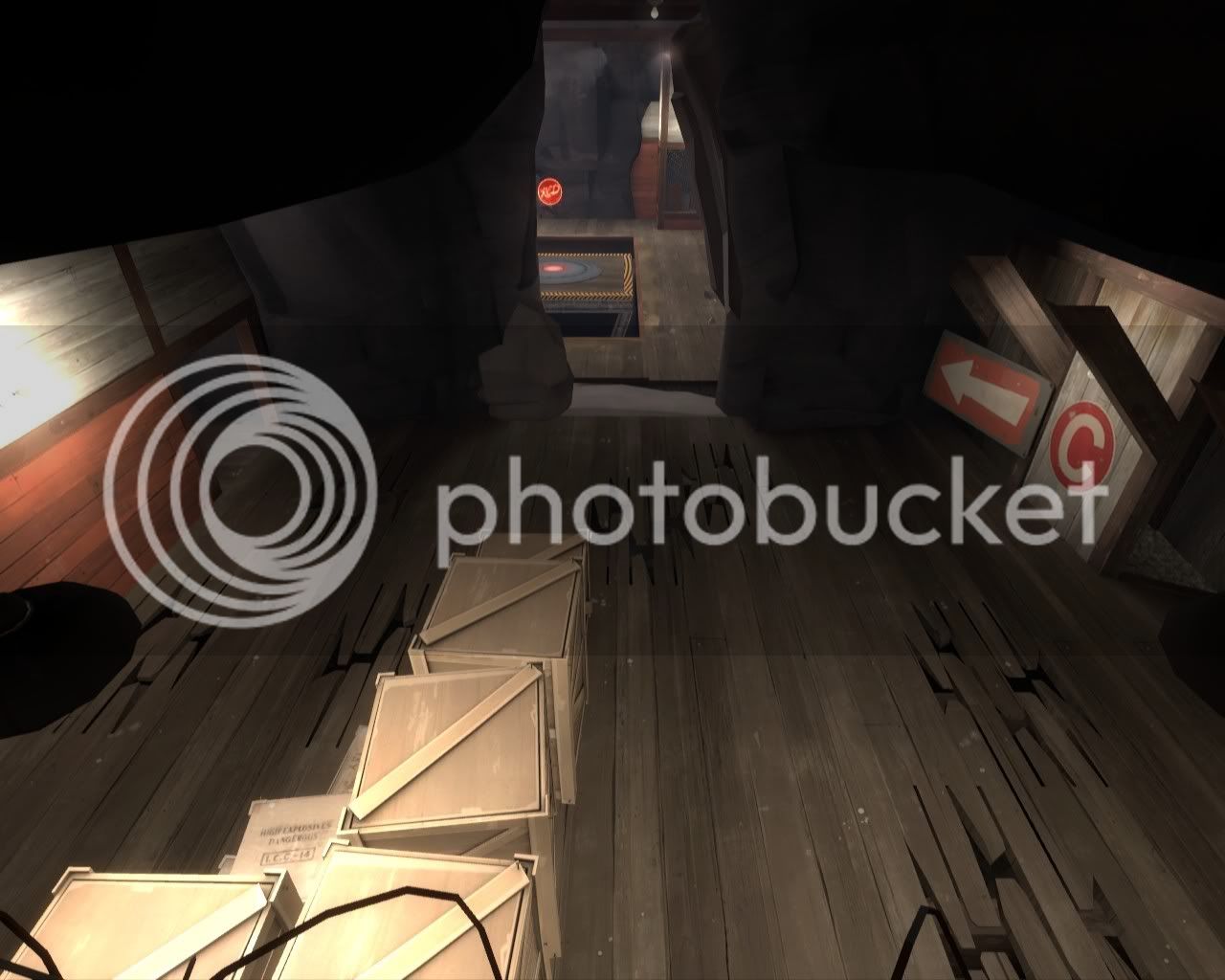
Since we don't get a public vote i thought it would be nice to discuss some of our favourite entries; where they look nice and where they could be improved.
My personal tastes lean towards Petazzo and Honeymustard, which may or may not come as a surprise considering they chose the same/similar theme as myself.
Either way both of these entries have executed the TF2 architecture to what i consider to be more accurate than most; and the light ambience is sufficiently complimentary to the respective themes.
Honeymustard's weak point seems to be his attention to the out of bounds/3dskybox area, lacking a sufficient fog distance to disguise his map edges and doesn't seem to have considered what to put here due to the lack of prop diversity. His C is sufficiently detailed if not overloaded with crates. A note on the concept of progression, the map disappointingly lacks any spytech.
Petazzo on the other hand has included spytech for his final capture point but in contrast to the rest of his map his detail has waned, possibly a result of running out of time before the deadline. His A and B presented a promising submission.
Whilst they may not be crammed full of detail I like these because they were well executed, they present a nice mood and accurately replicate the TF2 art/architectueral style.


