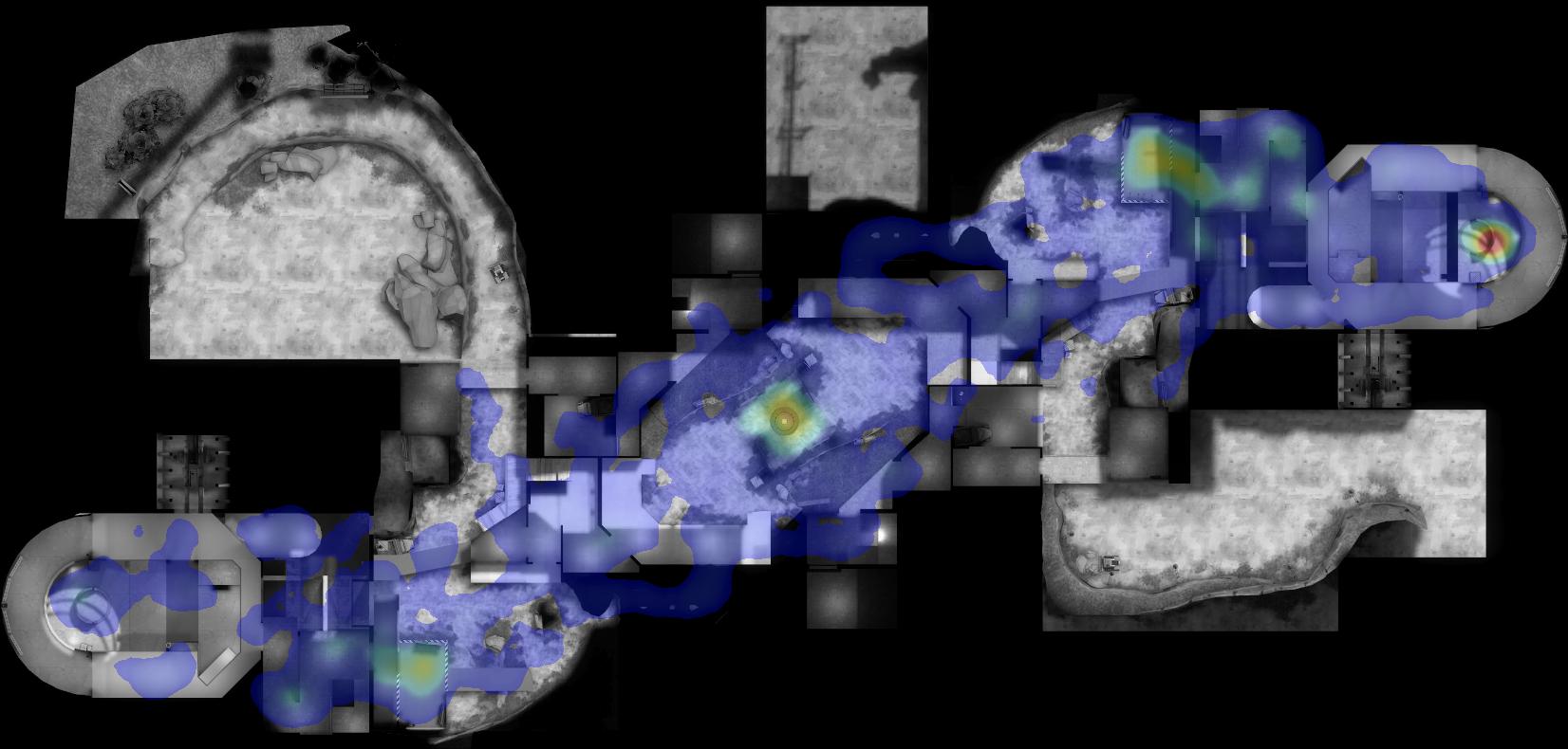
The big blurry red blobs are great for an overview and pretty pictures, they look great, super nice.
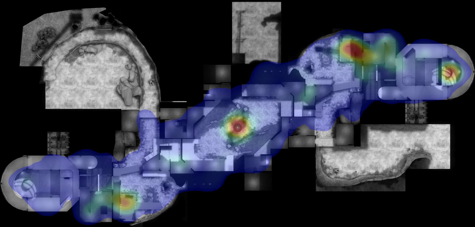
But for actual information gathering... to me as a mapper I have to look really hard to find what's relevant.
The pictures get prettier the blurrier the blobs get, and the larger the red and yellows get, but the ability to read anything from them just hits rock bottom very quickly.
I'll admit I've never really seen these kinds of heatmaps as particularly useful for mappers. The shape of the blobs always seem so arbitrarily defined, not being shaped to the rooms, spilling over into a completely irrelevant tunnel that happened to be next to a CP, but in reality it sees very little action, for example.
This is most likely due to a small sample size, which makes these huuuge green clouds that span multiple rooms but don't really tell you anything useful.
For this to be useful for testing purposes and not just finished maps that are in rotation on popular servers it needs to cater to low data/small sample size readability. A map in progress can see as little as 1-3 tests before the next version, that's at best 1½ hours of data. Some of it probably collected with less than 24 players.
Will a heatmap help me there? Probably not, because everything will be blue or have these massive diffuse green gas clouds covering everything.
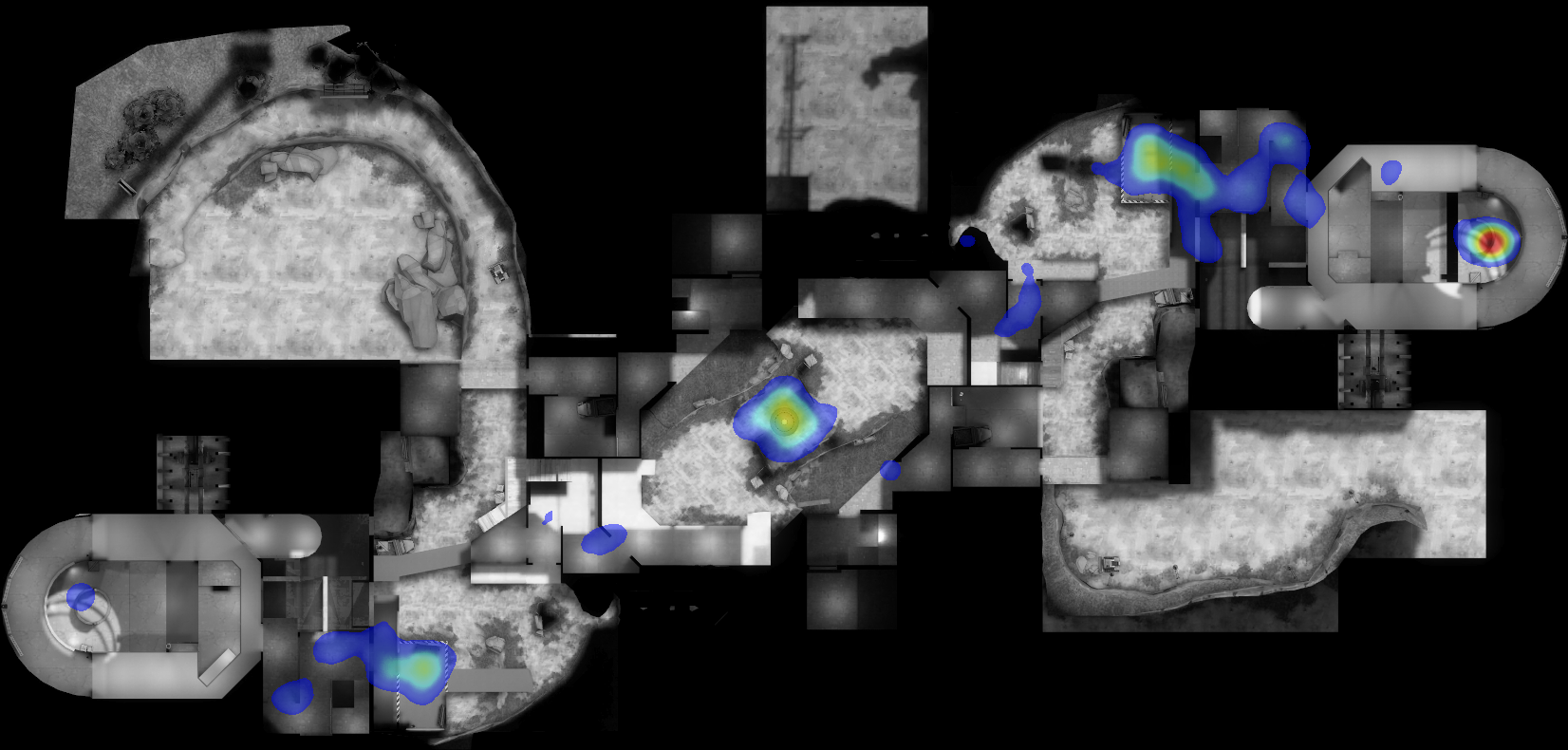
I took the first image you posted in this thread and had a go in photoshop with a few channel mixers and saturation filters and came up with this to help me find what was actually worth looking at in that heatmap

1) I removed the blue, it might as well not be there if it's not going to tell me anything.
2) I made the edges AND colors much sharper/intense.
3) I removed green gas, if the green wasn't intense enough it got culled completely, it's just irrelevant random noise deaths. The level of intensity that you deem relevant is probably the hardest thing to tweak.
I did not draw anything, I only tweaked settings and adjustment layers. It also looks like ass.
I found some green spots that were worth looking at, but being unable to tell if they're red or blue team deaths I would have to look at the demo for anything further.
The spot between mid-2nd is probably the most interesting, as it seems to be in a different location depending on if your team is stomping or not. Because clearly one team was winning most of the rounds. Or it's because of class composition of the teams?
I'm not going to read further into what the heatmap might mean, but this definitely helps me isolate a few key areas at a quick glance. And let's not forget that maybe I was expecting green in some areas where there's none? Now that I have these spots I can focus my attention to them when watching the demo.
As a mapper I don't really need the full gradient of green-yellow-red. Just give me those 3 colors, the in-between shades don't really matter to me. (maybe add blue if it's going to be useful).
I've never played glassworks, so I don't know anything about its gameplay or layout
Maybe this whole post is a load of bullshit. But maybe you can see what I'd like in a heatmap tool if it's intended to aid map development. I want well defined easy to read hotspots of different colors. Remove noise from the data and show me what's relevant.
That makes for really ugly pictures though.
But for actual information gathering... to me as a mapper I have to look really hard to find what's relevant.
The pictures get prettier the blurrier the blobs get, and the larger the red and yellows get, but the ability to read anything from them just hits rock bottom very quickly.
I'll admit I've never really seen these kinds of heatmaps as particularly useful for mappers. The shape of the blobs always seem so arbitrarily defined, not being shaped to the rooms, spilling over into a completely irrelevant tunnel that happened to be next to a CP, but in reality it sees very little action, for example.
This is most likely due to a small sample size, which makes these huuuge green clouds that span multiple rooms but don't really tell you anything useful.
For this to be useful for testing purposes and not just finished maps that are in rotation on popular servers it needs to cater to low data/small sample size readability. A map in progress can see as little as 1-3 tests before the next version, that's at best 1½ hours of data. Some of it probably collected with less than 24 players.
Will a heatmap help me there? Probably not, because everything will be blue or have these massive diffuse green gas clouds covering everything.
I took the first image you posted in this thread and had a go in photoshop with a few channel mixers and saturation filters and came up with this to help me find what was actually worth looking at in that heatmap
1) I removed the blue, it might as well not be there if it's not going to tell me anything.
2) I made the edges AND colors much sharper/intense.
3) I removed green gas, if the green wasn't intense enough it got culled completely, it's just irrelevant random noise deaths. The level of intensity that you deem relevant is probably the hardest thing to tweak.
I did not draw anything, I only tweaked settings and adjustment layers. It also looks like ass.
I found some green spots that were worth looking at, but being unable to tell if they're red or blue team deaths I would have to look at the demo for anything further.
The spot between mid-2nd is probably the most interesting, as it seems to be in a different location depending on if your team is stomping or not. Because clearly one team was winning most of the rounds. Or it's because of class composition of the teams?
I'm not going to read further into what the heatmap might mean, but this definitely helps me isolate a few key areas at a quick glance. And let's not forget that maybe I was expecting green in some areas where there's none? Now that I have these spots I can focus my attention to them when watching the demo.
As a mapper I don't really need the full gradient of green-yellow-red. Just give me those 3 colors, the in-between shades don't really matter to me. (maybe add blue if it's going to be useful).
I've never played glassworks, so I don't know anything about its gameplay or layout
Maybe this whole post is a load of bullshit. But maybe you can see what I'd like in a heatmap tool if it's intended to aid map development. I want well defined easy to read hotspots of different colors. Remove noise from the data and show me what's relevant.
That makes for really ugly pictures though.