-
This map is featured! Our best maps, all together in one place for your viewing pleasure.
You are using an out of date browser. It may not display this or other websites correctly.
You should upgrade or use an alternative browser.
You should upgrade or use an alternative browser.


Hey void, where did you get the meat grinders? Also, I really love this map and can't wait for it to be updated!
models\props_urban\urban_shredder.mdl
Oops, two years passed. Here's the fully-artpassed Beta version of this map!
I forgot all the changes made, but they're probably good. Plus, its on the Steam Workshop now too!
https://steamcommunity.com/sharedfiles/filedetails/?id=1712845210
Read the rest of this update entry...
I forgot all the changes made, but they're probably good. Plus, its on the Steam Workshop now too!
https://steamcommunity.com/sharedfiles/filedetails/?id=1712845210
Read the rest of this update entry...
Oops, two years passed. Here's the fully-artpassed Beta version of this map!
I forgot all the changes made, but they're probably good. Plus, its on the Steam Workshop now too!
https://steamcommunity.com/sharedfiles/filedetails/?id=1712845210
Read the rest of this update entry...
Want some feedback? Here's some feedback:

-I like these door textures but they seem a bit too realistic for tf2. Something just seems off about them. Also THIS IS NOT HOW DOUBLE DOORS WORK! I maybe the only one who cares about this since I see it all the time but double doors does not mean double door frames.

-It's weird to have these generator lights inside a building like this. I'd imagine you'd just install lights instead of use a temporary set up that has to constantly be refueled.

-There's gotta be a better way to block off this doorway. The barrels are a bit too simplistic to make it look like you can't jump over it plus I can get caught up on the one on the left as it sticks out from the clip brush

-You could probably use Blade64's method of guide brush displacements to smooth out the curves on these railings

-the reflections here are oddly bright. Looks like they may use the wrong cubemap due to not matching the rooms lighting.

-This area could use some detailing since it sits weirdly empty compared to surrounding areas.

-Should probably remove collision on these meat hooks

-These ad posters are great but I wish they where used more often or somewhere easier to see. It's hard to read them at this distance behind the window.

-Maybe up the cubemap resolution for reflections here or across the map. You use a lotta reflective surfaces.

-These brush conveyor belts look alright from top down but on an end like this it just looks odd. Maybe giving it more angles could make it look better or making some kind of custom model.

-Pretty much all the gameplay signs and conduits have collision. You may wanna change that.

-The blood adds some nice environmental storytelling but the texture is super stretched out and it's very noticeable.

-some kind of unique texture around the capture area would help make it more noticeable. It also feels kinda small.

-Easy to get caught up on this sign when jumping around as scout.

-these props don't exist on the other side of the map. I love me some asymmetrical detailing but they have collision so players can get caught up on em. Maybe remove collisions?

-This maybe a nitpick but how did this container get in here? There's no nearby doorway leading outside that's large enough for it to fit through.

-It's weird that this texture is super glossy on the left but not on the right.

-Clipping on these pillars is pretty good but I can get caught up on this one.

-Can also get caught up on these barrels, especially between it and the pillar.

-Could be neat to have some kinda counter somewhere keeping track of how many people fall in these. Those are always fun.
Overall the maps pretty nice but I do find it to be REALLY bright. This is possibly due to the high use of white and grey textures over anything else as light bounces off them really well. It makes the map hard to look at while also being rather dull. It would also be nice to be able to see outside a bit more. There is some kind of 3D skybox out there but I can hardly see any of it.
lastly the out of bounds Easter Eggs are great
-I like these door textures but they seem a bit too realistic for tf2. Something just seems off about them. Also THIS IS NOT HOW DOUBLE DOORS WORK! I maybe the only one who cares about this since I see it all the time but double doors does not mean double door frames.
-It's weird to have these generator lights inside a building like this. I'd imagine you'd just install lights instead of use a temporary set up that has to constantly be refueled.
-There's gotta be a better way to block off this doorway. The barrels are a bit too simplistic to make it look like you can't jump over it plus I can get caught up on the one on the left as it sticks out from the clip brush
-You could probably use Blade64's method of guide brush displacements to smooth out the curves on these railings
-the reflections here are oddly bright. Looks like they may use the wrong cubemap due to not matching the rooms lighting.
-This area could use some detailing since it sits weirdly empty compared to surrounding areas.
-Should probably remove collision on these meat hooks
-These ad posters are great but I wish they where used more often or somewhere easier to see. It's hard to read them at this distance behind the window.
-Maybe up the cubemap resolution for reflections here or across the map. You use a lotta reflective surfaces.
-These brush conveyor belts look alright from top down but on an end like this it just looks odd. Maybe giving it more angles could make it look better or making some kind of custom model.
-Pretty much all the gameplay signs and conduits have collision. You may wanna change that.
-The blood adds some nice environmental storytelling but the texture is super stretched out and it's very noticeable.
-some kind of unique texture around the capture area would help make it more noticeable. It also feels kinda small.
-Easy to get caught up on this sign when jumping around as scout.
-these props don't exist on the other side of the map. I love me some asymmetrical detailing but they have collision so players can get caught up on em. Maybe remove collisions?
-This maybe a nitpick but how did this container get in here? There's no nearby doorway leading outside that's large enough for it to fit through.
-It's weird that this texture is super glossy on the left but not on the right.
-Clipping on these pillars is pretty good but I can get caught up on this one.
-Can also get caught up on these barrels, especially between it and the pillar.
-Could be neat to have some kinda counter somewhere keeping track of how many people fall in these. Those are always fun.
Overall the maps pretty nice but I do find it to be REALLY bright. This is possibly due to the high use of white and grey textures over anything else as light bounces off them really well. It makes the map hard to look at while also being rather dull. It would also be nice to be able to see outside a bit more. There is some kind of 3D skybox out there but I can hardly see any of it.
lastly the out of bounds Easter Eggs are great
Mega got to this before me, so I omitted some pictures. Just ignore anything redundant.
https://imgur.com/a/29PYcEg
https://imgur.com/a/29PYcEg

Big feedback post incoming. The catch is, it's nearly all gameplay criticism. I don't really care about clipping at this point since I think something is a little wonky with how the map prioritises its routes.
Disclaimer: these are not presented as concrete facts. These are analyses presented from playing + spectating.
The establishing shot: immediately upon leaving spawn, this is the order of prominence the doors are noticed in. This labeling will stay consistent once we reach mid.
Orange door 1 is the door most players will gravitate towards, as it is dead centre and the shortest distance away.
Yellow door 2 is the most prominent flank door. This is important—it registers as a FLANK door, not a door that will lead to a choke, because it is much less lit up and at a 90° angle relative to door 1.
Teal door 3 and door 4 both are the least prominent doors. This is a major issue, in my eyes, as I will go into later. These doors actually lead to what is possibly the most important area of the map for pushing classes to use. They are coloured identically for reasons that will be expanded upon.

———
Let's follow the average player through door 1. We are going to posture that the player is attacking the point, which is being defended by RED team.
Immediately upon entry into door 1 the player is presented with two hard chokes, labeled with the cyan dotted lines. These are "hard chokes" because there are low doorways separating the attacker from the defender. The attacking player will not enjoy pushing through this route, as it is the most easily defended route by RED. This is possibly the least useful route to attack the point from, as a result. This is bad news, since this is the first door players gravitate towards.

———
We now switch to the perspective of RED, defending the point. The most common defensive position will be on the point itself. Door 1 is front and centre, with its massive chokes, and is the prime location for soldier spam, demo spam, and heavy bullets. This door will not be pushed in through successfully unless 1. an uber is used to push in through it or 2. an uber is used elsewhere to bait focus from the explosive classes. In my opinion, this wouldn't be a bad issue if door 1 had rotation options that didn't require retracing steps. However, the route is linear, and doesn't offer any connections to door 2's routes or door 3 / 4. This means players using door 1 who are not in a position to push in may often be frustrated by the lack of options presented to them. [The yellow dashed line represents a fall of over 256u, which makes pushing from said entrance unfeasible due to fall damage.]

———
This is not the last of door 1's problems, however. There is a very powerful and very safe sniper position given to the defending team which directly watches over door 1. The existence of a window next to door 1 gives the sniper even more control over the door, and effectively locks it out. This sniper is also given free vision over both of the exit doors from door 2, which I have labeled door 2a (for the upper route) and door 2b (for the lower route). Neither of these routes is a choke, and if pushes are attempted through them, the sniper has a great shot of shutting down anything that doesn't have an uber. The last important location to notice is what is labeled route 3 / C. This route is what door 3 leads into, and I have given it a new colour due to its importance. More on this later.
This sniper has unprecedented control over how every interaction on this point plays out, as well as an incredibly safe route on his immediate left to duck into. This route is not bombable by soldiers and not spammable by demomen. This results in the sniper having instant safety from any threat he sees coming, and considering the length of the mid and how long a soldier takes to cross it, is easily spotted. This is bad, and I am disappointed that this did not change at all from the earlier versions.

———
Another sniper on the map may choose to take up position in the defending team's conveyor area, which also has a host of sightlines that are important to note.
First one looks straight into route 3 / C. This is not terrible, but the sniper gets a ridiculous amount of cover and is essentially unkillable if paired with a friend holding the rooms to his right.

This same sniper can then rotate into the conveyor area, which has a beautiful view onto door 4, route C, and the other team's window W. There is more cover from this sniper than there is from the last, but still not nearly enough. The map needs some major layout manipulation to prevent snipers from dominating, in my eyes, and it's a shame that it probably won't happen.

———
So if normal classes can't effectively contest the point through door 1, how about door 2? We've established that the high ledge (2a) is unfeasible, so let's look at door 2b.
There is a major issue here. There is no cover from the opposing team's sniper which will sit at their door 2a. No cover whatsoever. Even the healthkit H will be impossible to grab without risking your head getting blown off. The hard choke present in this door makes it very iffy to use this door as a flank, as well, which is due to the position that the defending team has in their conveyor room.

Notice route rF. This is RED's flank route from their conveyor room. I am not sure if this route was intended to be used by BLU to contest RED's conveyor room, but the design gives RED a nasty advantage over anyone trying to use it as such.

Why, then, is RED given a full healthkit directly on top of this route that BLU should be using to push out RED? If a soldier is positioned in this room, there is no good way an attacking player will be able to take this ground without getting killed. They will have already been spotted out by the defending team by the time they enter rF, and anybody holding that room (engineer, perhaps?) will have a ridiculous advantage over them due to the tight hall and high height difference. This isn't a good way for BLU to enter RED's defences.

———
Moving on... how do we attack the point, then? The answer lies within doors 3/4. Let's examine them.
Doors 3 and 4 lead to and from the exact same place on the map, barring a very small position difference from door 4.


As noted earlier, these two doors are the least appealing doors for players exiting spawn, and this is a bad thing due to their importance. They lead into route 3 / C, henceforth just Choke C, the main choke of the map. As route 3 / C is open, wide, and maneuverable, it gets this designation. The majority of successful plays which do not include ubers will originate from this route. Flanks F1 and F2 exist from here as well, giving many options to players who choose to take the long road over here.
In my opinion, this area needs to be the area players are most drawn to when they exit the spawn. Choke C is the best route for attacking the point, as door 1 and door 2 don't present good options for the bulk of the offensive players.
There are issues. First: the pickups encircled in teal should not be that far forward. These should be placed in a location where teams will be standing to prepare, not a position where teams are already engaging fights. Potentially, they may want to be where the dotted teal trapezoid is.
My other issue is that this route is very exposed to window W. There is no way whatsoever for anyone to spam this sniper out, as he is simultaneously incredibly safe and incredibly hard to see. The lighting does not prioritise this sniper and most players probably won't see him as he picks them off.

Fortunately, door 4 is less exposed. However, it's the furthest entry point from the initial spawn and will most likely not see as much traffic as it needs. The black W2 represents the partial sniper line that players are exposed to here, which may present a problem due to the illegibility of it, again.

Flank F2 is an odd route, and certainly the most removed from gameplay as it stands. There won't be much action here since the spawns are so far away, and it's a shame, because it could present some interesting flank action if the spawns encouraged players to go to doors 3/4 more.

———
Lastly, some miscellaneous gameplay comments. This full health has no reason whatsoever to exist in a spot where the defending team benefits so much from it. It's protected from any spam coming from attackers, and nobody attacking is able to see when a defender goes to pick it up. It's incredibly safe and not a good thing for the map.

———
Players on the point during skirmishes do not have any cover at all. There is only one bit of cover from the sniper that does not include the full health kit, and it is hideously small. Their only choice, if they want to avoid the sniper, is to back out of the fight entirely. I really think there should be more cover options for these players.

———
The lighting does not encourage good route recognition. Door 2b, which is not an important door at all, is lit up with strange coloured lights that make it look like the most important doorway. Route C is given no prominence at all, with its colour and brightness being the exact same as the out-of-bounds area way above its head. Please change this! The window W needs to have more prominence as well, as it's way more important than it looks at the moment.

———
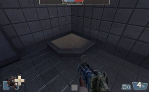
Also, I really think the grinders on the point are not fun at all and detract from the experience when fighting on mid. Nobody likes being pushed into them when trying to contest the point.
———
That's that. Figured the map needed some gameplay criticism since the mid point had very little change made from when I saw it last in alpha. It's a bit frustrating, considering the sightline and cover issues were pointed out already. Conclude what you will, but I think the map needs some serious layout revision (at the very least, revision to encourage players to use door 3/4 more and to neuter snipers). Looks good, but doesn't play as well as it looks. Here's hoping for improvements.
Disclaimer: these are not presented as concrete facts. These are analyses presented from playing + spectating.
The establishing shot: immediately upon leaving spawn, this is the order of prominence the doors are noticed in. This labeling will stay consistent once we reach mid.
Orange door 1 is the door most players will gravitate towards, as it is dead centre and the shortest distance away.
Yellow door 2 is the most prominent flank door. This is important—it registers as a FLANK door, not a door that will lead to a choke, because it is much less lit up and at a 90° angle relative to door 1.
Teal door 3 and door 4 both are the least prominent doors. This is a major issue, in my eyes, as I will go into later. These doors actually lead to what is possibly the most important area of the map for pushing classes to use. They are coloured identically for reasons that will be expanded upon.
———
Let's follow the average player through door 1. We are going to posture that the player is attacking the point, which is being defended by RED team.
Immediately upon entry into door 1 the player is presented with two hard chokes, labeled with the cyan dotted lines. These are "hard chokes" because there are low doorways separating the attacker from the defender. The attacking player will not enjoy pushing through this route, as it is the most easily defended route by RED. This is possibly the least useful route to attack the point from, as a result. This is bad news, since this is the first door players gravitate towards.
———
We now switch to the perspective of RED, defending the point. The most common defensive position will be on the point itself. Door 1 is front and centre, with its massive chokes, and is the prime location for soldier spam, demo spam, and heavy bullets. This door will not be pushed in through successfully unless 1. an uber is used to push in through it or 2. an uber is used elsewhere to bait focus from the explosive classes. In my opinion, this wouldn't be a bad issue if door 1 had rotation options that didn't require retracing steps. However, the route is linear, and doesn't offer any connections to door 2's routes or door 3 / 4. This means players using door 1 who are not in a position to push in may often be frustrated by the lack of options presented to them. [The yellow dashed line represents a fall of over 256u, which makes pushing from said entrance unfeasible due to fall damage.]
———
This is not the last of door 1's problems, however. There is a very powerful and very safe sniper position given to the defending team which directly watches over door 1. The existence of a window next to door 1 gives the sniper even more control over the door, and effectively locks it out. This sniper is also given free vision over both of the exit doors from door 2, which I have labeled door 2a (for the upper route) and door 2b (for the lower route). Neither of these routes is a choke, and if pushes are attempted through them, the sniper has a great shot of shutting down anything that doesn't have an uber. The last important location to notice is what is labeled route 3 / C. This route is what door 3 leads into, and I have given it a new colour due to its importance. More on this later.
This sniper has unprecedented control over how every interaction on this point plays out, as well as an incredibly safe route on his immediate left to duck into. This route is not bombable by soldiers and not spammable by demomen. This results in the sniper having instant safety from any threat he sees coming, and considering the length of the mid and how long a soldier takes to cross it, is easily spotted. This is bad, and I am disappointed that this did not change at all from the earlier versions.
———
Another sniper on the map may choose to take up position in the defending team's conveyor area, which also has a host of sightlines that are important to note.
First one looks straight into route 3 / C. This is not terrible, but the sniper gets a ridiculous amount of cover and is essentially unkillable if paired with a friend holding the rooms to his right.
This same sniper can then rotate into the conveyor area, which has a beautiful view onto door 4, route C, and the other team's window W. There is more cover from this sniper than there is from the last, but still not nearly enough. The map needs some major layout manipulation to prevent snipers from dominating, in my eyes, and it's a shame that it probably won't happen.
———
So if normal classes can't effectively contest the point through door 1, how about door 2? We've established that the high ledge (2a) is unfeasible, so let's look at door 2b.
There is a major issue here. There is no cover from the opposing team's sniper which will sit at their door 2a. No cover whatsoever. Even the healthkit H will be impossible to grab without risking your head getting blown off. The hard choke present in this door makes it very iffy to use this door as a flank, as well, which is due to the position that the defending team has in their conveyor room.
Notice route rF. This is RED's flank route from their conveyor room. I am not sure if this route was intended to be used by BLU to contest RED's conveyor room, but the design gives RED a nasty advantage over anyone trying to use it as such.
Why, then, is RED given a full healthkit directly on top of this route that BLU should be using to push out RED? If a soldier is positioned in this room, there is no good way an attacking player will be able to take this ground without getting killed. They will have already been spotted out by the defending team by the time they enter rF, and anybody holding that room (engineer, perhaps?) will have a ridiculous advantage over them due to the tight hall and high height difference. This isn't a good way for BLU to enter RED's defences.
———
Moving on... how do we attack the point, then? The answer lies within doors 3/4. Let's examine them.
Doors 3 and 4 lead to and from the exact same place on the map, barring a very small position difference from door 4.
As noted earlier, these two doors are the least appealing doors for players exiting spawn, and this is a bad thing due to their importance. They lead into route 3 / C, henceforth just Choke C, the main choke of the map. As route 3 / C is open, wide, and maneuverable, it gets this designation. The majority of successful plays which do not include ubers will originate from this route. Flanks F1 and F2 exist from here as well, giving many options to players who choose to take the long road over here.
In my opinion, this area needs to be the area players are most drawn to when they exit the spawn. Choke C is the best route for attacking the point, as door 1 and door 2 don't present good options for the bulk of the offensive players.
There are issues. First: the pickups encircled in teal should not be that far forward. These should be placed in a location where teams will be standing to prepare, not a position where teams are already engaging fights. Potentially, they may want to be where the dotted teal trapezoid is.
My other issue is that this route is very exposed to window W. There is no way whatsoever for anyone to spam this sniper out, as he is simultaneously incredibly safe and incredibly hard to see. The lighting does not prioritise this sniper and most players probably won't see him as he picks them off.
Fortunately, door 4 is less exposed. However, it's the furthest entry point from the initial spawn and will most likely not see as much traffic as it needs. The black W2 represents the partial sniper line that players are exposed to here, which may present a problem due to the illegibility of it, again.
Flank F2 is an odd route, and certainly the most removed from gameplay as it stands. There won't be much action here since the spawns are so far away, and it's a shame, because it could present some interesting flank action if the spawns encouraged players to go to doors 3/4 more.
———
Lastly, some miscellaneous gameplay comments. This full health has no reason whatsoever to exist in a spot where the defending team benefits so much from it. It's protected from any spam coming from attackers, and nobody attacking is able to see when a defender goes to pick it up. It's incredibly safe and not a good thing for the map.
———
Players on the point during skirmishes do not have any cover at all. There is only one bit of cover from the sniper that does not include the full health kit, and it is hideously small. Their only choice, if they want to avoid the sniper, is to back out of the fight entirely. I really think there should be more cover options for these players.
———
The lighting does not encourage good route recognition. Door 2b, which is not an important door at all, is lit up with strange coloured lights that make it look like the most important doorway. Route C is given no prominence at all, with its colour and brightness being the exact same as the out-of-bounds area way above its head. Please change this! The window W needs to have more prominence as well, as it's way more important than it looks at the moment.
———
Also, I really think the grinders on the point are not fun at all and detract from the experience when fighting on mid. Nobody likes being pushed into them when trying to contest the point.
———
That's that. Figured the map needed some gameplay criticism since the mid point had very little change made from when I saw it last in alpha. It's a bit frustrating, considering the sightline and cover issues were pointed out already. Conclude what you will, but I think the map needs some serious layout revision (at the very least, revision to encourage players to use door 3/4 more and to neuter snipers). Looks good, but doesn't play as well as it looks. Here's hoping for improvements.
Malachite Man
L6: Sharp Member
- Oct 16, 2015
- 345
- 198

TheMightyGerbil
L2: Junior Member
- Dec 23, 2012
- 79
- 21
Played it back in the day, liked and remembered it because it had conveyor belts like one of my maps did. Beautiful and professional job detailing it out and I am glad you stuck with it. It will probably be a regular play on my server for a bit . Airblasting people into things is always a bonus too .
. Airblasting people into things is always a bonus too .Slaughter now has all the gameplay adjustments of Laughter from public feedback, along with a visual upgrade, new assets, and more blood!
Read the rest of this update entry...
Read the rest of this update entry...
Feedback time again:

-This sightline still exists

-clip or remove collision on this prop

-I can get stuck here on the belt under the point

-is this clipped smooth? Doesn't seem like it and comes off as kinda awkward

-weird reflections

-Never realized this was supposed to be a loading dock open to the inside of a trailer. The idle engine sound effect here really sells it and it's a nice touch. Dunno if that was there before but I only noticed it now

-this room feels kind of empty. Maybe it could use some stuff on the walls?

-weird reflections all over these coffee props

-I think you could get away with higher cubemap reflections here

-there's multiple lil alcoves like this around the map that could be clipped smooth

-I still think this sign shouldn't have collision

-this is just a great looking shot. The mist on the floor and overall lighting make for some great touches

-all of this could be clipped smooth

-could use more clipping

-none of these doors nor ledges are clipped
That's it for now. Top notch work as always
-This sightline still exists
-clip or remove collision on this prop
-I can get stuck here on the belt under the point
-is this clipped smooth? Doesn't seem like it and comes off as kinda awkward
-weird reflections
-Never realized this was supposed to be a loading dock open to the inside of a trailer. The idle engine sound effect here really sells it and it's a nice touch. Dunno if that was there before but I only noticed it now
-this room feels kind of empty. Maybe it could use some stuff on the walls?
-weird reflections all over these coffee props
-I think you could get away with higher cubemap reflections here
-there's multiple lil alcoves like this around the map that could be clipped smooth
-I still think this sign shouldn't have collision
-this is just a great looking shot. The mist on the floor and overall lighting make for some great touches
-all of this could be clipped smooth
-could use more clipping
-none of these doors nor ledges are clipped
That's it for now. Top notch work as always
Attachments
Gravidea
L5: Dapper Member
- Apr 17, 2017
- 237
- 105
Hey there! I'm writing this post because I've noticed a few people from our servers (the LazyPurple servers) mentioning an issue with this map, specifically the file. I've had a lot of people come to me saying that the map is wonderful, except there are a few servers that use the same version string (that being b2a) that are somehow different, causing them to have to delete the map file and re-download it.
I've directed them to this download here on this thread in hopes that they grab the correct version, but I feel like this could possibly be sorted out with a new version string. Apparently, servers like Creators.tf run a different version using the same string for some odd reason. If this is an issue anyone else is facing, please feel free to back me up, as this is the only map as of recent that I've seen have this! I'm unsure if Void will actually come around and update the map based on THIS problem alone, but it would be nice!
I've directed them to this download here on this thread in hopes that they grab the correct version, but I feel like this could possibly be sorted out with a new version string. Apparently, servers like Creators.tf run a different version using the same string for some odd reason. If this is an issue anyone else is facing, please feel free to back me up, as this is the only map as of recent that I've seen have this! I'm unsure if Void will actually come around and update the map based on THIS problem alone, but it would be nice!