-
This map is featured! Our best maps, all together in one place for your viewing pleasure.
You are using an out of date browser. It may not display this or other websites correctly.
You should upgrade or use an alternative browser.
You should upgrade or use an alternative browser.
- Jan 18, 2009
- 844
- 479
KotH Arctic B2 has been released!
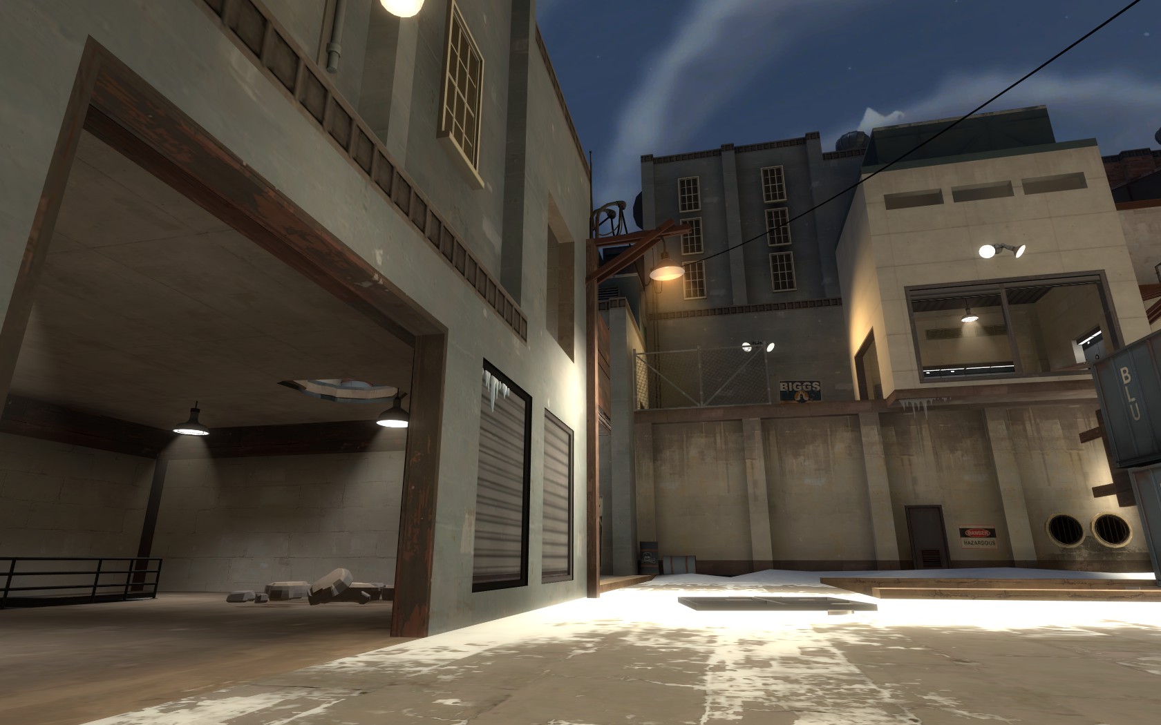
Brrr
By Hannes "Hanz" Tirez
hannes_tirez@hotmail.com
Changelog:
30/08/2012 - B2a:
- Packed a custom texture that I forgot
30/08/2012 - B2:
- Minor changes to the layout, refined a few gameplay elements here and there
- Detailed and optimized the whole map
- Other minor things
Now back to the good part
Download: (Updated to B2a*, tf2maps link stayed the same)
TF2Maps: http://forums.tf2maps.net/downloads.php?do=file&id=5126
Dropbox: http://dl.dropbox.com/u/754215/72hr - KotH map/RELEASE/koth_arctic_b2a.bsp.bz2
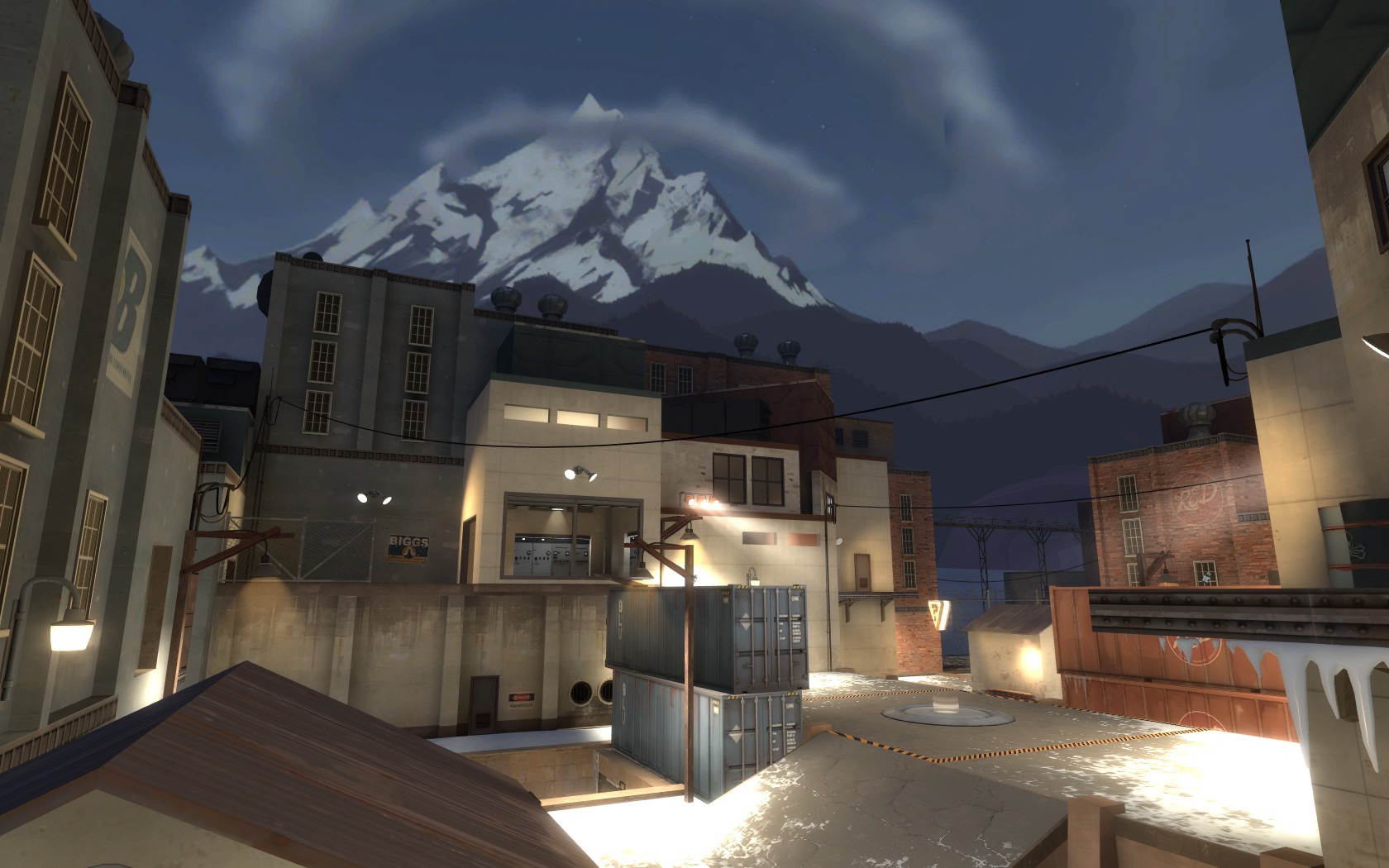
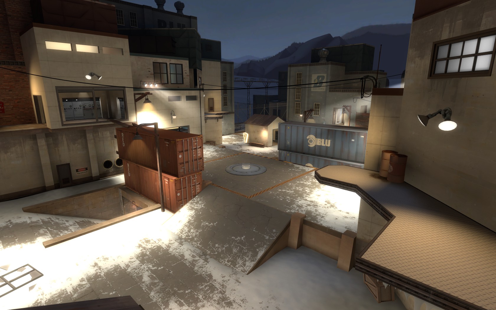
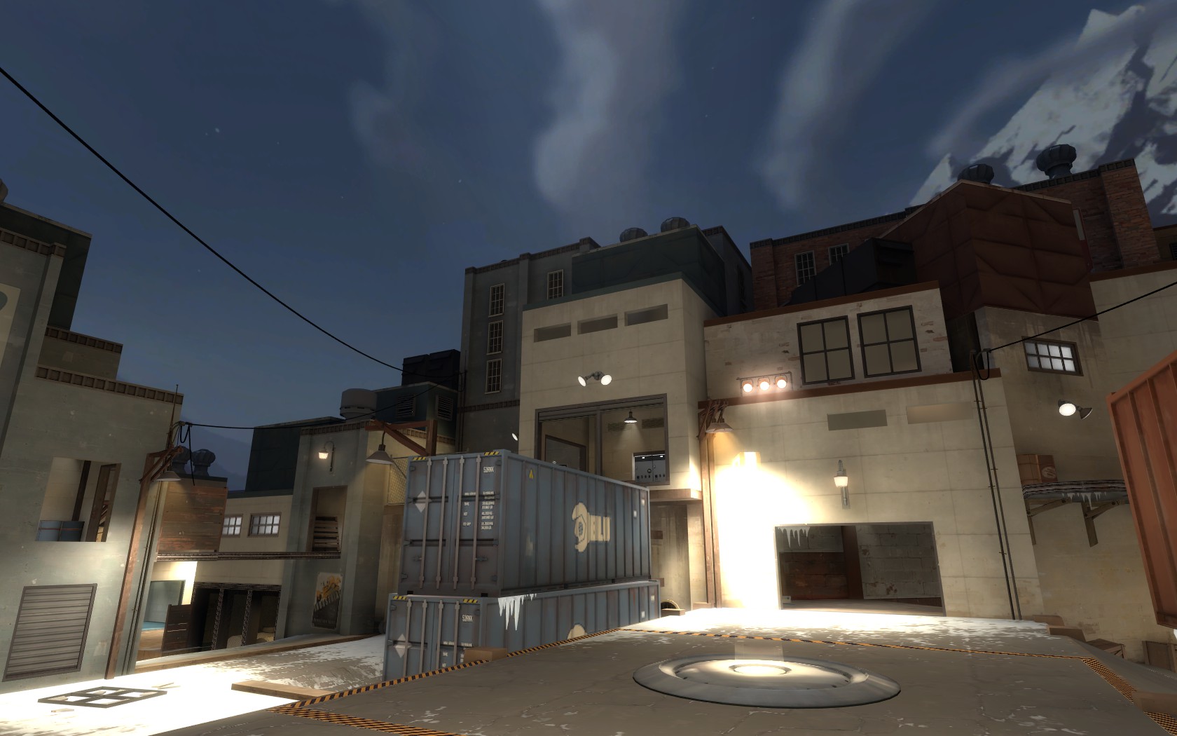
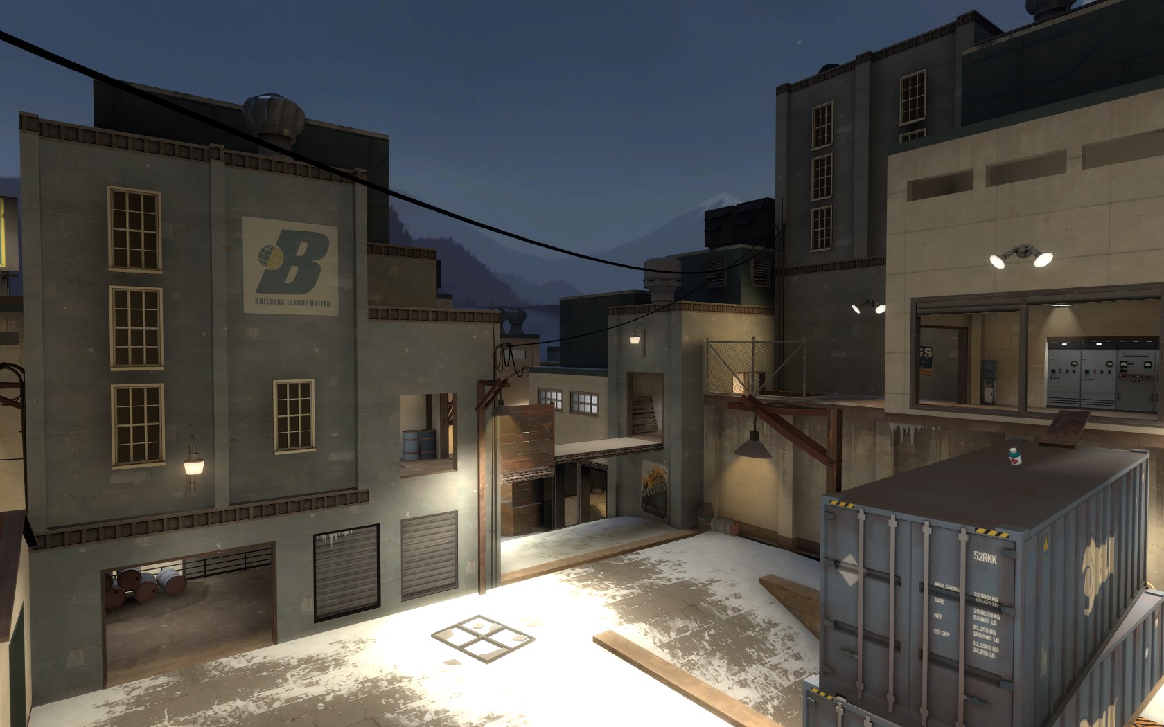
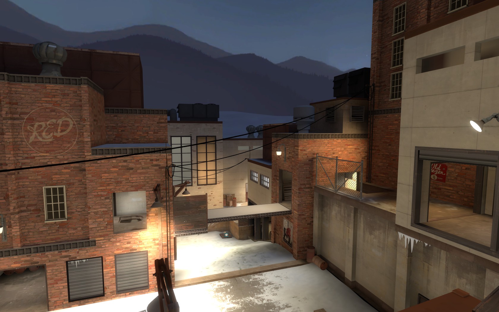
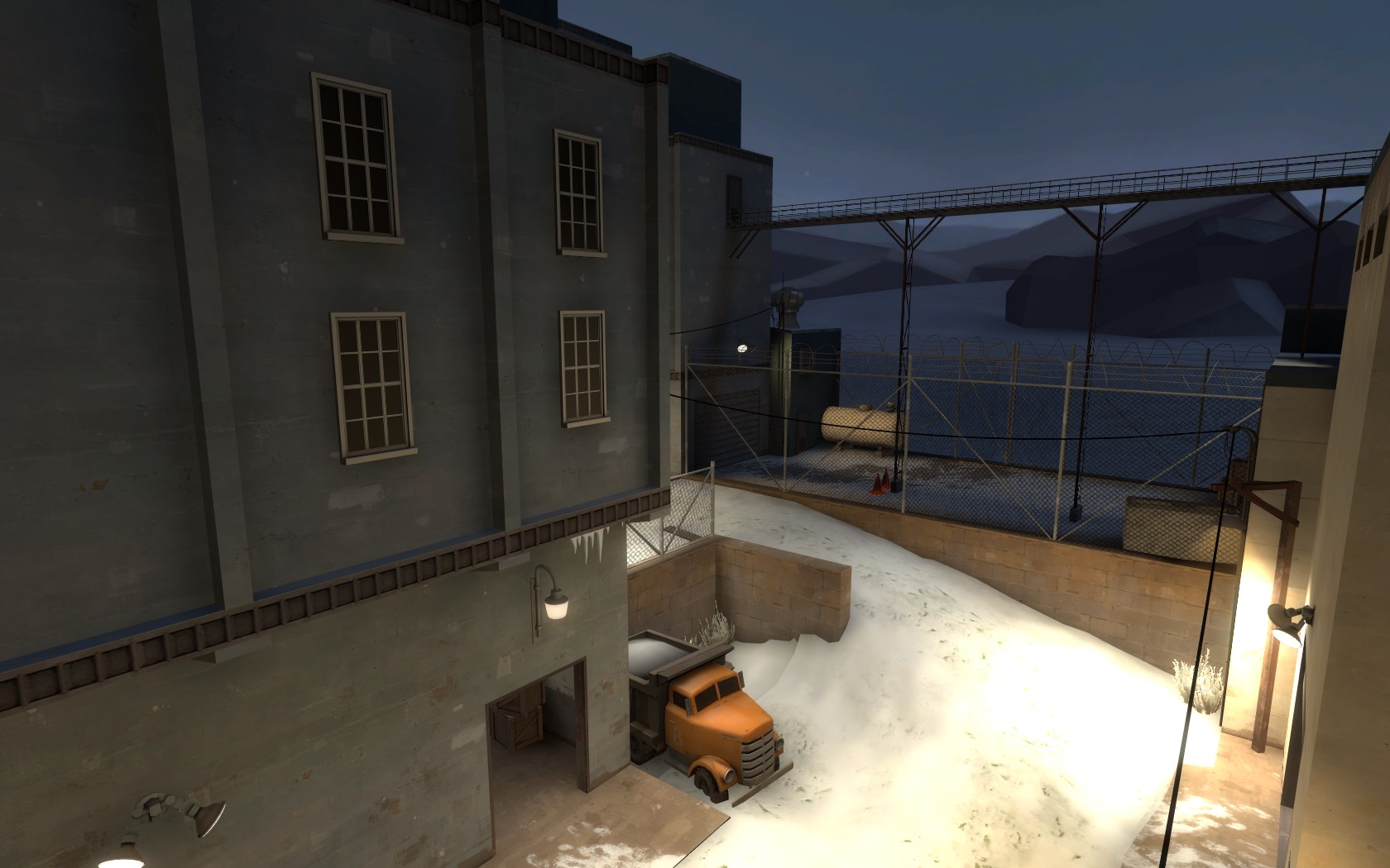
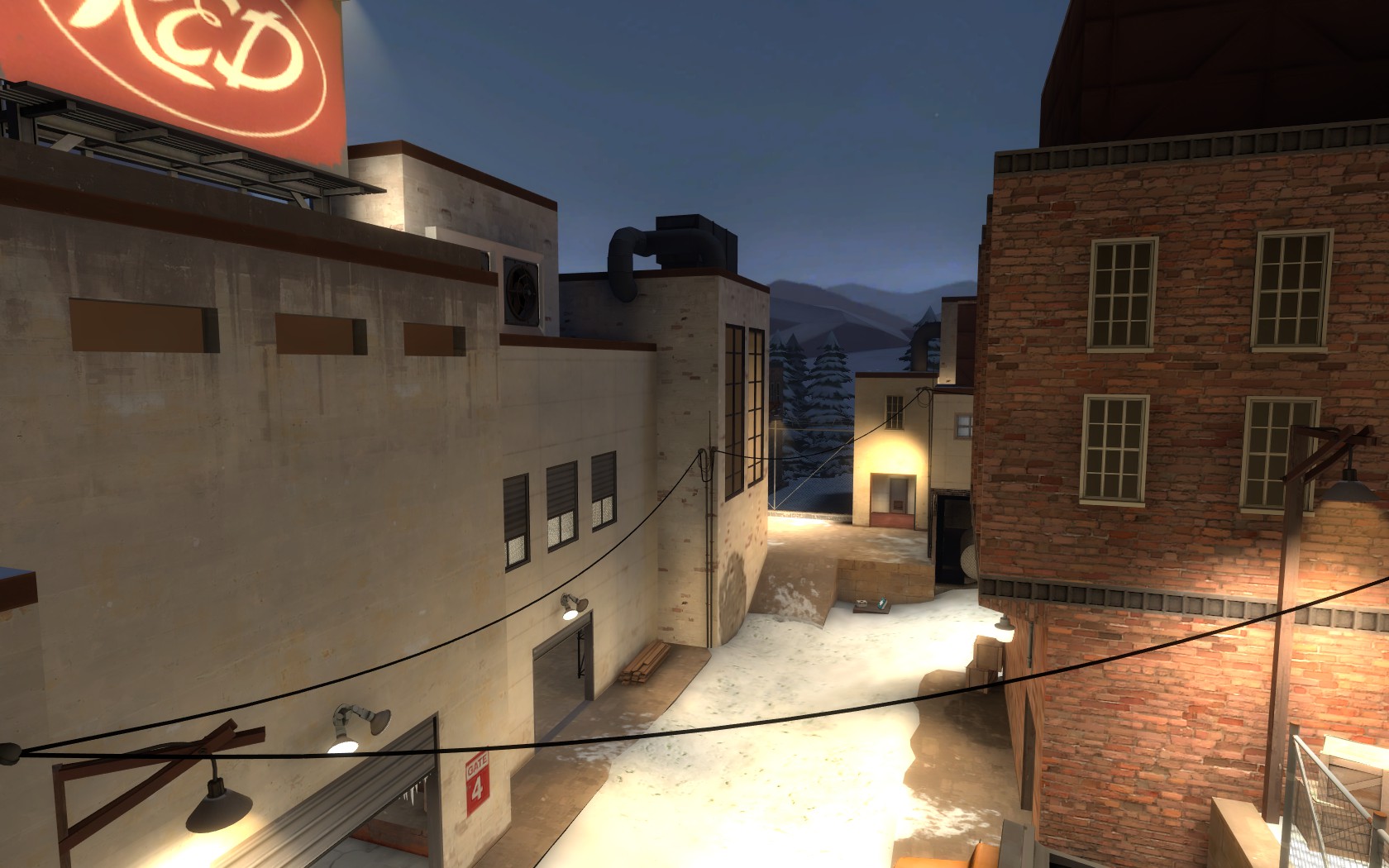
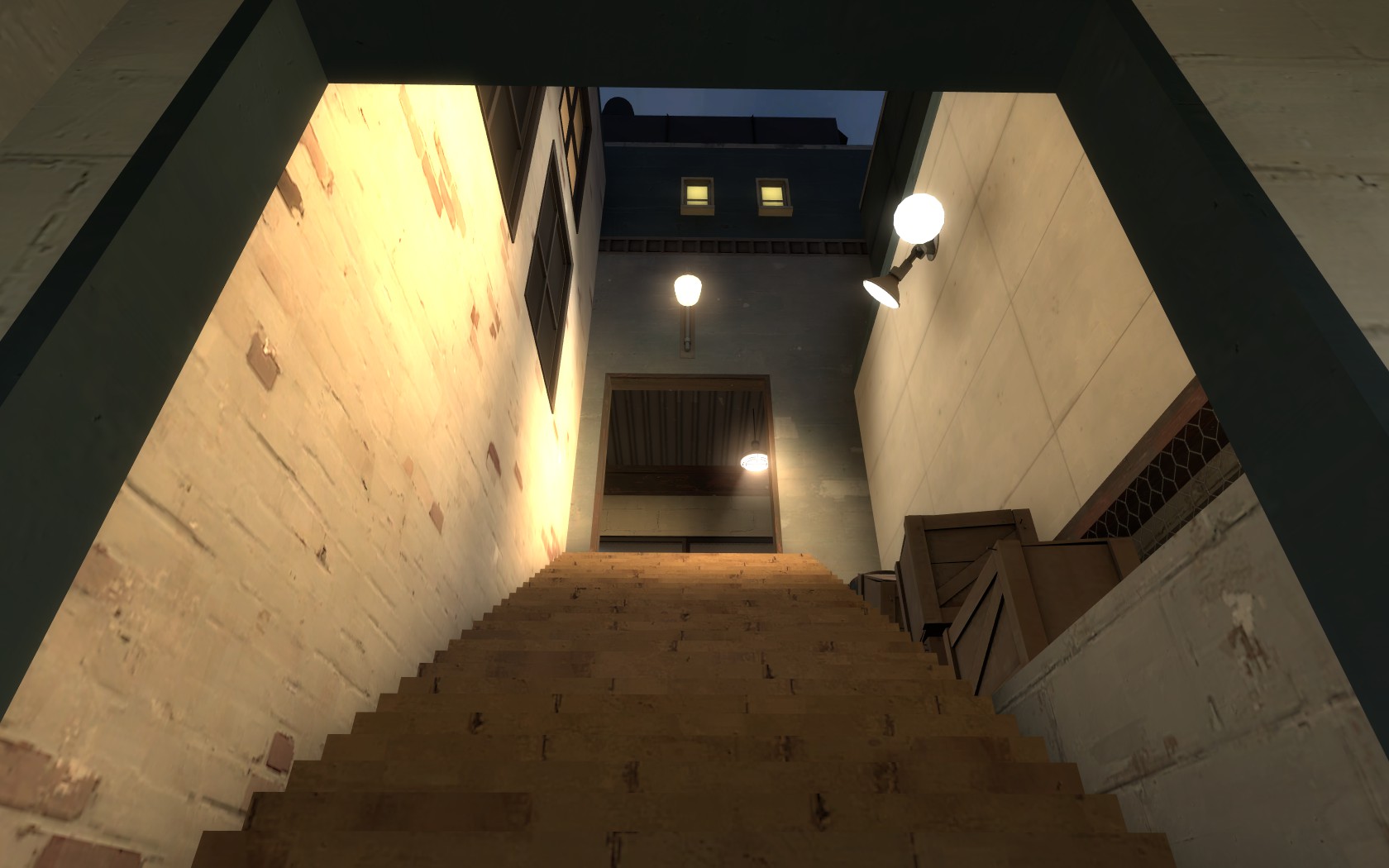
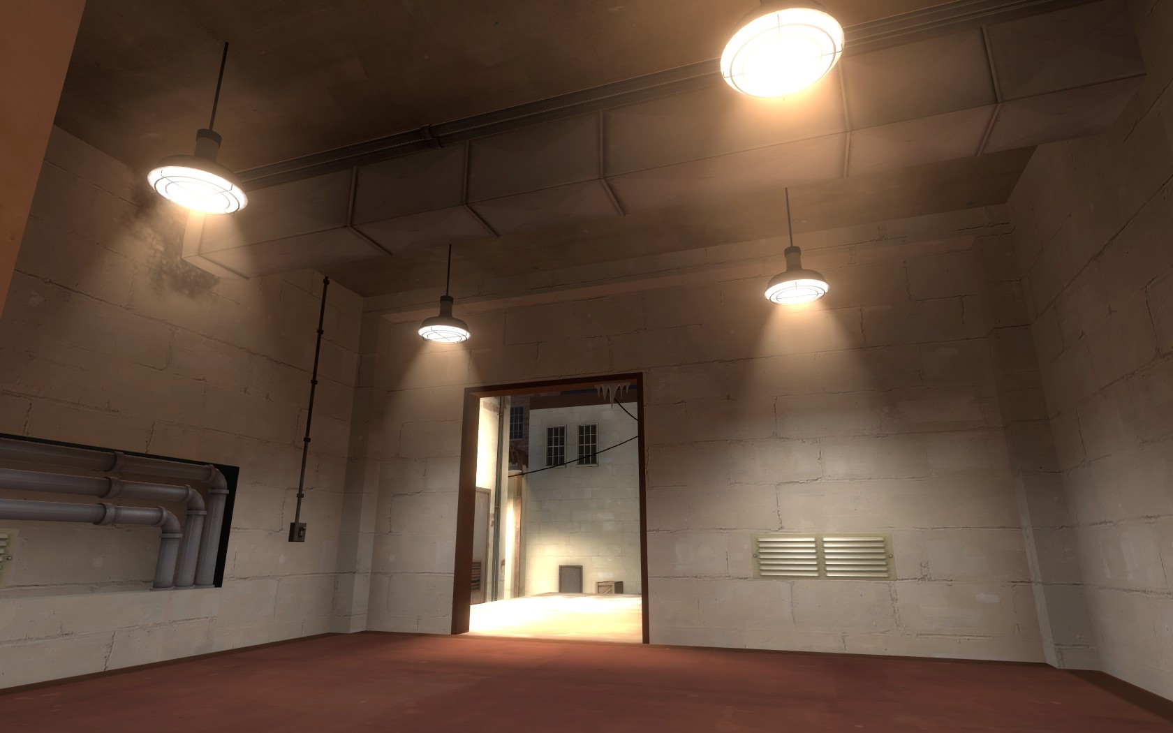
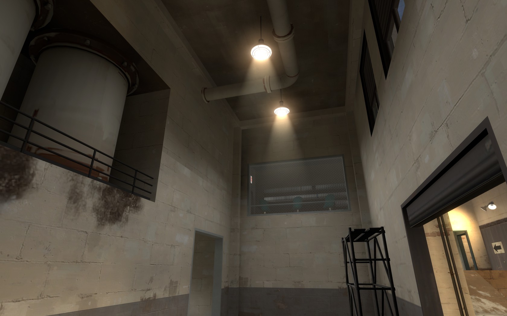
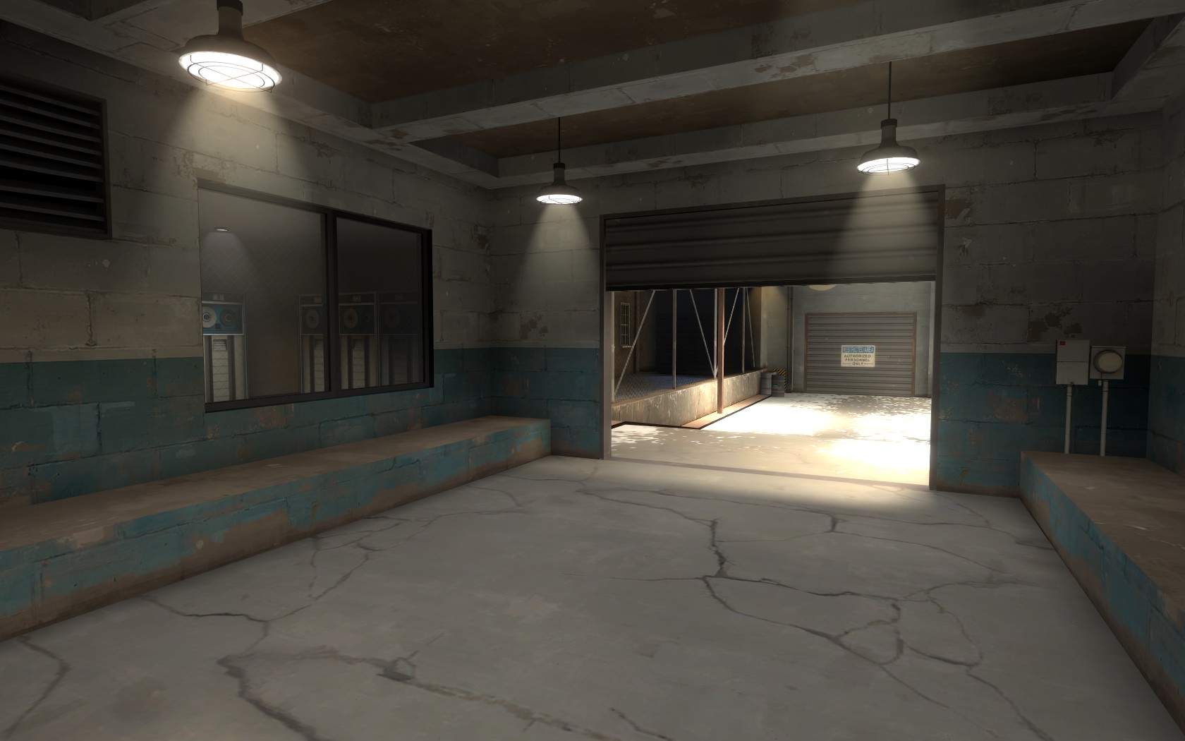
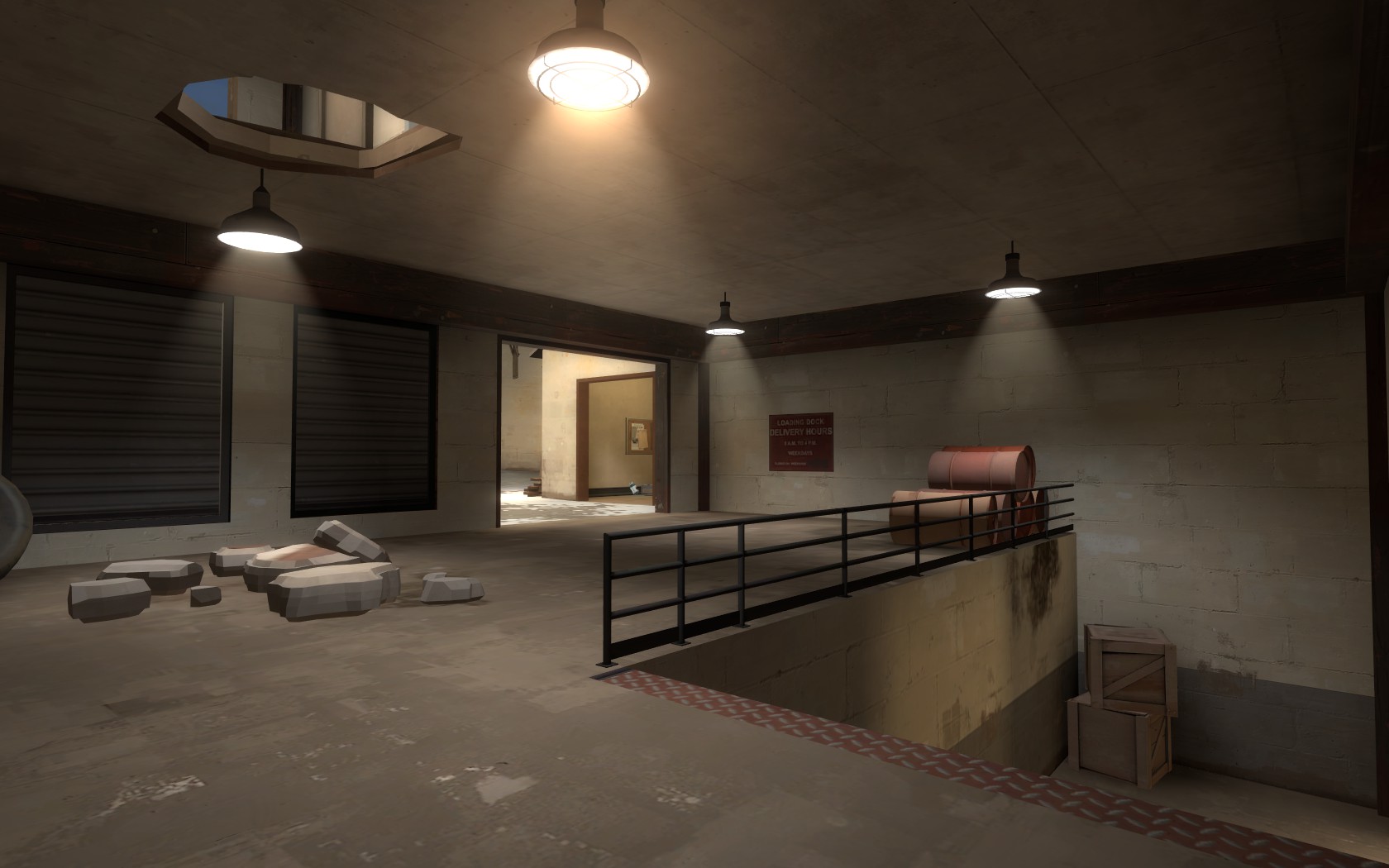
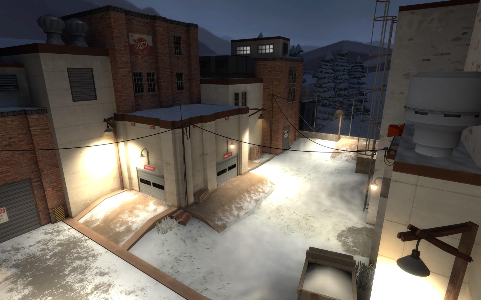
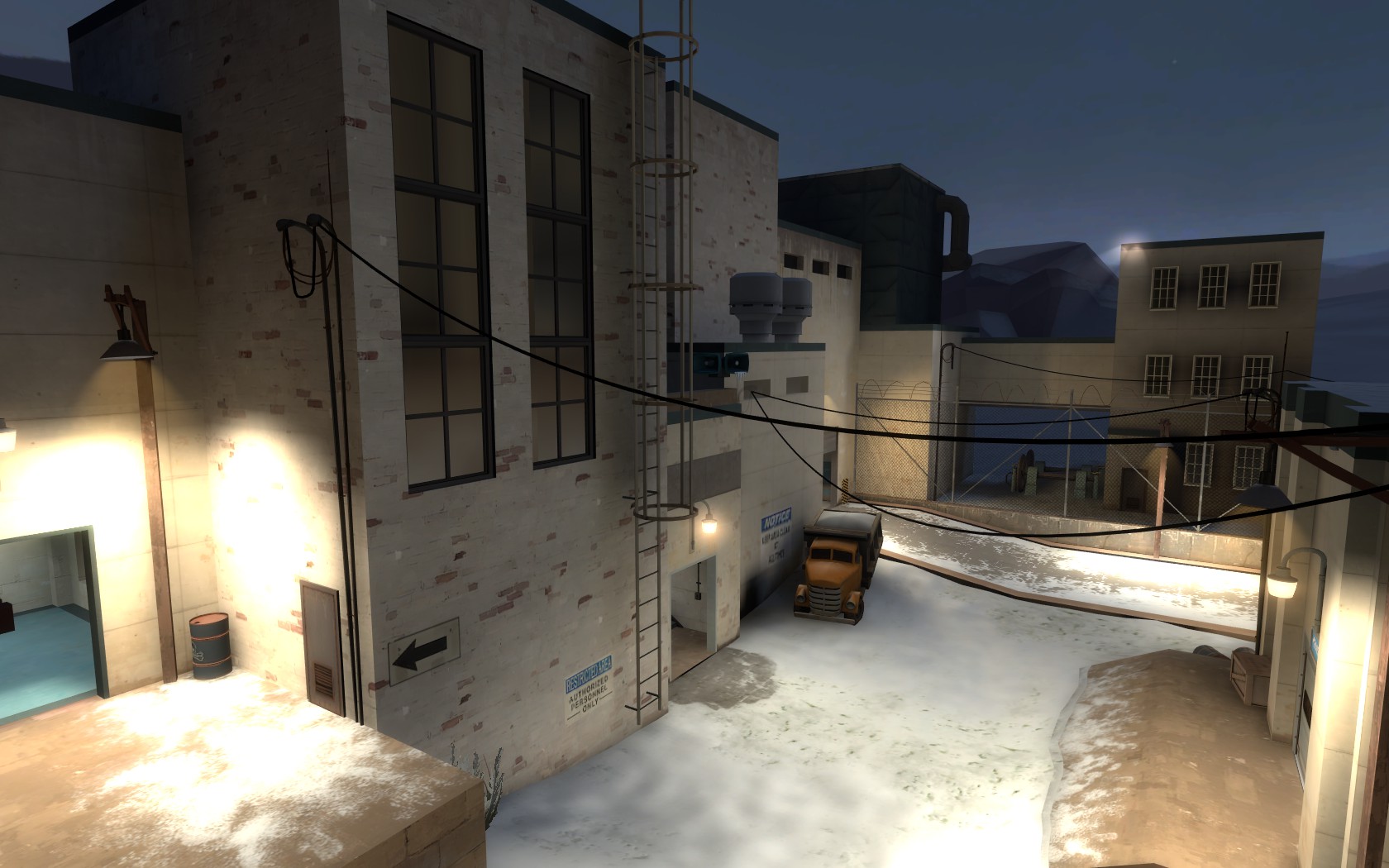
Screenshots:
Thanks to:
*yyler for running highlander tests
*ScorpioUprising for 6v6 feedback
*TF2Maps for testing it and being a great community that gives a lot of help
And dabp for the custom skybox, but also for the great feedback, tips and hints during the whole development of the map!
Brrr
By Hannes "Hanz" Tirez
hannes_tirez@hotmail.com
Changelog:
30/08/2012 - B2a:
- Packed a custom texture that I forgot
30/08/2012 - B2:
- Minor changes to the layout, refined a few gameplay elements here and there
- Detailed and optimized the whole map
- Other minor things
Now back to the good part
Download: (Updated to B2a*, tf2maps link stayed the same)
TF2Maps: http://forums.tf2maps.net/downloads.php?do=file&id=5126
Dropbox: http://dl.dropbox.com/u/754215/72hr - KotH map/RELEASE/koth_arctic_b2a.bsp.bz2
Screenshots:
Thanks to:
*yyler for running highlander tests
*ScorpioUprising for 6v6 feedback
*TF2Maps for testing it and being a great community that gives a lot of help
And dabp for the custom skybox, but also for the great feedback, tips and hints during the whole development of the map!
Last edited:
- Jan 18, 2009
- 844
- 479
30/08/2012 - B2a:
- Packed a custom texture that I forgot
Download:
TF2Maps: http://forums.tf2maps.net/downloads.php?do=file&id=5126
Dropbox: http://dl.dropbox.com/u/754215/72hr - KotH map/RELEASE/koth_arctic_b2a.bsp.bz2
Also updated the previous post with this download link, but the tf2maps download link stayed the same.
Last edited:


- Mar 20, 2012
- 391
- 806
The map screams Viaduct to me, but in essence that's actually quite a good thing - it plays very well.
A few notes from the recent playtest:
This whole lower area with the pillars should have clips that come out to the obtrusion of the side-pillars. With it making an S-formation, the pillars will catch players off-guard in combat and they'll back into it and get stuck. For a competitive crowd, you want to make your map geometry edges as smooth as a baby's bottom.
http://cloud-2.steampowered.com/ugc/938127448241493719/304BECF414E5C224B772A30F55B27BC9D5C9C34C/
The HP/Ammo packs in this area are kind of a pain in the butt to access. Not only are they tucked away, but you can actually get stuck on the displacement hill for the pick-up on the lower right. Also, you have a lot of medium ammo packs. If you run into problems with mini-sentries, I would consider downgrading a lot of them to smalls. You don't really need access to four medium ammo packs on a koth map.
http://cloud.steampowered.com/ugc/938127448241506744/6C232F09E72899EB0D1CBB66E4CB3FBF87F92FA0/
As for optimization, you're getting a lot of the map drawn out from mid which is causing a pretty gnarly FPS drop. In the case of Viaduct, I know Valve made the first row of buildings completely func_detail to avoid wonky visleaf cut ups.
http://cloud.steampowered.com/ugc/938127448241516787/5D71FB14F0DDF9AAFC85D4005516289685421EC4/
Another culprit is probably that driveway entrance from spawn. The entrances in Viaduct make Z and L formations to prevent visleaves from seeing each other. Pretty much the whole map is rendered from this position because of that driveway.
http://cloud.steampowered.com/ugc/938127448241640897/7A01BB3968CCE7BCE80A412B230CFC9DEFB8E930/
http://cloud.steampowered.com/ugc/938127448241644310/8C99F7E9B20BC8C96A61D8F8F55C6FE45DCC23D1/
Check your prop_static fade distances as well. A lot of these props don't seem like they are fading. Maybe I just didn't notice it, but I'd double-check it.
Good work, looking forward to seeing how well this does in the contest")
A few notes from the recent playtest:
This whole lower area with the pillars should have clips that come out to the obtrusion of the side-pillars. With it making an S-formation, the pillars will catch players off-guard in combat and they'll back into it and get stuck. For a competitive crowd, you want to make your map geometry edges as smooth as a baby's bottom.
http://cloud-2.steampowered.com/ugc/938127448241493719/304BECF414E5C224B772A30F55B27BC9D5C9C34C/
The HP/Ammo packs in this area are kind of a pain in the butt to access. Not only are they tucked away, but you can actually get stuck on the displacement hill for the pick-up on the lower right. Also, you have a lot of medium ammo packs. If you run into problems with mini-sentries, I would consider downgrading a lot of them to smalls. You don't really need access to four medium ammo packs on a koth map.
http://cloud.steampowered.com/ugc/938127448241506744/6C232F09E72899EB0D1CBB66E4CB3FBF87F92FA0/
As for optimization, you're getting a lot of the map drawn out from mid which is causing a pretty gnarly FPS drop. In the case of Viaduct, I know Valve made the first row of buildings completely func_detail to avoid wonky visleaf cut ups.
http://cloud.steampowered.com/ugc/938127448241516787/5D71FB14F0DDF9AAFC85D4005516289685421EC4/
Another culprit is probably that driveway entrance from spawn. The entrances in Viaduct make Z and L formations to prevent visleaves from seeing each other. Pretty much the whole map is rendered from this position because of that driveway.
http://cloud.steampowered.com/ugc/938127448241640897/7A01BB3968CCE7BCE80A412B230CFC9DEFB8E930/
http://cloud.steampowered.com/ugc/938127448241644310/8C99F7E9B20BC8C96A61D8F8F55C6FE45DCC23D1/
Check your prop_static fade distances as well. A lot of these props don't seem like they are fading. Maybe I just didn't notice it, but I'd double-check it.
Good work, looking forward to seeing how well this does in the contest
- Jan 18, 2009
- 844
- 479
The map screams Viaduct to me, but in essence that's actually quite a good thing - it plays very well.
A few notes from the recent playtest:
This whole lower area with the pillars should have clips that come out to the obtrusion of the side-pillars. With it making an S-formation, the pillars will catch players off-guard in combat and they'll back into it and get stuck. For a competitive crowd, you want to make your map geometry edges as smooth as a baby's bottom.
http://cloud-2.steampowered.com/ugc/938127448241493719/304BECF414E5C224B772A30F55B27BC9D5C9C34C/
The HP/Ammo packs in this area are kind of a pain in the butt to access. Not only are they tucked away, but you can actually get stuck on the displacement hill for the pick-up on the lower right. Also, you have a lot of medium ammo packs. If you run into problems with mini-sentries, I would consider downgrading a lot of them to smalls. You don't really need access to four medium ammo packs on a koth map.
http://cloud.steampowered.com/ugc/938127448241506744/6C232F09E72899EB0D1CBB66E4CB3FBF87F92FA0/
As for optimization, you're getting a lot of the map drawn out from mid which is causing a pretty gnarly FPS drop. In the case of Viaduct, I know Valve made the first row of buildings completely func_detail to avoid wonky visleaf cut ups.
http://cloud.steampowered.com/ugc/938127448241516787/5D71FB14F0DDF9AAFC85D4005516289685421EC4/
Another culprit is probably that driveway entrance from spawn. The entrances in Viaduct make Z and L formations to prevent visleaves from seeing each other. Pretty much the whole map is rendered from this position because of that driveway.
http://cloud.steampowered.com/ugc/938127448241640897/7A01BB3968CCE7BCE80A412B230CFC9DEFB8E930/
http://cloud.steampowered.com/ugc/938127448241644310/8C99F7E9B20BC8C96A61D8F8F55C6FE45DCC23D1/
Check your prop_static fade distances as well. A lot of these props don't seem like they are fading. Maybe I just didn't notice it, but I'd double-check it.
Good work, looking forward to seeing how well this does in the contest
Thanks for the feedback, I appreciate your effort! As for the things you noticed:
- The tunnel could indeed be more smooth, although I've clipped (or I should have) all the beams.
- I added more ammo because lots of people asked for this, but I'll probably reduce it. Didn't know about that displacement thing, probably forgot to check those at the end.
- Optimization could probably be better, but I should spent more time thinking of that while building a layout, that's what I learned this contest.

Played again in our newmap pugs, 6v6. Had a really good time. Some feedback, divided up into aesthetics and comp play. Unfortunately no demos, the server were on doesn't auto record and I forgot to record one for you.
Aesthetics:
1) The lighting is reasonable but has some problems you'll want to address. First, all your side fences have shadows enabled, which means you end up with some really dark buildings even though a lamp is right on the other side of the fence. Your yellow lights on posts are all very very very bright. Combine this with the white textures they are shining on, and the effect can be a bit overwhelming. I feel like you need to tone those lights down by about 20% to 30%. Also, on the middle point you have a duplicate set of lamp posts, so the light is doubled there (VERY BRIGHT).
2) The white snow spattering is cool looking, but you may have gone a bit over board. I think you should remove some of that overlay from the middle point itself, to make a clearer transition between the lower ground and higher ground.
3) Some odd shadow bugs in both spawns on the angled ceiling beams. Might want to check that. The ceiling also feels really low. I know you might be restricted by the shape of the buildings around it, but I would try to get rid of that lip between the upper area and the lower area. Also, the area where you spawn is also VERY bright. Its almost impossible to see the overlay on the floor.
4) The texture you've got for the sides of the metal bridges at mid (both between the window room, and near the hut) aren't centered. The strip of grey metal should be on the top and bottom, and the screws/indents should be in the middle. You may have to increase the scale of the texture to .35 in order to get it to match up right.
5) Just in general, you seem to have a bunch of redundant lights. I like the brush and prop lamp posts, but I feel like you have a lot of those in positions where another cleaner, less movement blocking light source is already in affect. Condense some of those, IMO, especially the lamp post near the exit below the cargo container.
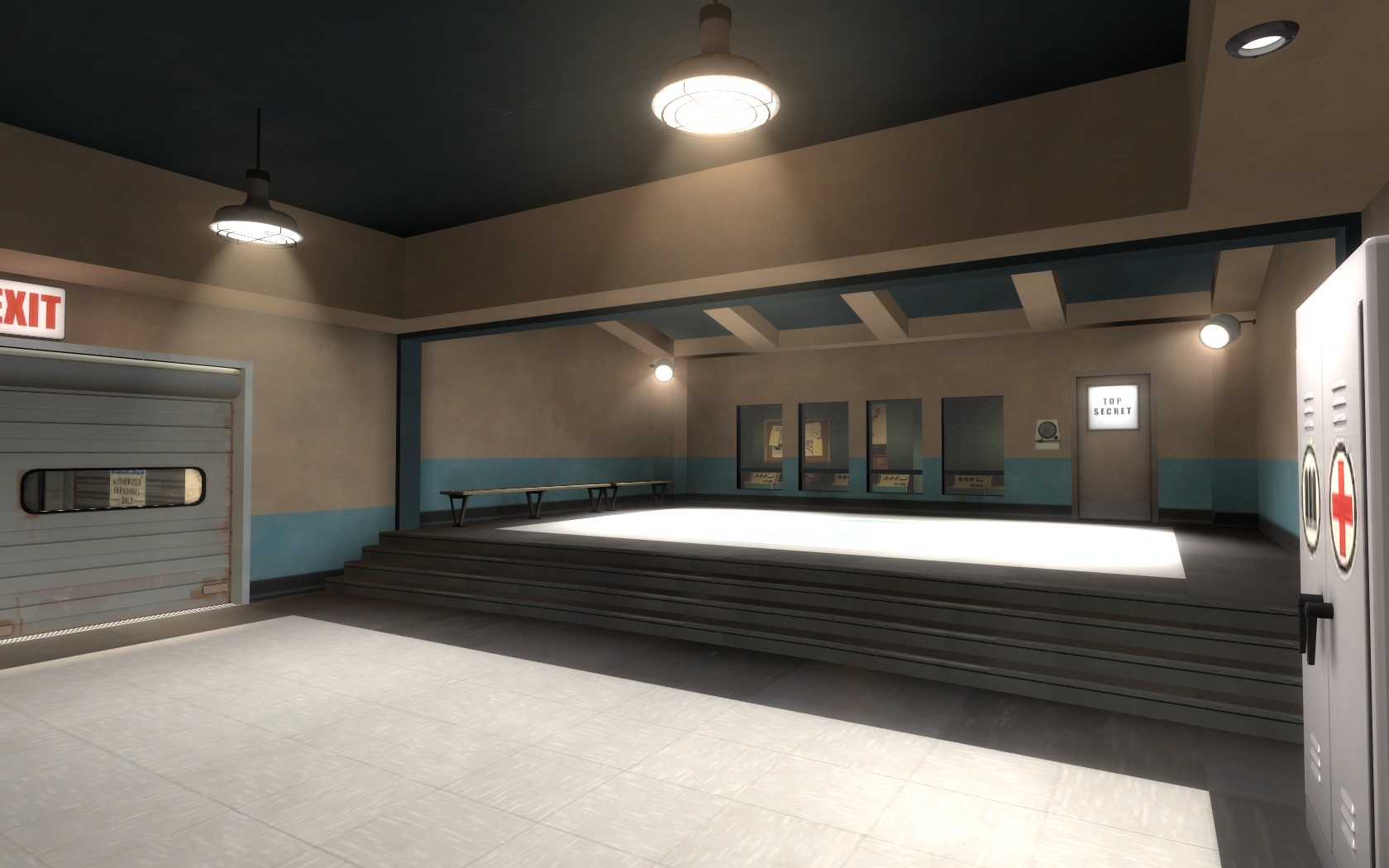
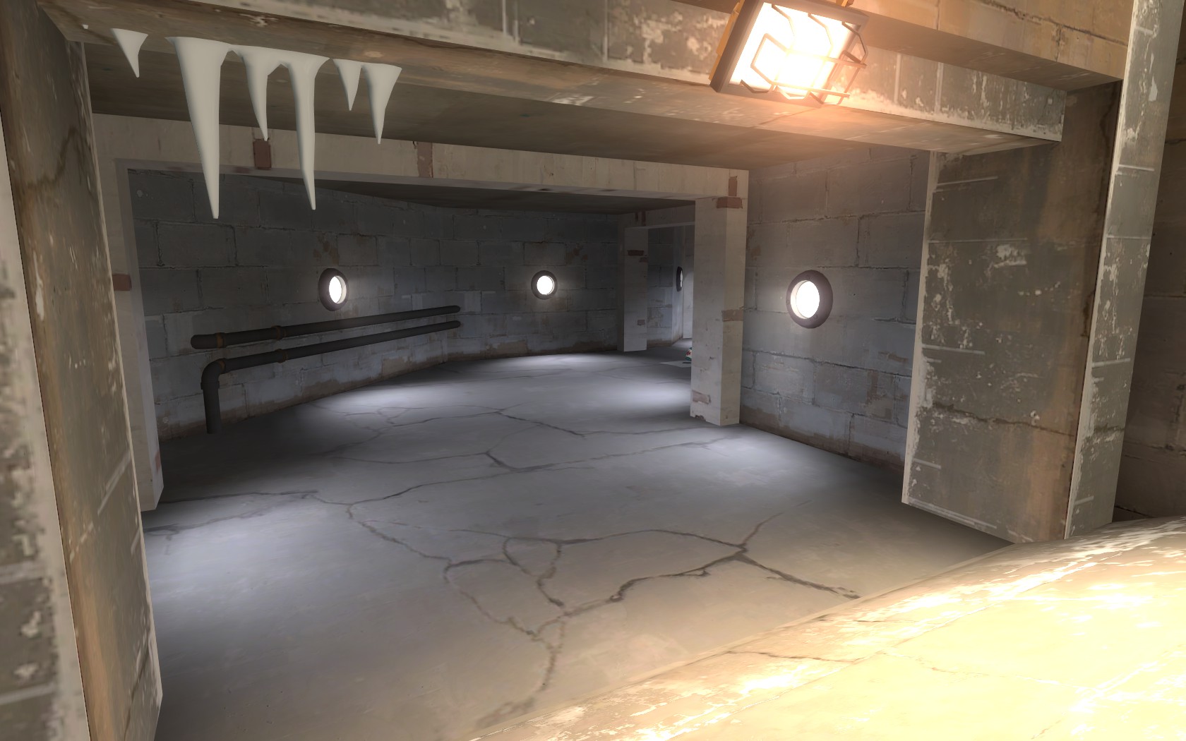
6) 2fort map room in the side hall seems VERY out of place. Would reccomend some sort of more industrial area instead, pipes and concrete beams with boxes. If you wanted to move that map room somewhere else i think it would look a lot cooler behind spawn, instead of what you have there now.
8) Prop spam! Okay, this is a pretty all encompassing concept, and its the sort of thing that comp players will notice, not because of aesthetics but because of frame rates (see donut's post above). You have a LOT of redundant props, or props that are unnecessary. I don't have time to go through and screenshot them, so I hope you'll be able to figure out what I'm talking about (if not, just ask).
- The stack of barrels in the middle building near the point. They are probably rendered throughout the entire koth area because that building is so open, and there are so many stacked in one spot. I think you should get rid of them entirely. If you still need to block a sightline, put a metal/wood wall there instead, taking out part of the handrail.
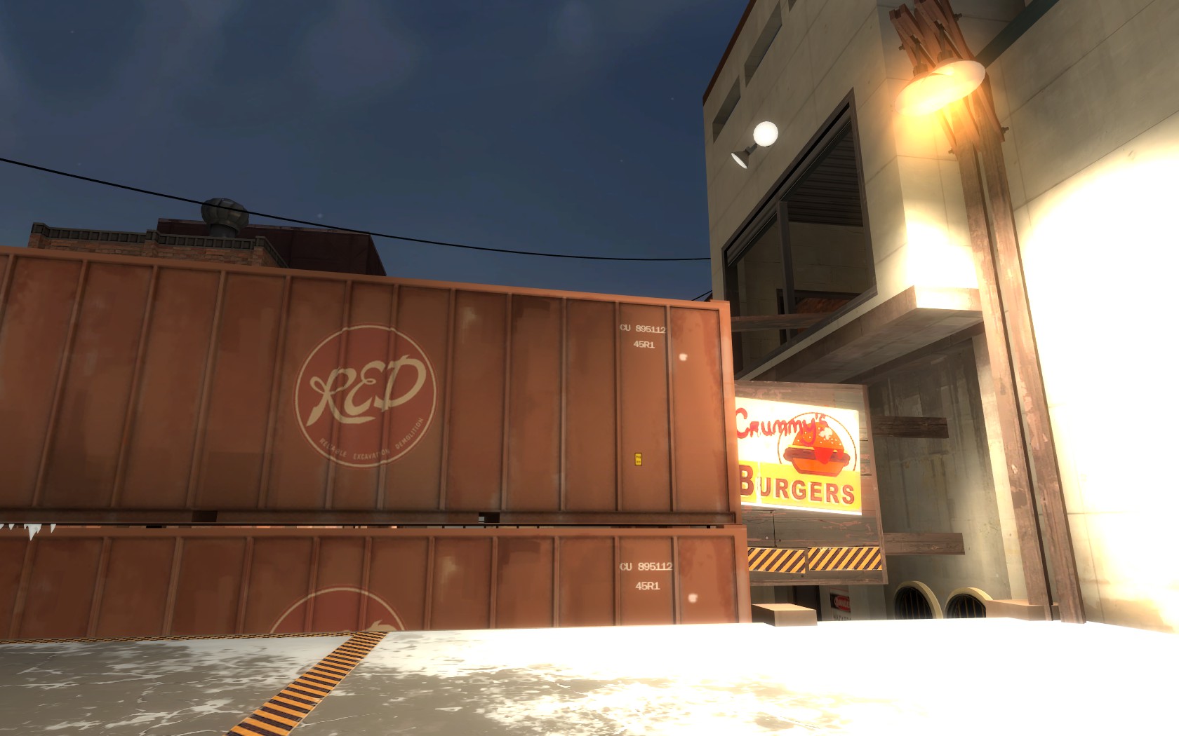
- The drainage (things?) next to the cargo containers and the wooden sniper sign. They don't really belong there and even if they did, I don't think you need two. I'd say just take em out altogether.
- Lighting props on middle. You have three seperate light sources on either side of the point (four if you include the extra leftover lamppost). I don't think you need all three, given how bright that area is just in general. I would keep one, and if I had to choose one, I would keep the triple lamp setup thats at the very top. Its pretty bright and spreads the light over the entire point, and the associated lighting affect is very enticing. Get rid of the lampposts and the wall lamp, really cut down on the clutter.
- You have a lot of stacks of crates and barrels. There cool looking, and you've arranged them nicely, but I think you should really focus on putting them in positions that will allow you to decrease the drawdistance aggressively. If you want to keep them in the positions they are in, get rid of about half the props to save on framerates.
- Lots of windows! You've got the revamped granary windows everywhere. I'd get rid of some of those. Maybe rethink how some of those buildings are set up and replace the windows with some brushwork or overlays instead. A good rule for cutting down on those windows: only one or two buildings of each teams color per area should have that same 3x3 or 2x3 window set up.
-Too many of the circular lamps underneath the point, cut them by half.
Just some things to start looking at. Props are the number one cause of framerate issues, and comp players will complain about that incessantly. They will blame the map for being a snow map, and that that causes the FPS loss, but in actuality it will be your props that cause it. Definitely cut down on those. It might not seem like it, but the map will end up looking quite a bit stronger when you figure out what props to cut.
Comp Play:
1) I think one of the primary issues that we had when we played is that the left side of the map is not very useful for the combo (medic, soldier, demo). If you try to push up left you have two options: walk up underneath the metal bridge, with the enemy team having vision of you the entire time, and the enemy soldiers spamming you from on top of the cargo container (i.e. very difficult) or walk up the stairs on the far left side, and take forever to get to the window/bridge/cargo container. Either way, its not very efficient and leads to a lot of problems. You definitely solved the problem with the sightline down the stairs, but as it stands now that area is still pretty difficult to utilize.
The group I was playing with had the following recommendation that I think could really solve a lot of issues with the left side. First, that little wooden fence needs to go (it really doesn't block any sniper sightlines, especially if the sniper is on the ramp at the point, as they cna just look over it). Second, extend that concrete platform out by about 32-64 units. Then, put a metal ramp that goes up to the window bridge. This accomplishes three things. 1) its blocks the sightline from middle to the exit on the left. 2) it allows easy access to that window area, in a way thats much quicker than the stairway area you have set up right now. 3) It allows combos pushing up left to get a bit of height before they push onto middle, even if they end up going to the ramp anyway. It also blocks any spam from the cargo container, forcing the soldier up there to jump the combo if he wants to do any damage, and gives the combo the ability to spam back and push him off before they commit.
If you take any of my suggestions here to heart, this one would be it. I think adjusting this will really balance out left and right much more than anything else you could do. I don't know what you should do with the bottom section of the stairs that you have now. You might try just blocking them off for now and seeing if they are necessary at all.
2) Health packs seem like a bit of an issue all over, but not really that bad. A couple of things people mentioned. The small pack in the hut seems really powerful for scouts, as you could easily dash in and get it in the middle of a fight and then come right back out fighting. It seemed really hard for a soldier to contend with that. One of the players recommended that you put the small health pack out, like near the two closed up windows in front of the middle building. Another player suggested that you put a small healthpack near the medium ammo in the side tunnel. I'm not sure how I feel about that, but he said it makes that flank a bit more viable for scout, while also making it a bit easier for a soldier to shut out a scout that tries to abuse it. I could see that being okay, but if you decided to do that I think you would need to keep only one or the other (not have both healthpack positions, or scouts get out of control). Another player mentioned that the medium healthpacks feel really far away. If you take damage at mid backing up for them takes a long time. I'm not sure how you could change that on the right side with the little alcove, but on the left you could move the medium healthpack underneath the newly created ramp and I think that could be a fair spot.
3) Did you adjust the cap time? Someone mentioned they thought it felt long. Check it compared to Via. I wouldn't recommend altering cap times.
4) The wooden sign near the cargo container is really interesting. Scouts seem able to use that spot to hop up onto the point and get a quick med pick. Its very chokey so people can get destroyed trying it, but its pretty interesting. The only thing I'd mention as a potential problem is that medics can fall down there and pretty much have no way of getting back up. Not saying you should adjust it (players really seemed to like it) but you should be aware of how that plays out. Scouts also like being able to jump from the side of the cargo container, onto the sign, and then onto the top of the other cargo. Neat!
5) The three chokes onto mid feel very Viaduct. However, unlike Via I feel like the middle entrance is the correct choice almost all the time. Changing the ramp to bridge on left might increase the use of that exit, but the right still seems a bit underused. You might try narrowing the middle entrance a bit (check viaduct to see how narrow that one is) and then people might gravitate to the right a bit more when fighting gets close to the chokes. Not sure its necessary though, just something to keep in mind.
Okay, that's all for now. We'll definitely be playing it in the coming weeks. A very fun and aggressive koth map.
Aesthetics:
1) The lighting is reasonable but has some problems you'll want to address. First, all your side fences have shadows enabled, which means you end up with some really dark buildings even though a lamp is right on the other side of the fence. Your yellow lights on posts are all very very very bright. Combine this with the white textures they are shining on, and the effect can be a bit overwhelming. I feel like you need to tone those lights down by about 20% to 30%. Also, on the middle point you have a duplicate set of lamp posts, so the light is doubled there (VERY BRIGHT).
2) The white snow spattering is cool looking, but you may have gone a bit over board. I think you should remove some of that overlay from the middle point itself, to make a clearer transition between the lower ground and higher ground.
3) Some odd shadow bugs in both spawns on the angled ceiling beams. Might want to check that. The ceiling also feels really low. I know you might be restricted by the shape of the buildings around it, but I would try to get rid of that lip between the upper area and the lower area. Also, the area where you spawn is also VERY bright. Its almost impossible to see the overlay on the floor.
4) The texture you've got for the sides of the metal bridges at mid (both between the window room, and near the hut) aren't centered. The strip of grey metal should be on the top and bottom, and the screws/indents should be in the middle. You may have to increase the scale of the texture to .35 in order to get it to match up right.
5) Just in general, you seem to have a bunch of redundant lights. I like the brush and prop lamp posts, but I feel like you have a lot of those in positions where another cleaner, less movement blocking light source is already in affect. Condense some of those, IMO, especially the lamp post near the exit below the cargo container.
6) 2fort map room in the side hall seems VERY out of place. Would reccomend some sort of more industrial area instead, pipes and concrete beams with boxes. If you wanted to move that map room somewhere else i think it would look a lot cooler behind spawn, instead of what you have there now.
8) Prop spam! Okay, this is a pretty all encompassing concept, and its the sort of thing that comp players will notice, not because of aesthetics but because of frame rates (see donut's post above). You have a LOT of redundant props, or props that are unnecessary. I don't have time to go through and screenshot them, so I hope you'll be able to figure out what I'm talking about (if not, just ask).
- The stack of barrels in the middle building near the point. They are probably rendered throughout the entire koth area because that building is so open, and there are so many stacked in one spot. I think you should get rid of them entirely. If you still need to block a sightline, put a metal/wood wall there instead, taking out part of the handrail.
- The drainage (things?) next to the cargo containers and the wooden sniper sign. They don't really belong there and even if they did, I don't think you need two. I'd say just take em out altogether.
- Lighting props on middle. You have three seperate light sources on either side of the point (four if you include the extra leftover lamppost). I don't think you need all three, given how bright that area is just in general. I would keep one, and if I had to choose one, I would keep the triple lamp setup thats at the very top. Its pretty bright and spreads the light over the entire point, and the associated lighting affect is very enticing. Get rid of the lampposts and the wall lamp, really cut down on the clutter.
- You have a lot of stacks of crates and barrels. There cool looking, and you've arranged them nicely, but I think you should really focus on putting them in positions that will allow you to decrease the drawdistance aggressively. If you want to keep them in the positions they are in, get rid of about half the props to save on framerates.
- Lots of windows! You've got the revamped granary windows everywhere. I'd get rid of some of those. Maybe rethink how some of those buildings are set up and replace the windows with some brushwork or overlays instead. A good rule for cutting down on those windows: only one or two buildings of each teams color per area should have that same 3x3 or 2x3 window set up.
-Too many of the circular lamps underneath the point, cut them by half.
Just some things to start looking at. Props are the number one cause of framerate issues, and comp players will complain about that incessantly. They will blame the map for being a snow map, and that that causes the FPS loss, but in actuality it will be your props that cause it. Definitely cut down on those. It might not seem like it, but the map will end up looking quite a bit stronger when you figure out what props to cut.
Comp Play:
1) I think one of the primary issues that we had when we played is that the left side of the map is not very useful for the combo (medic, soldier, demo). If you try to push up left you have two options: walk up underneath the metal bridge, with the enemy team having vision of you the entire time, and the enemy soldiers spamming you from on top of the cargo container (i.e. very difficult) or walk up the stairs on the far left side, and take forever to get to the window/bridge/cargo container. Either way, its not very efficient and leads to a lot of problems. You definitely solved the problem with the sightline down the stairs, but as it stands now that area is still pretty difficult to utilize.
The group I was playing with had the following recommendation that I think could really solve a lot of issues with the left side. First, that little wooden fence needs to go (it really doesn't block any sniper sightlines, especially if the sniper is on the ramp at the point, as they cna just look over it). Second, extend that concrete platform out by about 32-64 units. Then, put a metal ramp that goes up to the window bridge. This accomplishes three things. 1) its blocks the sightline from middle to the exit on the left. 2) it allows easy access to that window area, in a way thats much quicker than the stairway area you have set up right now. 3) It allows combos pushing up left to get a bit of height before they push onto middle, even if they end up going to the ramp anyway. It also blocks any spam from the cargo container, forcing the soldier up there to jump the combo if he wants to do any damage, and gives the combo the ability to spam back and push him off before they commit.
If you take any of my suggestions here to heart, this one would be it. I think adjusting this will really balance out left and right much more than anything else you could do. I don't know what you should do with the bottom section of the stairs that you have now. You might try just blocking them off for now and seeing if they are necessary at all.
2) Health packs seem like a bit of an issue all over, but not really that bad. A couple of things people mentioned. The small pack in the hut seems really powerful for scouts, as you could easily dash in and get it in the middle of a fight and then come right back out fighting. It seemed really hard for a soldier to contend with that. One of the players recommended that you put the small health pack out, like near the two closed up windows in front of the middle building. Another player suggested that you put a small healthpack near the medium ammo in the side tunnel. I'm not sure how I feel about that, but he said it makes that flank a bit more viable for scout, while also making it a bit easier for a soldier to shut out a scout that tries to abuse it. I could see that being okay, but if you decided to do that I think you would need to keep only one or the other (not have both healthpack positions, or scouts get out of control). Another player mentioned that the medium healthpacks feel really far away. If you take damage at mid backing up for them takes a long time. I'm not sure how you could change that on the right side with the little alcove, but on the left you could move the medium healthpack underneath the newly created ramp and I think that could be a fair spot.
3) Did you adjust the cap time? Someone mentioned they thought it felt long. Check it compared to Via. I wouldn't recommend altering cap times.
4) The wooden sign near the cargo container is really interesting. Scouts seem able to use that spot to hop up onto the point and get a quick med pick. Its very chokey so people can get destroyed trying it, but its pretty interesting. The only thing I'd mention as a potential problem is that medics can fall down there and pretty much have no way of getting back up. Not saying you should adjust it (players really seemed to like it) but you should be aware of how that plays out. Scouts also like being able to jump from the side of the cargo container, onto the sign, and then onto the top of the other cargo. Neat!
5) The three chokes onto mid feel very Viaduct. However, unlike Via I feel like the middle entrance is the correct choice almost all the time. Changing the ramp to bridge on left might increase the use of that exit, but the right still seems a bit underused. You might try narrowing the middle entrance a bit (check viaduct to see how narrow that one is) and then people might gravitate to the right a bit more when fighting gets close to the chokes. Not sure its necessary though, just something to keep in mind.
Okay, that's all for now. We'll definitely be playing it in the coming weeks. A very fun and aggressive koth map.
- Jan 18, 2009
- 844
- 479
-Awesome feedback snip-
Thanks for posting this! I really appreciate how you took the time to play and analyse the map.
I will definetely look into all the things you suggested. Not sure if I can already update the map now, it wouldn't really be fair to other people in the contest (as people would play a newer version and that's not the one I submitted). I don't know how long the judgement period will take, I'll probably continue after that. You can expect to see these new ideas you suggested in the next update though. Thanks for posting this! I really appreciate how you took the time to play and analyse the map.
Oh of course. I'm mostly just looking at the map in the context of what plays well, not necessarily what could be done for the contest.
Amidio
L2: Junior Member
- Apr 14, 2012
- 71
- 17
I just played this today on Star's server and noticed a problem with rollouts:
Pretty much every time the round started, people would try and rocket jump to the door, and end up hitting that wall and being unable to go any further. Not a huge deal, but was pretty annoying.
People seemed to enjoy it, but had some trouble finding health packs.
Pretty much every time the round started, people would try and rocket jump to the door, and end up hitting that wall and being unable to go any further. Not a huge deal, but was pretty annoying.
People seemed to enjoy it, but had some trouble finding health packs.
Last edited:
- Jan 18, 2009
- 844
- 479
I just played this today on Star's server and noticed a problem with rollouts:
Pretty much every time the round started, people would try and rocket jump to the door, and end up hitting that wall and being unable to go any further. Not a huge deal, but was pretty annoying.
People seemed to enjoy it, but had some trouble finding health packs.
Thanks for pointing that out, I never really thought about that! I'll fix it in the next version (which will release some time after the contest results are in).
About the healthpacks, I'll try to make them less hidden.


ARCTIC
Aesthetics
Final Aesthetics Score: 81
It’s really more Arctic “Circle” i guess, but whatever. A lovely nighttime snowy industrial map. The first issues hit you soon though, and there are really only two main places where this map lost marks.
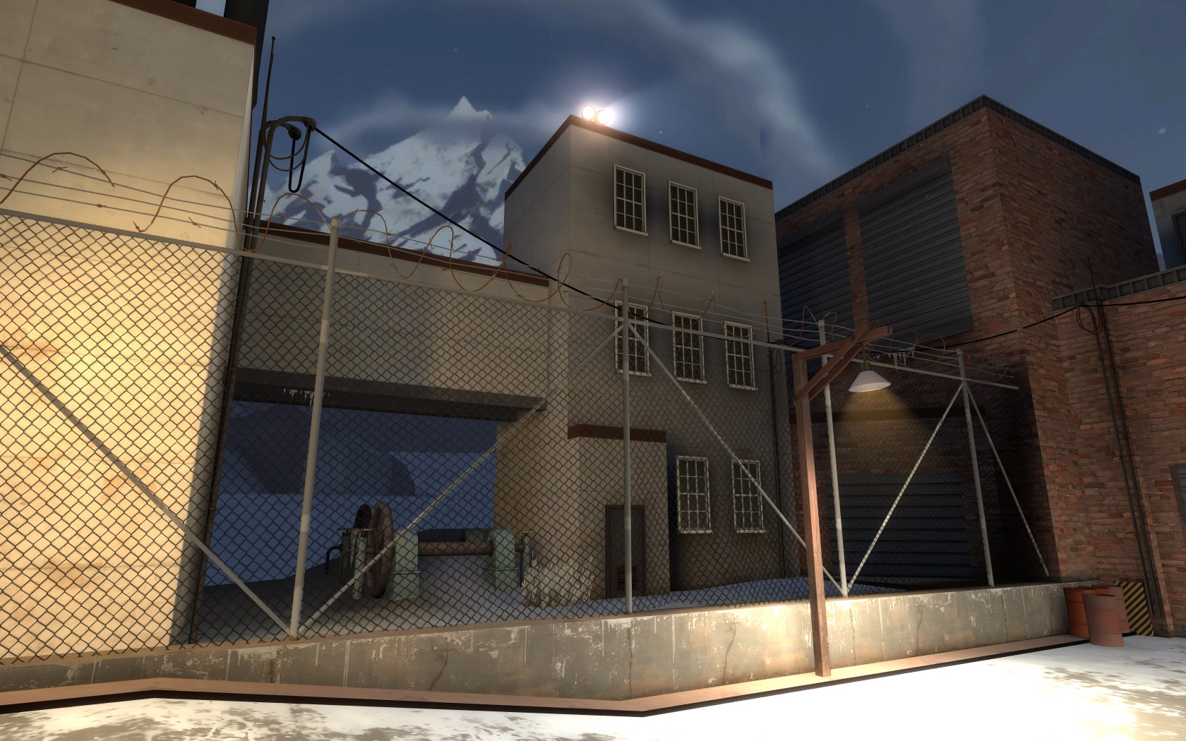
Firstly, the lights. They’re super-bright, and they’re everywhere. It’s really hard to use them to pick out routes, as you can in some maps, because there’s a super-bright HEY LOOK AT ME glow every 256 units or so. And they’re all too bright, washing the map out in sheer white. Boosting the environment light would be good, so they aren’t so necessary.
Secondly, the density of detailing is all over the place. Props are spread out pretty evenly, with high areas and side rooms or clusters of props getting way more attention than major attacking routes or the point itself. The eye is drawn away from all the important places.
Also: Inexplicably/Impossibly placed containers alert: Bing! If i plug my “Trucks where they shouldn’t be” alarm in, that Pings too.
Small visual bugs are pretty rare, which is cool.
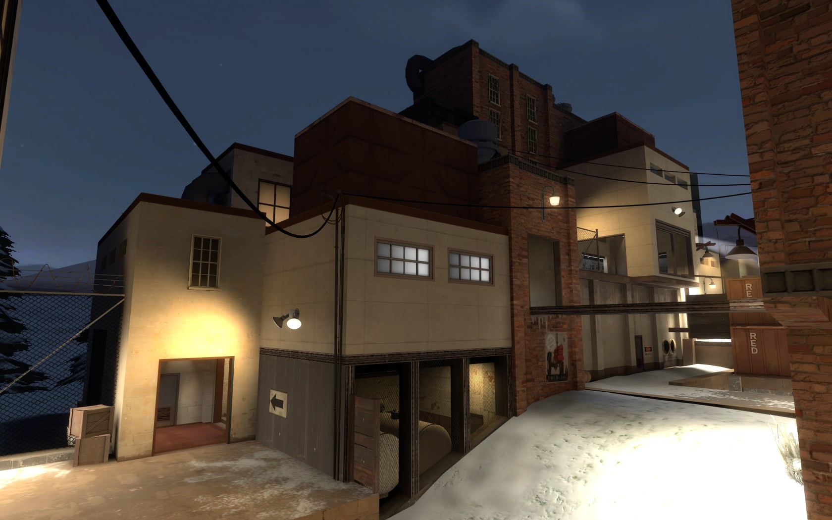
Generally really nice, although it’s sometimes hard to tell what buildings are, other than generic industrial, but they feel realistic and grounded in reality, and you can just about imagine it as a real place, where real people might work. This isn't helped by spytech dotted around, without much neutral ground or facades, and every building in the map seems to have a secret spy base hidden beneath it, which is a shame, as it feels unrealistic and leads to no real sense of progression.
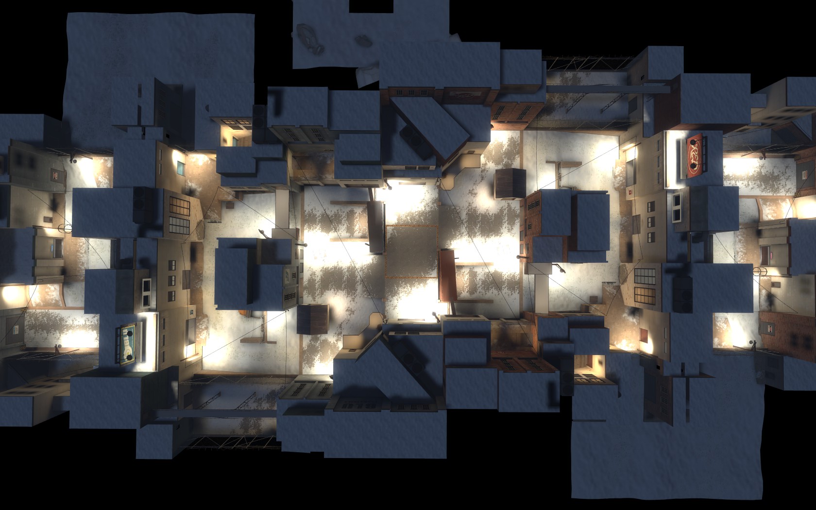
Album: http://leswordfish.minus.com/mba2UaH95w
Technical
Final Technical Score: 83
Aesthetics
Final Aesthetics Score: 81
It’s really more Arctic “Circle” i guess, but whatever. A lovely nighttime snowy industrial map. The first issues hit you soon though, and there are really only two main places where this map lost marks.
Firstly, the lights. They’re super-bright, and they’re everywhere. It’s really hard to use them to pick out routes, as you can in some maps, because there’s a super-bright HEY LOOK AT ME glow every 256 units or so. And they’re all too bright, washing the map out in sheer white. Boosting the environment light would be good, so they aren’t so necessary.
Secondly, the density of detailing is all over the place. Props are spread out pretty evenly, with high areas and side rooms or clusters of props getting way more attention than major attacking routes or the point itself. The eye is drawn away from all the important places.
Also: Inexplicably/Impossibly placed containers alert: Bing! If i plug my “Trucks where they shouldn’t be” alarm in, that Pings too.
Small visual bugs are pretty rare, which is cool.
Generally really nice, although it’s sometimes hard to tell what buildings are, other than generic industrial, but they feel realistic and grounded in reality, and you can just about imagine it as a real place, where real people might work. This isn't helped by spytech dotted around, without much neutral ground or facades, and every building in the map seems to have a secret spy base hidden beneath it, which is a shame, as it feels unrealistic and leads to no real sense of progression.
Album: http://leswordfish.minus.com/mba2UaH95w
Technical
Final Technical Score: 83
- No props with collision models in console.
- FPS generally good, better than viaducts. Optimisation also good, the map seems to have been designed with it in mind. A few more faces could be nodrawed.
- Clipping is distinctly not great. Loads of lights and other little props can be stood on, all over the place. Horizontally you get caught on all sorts of things.
- Entities seem fine and dandy.
TheKieranator
L6: Sharp Member
- Mar 6, 2011
- 282
- 213
ARCTIC
Aesthetics
Final Aesthetics Score: 80
Technical
Final Technical Score: 84
imgur album with additional notes
Aesthetics
Final Aesthetics Score: 80
- Industrial buildings, night and snow aren't often seen together in TF2 mapping; and it has to be said that you pulled it off well.
- My main issue lies with the lighting; the glare on the walls and snow is insanely bright and a tad painful to look at. Tone it down to a more reasonable level and up the light_environment if needed.
- The Spytech rooms interspersed throughout the map hurt the flow and theme progression and sometimes don't even fit the location. If you can substitute the non-spawn room Spytech bases for more appropriate scenes, then that will help the flow of the map.
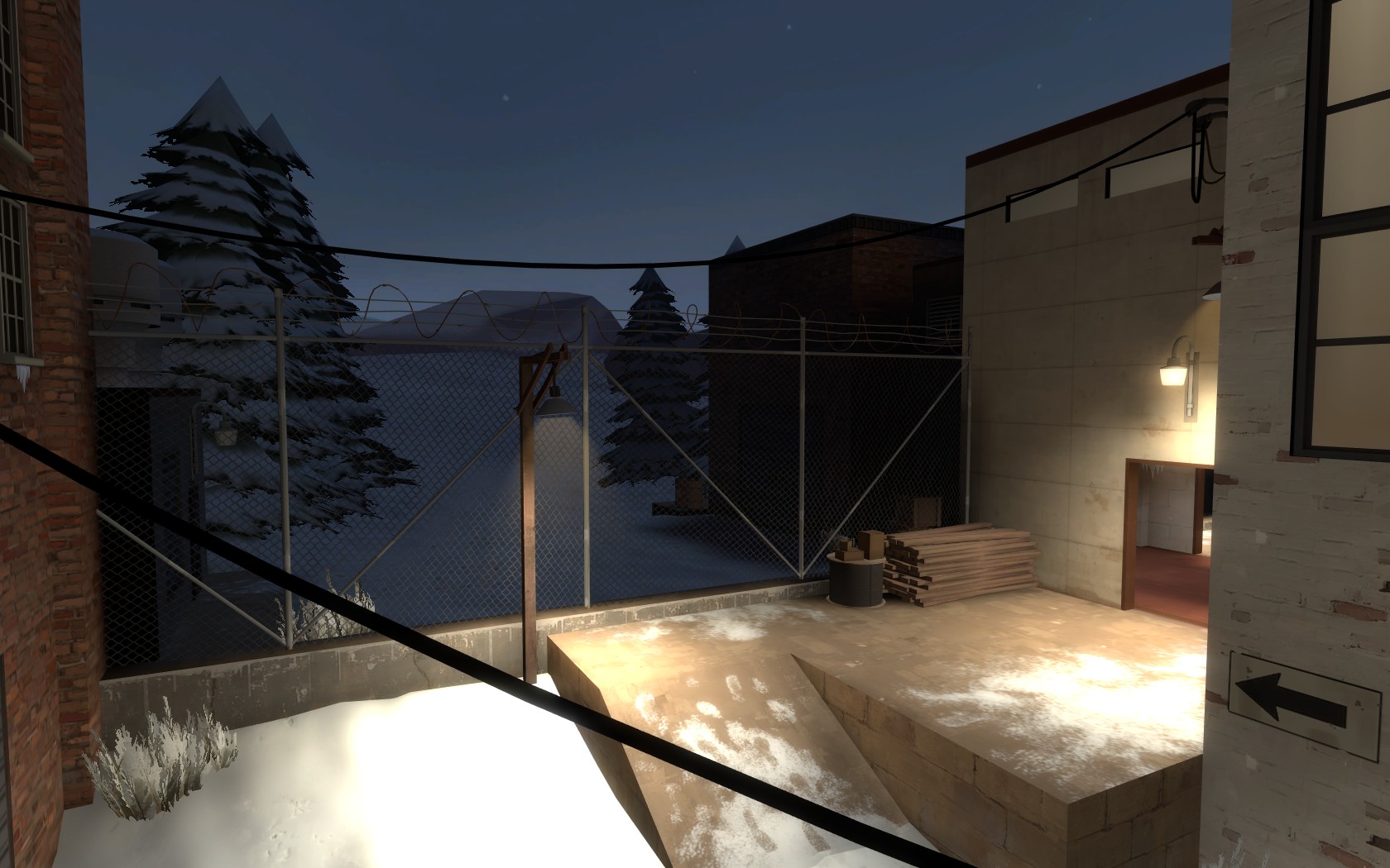
- Your skybox is rather empty and doesn't really extend the map in a meaningful way; it's just a cold and barren expanse. There are quite a few places you can see the skybox from, so it would really benefit from some populating.
Technical
Final Technical Score: 84
- You did a good job with the optimization; my framerate here was consistently better than on other koth maps such as koth_viaduct or koth_lakeside.
- I found your clipping to be adequate in most cases, but the clipping on the scaffolds in the middle route from spawn needs attention.
- No entity bugs that I could find
imgur album with additional notes
- Jul 22, 2009
- 1,874
- 1,258
congrats!
good thing you changed your mind there
Okay after todays test we can skip the 'definately finishing it'.
good thing you changed your mind there