BeerBowl

PL BeerBowl b8

FLOOR_MASTER

L3: Member
Mar 10, 2008
118
140
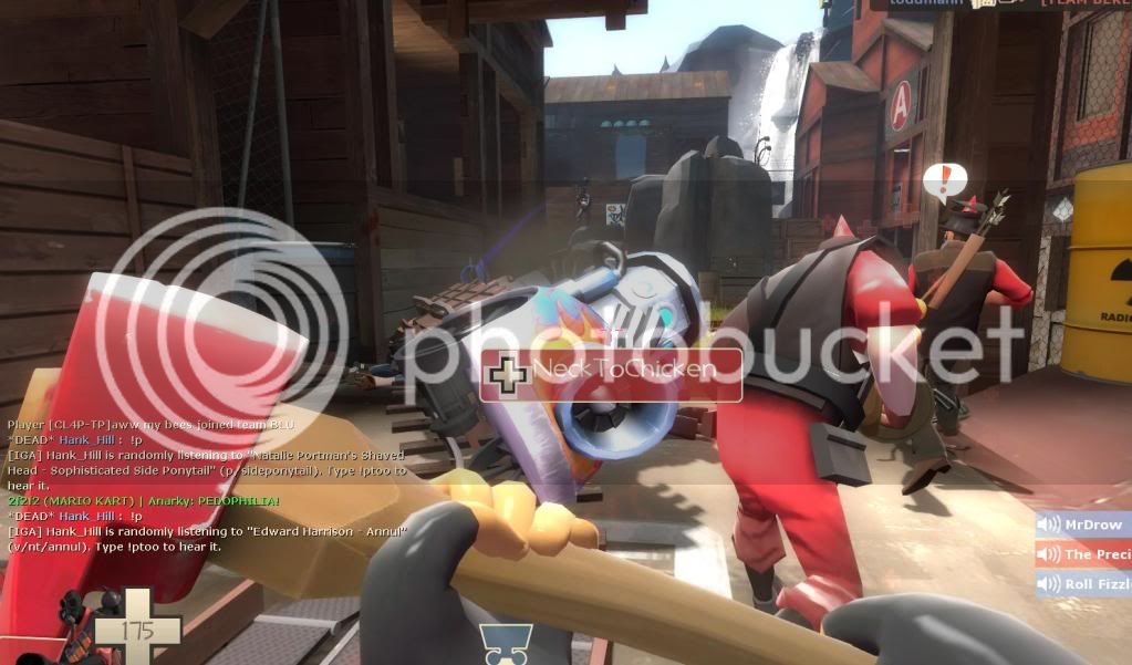
We've played at least a dozen rounds of b3b with 16v16. The most glaring issue right now is the ability for engineers to climb up to the area shown here. I'm not sure exactly what path they take, but I can find out if you're unable to determine that yourself:

beerbowl1.jpg
 

NightHawK

L3: Member
Mar 1, 2008
107
74
We've played at least a dozen rounds of b3b with 16v16. The most glaring issue right now is the ability for engineers to climb up to the area shown here. I'm not sure exactly what path they take, but I can find out if you're unable to determine that yourself:

beerbowl1.jpg

Okay Thanks. I'll fix that in beta 4.

Beta 4 should come out at the end of next month or earlier with Balancing Tweaks, Bug Fixes and more.
 
Last edited:

Icarus

aa
Sep 10, 2008
2,245
1,210
I'll give you a link to our discussion topic since people are still discussing it (3 pages) :eek:

[ame="http://www.clanwoof.com/forum/showthread.php?t=1725"](^) Clan Woof Forums[/ame]

You may need to register to see the topic.
 

Phobos

L3: Member
Feb 22, 2009
130
50
The map is the newest addition to my favorite server. The general feedback is positive and it is considered to be a fun map to play on. One of the most liked features is the option to get behind your enemy with ease. Oh, and randomness of the hotrod payload cart and the giant beer bottle of course. ;)

There is also some critique:
- Many people think the map is cluttered, over-detailed etc... basically the same that has been said in this thread. Bottomline: Less is more.

- The signs are confusing. The map has Hydro signs, A-B-C signs in both team colors and the lorry sign all over it. People didn't find them helpful, but rather distracting. Reducing the amount of signs and keeping them in one color should help to avoid confusion.

- The first Blu spawn is considered to be too big.

And three personal comments:
1. Can you do something about the wheels at the payload? I think Icarus said that they can't be animated, but them standing still when the cart moves looks weird.

2. Why is in the final area a BLU billboard? And why is a truck behind the billboard...on a roof?

3. Nasty little easter egg on the bottle. :p
 

NightHawK

L3: Member
Mar 1, 2008
107
74
The map is the newest addition to my favorite server. The general feedback is positive and it is considered to be a fun map to play on. One of the most liked features is the option to get behind your enemy with ease. Oh, and randomness of the hotrod payload cart and the giant beer bottle of course. ;)

There is also some critique:
- Many people think the map is cluttered, over-detailed etc... basically the same that has been said in this thread. Bottomline: Less is more.

- The signs are confusing. The map has Hydro signs, A-B-C signs in both team colors and the lorry sign all over it. People didn't find them helpful, but rather distracting. Reducing the amount of signs and keeping them in one color should help to avoid confusion.

- The first Blu spawn is considered to be too big.

And three personal comments:
1. Can you do something about the wheels at the payload? I think Icarus said that they can't be animated, but them standing still when the cart moves looks weird.

2. Why is in the final area a BLU billboard? And why is a truck behind the billboard...on a roof?

3. Nasty little easter egg on the bottle. :p
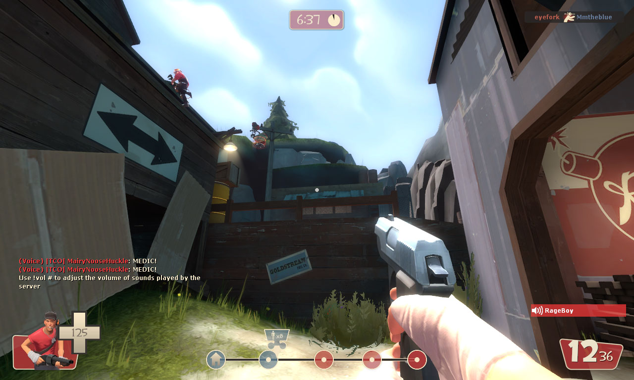
Thanks for the feedback, kinda working on removing unnecessary props.

For your Questions:

1. It's possible. Using a prop_dynamic as the cart model. Were still working on it.

2. I don't know...

3. Hahaha.

Well, if someone wants to help me out and show me where most of the clutter is that would help me out a lot.

I'm not too sure when i will be able to release beta 4 since, i been working a lot.
 
Last edited:

Uriak

L8: Fancy Shmancy Member
Apr 27, 2008
543
70
Ho, I didn't look at the thread so far, but this map has been on our cycle for weeks now.

Well, I'll go with a bit the same critiques :

--> map very cluttered. There is amost no sense of space, spies are coming from everywhere and best option is to clamp to the cart. There are a few zones where demomen/sentry defence is just too strong.
-> the final straight line is really... final. Sure there are 2 sideways, but there are up to 3-4 four very good sentry spots. The one around the main gate can cover both the traks and the upper sideway. One über is almost always useless, 2 or more are required.
->detailling is a bit too much. The maps runs fine (at least for me) but there is a sens of visual distraction. Too many props without any color coherence. Try to simplify a bit and above all give a more coherent theme to parts of the maps. Maybe your lighting is too neutral.

Finally, most important issue, the first blue forward spawn ! It must absolutely not be enabled by a control point in front of it. So, either set this control point farther, either enable this spawn later.
Well aside from this, this is quite massive work, for an amusing theme. ;)
 
Last edited:
Apr 19, 2009
4,460
1,722
Your map was been in the 2fort2furious server and many people have given feedback. These are some of the most repeated things people have said:

1. the framerates are really gnarly. Frontier at its worse was better than Beerbowl.
2. it's very chokepoint heavy and I can't help but feel like offense has a low win rate
3. it is thematically kinda thrown together. Parts don't feel distinct from one another
4. the map is super prop heavy

As harsh as this is I just thought you would like to know what non-mapping players are saying about the map.
 

flubber

L4: Comfortable Member
Nov 16, 2007
171
35
2. it's very chokepoint heavy and I can't help but feel like offense has a low win rate

Once people know the map i think it's getting balance (on our server we are actually at : Red 146victory and 132 for Blue. The reals problems in the map for me are :
- Red spawn too far (especially to defend part 1)
- Too many pathways, it makes it look a little chaotic
 

Sgt.Sausage

L420: High Member
Dec 5, 2008
420
103
I am sure you have gotten this alot, but optimization is horrible you might want to remove some of the props. Their is just so much crap if you no what i mean its hard to look at and focus on gameplay. Everything looks the same and you bump into stuff alot.

But other than that its a fun map, love the layout and theme. Good luck
 
Aug 10, 2009
1,240
399
1) Lol Nice Caps Goin On There TeamNightHawk

2) Lol Sgt Sausage "but other than that..."

3) Looks good, make sure it plays good, and it is a bit detail-rediculous

4) Lots of blue lighting. Like, literal blue in those screenies.
 

NightHawK

L3: Member
Mar 1, 2008
107
74
I am sure you have gotten this alot, but optimization is horrible you might want to remove some of the props. Their is just so much crap if you no what i mean its hard to look at and focus on gameplay. Everything looks the same and you bump into stuff alot.

But other than that its a fun map, love the layout and theme. Good luck


I'm removing at least 35% of the props on the whole map. The pictures above are just a start. If you don't see the difference look closely. :O

Also, absurdistof

Thanks, I like how your list starts with all the letter L's. :)
_____________________________________________

Just a small tad, secret.... I haven't really used a lot of hint brushes... I used a good amount of areaportals but, my map lacks optimization by Hint Brushes. So if anyone can help, and show me where to place these hint brushes it would help a lot. I'll look at the optimization tutorial and read more about the hint brushes. Once, i get done with a lot of homework.
 
Last edited:

Sgt.Sausage

L420: High Member
Dec 5, 2008
420
103
I'm removing at least 35% of the props on the whole map. The pictures above are just a start. If you don't see the difference look closely. :O

Also, absurdistof

Thanks, I like how your list starts with all the letter L's. :)
_____________________________________________

Just a small tad, secret.... I haven't really used a lot of hint brushes... I used a good amount of areaportals but, my map lacks optimization by Hint Brushes. So if anyone can help, and show me where to place these hint brushes it would help a lot. I'll look at the optimization tutorial and read more about the hint brushes. Once, i get done with a lot of homework.

That sounds good, i will make sure to pay close attention.

I didnt notice the l's till you said so. :p
 

Blue552

L3: Member
Sep 16, 2009
137
18
just from the picks looks like theres a lot of props, could hinder peforemance - looks really cool though.