You are using an out of date browser. It may not display this or other websites correctly.
You should upgrade or use an alternative browser.
You should upgrade or use an alternative browser.
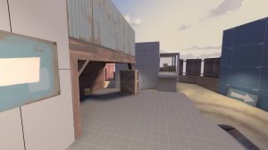
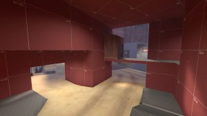
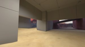
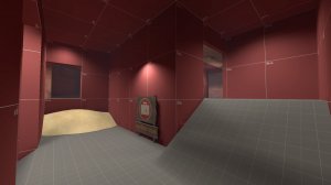
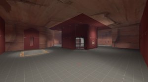
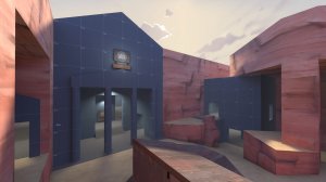
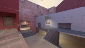
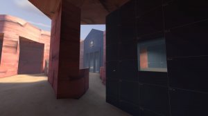
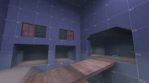
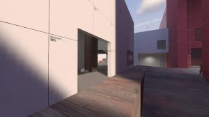
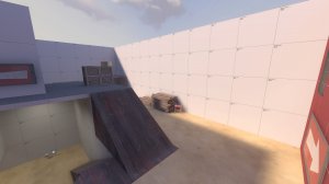
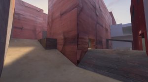
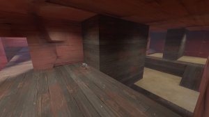
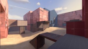
Version Alpha 7 of ctf_chin. My experimentations impacted the map quite positively. Previously uncomfortable playspaces now feel a lot safer and managable. Minor visual tweaks have altered how engagements play out and how players navigate the map. However, there are a few areas I would like to adjust before I commit to detailing and entering the Beta stage.
My aim with ctf_chin has always been to incentivize offense's push into flagroom by making defense less static and more nuanced. I want it to be feasible that a semi-coordinated attacking team could systematically push through a defensive hold in the enemies' base. The changes in a6 to the flagroom have deincentivized defenders from holding far into their base, which is a positive and intended direction. However, these changes have highlighted the strength of defensive huddles outside the flagrooms' exits. A sentry gun or congregation of defensive classes often suprised attackers as they exited the enemies' flagroom. Attackers displayed a lack of agency in this situation, with little they could have done to prevent a failed push other than extending past the enemies' spawn to check the path ahead first. This defeats the purpose of my experimental layout and makes the map more similar to other CTF maps. I have made some changes to address these scenarios.
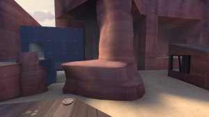
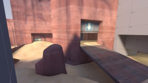
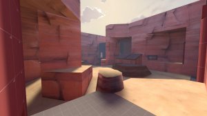
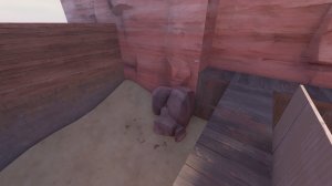
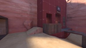
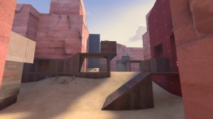
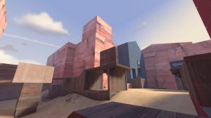
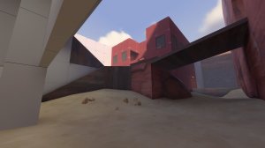
*The extrusions on the rock pillars at mid and the hoodoo outside the spawns were a positive change, allowing more movement and height advantage to grounded classes. They were however quite easy to overlook due to how they were shaded. I have made the flat walkable surface of the rock wall it's own surface and modified the displacements accordingly to make them more visible in game. I have also adjusted the overhang of the rock pillars' bases so slow classes can more reliably jump accross to the enemies' balcony and take the high ground route into the lobby. This should help offense clear out the defender's fortifications in the lobby area in the caves.
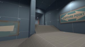
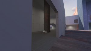
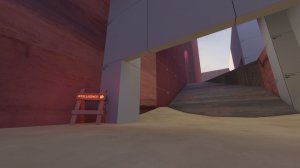
*The arches in the lower valley exit have been heightened so spam is less effective at shutting down pushes through this area. This also allows longer sightlines into the yards outside spawn for attackers, which should give more long range options to take down defensive holds further into the base. The barrier on top of the arch on the stairs has been moved forward. It is a sightline blocker from spawn to the enemies side of the map so it must remain but I feel the health pack and the open space down here should still make offense quite possible despite the choke it creates.
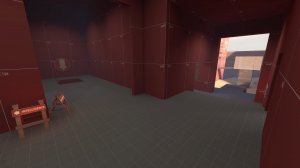
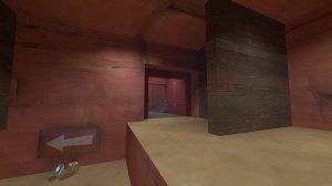
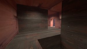
*It was quite difficult to get a long range angle on defense from the bridge exit in the cave lobby should offense get in here. I have increased the walkable space and removed some cave walls in here to make it easier to edge a sightline into the defensive holds beyond.
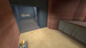
*Sentries in the lobby area near the porch access arch were too powerful. A cheeky sentry placed in the corners near the doorway was difficult to get sight on but completely denied entry via this very important offensive route. I have made the doorway flush with the rock wall and blocked off the inner corner to remove this sentry spot. Sentries on the dropdown balcony should be more exposed from outside now too, enabling long range classes to take them down from a safer distance.
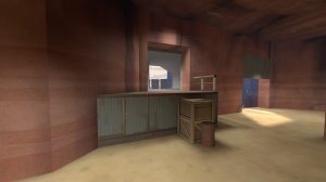
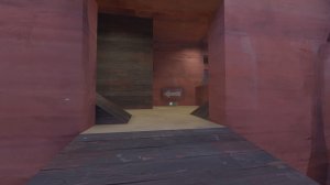
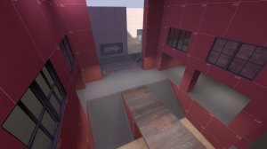
*Although I intended the highground outside spawn to be the most effective defensive area, defenders did not have an incentive to hold there until I nerfed the flagroom's defensive capabilities. Defense on the platform was very strong and had but one access point for non jumper classes - the bridge route from lobby. This made it very difficult to get eyes on players defending up there and made it nigh impossible to coordinate a push to clear it out. In response, I have made a risky change by adding a new route - a prop jump up to the highground via the dropdown. This will give attackers a quick but chokey entrance to the defensive stronghold ahead and allow them to quickly check for threats. If undefended it will allow offense to more easily take down sentry nests outside the flagroom but it's enclosed nature will force attackers to take a lot of damage if they are contested by defenders coming from spawn.
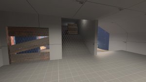
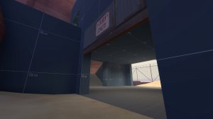
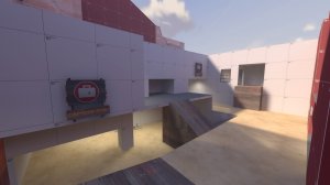
*There was little an offensive team could do to check the status of defense outside the intel room other than running head first into it via the dropdown routes. This was quite frustrating for attackers as it forced them to push far past the enemy spawn to find out what was going on in front of the flag. I have re-added the window from earlier alpha versions to the dropdown area. This allows attackers to prop jump up to this room and peak out through the boarded aperture for sentries and revved up heavies before trying to take the flag. The low commitment neccessary to accomplish this by attackers should make this easy to do without extending too far and getting punished outside the enemies' spawn. Defenders can still shut this down by taking control of this room, but this will take their attention away from the flag itself, creating a fork for them to choose between. I have added an out of bounds detail area to make this area a bit more distinct and memorable and to also make the room feel less enclosed.
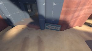
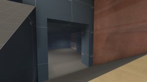
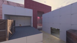
*A sentry gun between the two exits of the flagroom was quite difficult to get sight on to attack it. The new dropdown access point gives attackers a quicker way to contest the gun but I felt it was necessary to take down some geometry in their path to make it easier to get a line of sight on it and to make their approach to the flagroom less of an awkward right angle around a corner. The wall enclosing the large ammo pack has been torn down leaving just a framework pillar and a crate as cover. This should make approaching the flag from this entry point more of a straight line while still offering some cover to combat enemies around.
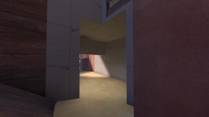
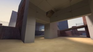
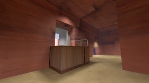
*The valley path from the flag room has been made tighter by the addition of a new support wall to facilitate the new window extension overlooking the flagroom's exit. This should not majorly effect the gameplay here but it might make flagrunners consider using the other exits more. I have lowered the light level here too to make it look less favourable. In addition, to favour attackers more I have raised the crossing wall above the valley to give better view to the bridge. This should obstruct movement and sight less and give more safe actions to offense.
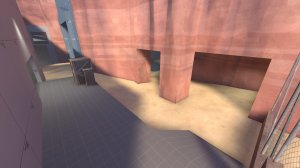
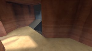
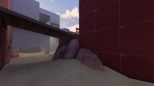
*The overhang exit was often unused due to the effectiveness of sentries outside the flagroom. I have widened this space to give attackers longer sightlines and to give them more room to dodge attacks. A rock pillar has been added to prop up the widened overhang which doubles up as cover to juke sentries behind. The health pack here was often too difficult to pick up for attackers as sentries around the corner blocked access to it. This left attackers without any good health sources when they dropped down. I have moved the packs forward behind the rock pillar where they are more visible to attackers and are less dangerously presented to them.
*The porch on the walkway along the stair-room was too often used by engineers as hard cover to juke attackers behind and force them into their sentries' line of sight. I have removed the porch to make this area less defensive and added some crates to give some more dynamic cover to hide behind that isn't too powerful for defense. It is also a method to give a sense of scale in a currently featureless area - it felt too strange before.
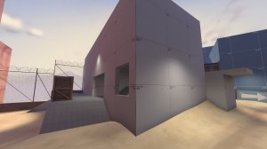
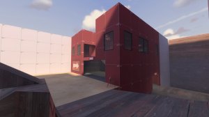
*A window has been added to the stair-room's flag facing wall. I want the interior of this space to be more visible to flagrunners so it is less overlooked by them as a highground route. Before it was too easy to dismiss the building as being a detail area so I have made it more inviting to players exiting via the main flagroom porch.
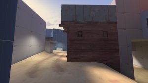
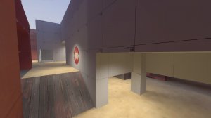
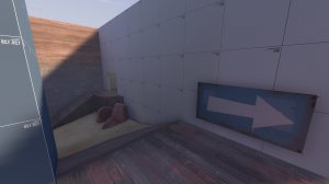
*The new changes to the highground outside spawn make it more important for attackers to understand there is gameplay space behind the geometry in front of them. I have added some details to the side wall along the road such as a windowsill and some trusswork holding up the elevated corridor. I hope this draws attention to this wall. I have also added some boarded up windows to show there is something on the other side of the wall and that it isn't completely solid.
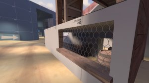
*The windowsill previously mentioned is attatched to a new aperture looking into the lower valley connector. I want it to be easier for players using the road route to see what is in front of them before they commit. It also allows them to check the flank in the valley to see if defenders are rushing them from behind. This should make this area more friendly to offense and allow them to check the status of sentries outside spawn without comprimising their position.
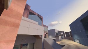
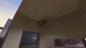
*Finally, as an aesthetic change, I have made the roof over the perch sloped to allow better sight to the all important objective area from the bridge perspective. The rock wall carved structures over the porches have been heightened also. This should make the general direction of the objective more clear to attackers' approaching from the bridge as it towers above the surrounding geometry before them.
Thank you for your continued interest in my changelogs. I really appreciate the support. While these logs have been mostly gameplay change oriented, I also plan to log my thoughts and reasoning behind detail adjustments as I enter the Beta stage. I do hope they will be just as beneficial to you. Happy New Year and thanks for following ctf_chin's development!
Attachments
Version Alpha 6 of ctf_chin. I feel like the map is in quite a good spot right now. Much fewer gripes are being reported by playtesters compared to previous versions. From playing the map myself in tests, I am very happy with the resulting combat in individual areas - it feels quite different from every other CTF map I've played and much more interesting engagements are happening.
One thing lacking in playtests is comments on additions that could be made. Plenty of comments can be left on the existing material in your level, but it is quite difficult for a tester to estimate the merit of adding something new. Therefore, I will be experimenting with some changes in Alpha 6 that were not requested, but are alterations I am interested in testing to see if they improve the overall experience. I will also be tweaking some existing geometry to improve micro gameplay and class balance.


*Players on the ground at mid could feel quite vulnerable to suprise attacks at high playercounts. The geometry blocked vision as I intended it to for the purpose of keeping snipers in check but this made it quite difficult to check corners and behind solid walls. Snipers also commented that they felt quite useless at mid as they were often unable to get a good sightline on an attacker before they got too close. I have strategically removed certain walls in the shacks to make it easier to check the opposite side from you for flankers. Now you don' have to walk all the way around to check which comprimised your position and exposed you - quite a chore. I have installed transparent wooden fencing in the new gaps so that it does not alter the geometry, it just permits more vision. This should also buff snipers, allowing them to see through the shacks, charge up a shot and shoot the enemies lurking behind it.
In addition I have added a detail that I've been wanting to add for some time, but previously had no reason to in a gameplay focused alpha. It is based on the burial chambers below the Khazneh in Petra. A metallic grate blocks off the new out of bounds detail and will signal flankers' location to players at mid should they walk over it, emitting loud banging footsteps near the health pack.


*To further reduce the chore-like nature of checking the flank routes, I have displaced the rock pillars at mid, pushing their lower inner surface in towards mid and exposing a sightline from lower to the enemies' porch. This reduces the distance you have to walk to check this cave area. It should also make peaking from the lower area for info easier as you can now check farther into mid. In addition, this will make the exit options through mid easier to identify when returning to your base from the valley basement.
The shoe like base of the rock pillar has been displaced also. I wasn't quite happy with how movement was organised here - classes couldn't quite make the jump from the rock to the sniper balcony. I have displaced the surfaces closer so this jump is easier for slow classes and I have added a little extrusion at the base near mid that can be jumped up to climb onto this high ground.
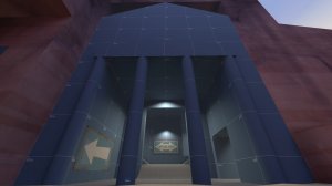
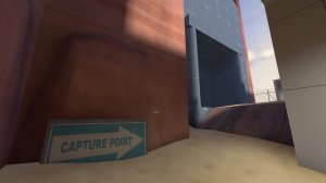
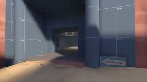
*In preparation for Beta versions and the detailing ensuing, I have removed the Swamp Pack intelligence briefcase signs. Originally I added them to denote the flag's location more clearly, but I feel like they were clumsy looking and will break the immersion of the level. Why would both teams sign where their secret documents are? The capture zone text beneath them could confuse players as other maps use it exclusively on the objective itself. This could confuse some players into thinking the capture zone was near the signs. I looked at other maps in TF2 to look for methods of signing my objectives in a less immersion breaking manner. I settled on a method similar to another temple themed map, Lakeside, which uses the capture point arrow signs. They have the added benefit of directional symbols that point to the objective instead of vaguely implying it is behind the sign somewhere. They are also less overt about the secretive nature of the objective, which I think strikes a happy balance between immersion and gameplay.
I have moved the signs back from their previous postions so the arrows are less confusing but have been careful to ensure they are still visible where they are important. This should also declutter the view outside of spawn which previously had 4 or 5 signs visible at once, overwhelming the player with information. Now you just see two arrows pointing you towards mid.
*The porch area is a high traffic combat zone and the sand pile jump to the left entrance was often annoying to use as it opened you up to attacks from behind you. I have smoothed this movement out by changing it to a simple staircase leading to a wider doorframe.
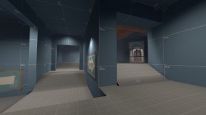
*The right exit was quite daunting to use as an attacker as it was a blind turn into an open area. I have widened the doorframe here so you can see farther into the room from the diagonal vantage point you approach it from, allowing better vision on the important windows early and making it easier to check for enemies. This also removes an annoying corner that could be abused at the top of the stairs. I have also sliced the stairs in half and pushed them around the central wall. This makes the climb to the window room more gradual and lessens the advantage of players camping at the top of them inside.
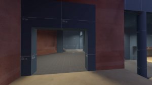
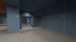
*The upper secondary entrance to the window room was quite annoying to use. It was a tight corridor leading to a blind doorway and confused some players about how it connected to the rest of the gameplay space. I have widened the room so there is more space to dodge attacks and to make it easier to check around corners without sacrificing your postion by pushing forward for info. The height advantage the left side had over the main entrance made it feel disjointed so I have smoothed this transition by lowering it slightly. This should make this area feel more like a lobby and a staging area rather than two independent routes. The more open, straightforward nature of this modified route should make it easier to read at a glance and new players searching it for health packs here should be less dissapointed when they have to retreat as there is less ground to cover. (I don't want to add packs close to the windows as I feel it could make camping this room far too easy. Players should have to retreat or commit to moving forward.)
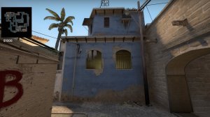
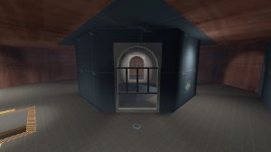
*The modifications made in Alpha 5 to draw better attention to the all important windows in the attic were not sufficient. New players still ignored them. I feel like this is because they have seen the windowframe props used before in other maps and associate them with solid glass barriers. I have researched other maps for methods to denote that an opening is solid to your movement but not to your projectiles and I settled on de_mirage from CSGO's solution. Valve used jail cell like bars on the window frames to block one of the windows in the B apartments. I tried to immitate this in a similar fashion but in a slightly different way so that the bars obstruct vision less. There is a small gap in the new arch openings that let you clearly see all of the room below but the bars above should show that you cannot pass through this aperture. The angled nature of these windows previously made it difficult to see much through them from any direction that was not perpendicular. The width and height of the windows has been increased to make it easier to see into the room below (and above) from a diagonal approach. This should make firing shots through these holes easier and more effective for defenders and attackers alike.
I have also cleaned up the room and reverted some changes so the windows are less chokey to approach and less controllable by spam below.
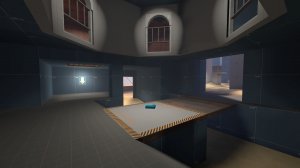
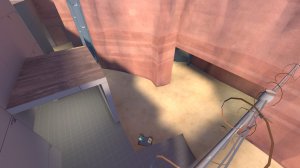
* I appreciate that engineers enjoyed defending the flagroom from attackers above but I feel like it came at the cost of slowing the game down too much and it frustrated players trying to play the objective. This goes against the intention I had to make this map have a quicker pace than other CTF maps whose rounds could be extended for a very long time by turtling in the flagrooms. As an experimental change I have flipped the stairs and bridge in the flagroom to push the lowground towards the exits. This makes defending far into the flagroom more of a risk as there is less advantaged ground to retreat to when attacked. There is less uninterupted flat space for defenders to hold, making it clearer this is an unsafe area and defenders should be defending from outside the flagroom. It also creates a gulf between the attackers' and defenders' entrances. Previously using the dropdown deeper into the flagroom would place you in between two exits that defenders could use. Now it should be more clear where you can escape as both exits are pushed forward away from your entrance dropdowns.
These changes should incentivize holding in a position that is easier to approach as an attacker as it is not only approachable from one direction (it is pinned between the normal routes and the dropdown shortcuts). This should resolve engagements quicker as attackers will wipe the defense and win the flag or defenders will kill attackers (who are forced to commit to the further back sentries) dropping down and get a chance to push forward. There should be no more stalemates between attackers in the windows and sentries below.
As a result of the flipped stairs, the side exit has been pushed forward which should decrease rotation times for both teams and kill some dead space that contributed little.
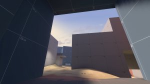
*Players remained confused about where to exit from the flagroom. I feel this is because the buildings in front of them were quite intimidating and hard to read. I have removed the overpass over the main mid route so it is more cleanly denoted as a main path. This should also make it easier to blast jump out of the middle path, making it much more important to defend because movement in that area is less confined. The sky access above the mid route should make the exit direction easier to read.
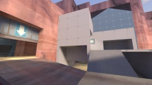
* The ceiling of the lowground has been raised to give more room for movement and the support wall has been pushed back from the bridge for better vision. This also better shows that there is a route from the highground as it is no longer planar with the rest of the platform. From below there is a small hint there is a route above as the staircase cuts through the ceiling.
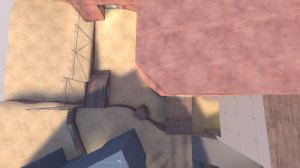
*The valley exit felt very segregated from the rest of the outside area near spawn. I have shaved off the corner of the rock wall. This should give better vision of the entire gameplay space from all angles. Together with the removal of the arch over the road, this should make this outdoors space feel like more of a unit instead of seperate spaces, simplifying the geometry for memorisation for new players and increasing the number of landmarks visible at any given time.
A hoodoo rock has been added near the bridge to give a strong spot to hold from. This should give flagrunners something to worry about should they choose to use the lower exit. It has an extrusion like the rock pillars at mid, allowing slow classes to climb it and jump onto the bridge, which should make for some interesting engagements and make valley more defensible even after being widened.
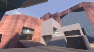
* Finally, as a small gameplay detail, I have lowered the canyon wall between mid and spawn. This makes it less visually imposing adds contrast to the tall wall over the flagroom. This should hint that the flagroom is a dead end and the lower wall is the direction of your escape. I have heightened some of the walls over the secondary exit from the flagroom to give it more of a profile from the side and to block sight to the sky, making it look less friendly to push into.
Thanks for reading and sorry for the delay on this update. I wish you a very Happy Christmas.
Version Alpha 5 of ctf_chin. Playtests of Alpha 4 indicated that the major flow simplifications I made were worth it. Players reacted positively to the reorientation of the flagrooms. The reduction of corners between combat areas has decreased incidents of players getting lost and leaving upset feedback. Geometry is intruding on play less, letting testers have much more engagement with each other. The amount of skirmishes and the quality of combat between teams has increased now that there is more of a team presence with fewer lost players.
Now that I am happy with the arrangement and orientation of the key elements of the map I feel it is reasonable to push ctf_chin's development cycle forward. I will be refining the geometry I have from now on, making more delicate changes in response to feedback as I feel the core makeup of the map is quite solid and has less glaring issues compared to previous iterations. Now that I'm focusing less on the macro scale, my aim is to improve the quality of the maps' micro gameplay - making combat in the seperate arenas more engaging and balancing geometry for each of TF2's classes.
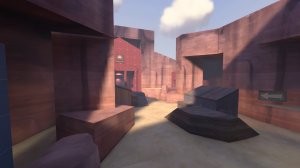
*I have changed the textures of the canyon walls to be less contrasting as I felt the previous rocky material's lumps and bumps drew too much attention to itself. The smoother, darker Hydro canyon walls are less noisy and let the man made structures take focus.
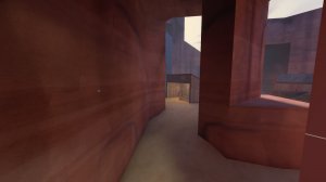
*Mid has seen few changes this iteration but I have adjusted the areas under the overhangs. The small health kits felt like traps - they were out of the way of the main paths and cornered players in a dead end with little retreat options. Another issue was the ease of dealing permanent chip damage to attackers holding mid as a defender. The lack of safe health packs at mid forced a full retreat to your own base to heal up or an overextension into the defenders' lobby to access their medium health kits. I have moved the health kits inside the now open shacks and added some ammo next to them. This places the packs in a more accessible area and should prevent a few unnecessary deaths to spam and chip damage. The corners the packs used to reside in has been walled off diagonally. This should push players in a more forward direction instead of to the side - towards their objective and not into a dangerous dead end.
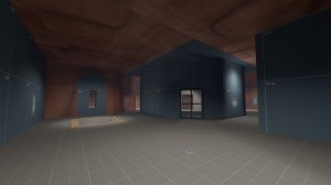
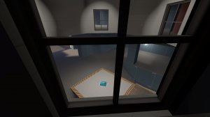
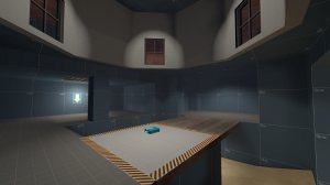
*I noticed in the playtests that some players overlooked the open windows in the dropdown room. I have pushed the windows farther back, allowing them better vision over the room below and letting attackers more easily see the flag which was previously directly below their feet.
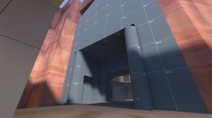
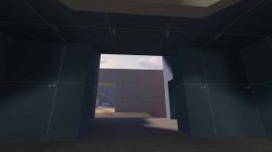
*One player noted that they were getting confused after picking up the flag, not knowing where they should aim to go. I have raised the ceiling on the porch exit from the flagroom and lowered the roof of the intermediate scaffold-like building so that attackers can more easily see the sky outside. This should more clearly label this main door as the exit from the flagroom and the access point to the escape routes outside.
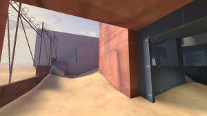
*The previous version changed the side exit to be inside a cave. I feel like this was a positive change, marking this doorway as being part of the flagroom. However this interior section seemed to deceive flagrunners inside into thinking that the door led farther into the interior space. I wanted to indicate more clearly that it was a secondary exit from the inside so I opened up the cave wall and reduced the overhang to just over the door. The natural light here should contrast with the darker interior space and more clearly note this route's true purpose. I removed the tall old boundary walls that were hold overs from the rushed Alpha 1 and replaced them with see through chainlink fence, allowing sight to the sandy dunes outside the playspace. This should decrease the feeling of confinement in this space and it's new brightness should attract the attention of flagrunners more. I also adjusted the health pack placement. The small health pack near the cave entrance is gone now but I moved the medium outside of the highground building. This should make this route more viable to push out of and the packs' placement should favour attackers more.
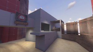
*The highground building's orientation used to mislead players into thinking they should push straight toward the spawn building. I have altered the interior of the building to be more simple and you now approach the upper exit in a more diagonal fashion, leading you more towards the exits to lobby than the waiting enemy team. I have also removed the connection to the spawn building, more clearly denoting that these two buildings are seperate. I have added the piles of wood back but out of bounds and erected a wooden fence with cracks to allow sight to the dunes outside. I really wanted to reduce the enclosed feeling the spawnyard had so removing the retaining walls and buildings was necessary. The newly visible open area outside the map should allow some interesting options for out of bounds and skybox detailing down the line.
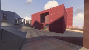
*The poor vision directly out of your spawn doors used to conceal the routes to the frontline until you exited the spawn building. I feel this contributed to the misdirection that led to players getting lost. Spawn has been rotated slightly and the spawndoors have been turned 90 degrees. The spawnpoints now point at mid instead of off to the side and the spawndoors lead to a much more open air room with clear vision on the bridge in the middle, the stairs to the highground and to the valley to the left. Granting players sight to these routes first will give them priority in the players mind and lead them more naturally to mid. (During the development of this map I tried my best to avoid relying on non 90-degree angled geometry to make interesting play spaces as I felt I was using odd attack angles as a crutch to make my maps more interesting instead of focusing on the core principles. Now that the ctf_chin has reached a more complete stage in it's development I feel like I can use angled geometry to my benefit instead of as a gimmick.)
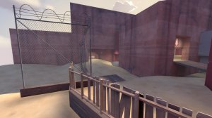
*In keeping with my previous changes to the outer walls inside the base, the canyon has also had it's retaining trench walls removed, revealing more open space outside the map. Alpha 4 of ctf_chin had a secondary doorway in valley that I intended as a flank away from the spam in lower lobby but many players confused it for the main doorway. I have removed the second doorframe and widened the choke in valley to compensate. The arrow remains to point players towards the exit.
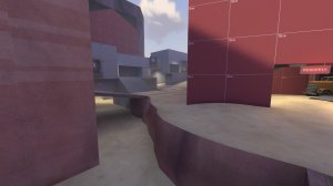
*Flagrunners using the lower valley route remained difficult to engage as a defender in alpha 4. I have pushed the short canyon wall forward to make the exit under the bridge tighter and easier to control with explosives and spam. The staircase on the left has been moved forward to bring it into view from under the grey building. This should bring the side stairs to the attention of the flagrunners, making it clear there is a path there, but it will lead them straight past the defenders spawn from a disadvantageous position, so they will need to be careful. I have adjusted arrow placement so they are better framed from all viewpoints.
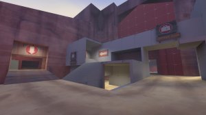
*The midground choke has been pushed farther towards the exits, making the intermediate area between the flag and the spawn more of a corner instead of a T-junction. This should remove the feeling that using the inner routes is pushing farther into enemy territory instead of heading towards your escape. It should also make it easier for defenders to get information on the flagroom's status by peaking around the corner out of spawn. I made the path from spawn to the flag as close to a straight line as I could without introducing problematic sniper sightlines. Finally, I have added road overlays to the paths outside spawn. This should give some parallax to the ground, making it easier to get an idea of the scale of the arena. These new focal points should also lead players' eyes towards key points of interest.
Version Alpha 4 of ctf_chin. I was pleased with the map's progress from version alpha 1 to alpha 2; there was stark improvement in the map's layout and flow. However, newer players who had not played the map before remained confused by the layout, leaving immediate feedback on the map load. My initial strategy releasing alpha 3 was to add minor changes that alter gameplay incrementally around the various arenas in the map in the hope that it would smooth out the negative impressions left by playtesters' experiences. However, confusion remained so I have decided to go for plan B which is a major overhaul of the arrangement of the map's geometry. I have tried to maintain as much initial brushwork as possible to reduce my own workload and to keep the same concept and intention as the original versions of the level. Much of the key elements remain the same, but the connectors are quite different.
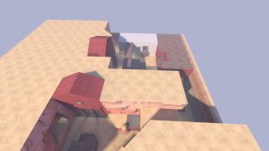
*While studying the demo files left during the playsessions, one flaw that struck me was the amount of unnecessary turns players needed to make while attempting to grab the flag and escape with it. A key aim going forward is to reduce the turns players need to corner in an attempt to reduce confusion. Running in a straightline at any point should lead you in the direction you want to go now. I have tried to make most of the angles and doorways a player will need to turn or enter at any given time at most 90 degrees. To do this I shifted the flagrooms and the dropdown area above them to the right so that they face the attacking team in a much more direct fashion. It was neccesary to shift the spawns and the yard outside them to the right too to facilitate this change. The flagroom in Alpha 1's main route exited the player facing away from their intended movement direction by 180 degrees. Alpha 2 was rotated 90 degrees, mitigating the problem, but not fixing it. Now attackers should be able to sprint straight out of the flagroom towards the exits to mid. This simplifies ctf_chin to be more akin to other ctf maps already in the game. The overall layout is quite similar to ctf_turbine now, but with quite major differences that I feel will improve the feel of the gamemode.
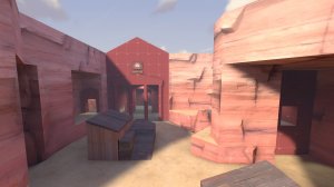
*Mid has seen radical changes. Previously a turn to the left was needed to enter the dropdown area. Now all routes should angle attackers directly towards the intel. The entrances from the defenders' lobby and spawnyard are more concealed and enter the central arena from the corner to the right. This should hopefully encourage attackers to enter the enemy flagroom first before considering attacking the more intimidating looking battlements area concealed under a shaded cliff overhang. I have tried to increase the detail density near the dropdown's porch entrance in an attempt to draw the players' eyes towards it more naturally. The secondary entrance to the dropdown room has been seperated from the main building to give attackers more incentive to push in there and to mitigate spam.
*The dropdown room's entry lobby has been expanded. It is much wider now, with two routes that diverge before entering the main room. This should make playing in this area much more interesting and easier to push into for both attackers and defenders seeking to clear it out. A window ledge with a sandy ramp leading up to it looks over the main entrance. This is easily accessed by a trick jump into the secondary entrance from mid and should give a major advantage to whichever team has control after a midfight.
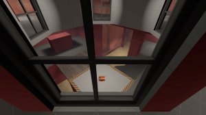
*The dropdown room has seen a major rework. Previously the dropdown trapdoors and windows overlooking the flag were only accessible from one angle. I have made the entire area into one big attic-like room with an octagonal structure in the middle. The windows are now angled to give a much more flexible view over the flagroom and are able to be rotated around much more easily. However, they have been pushed much farther into the room, so there is quite a sizable area that is not visible underneath the one being used by an attacker at any given time. This should make the windows' usage much more dynamic and interesting to play around for both attackers and defenders. The flag has been pushed forward from it's previous postion in a2 and a3 to be more similar to it's a1 placement. This is to make the flag and the capture zone more visible from all windows simultaneously. I am hoping the 2 new entrances to the attic room and it's circular nature makes taking care of sentry nests inside of it much less daunting compared to how it was previously.
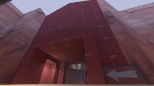
*The main exit from the flagroom has been rotated 90 degrees once more. It now directly faces the defender's spawn room. This will hopefully make movement towards it much simpler with fewer corners to turn before getting sight on your flag. The main exit now delivers you to a transitionary area between two chokes. This should make the decision to take the low ground or the mid ground much tougher as rotate times for the higher grounds are much lower now compared to previous iterations. I have also reverted the previous change that increased the height differences down into the valley area. This should make combat much safer for non explosive jumping classes but should give players using the speedy lowground much less cover from the canyon walls. I also nerfed the lowground by making it's entrance much chokier for attackers. Hopefully the other routes will see much more action now.
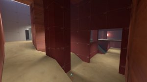
*I have changed the secondary exit from the flagroom to be inside the same cave the flag is in. This should hopefully signal more clearly to players that it is a way into the flagroom. I have also made it much easier to access by removing some walls and heightening the doorframe into the flag. I have changed the medium health pack in this area into a small, but I added another small to the main entrance. This should hopefully reduce the walk time players have to make to get to a health pack and reduce confusion as to where the health is.
*The routes from the flag have all been simplified. They approach the area outside the spawn building much more directly now. The highground now extends much farther towards the spawnroom and bypasses the choke on the midground. It should more clearly direct attackers towards the exits as it is a clean straight walk to all 3 of them from that doorway. I added a window for defenders to use to watch the flank more easily now that it is much more powerful. It can also be used by attackers to spot any threats that stand in their way. Giant wooden flag signs should more clearly indicate where defenders should guard.
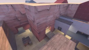
*The valley exit has been pushed forward and made to connect to the main lobby in an indoors choke. All 3 exits have bright lighting and large arrows that should lead players toward them more cleanly.
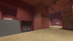
*The lobby has been squeezed into an L shape which should make it much easier for defenders to survey threats before entering. It also has highlighted arrows pointing towards mid which should reduce confusion. The elbow shape should increase visibility but I have taken care to make it difficult to effectively shut down all exits in a stationary postion which I feel ruins quite a lot of ctf maps and leads to stale and spammy gameplay. You will be able to see someone escaping with your flag but you will need to commit to one of the routes to stop them. Now that defenders have much better sight into this lobby, I have closed the main exit off to remove any problematic sightlines from mid. The new lower connector to the valley maintains the number of exits from defenders' lobby.
*The highground entrance to lobby has been turned into a ledge. This should let defenders more easily gain control of their lobby and should give flagrunners who have cleared the highground a quicker exit past the defenders.
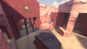
*The scaffolding at mid added a lot of problems. The perch made it very easy to watch all entrances to mid from one position, which made it feel very difficult to attack from any exit that wasn't the highground sniper nest. I have widened mid and the new L shape lobby lets players push out much more easily now. Hopefully it should feel like there are many more viable angles to attack mid from other than head on and combat should be more dynamic. One soldier cannot shut down all exits onto mid effectively now. A team with a forward hold on mid will need to rotate to watch all exits which should let players flank each other much more easily, giving players more options.
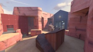
*When redesigning mid I looked at competitive 5cp maps to analyse their entrances and midfights. I have reduced the height differences at mid to make advantages less dramatic and easier to comprehend at a glance. A new hut outside of the porch gives both teams quick high ground and easy access to each other's intel rooms. This replaces the older perches from Alpha 3. I was inspired by granary's containers on mid that let you jump between two pieces of highground during a midfight. Now that there is more highground to defend, fights at mid should be more dynamic and territory should change hands more. I widened mid by cutting into the cliffs on either side of the arena which adds a small dark flank with a small health pack that teams will need to watch to defend their forward holds. I also added a medium health pack in the valley connector so it is easier to fall back and stock up in your lobby during combat now that there are two packs there. Overall the mid is less chokey so combat will happen in a much wider range of areas. I have carefully aranged the new pieces at mid so that grounded players have more cover to approach snipers at the other teams battlements. Snipers will still have long sightlines to attack each other however. They will need to be hyper aware of the new flanks to remain safe.
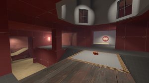
*Lighting throughout the map has been completely redone. I have changed the lighting in many areas to draw attention to points of interest, signs and the objective. I hope this will subconsciously lead playtesters where they want to go and improve their experiences.
Alpha 2 of ctf_chin played quite well compared to the first version. The major layout adjustments improved combat flow considerably but there were some complaints. Playtesters reported some minor issues with the importance of some routes being overshadowed by others due to ease of use. Other players reported that they felt the map's middle area was too vertical and the prescence of snipers in certain positions was too threatening. I have made a few iterative changes to address this feedback.
*Engineers who decided to defend the intel despite their vunerability there were left with few tools to punish unwary players who quickly rushed the one way trapdoors. I have experimented with the newly added boards on the windows so that sentries can cover them more easily, but can still be jiggle peaked to be destroyed. I have also added little crannies in the corners beside the briefcase where an engi can take cover with a dispenser but where a sentry will not be so effective at defending due to the windows' adjusted sightlines.
*The doorway leading to the highground balcony jump to the perch was a bit too easily accessed by flagrunners and did not encourage choicemaking. Players also felt that the lower exit from the flag room was not useful enough. I decided to address both of these issues by moving the doorway farther into the base past the flag room. This should give the lowground exit more use as it gives safer access to the highground and has a pair of medium health kits along it's route.
*The previous change altered sightlines into the spawnroom a bit too much so I shrank the doorframe near the wood piles and shifted it over towards the balcony.
*Players did comment that it was easier to navigate the map but there were requests to have better signage towards your own flag. I adjusted some previous signs' placement and added a few more.
*To address the complaints of verticality being too prevalent I added rolling sandy displacement floors across the map. This should make fighting on the lowground more interesting and smooth the transitions between areas more gradually than the brush based floors previously.
*The lowground areas needed more ways to combat the highground and I've experimented adding skill jumps up prop rocks to certain areas. This should add a few more options for players on the lowground who previously felt quite helpless.
*Added a second prop jump here from the top of the canyon exits to the top of the scaffolding at mid. This should let skilled players quickly reach their highground from the bottom of the arena and gives more options to classes who cannot explosive jump in the fight for the centre of the map.
*The original version of ctf_chin had a intel dropdown porch area that was easily accessed by the attacking team. In Alpha 2 I changed this by connecting the porch to the lobby of the defending team. This meant that defenders could more easily flank and intercept attackers in the window area overlooking the flag. Some players lamented the ease of access mid control gave attackers to the enemies' flag. To address this I have extended the porches of the dropdown rooms into mid and altered the connectors. There is now a skill-jump from mid onto the perch that enters deeper into the dropdown room and I added a small health pack to it. The connector from the lobby has been pushed farther back towards mid so attackers can more easily defend their flank while pushing into the flag room.
*Minor alterations for player flow have been made to the lobby areas. I extended the stairs to the highground exits on either side so they are more visible while pushing into mid.
*I have reduced the space a sniper can stand in at the connector to the scaffolding at mid. This should make it feel much safter to push in and it should make the sniper more vunerable to flankers.
*To remove some of the angles at mid and make it feel safer to attack, I added some barriers on the scaffolding. I also moved some arrows forward so it is more obvious that I want players to push into the flagroom entrance first, not the lobbies.
*To aid visibility and to push the players focus downwards I have extended the canyon walls upwards in some areas. The negative space should attract attention to the balconies looking over your approach to the centre of the map and the tall walls should make the divide between the two team's territories more apparent.
Attachments
Version Alpha 2 of ctf_chin. The main focus is to aid player navigation with signage and geometry changes. I've been sitting on this since about one hour after the hard deadline for the Back to Basics contest passedI'm upset that this wasn't the version that was being played for the contest as I feel I made a lot of necessary changes. It was quite painful to watch a1 be played for 4 weeks when I had addressed some of the issues already but such is life. Get your work in on time by starting on it early!
Notable changes:
*Overhauled spawnrooms. Spawns now point towards mid and open into a house with multiple exits for player navigation smoothing. The a1 intention was to lessen the impact of turtling outside of the spawndoors by using dropdowns and a long walk time back to the resupply but it just made the map feel overly complex for new players. There are now windows that show the yard outside to help players see where they want to go.
*Rotated the intel room. This should lead players more easily in and out of the objective. The original version overcomplicated the figure of 8 layout too much - now there are less corners that need to be rounded to get out of the base and it's a straight run out of the flagzone. Also I removed an exit from the intel room to declutter the area and simplify it. A lowground exit now remains where the original main exit was before. The flag now sits farther into the room to lengthen the distance players have to run to get out with the flag.
*Added some wooden boards to some of the windows into the flagroom. This should shade the defenders below from some of the spam above and let them dodge more easily but it should still let attackers clear out the flag of campers safely if they watch for flankers.
*Simplified the old courtyard room into an L shaped building. This should direct players more easily out of the base and should serve to be less confusing. Now it is a simple staircase up to a balcony where the old highground exit was and there is much simpler connection to the midground. In a1 the idea was to have the highground flank be difficult to lock down for flagrunners so I added flanks to what was already a flank route but I don't think it was neccessary after playtesting.
*Removed some geometry connecting the highground connector to the staircase shack near spawn. You now jump from the balcony to the highground perch to take the upper exit out of the yard. This is to further simplify the area outside the intel room. To make combat more interesting I added a short inside section under the perch and some wood piles for scouts to jump around on. To aid movement from spawn to mid the staircase has been pushed forward and the building it use to lead to has been removed. This also means the yard is shorter which should help with the overscaled feeling it might have had before.
*Deepened the lowground exit from the intel room going under the bridge. The original exit was being used a lot as the main exit as it was the quickest to access. I still like that the theoretical weakest route should be the easiest to use but I wanted to nerf it's effectiveness. This should let defenders have a better advantage over cheeky speed cappers.
*Lengthened the distance of the canyon exit from the intel room. Now flag runners will be more exposed from the bridge for longer and will be easier to intercept using the midground lobby exit. There is a new lowground connector to the lobby to compensate for the longer run time.
*Simplified lobby to be one room. This serves to simplify all the exits and entrances into one area for ease of navigation and to help players pushing out of their spawns to coordinate a push into mid. Also added a new upper exit to help defenders push out into mid.
*Remade mid. The original rocky mid area is now removed and has been made more choke like to aid defenders stopping flag caps. Two canyon walls squeeze together and there is now scaffolding for classes to access from their lobbies. This should aid pushes into mid after losing a midfight and gives an advantage over players making a run for the flagroom. The original highground exit near the flagroom dropdowns has been simplified from 2 exits to 1. It should be easier to intercept players running directly at your flagroom now that it is a bit chokier to access. A highground perch sits between the main archway in and mid to force slow classes to take the wooden stairs up to the porch area.
*Adjusted all pack placements to aid pushes and retreats in certain areas.
*Added signs to some areas to aid player navigation. There are now sawhorses with gameplay signs to point you in the direction of the intelligence and the battlements. Also added a window to the upper entrance to lobby to make it easier to see where the intel room is for attackers and new players.
*Added some textures here and there to aid player recognition of areas - dev textures only for walls made it quite difficult to orient yourself in the playspace in version a1. The lobby's exterior is now textured as I intended it to be detailed - a big canyon wall.
*The flag return time (in seconds) has been decreased from 30 to 20. Previously, suicide runs to the flag were too effective. A scout could run with the flag down valley and die and would potentially be able to respawn and pick it up again all by themself. This change aims to force players to work as a team to get a flag home to their base and should relieve some pressure from defenders.

