Hey, we pugged this in 6v6 tonight. I think you have several problems that will make this not such a competitive friendly map.
The demo from tonight:
https://dl.dropbox.com/u/3492731/spacesaver/20120714-0256-koth_idolon_72.dem
Quick comment on the demo: we played this using ESEA 6v6 rules, but the red team was pretty crazy with the offclassing shenanigans. Mangachu, in particular, played atrociously and refused to take it seriously, which means this demo is not fully indicative of how this map might play out in comp settings.
1) Death pits are usually a big no-no in comp maps. They are okay in some very, very infrequent scenarios. Unfortunately, you have the largest and most all encompassing death pit ever directly under your entire map, and it will probably be impossible to fix it. However, if you were interested in changing it. I think you would need to radically rethink some areas, and make a lot more of the platforms and bridges expand out in all directions so that you don't have any areas where you can fall. Its going to be way different than what you intended, but thats about the only way I could see comp players wanting to play it.
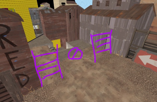
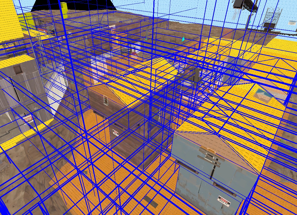
2) The rooftop exit is very very strong for snipers. I mean, you can see almost everything and you can weave your shot between all manner of buildings and seriously wreck people. Further, because you put spawn_visualizers over all the doors back to spawn area, only soldiers and demos have any reasonable access to the sniper if hes up there. If you compare it to viaduct, your map is more sniper friendly by an order of magnitude, and thats already one of the key problems with viaduct to begin with. I reccomend you remove the spawn visualizers (you should probably do this anyway, just to fit with the established trend of koth maps) and then change it so that instead of having one exit below and one to the roof, you have two exits below. This, combined with 1) would really help to give both sides of the map some identity, and allow for players to really have some options when choosing between them.
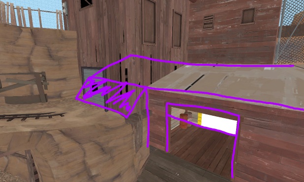
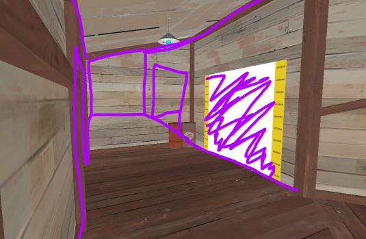
3) The side of the map closest to the point is a bit odd. For one, you can't retreat back up if you drop off the ledge. I saw multiple people during our pug get caught in that little alcove beneath the exit, thinking they could back up there, only to get destroyed when they could not. The two connecting huts near the point are a pain to walk through, having them be so narrow and congested leads to really boring gameplay. Either your med gets in there and just sits around, doing nothing. Or they immediately get destroyed by the tiniest amount of spam, because they have nowhere to dodge to and from. And, then the death pit means you pretty much want to sit on the far (southern?) side of the map and just hug the wall the entire time.
Reccomendations: Put a ramp so people can back up onto the ledge. Make the two houses one house so that combat in there is a bit more open, while keeping the dropdown and a window to the point. Make it so the side over by the medium healthpack is much more solid without so many ways to drop down (see 1) above)
4) The height all over the map is interesting, but it makes the map much harder to play for any non-soldier class. I think those two accessible roofs could be salvaged, but you'll have to lower them quite a bit. Maybe, drop the grey building down as well, making that entire platform area flat and level, with the grey building brought down to compensate. Then, take the buildings rooftops and bring them down as well. That would make it much easier to see players up on top of those roofs, and would make it much easier to fight them. If you get rid of the rooftop exit from above, you'll have to figure out another way for scouts to get access to the roof. I'm guessing that the grey building might work reasonably well, as long as the heights match up.
5) Health and ammo are in weird spots. The conveyor belt with (almost) randomly timed large health and ammo is pretty broken. A lot of our scouts abused that, but many felt like it was a dice roll of whether or not the health would be in a spot you needed, or not be there at all (not good for comp play, when you feel like a feature of the map is randomly determined). Also, the fact that its a full health down there is probably pretty broken for comp play, scouts and spies would abuse the hell out of it (medium at least, please). Other than the medium, there is very little ammo around the rest of the map. Given where we were fighting, I feel like you should put some small ammos near the point, and not spread to either edge of the map. You could keep one of the medium ammos in the southern building (if you made it) but I would reccommend putting another near (not in) the grey building towards the north. The medium near the point is okay, but it does seem pretty large to be sitting right next to the point. You might consider making it a small, moving it back towards the grey building, or making ita small and moving it towards the grey building.
I think you have some really sick geometry that could play really well in a comp setting, but that death pit has to go if you are honestly considering this for competitive play. The conveyor belt is hit or miss, but if you got rid of the full health/ammo and repositioned some of the health and ammo around the map, it would work out for the better. You could add another conveyor from the other side, with the only death pit being where they meet, and that MIGHT work for comp. People will always complain about a deathpit, so you should be prepared for some pretty strong criticisms even if you leave a very VERY small deathpit. And that sniper rooftop is broken beyond belief.
If you made some of these changes I'm sure I could convince my pug group to give the map another go around, but the bare minimum would be the radical reduction of the deathpit.
Hope this helps!


