ARENA Yunshu

Bakscratch

Finisher of Maps
aa
Oct 29, 2010
714
1,495
Yunshu.png


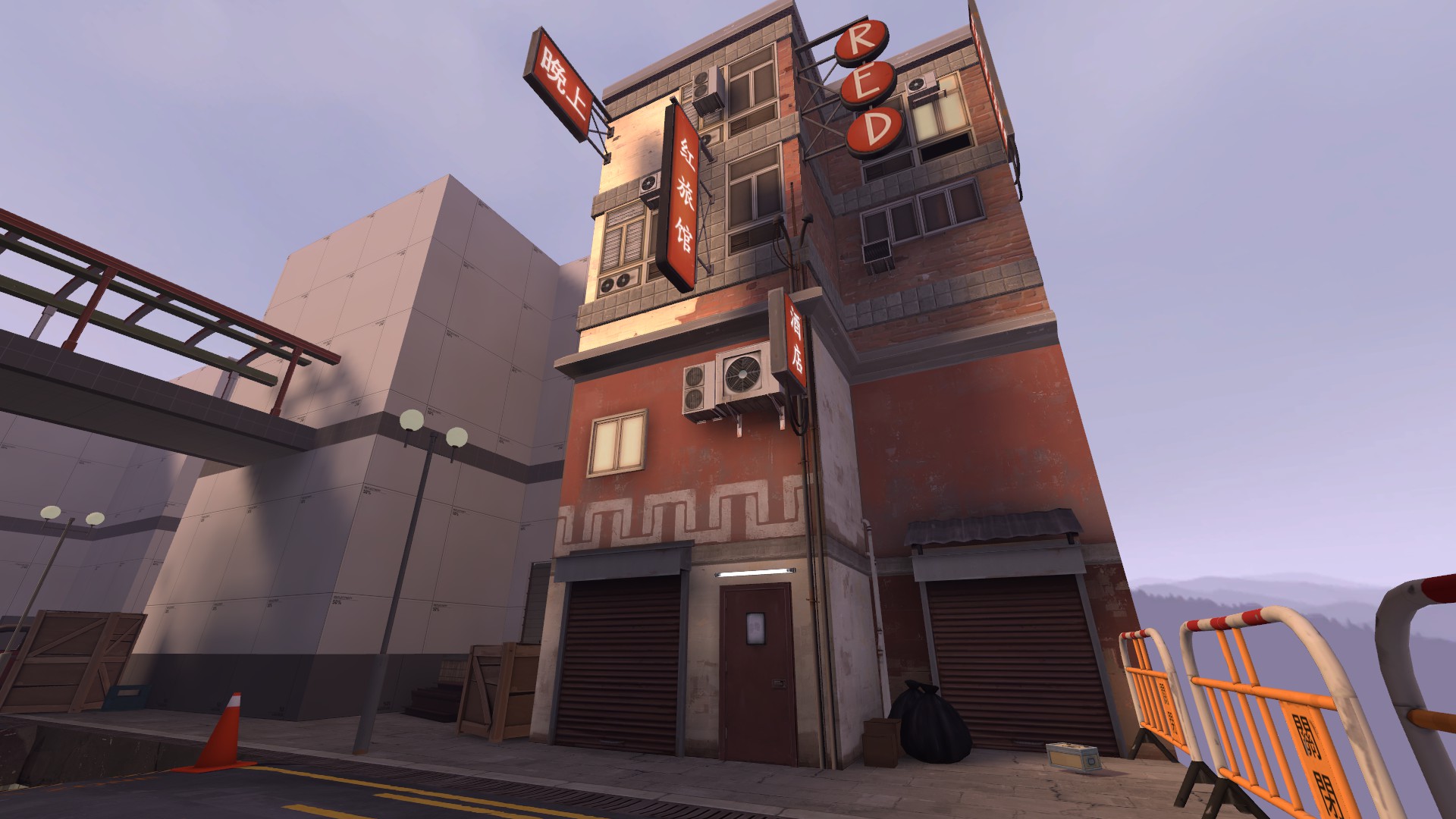
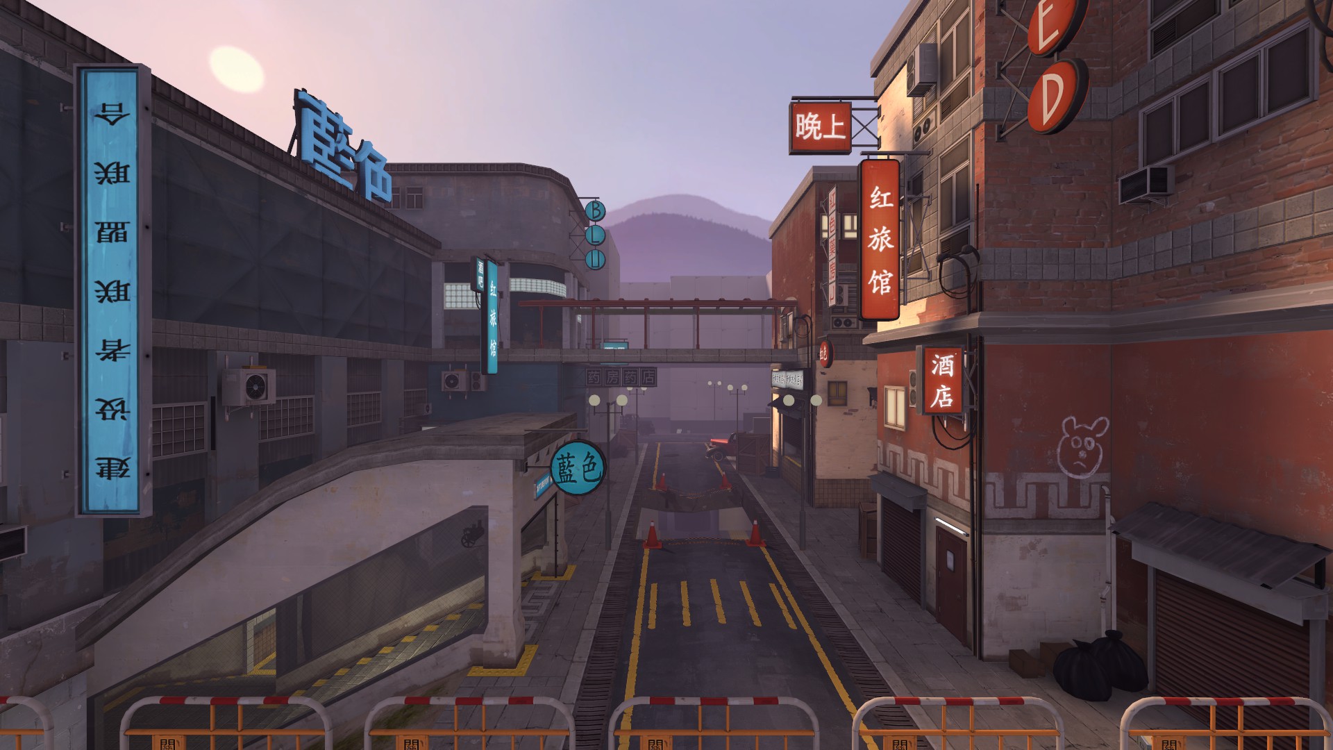
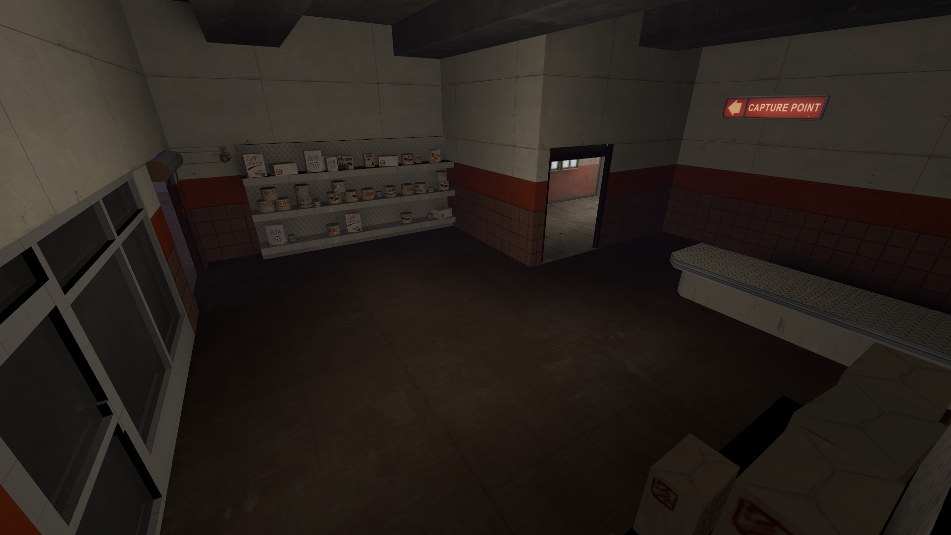
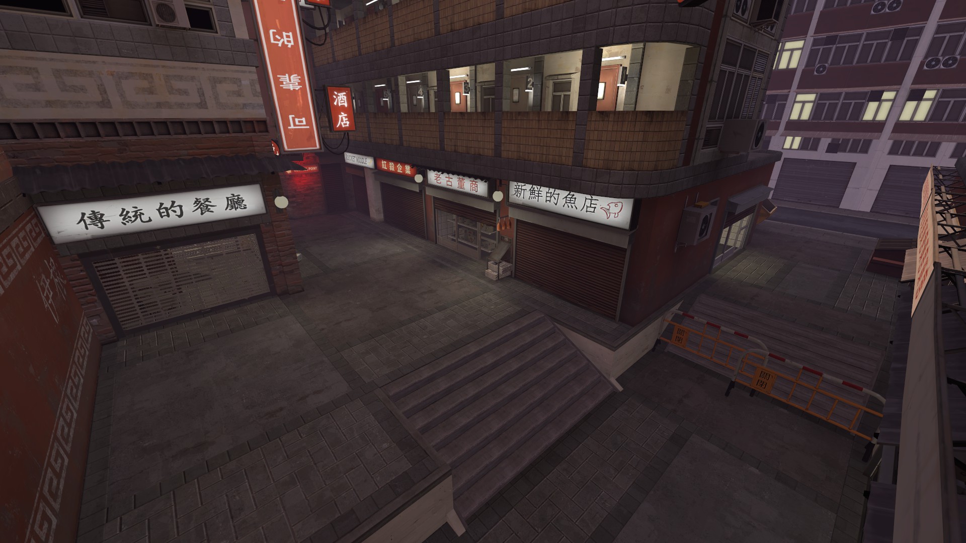
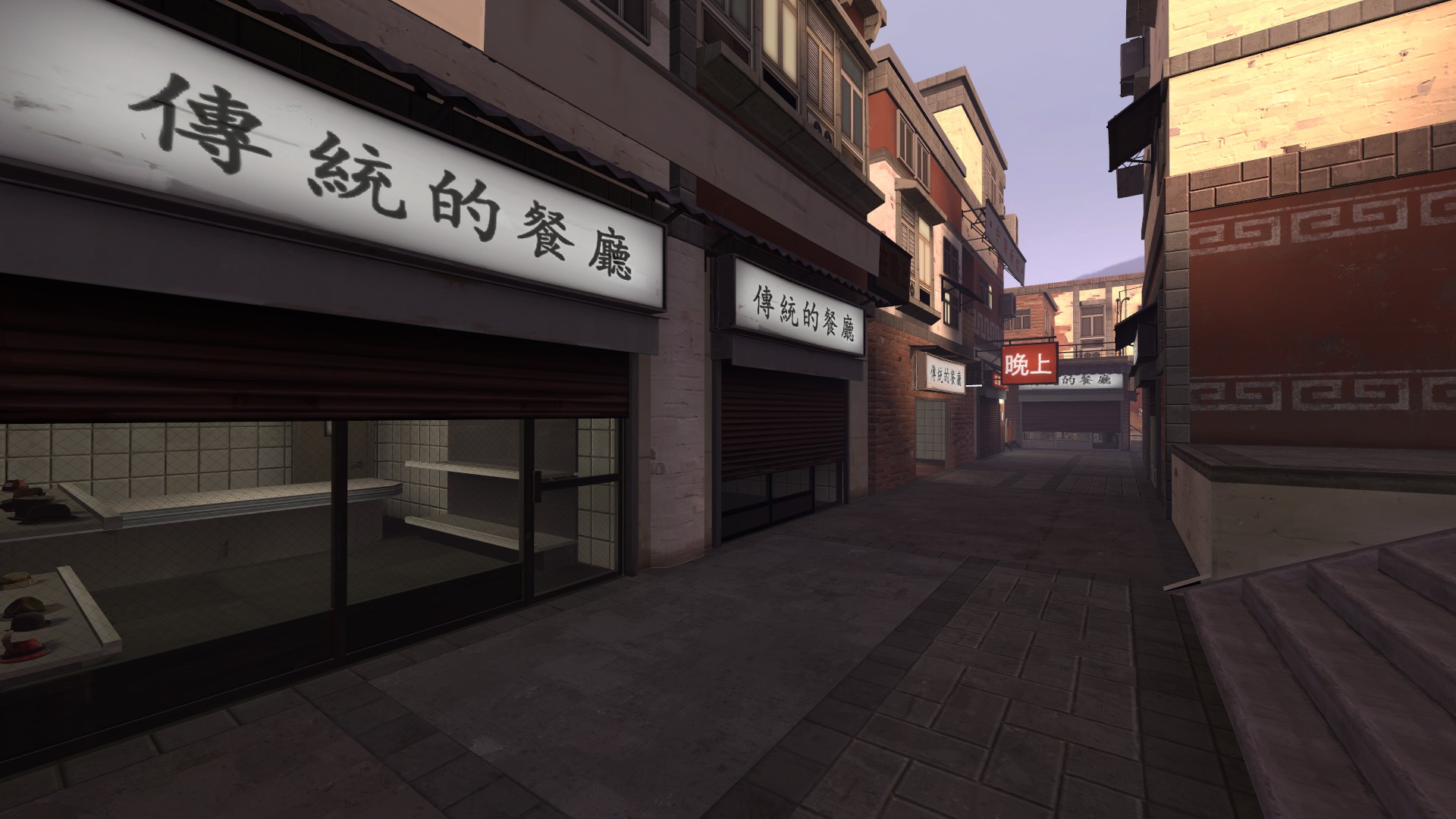
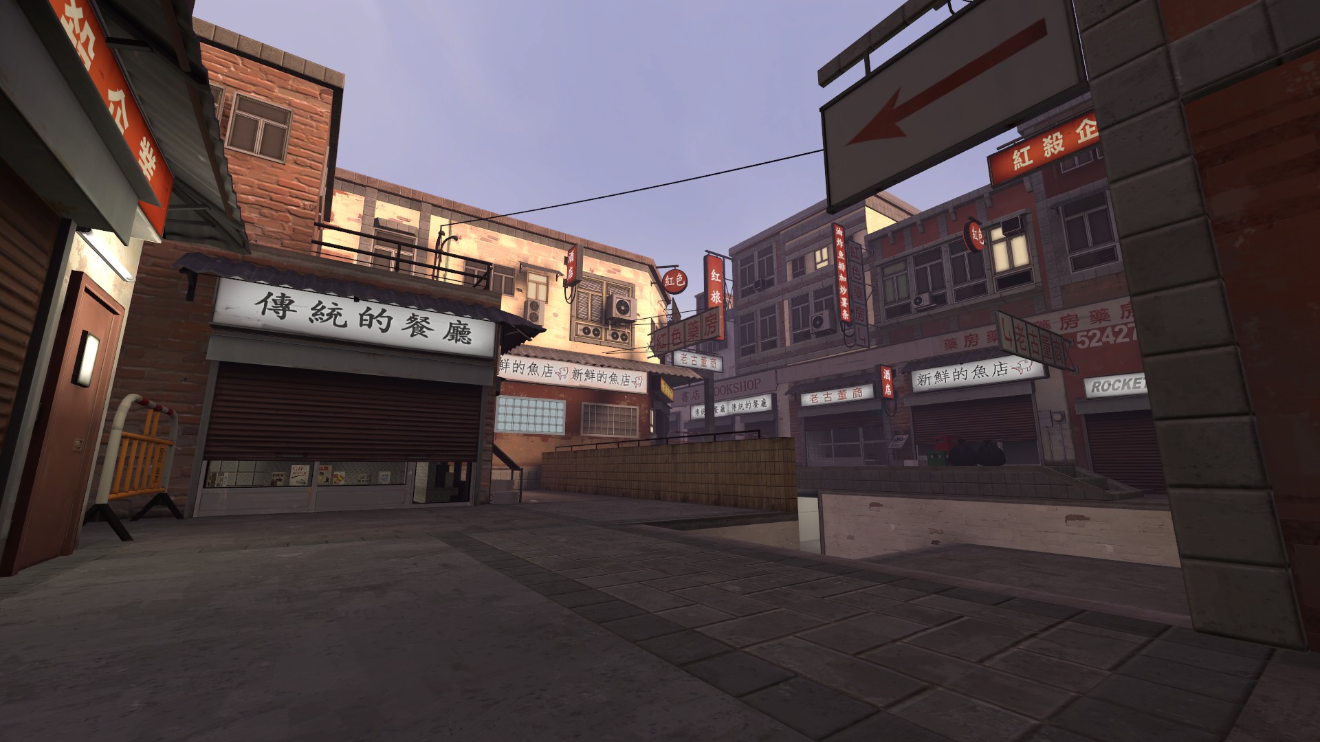
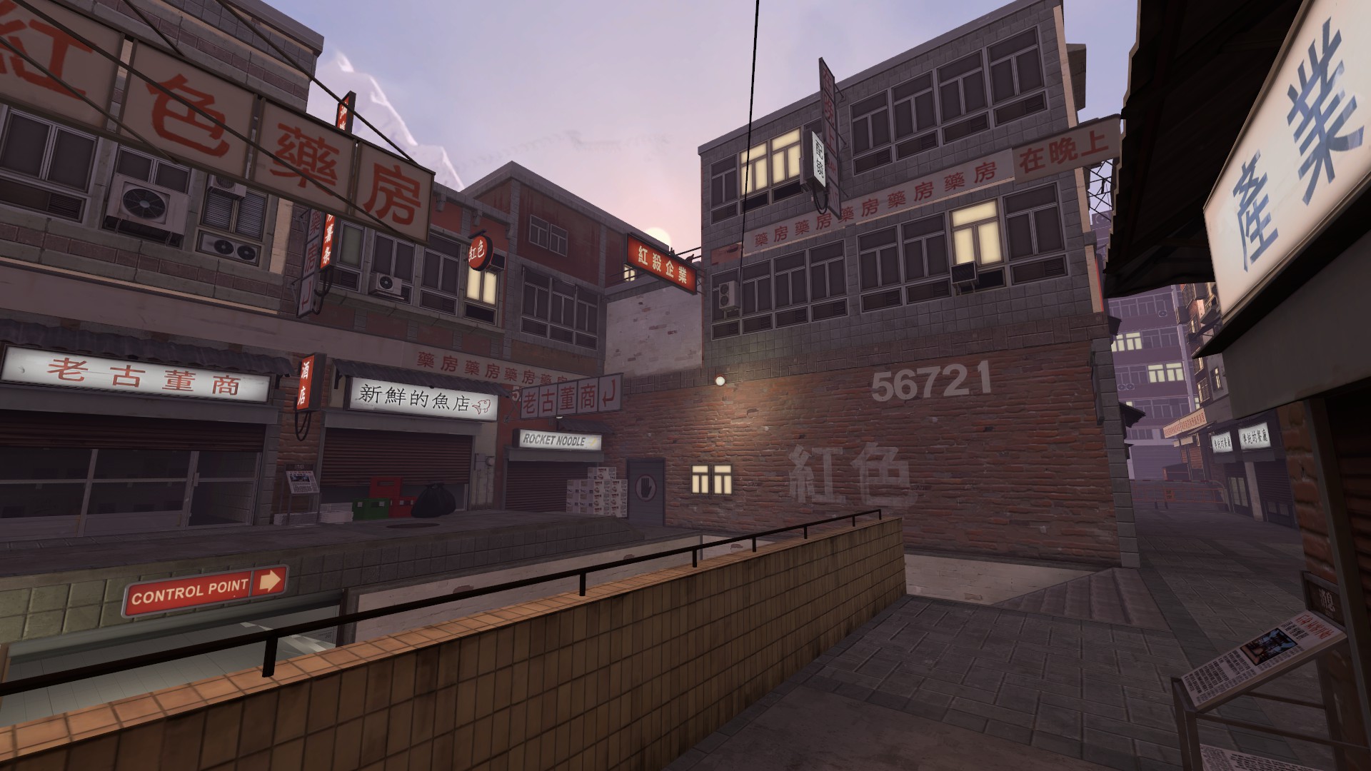
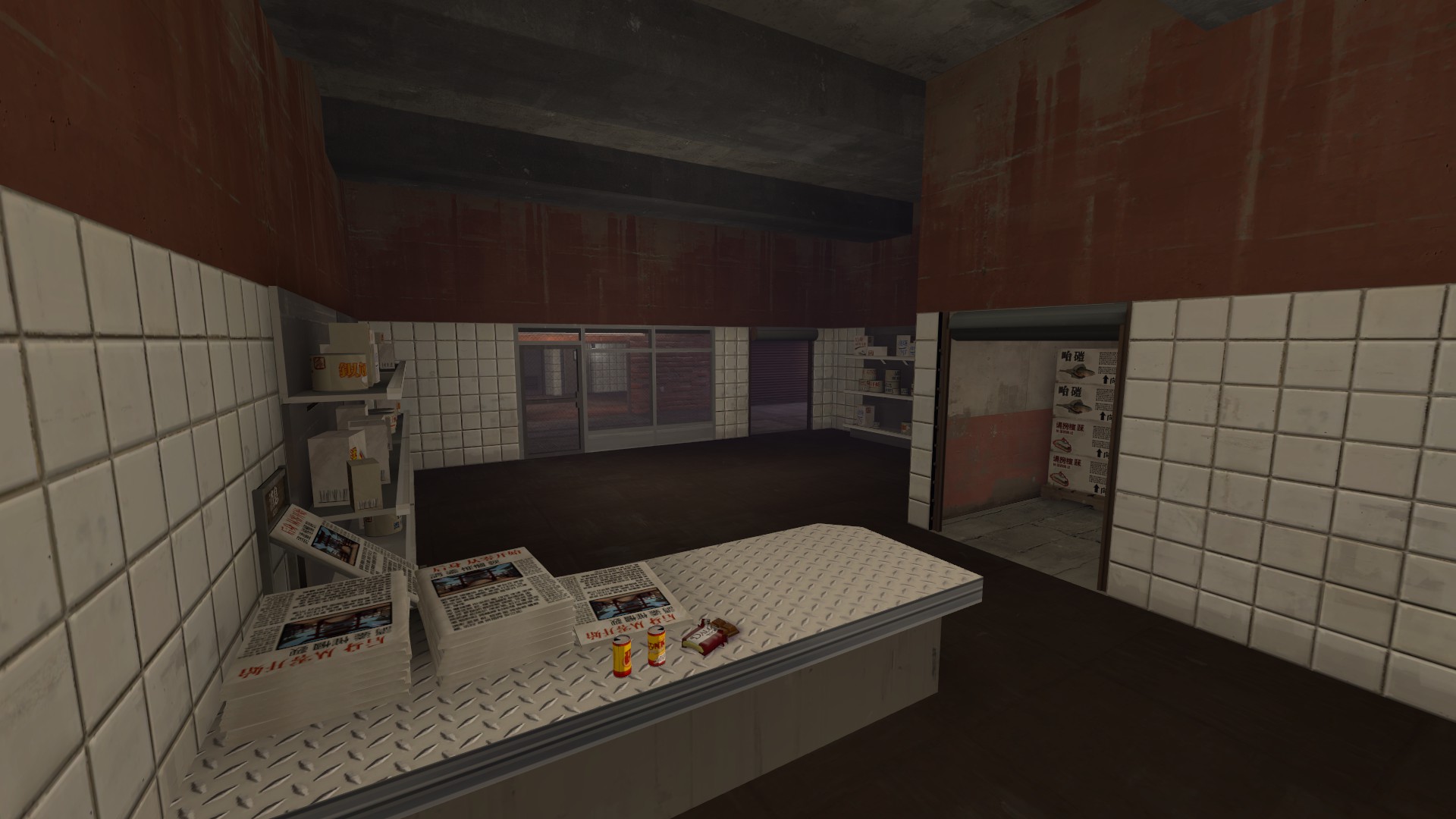
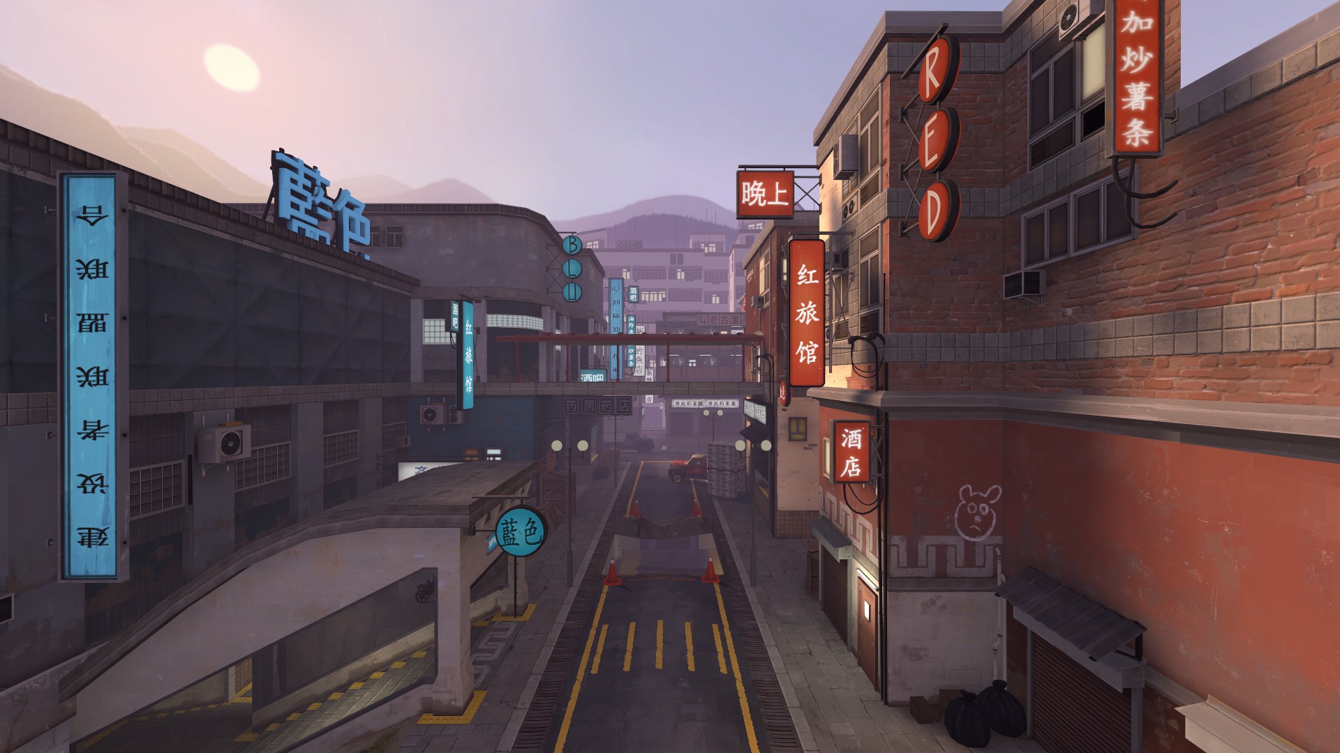
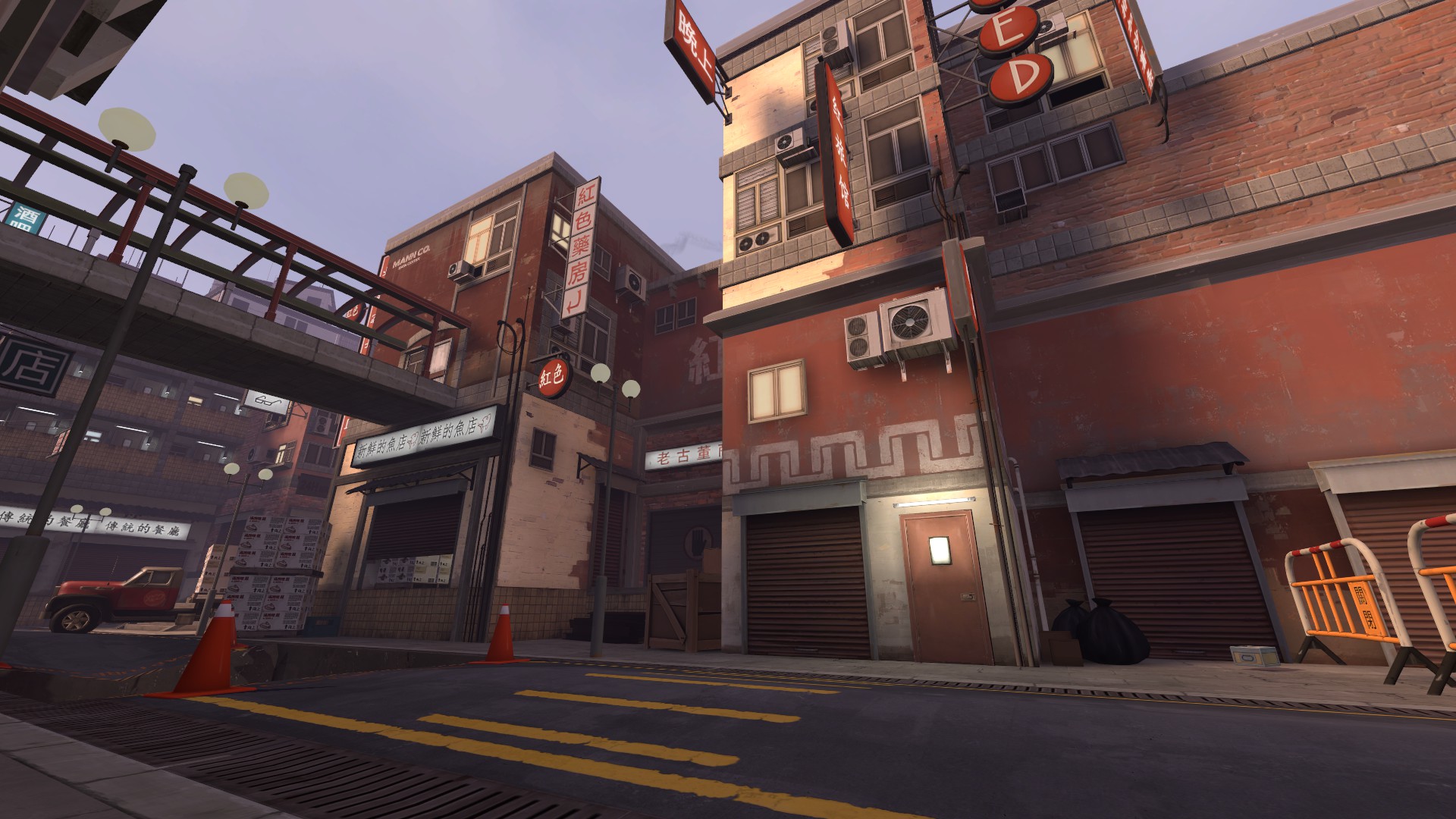
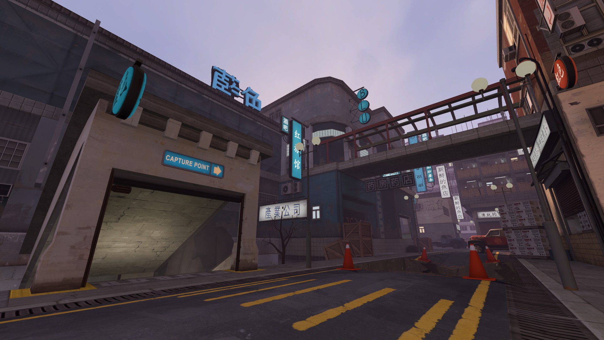
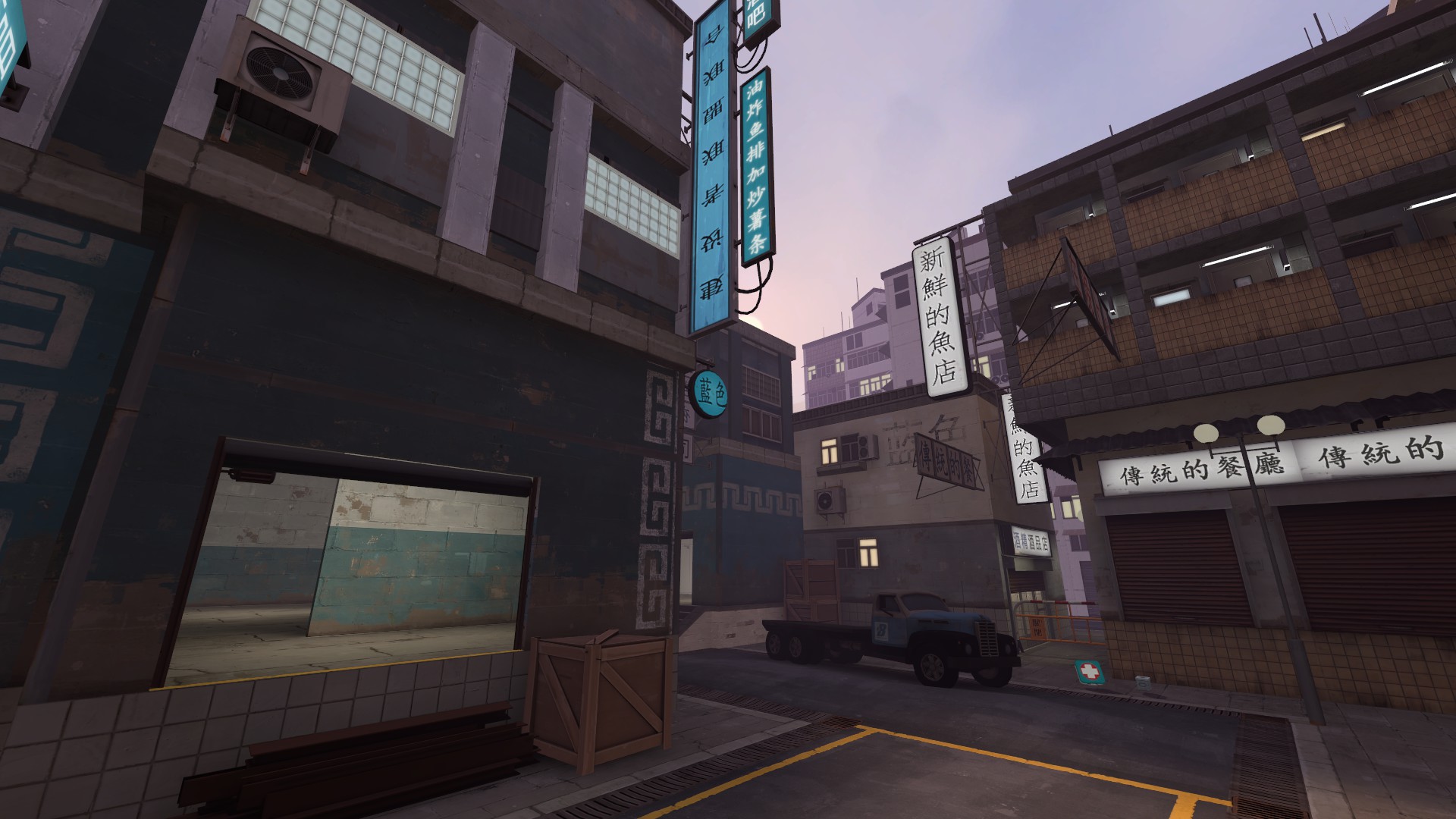
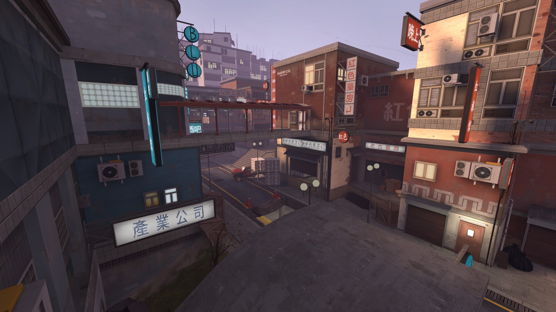
The gameplay of this map is focused around having an asymmetrical arena map, where the blu starts in the subways maintenance rooms and the red starts in the shopping squares above the subway.

Its base in a small road behind some shops where the shipment are delivered to the shops, a disaster has also reveled the subway system below the road which has now turned into the worlds hottest death trade arena.

Any problems leave them below or you can send me a message if you got any questions.

Also big thanks to Aly for her amazing quick and awesome models she did for me
http://forums.tf2maps.net/showthread.php?t=22032

Thanks and have fun

GFHL
 
Last edited:

Penguin

Clinically Diagnosed with Small Mapper's Syndrome
aa
May 21, 2009
2,039
1,484
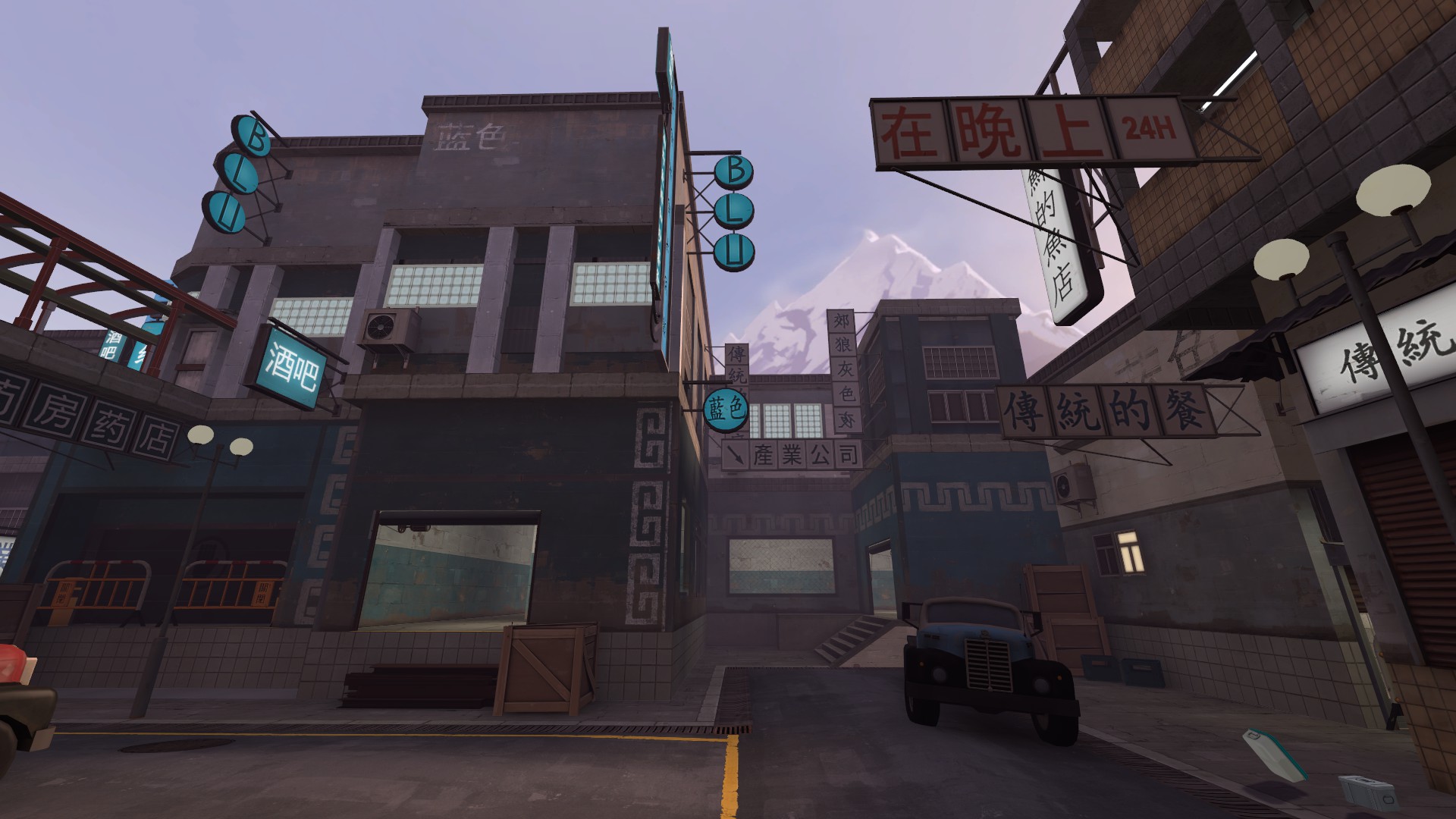
looks great, but the alpine sky texture is questionable imho
 

Pocket

Half a Lambert is better than one.
aa
Nov 14, 2009
4,701
2,583
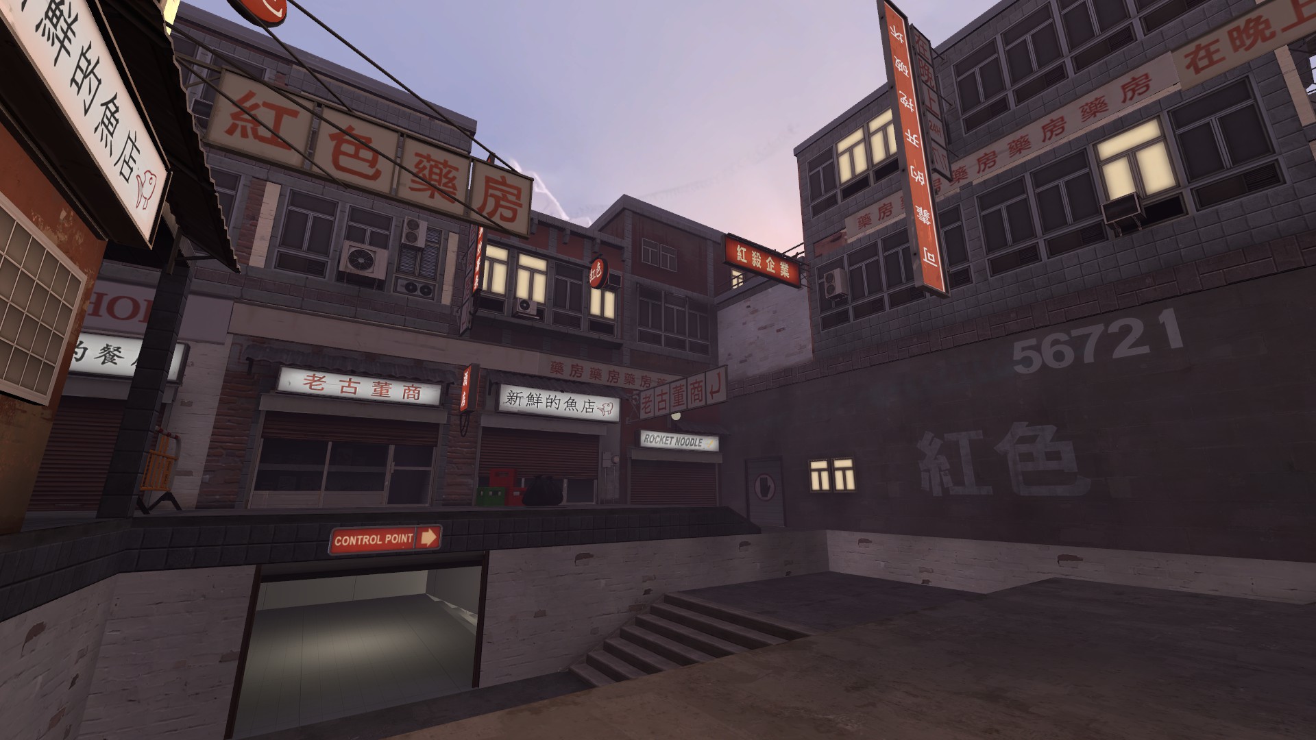
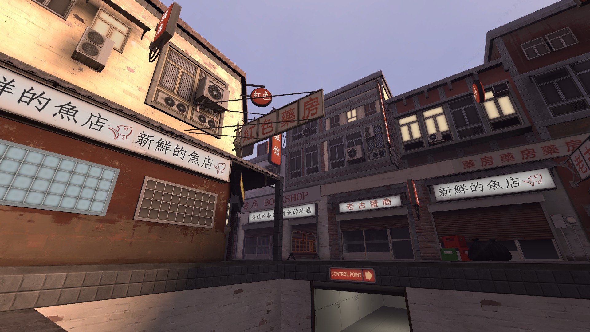
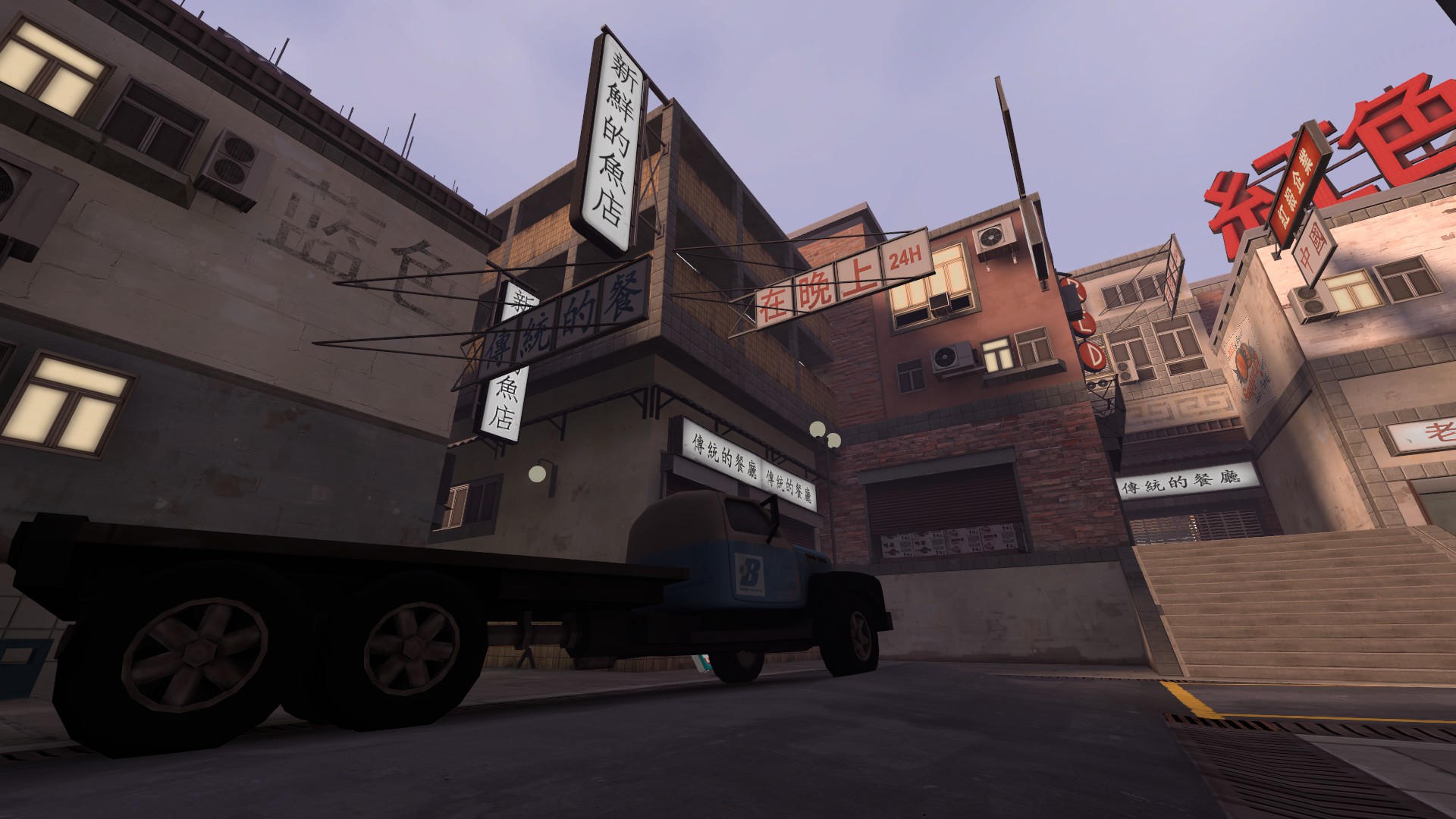
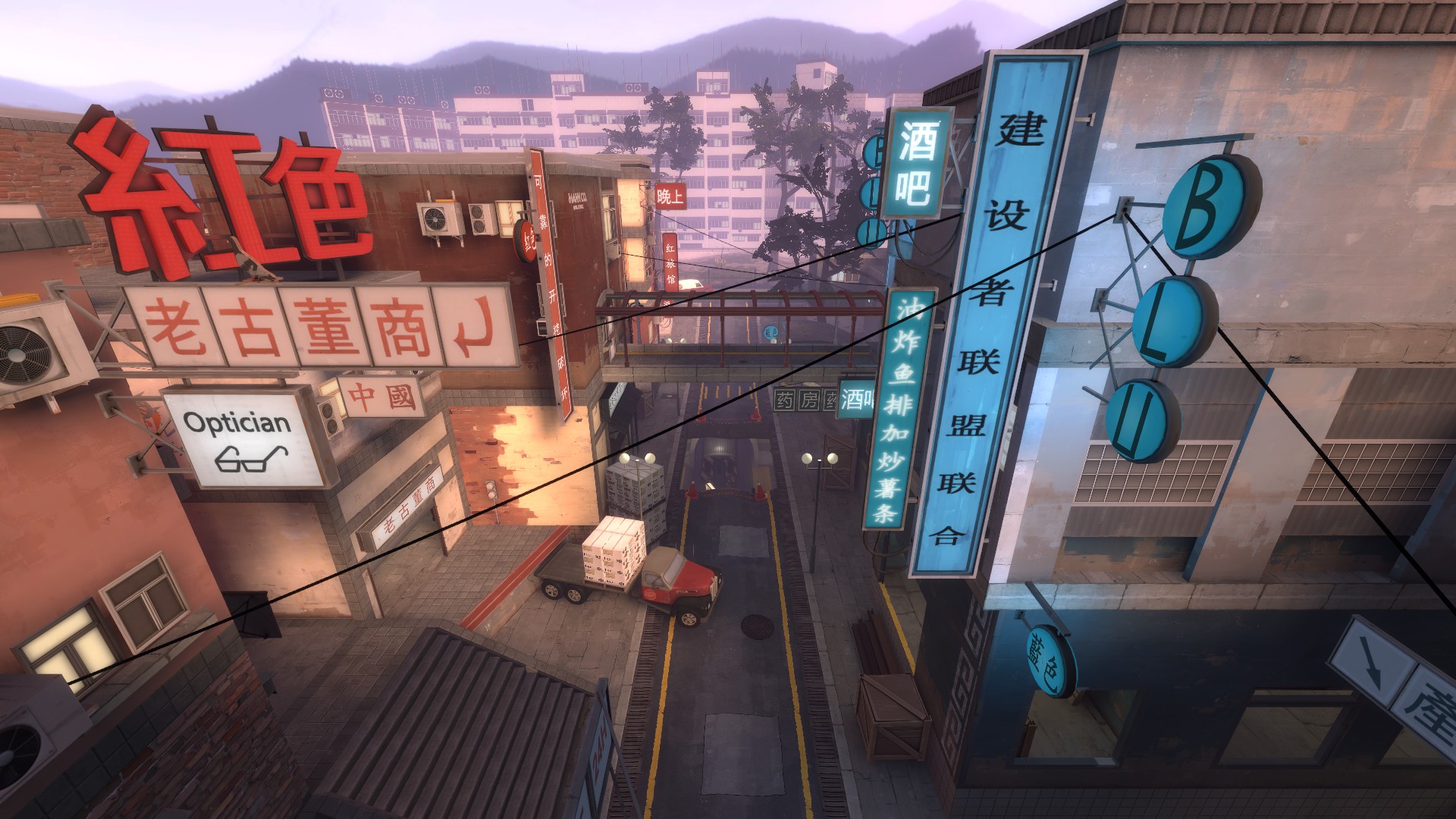
One thing that concerns me with this and any other map that's copying the Soho style: Do you know what all of the signs mean? Because they're not just random stuff; they were actually meant to match the kinds of buildings they were attached to in Kong King. The wiki lists off some of them, but not all, unfortunately. I'm just imagining someone who's fluent in Chinese playing this map and laughing that the convenience store has a sign that says "AUTO PARTS" or something on it. I'm just saying, you'd never be that casual about signs that are in English.

And this map in particular seems to have a lot of repetition, with the same sign appearing on several different buildings. If nothing else, that seems like it'd really stand out as being implausible even to people who don't know what they mean.
 

Yacan1

D I G I T A L I N F L U E N C E R
aa
Nov 7, 2010
411
793
I love the detail work, you nailed a day-time soho theme without using the large scale buildings in koth_king. I like the more rural feel to it too. Nice chinese overlays too, they appear to be gritty and worn which is cool. The little boxes and other products seem neat as well. Good work
 

Bakscratch

Finisher of Maps
aa
Oct 29, 2010
714
1,495
DONE.jpg

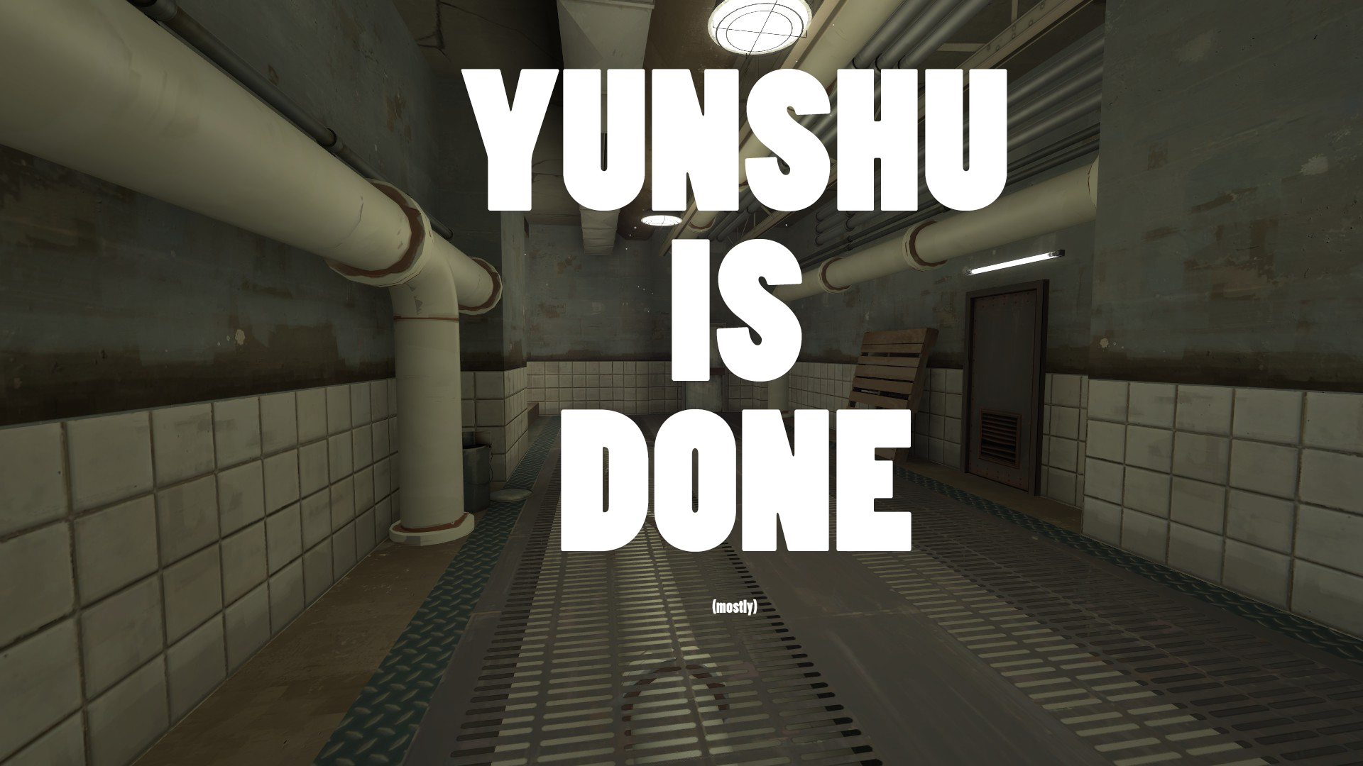
DONE, its up to a standard which I am very happy with. The entire map is now Detail, the only downside is the optimization which I may need help with. But other than that its there B3 will be out really soon!