WiP in WiP, post your screenshots!

Arhurt

L6: Sharp Member
May 7, 2008
315
140
OK, I know this kind of topics are annoying to some, but I kinda felt we needed one.

If you aren't ready to start a new topic yet, this is the place for you!

Any pictures are valid here, this is the WiP in WiP thread so we stop cluttering the forum with unfinished works


Feel free to post any pics of your work. Could be serious work or from a map you started on a grey sunday :)


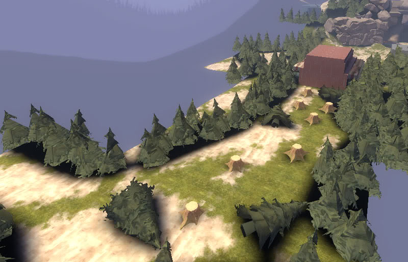
I'll start with a small experiment with displacements in a map to use my custom tree and foliage models, the birth of arena_jungle:
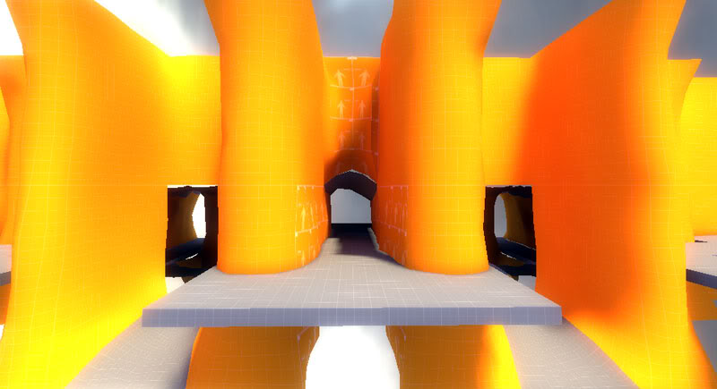
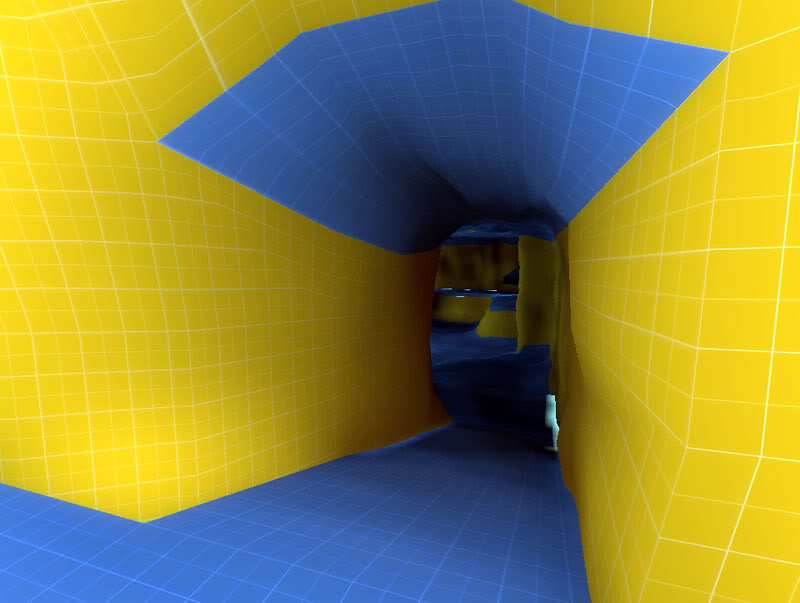
arena_jungle040000.jpg

arena_jungle040001.jpg

arena_jungle040002.jpg

arena_jungle040003.jpg


And don't mind the yellow texture, I used a batch automate action from photoshop that had an autolevels preset in the middle.
 

Arhurt

L6: Sharp Member
May 7, 2008
315
140
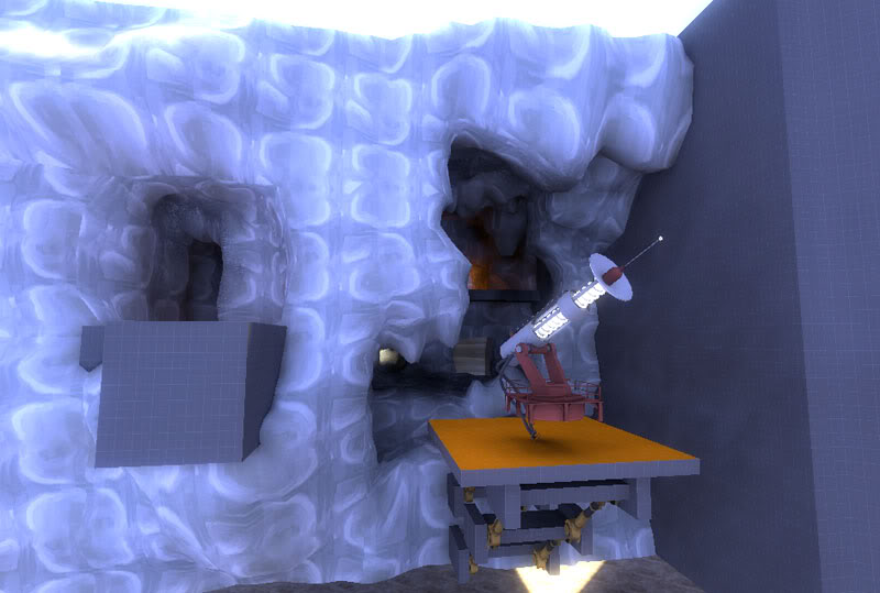
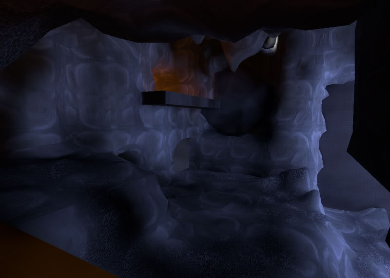
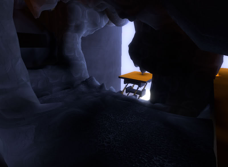
cp_mountainbase_040000.jpg

cp_mountainbase_040001.jpg

cp_mountainbase_040002.jpg

cp_mountainbase_040003.jpg

cp_mountainbase_040004.jpg


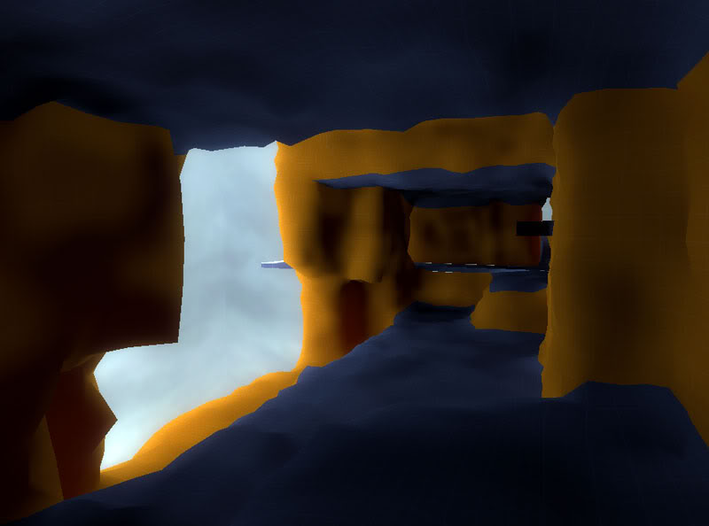
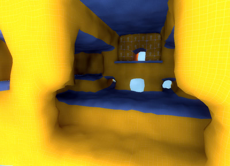
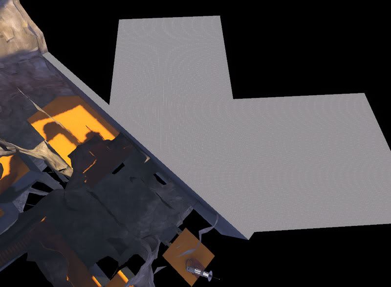
Just some Idea I thought would be cool, a major cave, since one of the best parts of ctf_aerospace was the cave on the early alphas and I am not going to change anything on the map until I have tested it some more.

The rock material needs a lot more work, and these quick render lights hurt the eyes, but hey, this is what this thread is all about right?


PS: C'mon post your sketches and experiments as well ;)
 

Username

L2: Junior Member
Aug 26, 2008
96
61
Is this really a jungle? I'd almost rather it was a moon base with a giant laser beam, a la Austin Powers. :D
 

YM

LVL100 YM
aa
Dec 5, 2007
7,158
6,079
Some of the very early stuff for tc_strata:
- http://www.flickr.com/photos/28746141@N08/2806631185/
- http://www.flickr.com/photos/28746141@N08/2806631179/

The fist makes sense in my head, thats all that matters, the latter is a little open but its the first time I compiled it and it wont be hard to change, theres alos a modification I intend to make that I haven't put in yet (mangy went and drew it nicely for me but I've not got the link to the image :()

The beginings of a texture for tc_strata (all feedback welcome!):
- http://www.flickr.com/photos/28746141@N08/2804652904/

Something I've been working on for the 'soccer' *ahem* football mod:
- http://www.flickr.com/photos/28746141@N08/2805210693/
- http://www.flickr.com/photos/28746141@N08/2805210691/
 
Last edited:

Shaar

L3: Junior Member<BR>toboruin
Aug 7, 2008
231
206

*<3*


Yeah, we needed a topic like this. People who just pop in and leave piss me off to no end, especially on topic with low posts. I can't really add more to that, as I dont have new screens to show >:/
 

Arhurt

L6: Sharp Member
May 7, 2008
315
140
Youme, I like the way that texture can go, but I think that there is too much noise at this time, it's hard to judge without a flat capture of it.

Vander that is looking really good, I'd like to see it evolving in a full map. Looks like something you would find in Ep3 translated into TF2fullness!
 

Arhurt

L6: Sharp Member
May 7, 2008
315
140
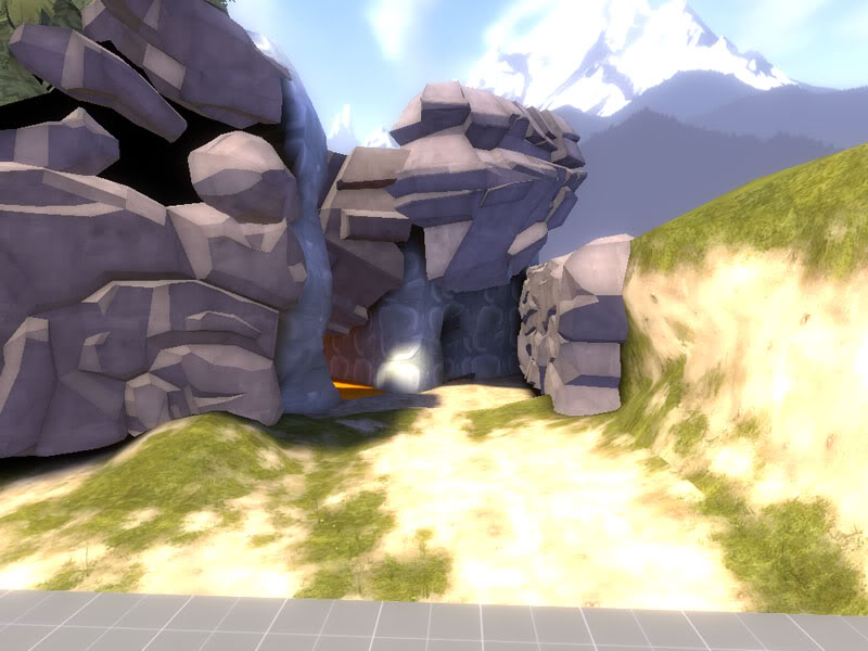
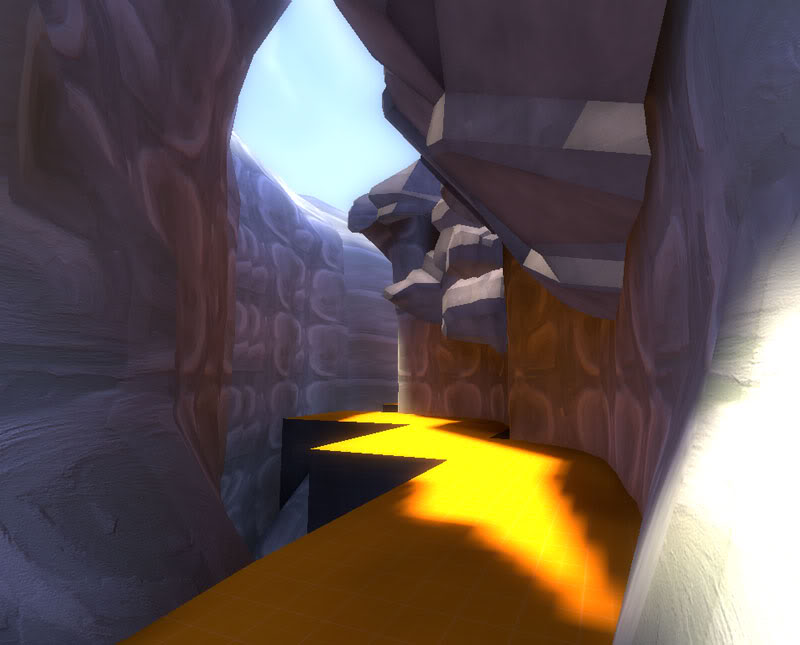
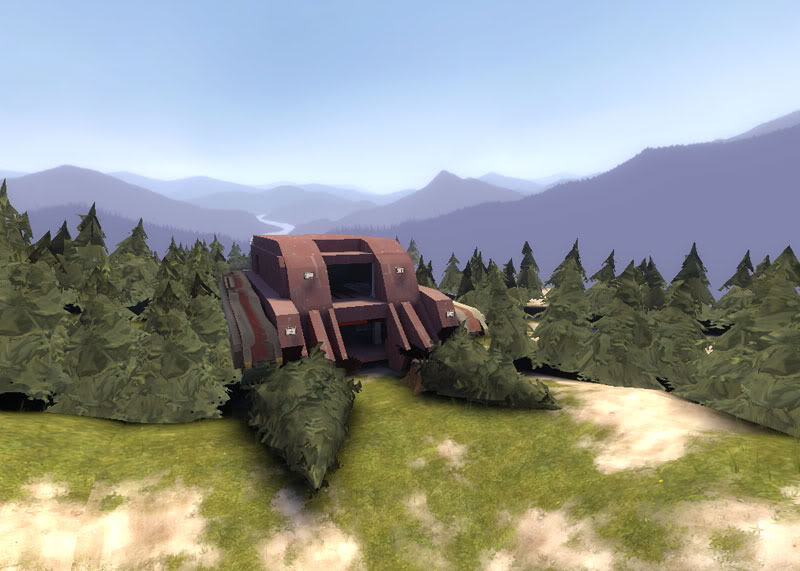
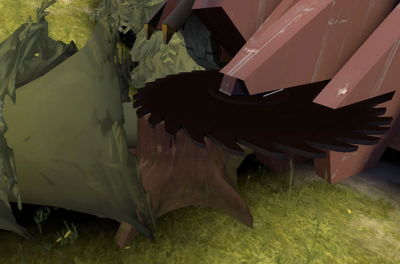
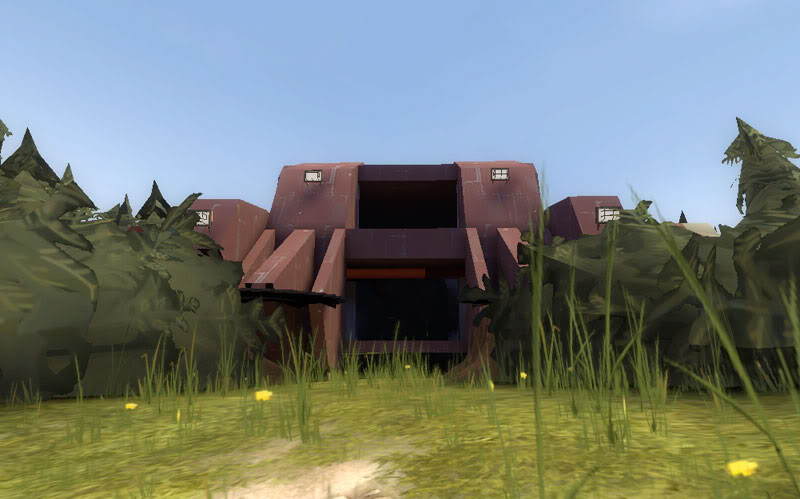
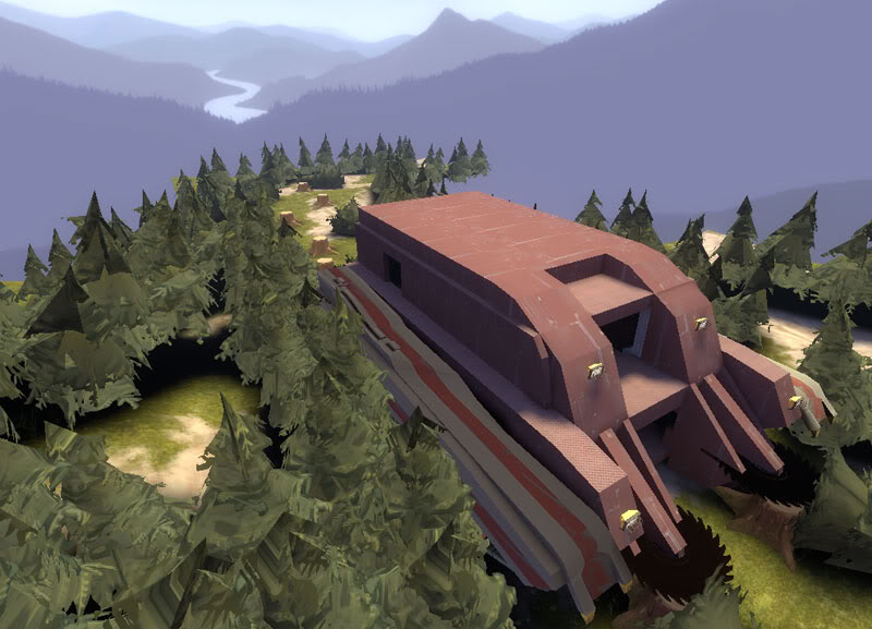
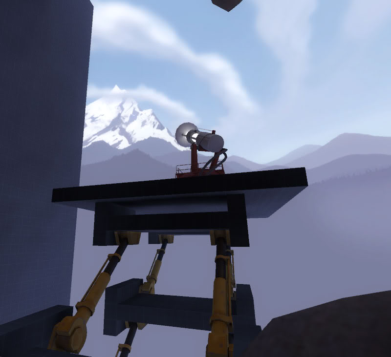
Anyway, here's the last update on this side project. I'll only come back to it after I'm done with ctf_aerospace or I may not complete any of them.

The idea is that the Blue team has a base on the mountains and is constructing a giant laser to melt the ice on the top of the mountains and flood the red team's base.

In response, the red team manufactures a tree-sawing tank and storm into the mountain to destroy the blue team's giant laser!

cp_mountainbase_040005.jpg

cp_mountainbase_040006.jpg

cp_mountainbase_040007.jpg

cp_mountainbase_040008.jpg

cp_mountainbase_040009.jpg

cp_mountainbase_040000.jpg

cp_mountainbase_040012.jpg


Level design-wise, the great challenge I'm going to have is that I have rotated the cave area by 45º to add a nice variation of shapes to the base. The inner base itself will be aligned to the hammer grid, but the cave and ouside areas will be rotated.

cp_mountainbase_040013.jpg
 

Gadget

aa
Mar 10, 2008
539
538
I really like those rocks and caves, Arhurt. The displacements need a little smoothing though, in my opinion. The story idea behind the forest scence is very nice.

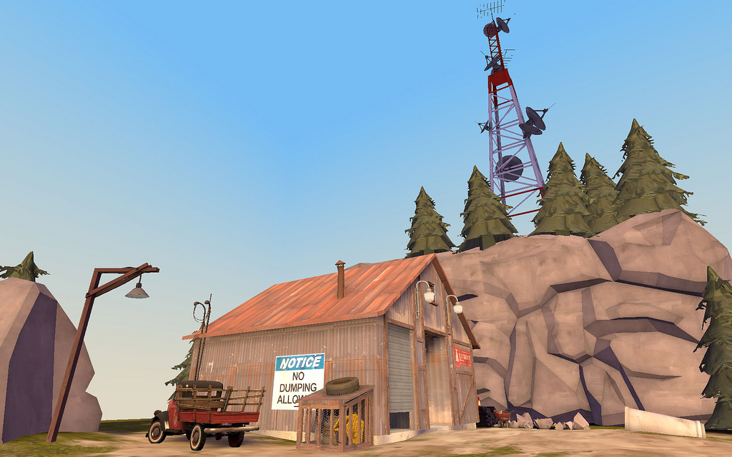
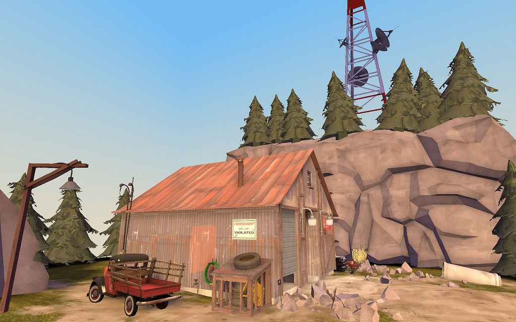
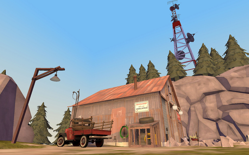
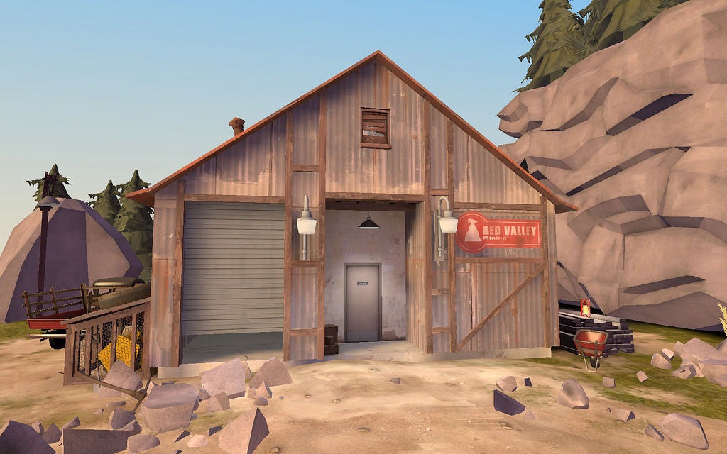
Vander, this scene looks pretty good. Here's some little things I'd like to mention. I would have placed those lamps at the height of the red sign, made the 'notice' sign a little smaller, made the roof half as thin and I would have aligned the textures differently (one of them seems a little scaled too big).

I'm really looking forward to more maps with the high quality of what has been posted so far.
 

Vander

L8: Fancy Shmancy Member
Feb 16, 2008
506
215
Vander, this scene looks pretty good. Here's some little things I'd like to mention. I would have placed those lamps at the height of the red sign, made the 'notice' sign a little smaller, made the roof half as thin and I would have aligned the textures differently (one of them seems a little scaled too big).

Thanks for the comments! I hadn't noticed that texture was a different size than the rest. Good catch. As for making the notice sign smaller...how do I change that? I didn't know I could resize overlays.

Also, what's a good thickness for roofs (rooves?) of this sort? I have the current one at a 4 height. Should I go 2?
 

Username

L2: Junior Member
Aug 26, 2008
96
61
Thanks for the comments! I hadn't noticed that texture was a different size than the rest. Good catch. As for making the notice sign smaller...how do I change that? I didn't know I could resize overlays.

Also, what's a good thickness for roofs (rooves?) of this sort? I have the current one at a 4 height. Should I go 2?

Well, to resize overlays, I use ctl+M.
 

Gadget

aa
Mar 10, 2008
539
538
Here's how I resize overlays: when in 3D view select the overlay and press X. This will give you transformation controls to move and scale anything within the 3D view. When done press X again (optional). Another way is to just scale them in one of the 2D views.

To me the roof looked like 8 units so I would have suggested 4. Try 2 units then and see if it's better.
 

Arhurt

L6: Sharp Member
May 7, 2008
315
140
I found a bunch of lovely drawn pictures on the net and decided to do a map with a complete new set of textures and props. This is going to be a lot of work but I'm sure it will turn out pretty well. It will be attack/defend style with three linear control points. Here's one of them as a little teaser:

cyprus.jpg

How could I miss this? :blink: Great concept, I´m looking forward to this!

Vander, just a nitpick, but trees don't usually grow on top of rock.

And yes the displacements need more subdivisions. I always start with a power of 2 and make it more detailed as needed.
 

Vander

L8: Fancy Shmancy Member
Feb 16, 2008
506
215
Fixed the bad texture size in the doorway. Added a few more props. Thinned the roof down to 4 (it WAS on 8! Good call GarbageMan!). As for trees growing out of rock...in my imagination, I see it as the top of a cliff up there, I just can't actually see the ground the trees are in because it's so high up.

2809391562_d40f4a268e_b.jpg

2808543037_0a67149002_b.jpg

2809391508_21484ccc1d_b.jpg


Shmitz, I feel your pain man. Sometimes I think visitors forget we have blogs here. Too bad they don't show up in the forums.

*EDIT* BTW, I can't get overlays to resize. If I adjust anything using the methods mentioned earlier in the thread, it simply cuts off part of the overlay, rather than actually scalling to a different size. Help!
 
Last edited:

Gadligg

L1: Registered
Aug 28, 2008
4
0
A map I started on yesterday, pl_meadow. Does anyone know how to get rid of the gun while taking screenshots?

plmeadow0001yc9.jpg


I wish my computer could handle AA.