Whiterock

CP Whiterock rc2

  • This map is featured! Our best maps, all together in one place for your viewing pleasure.

Freyja

aa
Jul 31, 2009
3,011
5,839

Keikoku is my entry into the 72h mapping winter classic contest, as well as the Major mapping contest #10 (Two skillsets).

Second place in the 72h 2014 winter classic.
First place in the first and second phase of the Major Mapping contest #10

It is a 2CP attack defend map in the upward theme, featuring deathpits, trains and mind controlling radio broadcast stations.

Download original 72h version.

Special Thanks:

Scarface for finding ridiculous exploits I never could have imagined.
Boojum Snark as always, for his pack.
Stevethepocket and Idolon for detail feedback
 
Last edited:

Freyja

aa
Jul 31, 2009
3,011
5,839
a2 released:


Changed the size of the health pack under A to make the risk of that path more worth it.
Changed the bridge in between A and blu spawn to be covered.
Changed the building between A and B to be larger with more holdable geometry.
Added more cover to B.
 

Freyja

aa
Jul 31, 2009
3,011
5,839
a3 released:

Added a staircase behind the medium health below B that leads up to the defender's deck.
Slowed down the train signifiantly and added another flatbead car.
Made train come less frequently.
Added a new area under A, changed health into large health and added large ammo, allows flanking behind sentry deck.
Increased the size of the sentry deck.
Added a balcony to the cliffside building between Spawn and A.
Added a small health to the cliffside building between spawn and A.
Repositioned red spawns to distribute players through other doors better.
Fixed a position red players could shoot into blue spawn.
Added a small box at B to aid in jumping onto the skybridge building.
 

Freyja

aa
Jul 31, 2009
3,011
5,839
After looking over this map today in hammer, I'm pretty confident with it.

It's not the greatest map, but it's fun and unique, and with the contest deadline just around the corner, and university back on, I think that's enough.

For a4, I have optimised it (areaportals in every door, hints and such) for anyone if they choose to detail it. There are a few small changes, but I don't imagine them to break the map and this will likely be the version I submit.

I leave no detailing advice to anyone, except that you may want to make sure the train fits the theme...The intention was upward theme of course, but I'd absolutely love to see what people can do with it. Good luck, any who take it up.

a4 released.

Changed staircase behind B so it leads up to the trestle, rather than red's spawn door. Red's spawn platform can still be reached by tricky jumping, but it is more costly and lengthy.
Did some optimisation.
Fixed the broken displacement.
Changed the windows on the skybridge flank to glass - they were the only open windows and players of both teams were surprised to find them open.
The doors for the train now no longer close on the train.
 

Freyja

aa
Jul 31, 2009
3,011
5,839
I have updated this post to reflect my submission to 2SS for detailing, as I continue to further develop this regardless of the results of the 2SS contest.
 

Pocket

Half a Lambert is better than one.
aa
Nov 14, 2009
4,701
2,583
Now that you've done that, I had some feedback about the detailing that was too technical or subjective for the voting thread.

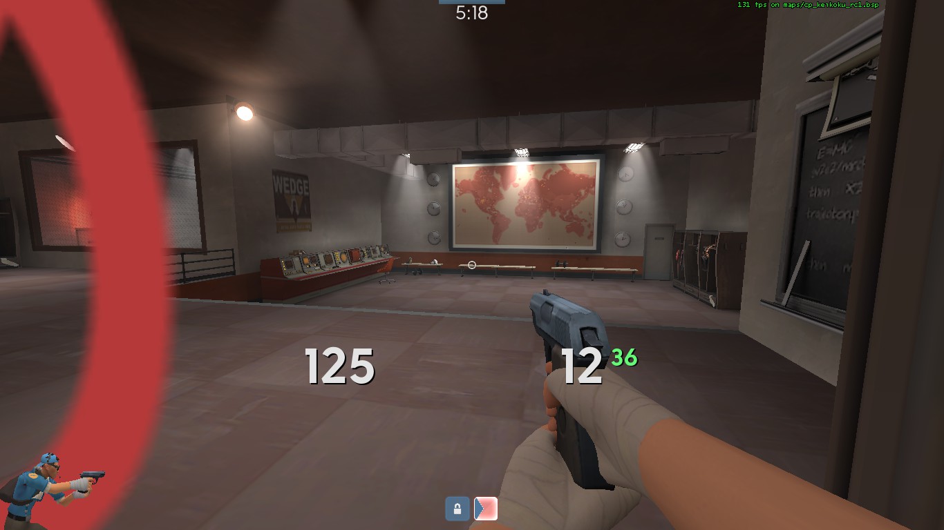
First up, the side effects of vertex lighting. There are several props that ought to have self-shadowing disabled. Mostly those wooden windows. Here are some:

8EB6446AAE4476D55DA21E080193CA39FDDF3DA8


In general doors and windows should have self-shadowing off. The ones with actual "glass" in them are fine since they're phong-shaded and thus exempt from vertex lighting anyway. Note also the misaligned textures on the edges of the roofs, which are also present elsewhere. In general I recommend giving this map a once-over all around to spot the offending roofs and windows. If I spot any remaining in the next beta, I'll try to point them out via feedback nodes.

7D7986EB0870E66D5ACCC3A18455500D633CEF6E


Barrels. Also the ones in RED's spawn.

D4B68616CDEB180BF525906174F4F839B5638286


A subtler example than most, but it's one that I did catch when I was flying around. The corrugated-metal awnings are the other main offender.

147AA3706CE1CC8FA6A9C8D61022236527E4C645


These clocks look like they ought to have vertex lighting disabled altogether. I'm not sure why the lighting on them is so stark and weird; nothing else in this room is lit improperly. Speaking of this screenshot and improper lighting, notice the funky wall lighting between the map and the clocks on the right. Looks like VBSP made some regrettable lightmap cuts on that wall. I don't know how to fix that, but I figured I'd point it out in case you did.

8882C11BD966588D5A7B176EC17166A14C607FC6


On the flip side of the coin, here's a prop that suffers from a lack of vertex lighting. This 3pipe ought to be split into two 64-unit ones so that the half on this floor gets lit correctly. (The bottom half is just fine, by the way. The lighting origin must be at the bottom edge.) I do like the continuity of having the same pipes stretch from one room to another, though. And speaking of continuity, I was disappointed that the same wasn't true of the ductwork inside spawn:

6DAE8839CD4D723E797AFDECF697E66916E6A650


The duct inside the out-of-bounds room connects to the wall of the in-bounds room and then just stops, even though there's another one just a meter away that it could continue into. The measurements look just about right too.

I'm going to save the other big thing I was going to say for another post, since it's unrelated and more of a suggestion than actual feedback.
 

ics

http://ics-base.net
aa
Jun 17, 2010
841
543
Good looking map, going to test this out on my gameservers. Little sad about about it only having one stage and there doesn't seem too many entities being used atm, so could you consider adding another stage?
 

Freyja

aa
Jul 31, 2009
3,011
5,839
The map was designed as single stage, because singlestage is better in my opinion. It wouldn't even make comprehensive sense to add any more stages. And what do you mean not many entities used. That's good.
 
Last edited:

ics

http://ics-base.net
aa
Jun 17, 2010
841
543
I only ment that there would be space for more entities to do a second stage. But i've ran this on my server now and listened what the players had to say about it. The last CP is kind of hard to get on to and the map is very large. Not too much health on left side of the map, except on RED side. Difficult to get into as BLU. No one seems to be using the left side route much and the pathways under the last RED cp are sort of poitless, as no one seemed to use them either. Other than that, i heard no complaints. Still, feels kind of short map to me.
 

Zed

Certified Most Crunk™
aa
Aug 7, 2014
1,241
1,025
MnlcNWk.jpg


Blu players can open this door.
 
Dec 28, 2014
330
307
Did you remove this map from the map workshop for some reason? I was writing an email to the TF2 team recommending custom maps for the next campaign, I wanted to recommend this map but it seems like it's gone from the workshop.
 

Dr Gore

L1: Registered
Dec 12, 2015
2
0
Did you remove this map from the map workshop for some reason? I was writing an email to the TF2 team recommending custom maps for the next campaign, I wanted to recommend this map but it seems like it's gone from the workshop.
I also can't seem to find it on the workshop, and would really like it to be on there as I know it's a bit more well known how to get a map off of the workshop then on here
also I seem to be having some trouble running it on my server? I simply hit the download button and moved the map it downloaded too the maps folder on my server, so that there was "cp_keikoku_rc1.bsp.bz2" under the maps folder, I must have messed something up as it's not running, just unsure of what, terribly sorry, and thank you for your for your time
 

Zed

Certified Most Crunk™
aa
Aug 7, 2014
1,241
1,025
You released a keikoku rc2, right?
 

Zed

Certified Most Crunk™
aa
Aug 7, 2014
1,241
1,025
"Sideward"
 

Zed

Certified Most Crunk™
aa
Aug 7, 2014
1,241
1,025
I think that it's just much more difficult for the average player to remember.

Also it's Japanese so people have no clue how it's pronounced.