You are using an out of date browser. It may not display this or other websites correctly.
You should upgrade or use an alternative browser.
You should upgrade or use an alternative browser.
I don't like your stage 2. Here's why:
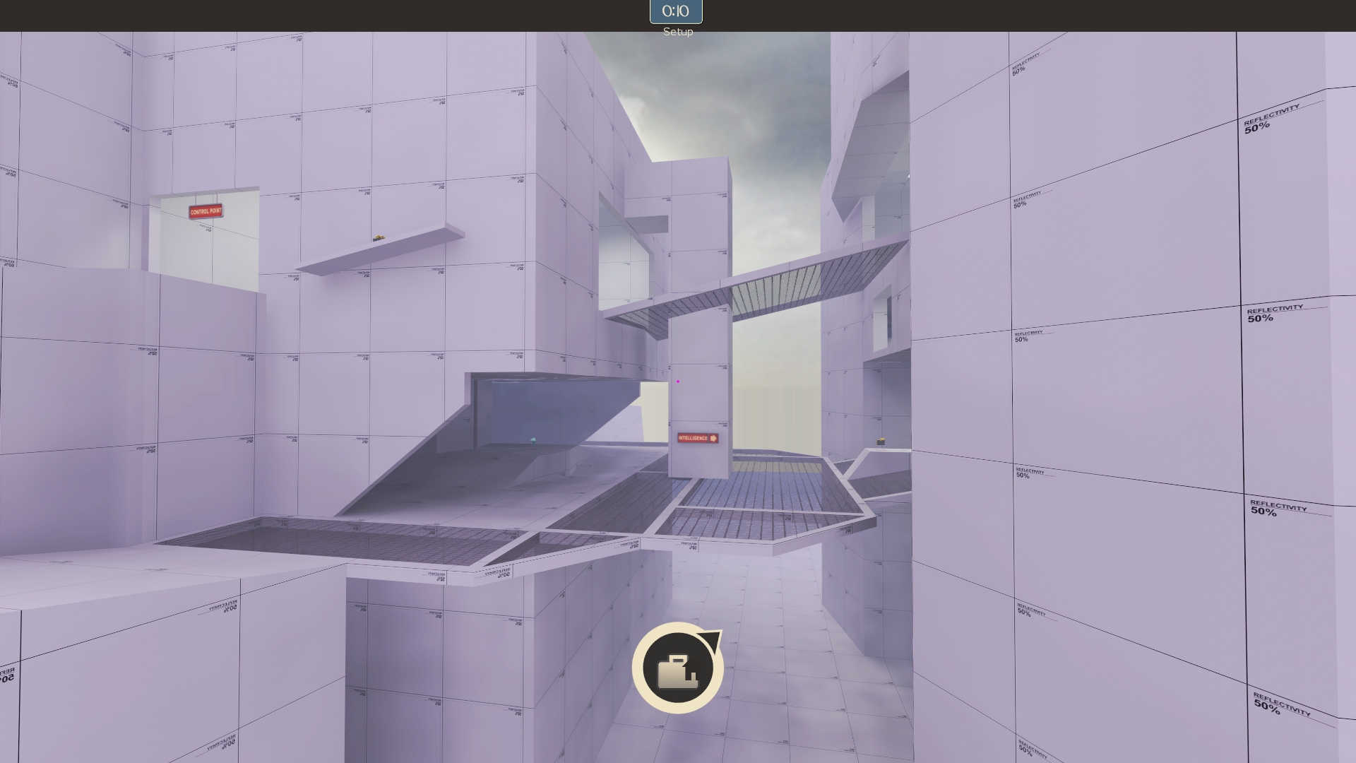
The first thing I notice is I'm rendering your whole map at once.
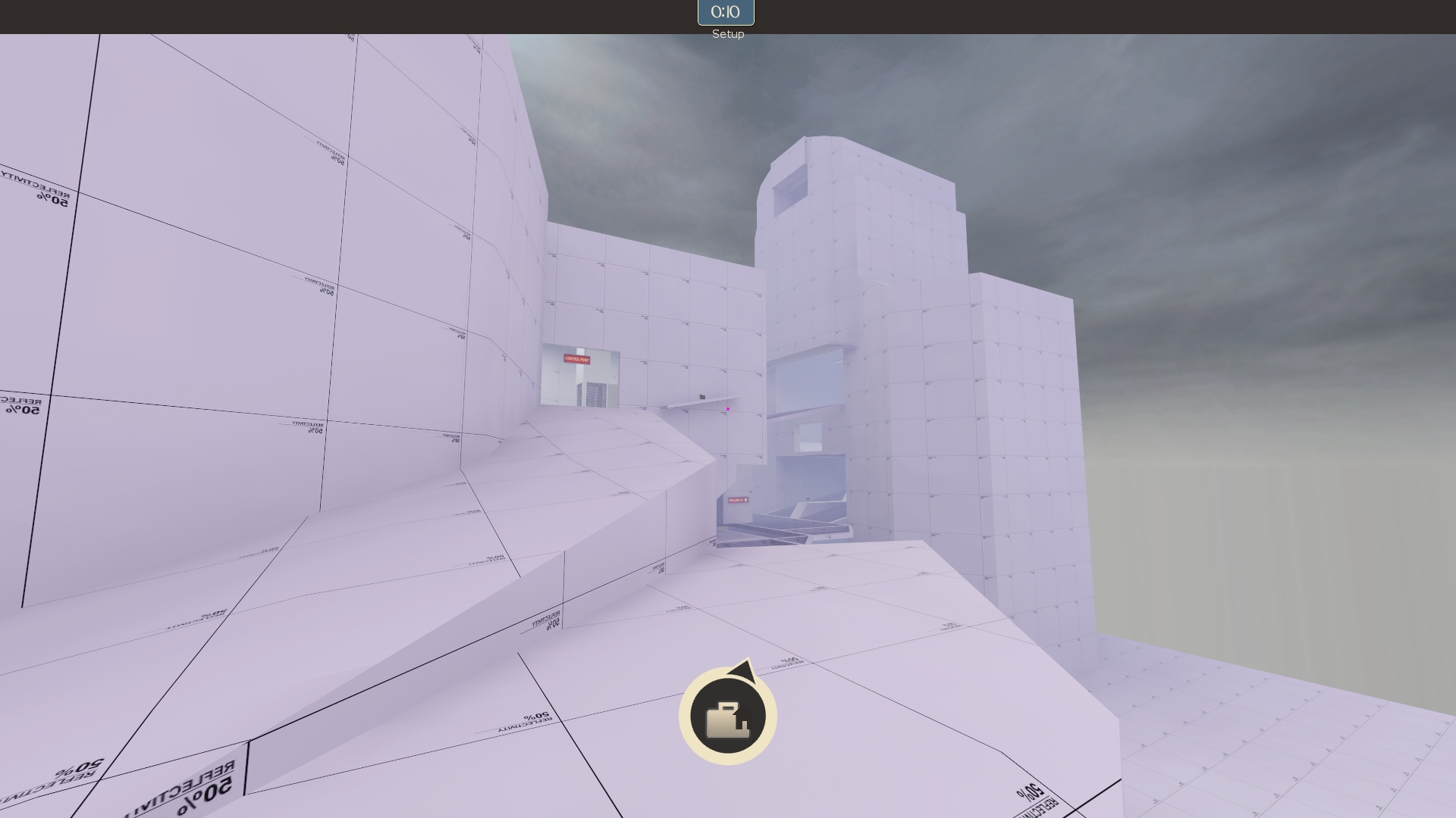
From this spot I can see 2 of the 3 paths from the intel to the point (the one I can't see is the other spawn area). I can also watch the point area a little. That's a lot of visibility, and it being arena only makes it profoundly worse. Not to mention it's all death pit everywhere around it. By the way, I'm a few feet down one of the paths here, and I can only just start to read the signs. I need more indication of where I'm going before I dedicate myself to the route, especially when they're so visibly different.
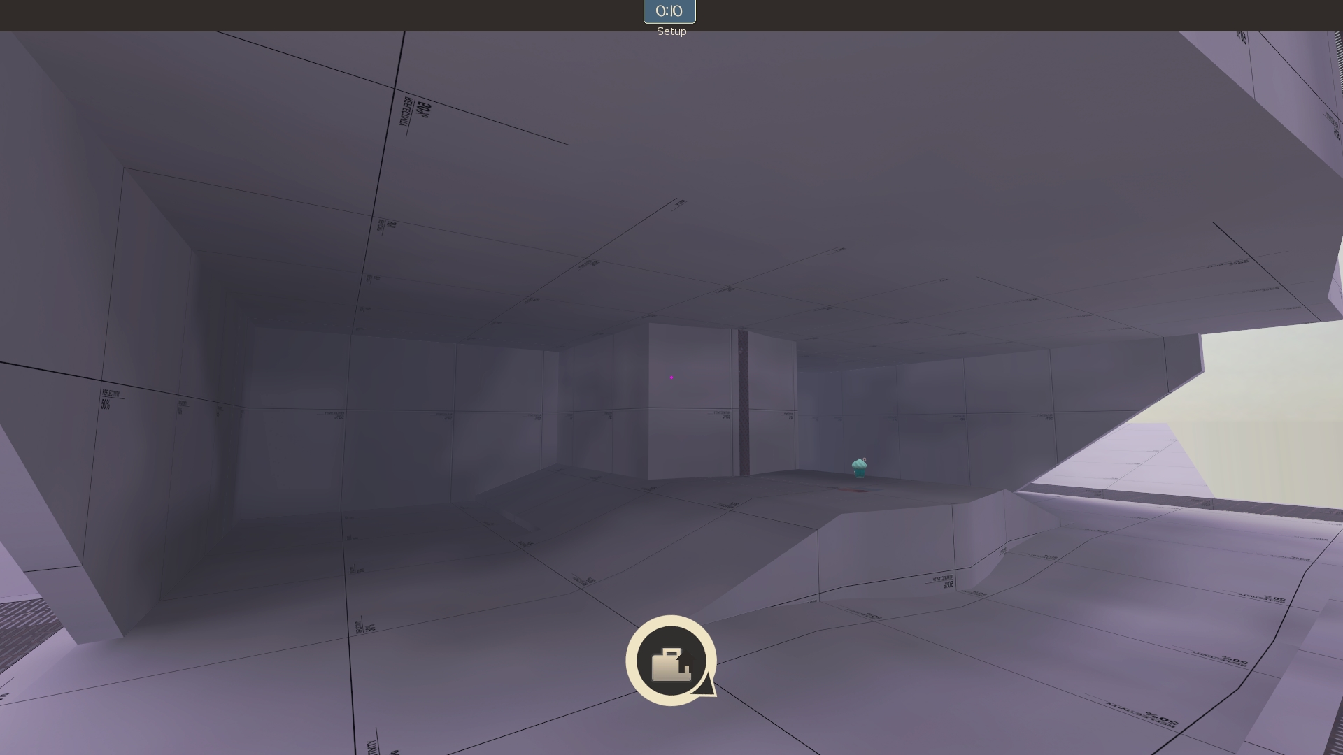
Your lower area is kind of completely useless. I kept expecting something to be back here, somewhere, but I was killed before I was able to explore it every time because the teams meet so quickly. It was 4v4 or something so who knows, but I think I'd still have expected something to be here on a full server. I just don't know why it exists if not.
I actually don't know why the lower area exists as it does... it's so disconnected from the rest of the map and strategically worthless to boot. I kept thinking the flag spawned down there, for a few reasons. The first reason is you only have one sign on the lower area and it points here:
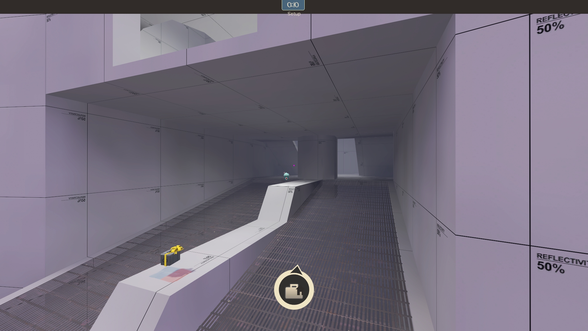
I kept dying when I got here, too, so I didn't know this was wrong for a while. But the interesting geometry and the fact that I knew the control point was above and behind me made me think the flag was behind that pillar, or that the pillar would descend and the flag would be there. Also, the HUD arrow actually points right to that pillar because there's no way for the arrow to show players if the flag is above or below them--so I didn't have any indication that the flag wasn't right there!
The main reason, though, is that this whole lower area is so remote and useless that I was assuming you had made it important by putting the flag down here too, but you didn't. It's just a big empty platform and stairs to the flag.
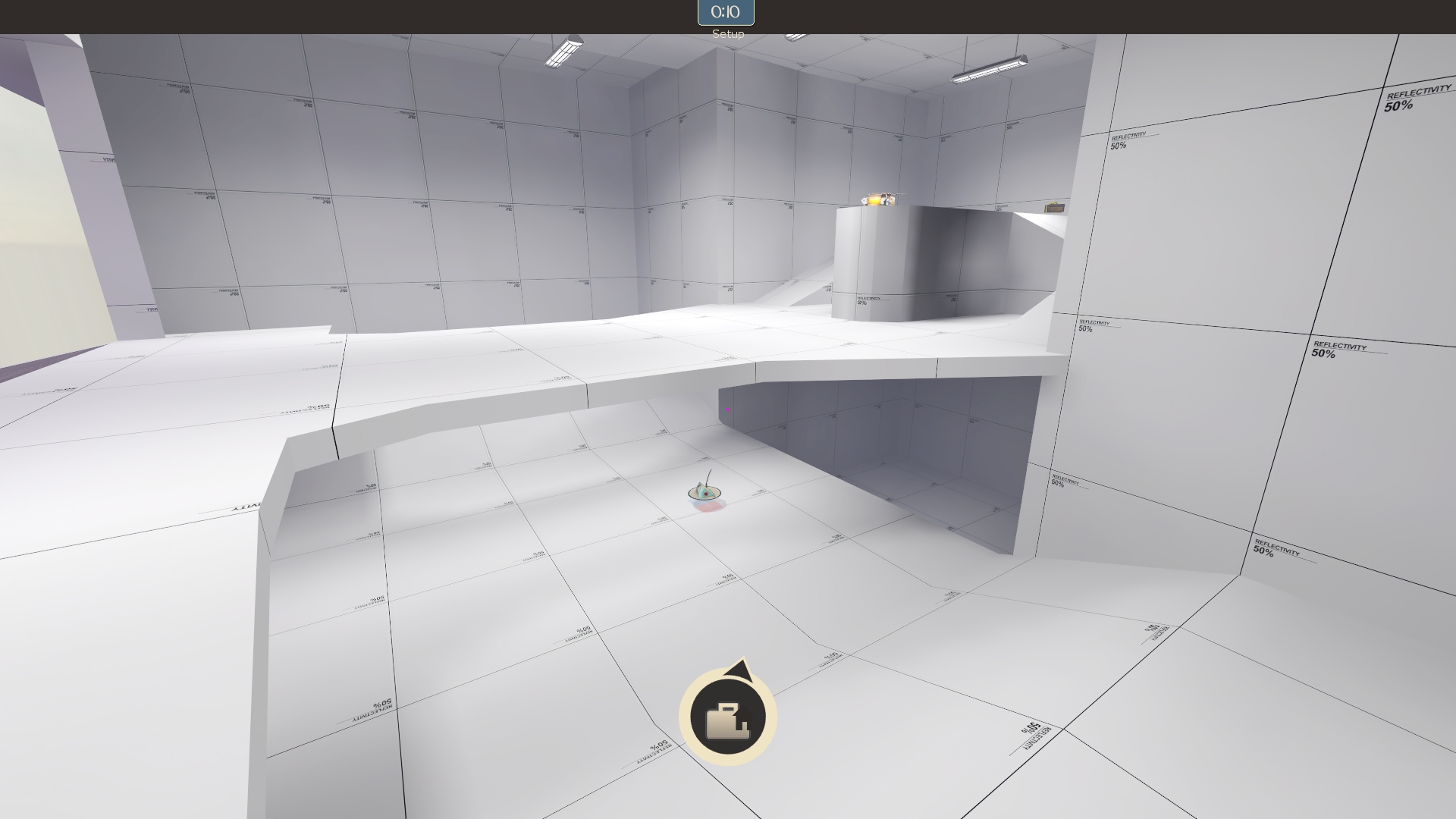
The stairs seem like a miserable flank, especially when defenders have a medium health and ammo (in arena! with respawns!) right there to help them camp. They can watch you come in and you won't be able to get close to them for a long time. I'm not sure if that beats attacking the flag room from the cap room, which looks really easily spammed out and only has the single, open, uphill, coverless route there.
This whole lower half of your map... it's not useless, but only because it's providing overflow routes for players. As a play area, with nothing of value in it, it probably shouldn't be this big or you should make it more useful.
I'd say just put stairs to the cap room there. Maybe raise it all a bit so your stairs can be shorter and getting between the two levels doesn't feel so arduous. I think you should put either the flag or the cap on the bottom floor, and they should probably be diagonally across from each other (viewed from the side) with routes of similar distance to the point. Bend the mountain paths from a C shape into a V shape so players can only snipe the bridges from the corner bend (if at all), preferably near where the point building is, and not all the way from spawn. That's going to help your VVIS issues also. And please use team colored dev textures. If you don't like the walls of red and blue, just put some stripes in.
None of this is about gameplay. It's just observations on flow, map readability, etc. Hopefully I can give you some gameplay feedback shortly.
The first thing I notice is I'm rendering your whole map at once.

From this spot I can see 2 of the 3 paths from the intel to the point (the one I can't see is the other spawn area). I can also watch the point area a little. That's a lot of visibility, and it being arena only makes it profoundly worse. Not to mention it's all death pit everywhere around it. By the way, I'm a few feet down one of the paths here, and I can only just start to read the signs. I need more indication of where I'm going before I dedicate myself to the route, especially when they're so visibly different.

Your lower area is kind of completely useless. I kept expecting something to be back here, somewhere, but I was killed before I was able to explore it every time because the teams meet so quickly. It was 4v4 or something so who knows, but I think I'd still have expected something to be here on a full server. I just don't know why it exists if not.
I actually don't know why the lower area exists as it does... it's so disconnected from the rest of the map and strategically worthless to boot. I kept thinking the flag spawned down there, for a few reasons. The first reason is you only have one sign on the lower area and it points here:

I kept dying when I got here, too, so I didn't know this was wrong for a while. But the interesting geometry and the fact that I knew the control point was above and behind me made me think the flag was behind that pillar, or that the pillar would descend and the flag would be there. Also, the HUD arrow actually points right to that pillar because there's no way for the arrow to show players if the flag is above or below them--so I didn't have any indication that the flag wasn't right there!
The main reason, though, is that this whole lower area is so remote and useless that I was assuming you had made it important by putting the flag down here too, but you didn't. It's just a big empty platform and stairs to the flag.

The stairs seem like a miserable flank, especially when defenders have a medium health and ammo (in arena! with respawns!) right there to help them camp. They can watch you come in and you won't be able to get close to them for a long time. I'm not sure if that beats attacking the flag room from the cap room, which looks really easily spammed out and only has the single, open, uphill, coverless route there.

This whole lower half of your map... it's not useless, but only because it's providing overflow routes for players. As a play area, with nothing of value in it, it probably shouldn't be this big or you should make it more useful.
I'd say just put stairs to the cap room there. Maybe raise it all a bit so your stairs can be shorter and getting between the two levels doesn't feel so arduous. I think you should put either the flag or the cap on the bottom floor, and they should probably be diagonally across from each other (viewed from the side) with routes of similar distance to the point. Bend the mountain paths from a C shape into a V shape so players can only snipe the bridges from the corner bend (if at all), preferably near where the point building is, and not all the way from spawn. That's going to help your VVIS issues also. And please use team colored dev textures. If you don't like the walls of red and blue, just put some stripes in.
None of this is about gameplay. It's just observations on flow, map readability, etc. Hopefully I can give you some gameplay feedback shortly.
Last edited:
Apoligies for the not so frequent updates. My computer decided to go boom (litterally) so i am out of service for at least another 3 days. Too bad too, because i fixed almost everything in Tylers post and more. Heres to hoping my hard drive wasn't hit.
In the meantime i sketched up some detailed layouts for possible stage 3s, yet they are a lot safer in terms of layout.
In the meantime i sketched up some detailed layouts for possible stage 3s, yet they are a lot safer in terms of layout.
Last edited:
Stage 2 A4
Download
Download
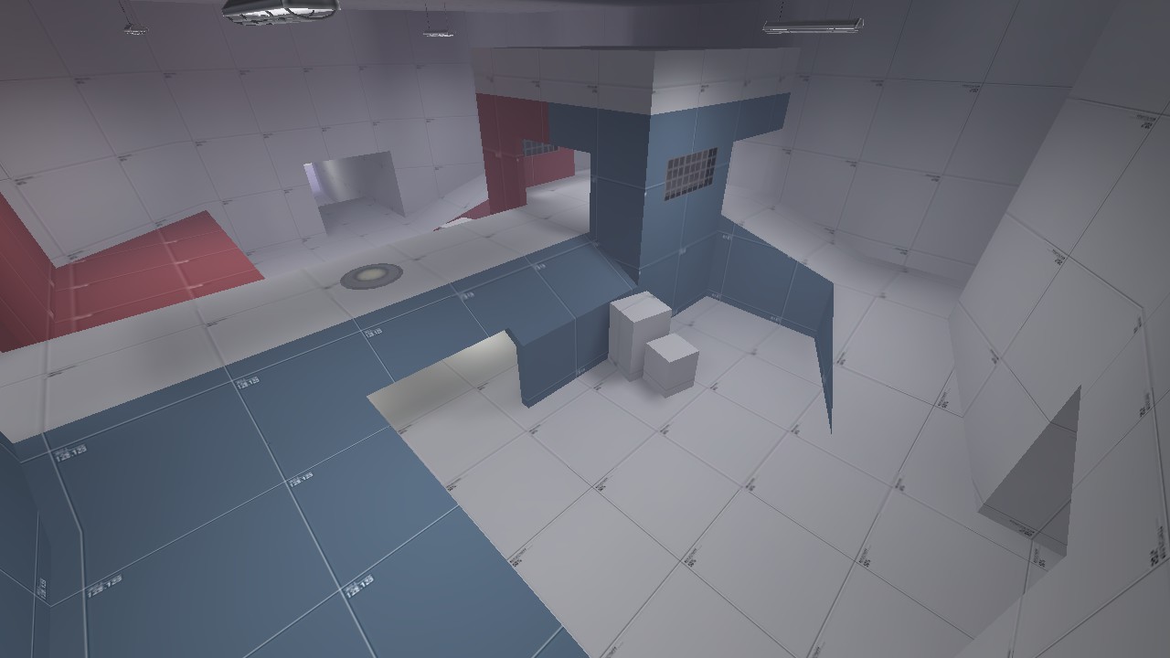
- Added a whole new area to the inside of the mountain.
- Added due to complaints that the map was too small and fights where too short.
- Due to this new area, I have moved the Australium Capture zone into the mountain. This should make it more difficult that previously.
- Added team colours to the structures.
- Changed "Intelligence" signs to "Australium" ones.
- Big optimization pass.
- Added bulletblock to the bridge that was allowing splash damage to pass through it.
- Changed the side route at mid so other classes can use it.
- Added pillars to the bottom area.
- Done because this area was very flat and open.
- Added signs at the spawn that indicate where the capture point and Australium are.
- Moved spawn closer to the mid slightly.

- Sep 5, 2009
- 912
- 684
Large amount was changed in the layout; Australium pickup location and capture area moved farther apart.
Read the rest of this update entry...
Read the rest of this update entry...
So after the gameday, any extended thoughts on the map? People said that the map was fun, but the gamemode didn't work because the only team that capped it would be the winning one, and that was definitely the case. Would last man standing mechanics help this out or not?


