Underground

MVM Underground RC3 v2

Woozlez

L3: Member
Jul 28, 2010
129
287
MVM Underground RC1
Level design, Optimization, and Skybox by Joe 'Woozlez' P

Go play on Potato's Servers!
http://steamcommunity.com/groups/potatoservers

~Narrative~

Remember back when we met the director, and he was brutally murdered by Miss Pauling and thrown down a mineshaft? And then a bit later we learned all about the history of Coaltown and its historic mine that was supposedly destroyed? And then in Bigrock, you got a taste of what might be a huge cavernous system? Have you heard all these talks of Coal and Gold and Australium but wondered why only the surface was ever cracked?

Now, what if I told you that every single one of those mines was made of a huge underground system? That’s right, this humongous mine stretches underneath the entire Badlands! And the robots are here to destroy it all! Protect one of the last standing mining facilities underneath the Badlands against the robot menace in MVM_Underground.

No decompiling this map in any form, for any reason unless you have Woozlez's express permission.

NAV AND POP FILES NOW INCLUDED IN ZIP.

Version log:

a2:
  • Implemented 4 randomized routes
  • Added two new spawns
  • Added navigation flank on the right side of the map
  • Fixed all of the waves, and added some custom bots

a3:
  • Changed pop file to an advanced mission
  • Funneled all paths through central building
  • Implemented more Decoy and Coaltown themed buildings
  • Improved lighting

a4:
  • Changed pop file to a mannworks-like mission
  • Compiled with better lighting
  • Added ridge on right side path, underneath overpass
  • While one side of the map is being used, bots do not go on the other side any more.

b1:
  • Totally custom pop file created
  • Custom boss added
  • Fixed tons of minor visual issues
  • Optimized map using hint brushes
  • Reduced number of models, removing any that didn't add much to the map
  • Reduced number of artificial lights in order to help with optimization

b2:
  • Basically over 100 minor edits suggested by people over the course of 8 or more playtests
  • An overall 10 fps increase due to the addition of hint brushes to block off visualization of much of the map
  • Much updating of the advanced mission, with the addition of a new wave

b3:
  • Everything works now, as in all flanking works properly in the pop file, and engineers appear and go to everywhere they're supposed to.
  • The only differences between b3 and Release Candidate now are going to be a slight adjustment to two buildings, the addition of cave sounds, advanced lighting compile, quicklist photo, and more custom icons. Release Candidate will be done by the end of November, based on current schedule.

b4:
Adjustment to buildings made. Adjustment to flanking paths made.

b5:
Fixed nav_avoid issue, improved lighting

RC1:
Everything is wonderful
 
Last edited:

RubbishyUser

L7: Fancy Member
Feb 17, 2013
414
488
This level's really beautiful in macro, but there are a few miniature features that you really need to clean up before you call it a day, just from what I can see in the screenshots.

Now what I'm gonna write will be extremely nit-picky and harsh, but it's only because all of this stuff stands out when you have such a great backdrop, and I bring this stuff up because in a large, detailed map, it can be real easy to miss the small details unless someone picks it over for you.

First: The barrel lighting seems to be fullbright. Dunno how that happens.
Second: Not a fan of those wood planks going across the displacement bridge underneath the Mann. Mining Facility sign. Given the shape of the ground, they would not spread the load and stop it from subsiding, and besides they have weird shadows on them. Euugh.

Also, I'm worried about the structure above the bomb hole. What is holding it up? If the rock above is so strong and hard that you can hang what I presume is a mineshaft from the surface on it, then how on earth did they manage to drill through it? That has to be bedrock strength! Secondly, how on earth could just the bottom half be ripped out? as in, what occurs to make that happen? It looks good, but it's just impossible. A sinkhole would make far more sense and is actually possible.

Third: The stairway leading up from the grinder only has one side to the supports to hold the stairway in place. Compare to the stairways outside of spawn.

Fourth: Now I may be wrong based upon the angle, but I think the walkway above the track needs a support. You might have gotten away with it if this was a concrete base, but wood isn't nearly as strong for it's weight. Compare to the giant-ass buttresses for the smaller structure above next to the pipeline. (Which, incidentally, has a lighting error).

Fifth: What's going on with that wall on the left hand side? Am I supposed to see into there? It almost looks like a nodraw. Also, I'd personally like it if the bunker on the right had a dividing wood in the middle of that window. Again, concrete might've been able to pull it off, but not wood.

Sixth: Nice try. Seriously, I'm totally getting the vibe of coal pile spilling out on to the ground. But the "lumps" of coal in the pile are totally a different colour to the lumps on the ground.

Final thing I'm worried about is how well tested this map is. Have we seen this map before on a different thread with a different name? Who did you test it with? Did you contact Harribo and get any tf2maps testing? It can be difficult to arrange this stuff with MvM maps, but it's also hard to innately understand how difficult it should be. Don't want to detail too badly when you discover the whole first area is a super easy choke. At a guess, I think this map could be tough for pyros with very little space to knock the bomb back. Which reminds me, we need the little ground indicators.

But once again: beautiful and originally themed map. But I know you need constructive criticism, not compliments. Or maybe this is unconstructive criticism, and I'm just jealous of the number of thanks you got on the WIP thread when you posted these screens. :p
 

Woozlez

L3: Member
Jul 28, 2010
129
287
Fixes:
First: Reduced an ambient spotlight to reduce barrel lighting.

Second: Removed wood planks. (I had just added those, wanted to see how it looked rendered, I don't like it either.) Will change structure above point to be more like HL2EP2 Mine structures (Example: http://i.imgur.com/RzdT0xx.jpg?1 )

Third: Supports were on there, just had to move it like 8 hammer units for them to show up, and they're attached to the rock wall.

Fourth: Added supports: http://puu.sh/8MkKN.jpg

Fifth: That's one of the few buildings I haven't finished. There's will be a doorway through that wall, and the mine carts will be inside the building itself. Shortened bunker window and added supports: http://puu.sh/8MlcQ.jpg

Sixth: Changed to ground version of coal: http://puu.sh/8MkQG.jpg

Other: Only has been tested with my friends so far, still getting the coding of the waves down. The indicators aren't there in compiled map, but are there in editor. Made up for no bridge pushback (Like Decoy or Bigrock with their bridges you can blast them off of) by adding grinder at end. I'm imagining frantic airblasting between two pyros, trying to dunk them in there. Otherwise, there's:

First: Pushing them off when they climb up at the beginning
Second: Pushing them from the left side towards the center
Third: Pushing them into the pit
Fourth: Pushing them into the dead end under the walkway
Fifth: Pushing them off the leftside upper area is a huge plus

EDIT: The sinkhole has begun: http://puu.sh/8MoyV.jpg
 
Last edited:

Woozlez

L3: Member
Jul 28, 2010
129
287
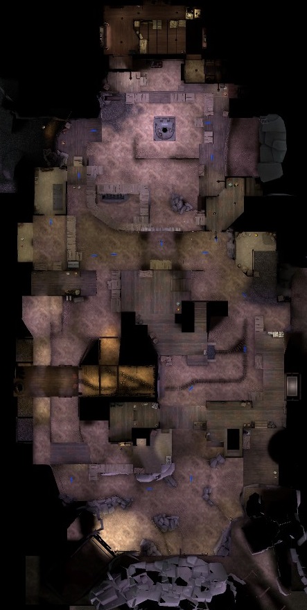
Level overview!

5lTZ2VL.jpg
 

Lenny

L2: Junior Member
May 2, 2013
90
35
... I wonder what things we could record on heatmaps that would benefit MvM mappers.

A place where players often die would be a start.
 

Woozlez

L3: Member
Jul 28, 2010
129
287
The bsp is packed with the proper skybox, the navigation for the bots is generated, and the pop file is created.

mvm_underground is now ready for a game day!
 

UKCS-Alias

Mann vs Machine... or... Mapper vs Meta?
aa
Sep 8, 2008
1,264
817
This is the feedback i can remember from the map:
  • To me the waves had a weird skillcurve. wave 1 to 3 seemed fine for normal, but then it became harder and felt more like intermediate. But then at the end it went straight back to normal.
  • Bots only use 1 path, this is simply the shortest path to the hatch. If you have more paths there must be a system like most maps that will tell them which side to go
  • Near the banana deathpit in the window bots got stuck. you could make it more open so they can walk under it, or fully lock it down. But as alternative you could also use a respawnroom visualizer set to the red spawn so the players can walk through but the bots see it as a closed area (yet still know they can shoot through it)
  • Wave 6 had a bug in the popfile
  • Wave 2 felt too boring by not having the huntsman near the tank. I would suggest splitting the tank to 2 parts. 1 tank before/during the huntsman, 1 tank that spawns once all huntsman have spawned (note, spawned and not dead). Further just make the huntsman a hard number and not as support.
  • SMG snipers give a crappy sound when they come in. That smg makes cracking sounds when used in large numbers. The same also happens with conch soldiers where the horn gets too loud. Be carefull when to use them because of those reasons.
  • Both spawndoors had the same name making them perform quite bad and allow players to get stuck
  • The wall at the gate side has some thin layer of gravel on top of it which simply looks weird. Using the normal rock texture would do better there
  • Some bot spawns appeared broken from the server console spam.
  • Although it didnt prove a problem for us i wouldnt be suprised if normal players get fooled by this: that tank path can also spawn normal enemies. When near the normal entrance on the lower ground that part is often a blind zone. Some indication would be welcome to know they also spawn there. See it as if on bigrock the bots also would spawn in that tank path. They would catch you by surprise.
  • There are a few square flat rock walls that look odd and a gravel pile thats too smooth.
  • Just to inform: It felt like the map had 2 lines of defense on the left. That front line and the left top flank in that S turn they make. Although there could be more, those are the ones i noticed to be most effective. This could be important information to balance the right side later on.
  • Lacks good visual landmarks for the players to see where they are
I liked the map though. A bit confusing at first due to the many paths though, and even at the end of the test i wasnt fully aware of all the pathing. But that could be that landmark issue.
 

Woozlez

L3: Member
Jul 28, 2010
129
287
Corrections done because of feedback:


  • Evened out difficulty to intermediate level
  • Added 4 separate paths, fixed a spawn location, and added a whole new spawn up above on the overpass, allowing for the robots to sneakily flank back to the base.
  • Window properly shortened, so that the robots will not enter the banana deathpit window.
  • Heavy shotgun template corrected so that the wave 6 bug is removed.
  • 2 tanks, spies, and huntsman snipers coming from all spawns in wave 2
  • SMG Snipers and concheror soldier spawn times increased, spawn numbers at one time reduced
  • Spawn door names changed to be different
  • Gravel at frontlines changed to rock
  • Bot spawns fixed, some spawn entities were placed where they couldn't recognize being able to spawn
  • Enemies were spawning from the tunnel because they couldn't find another place to spawn, due to their spawn entities being placed in an unusable position. They should no longer spawn from there.
  • Square rock wall is now rounder and gravel is rockier.

Otherwise, I'm hoping to make more visual landmarks via mine-specific models and overlays. Could use some suggestions for lore and what props might be good to add in certain places. There's an especially empty cave wall above the mining tunnel entrance that could use some prop and detailing ideas. Same thing with spawn, where there is an unfinished detailing area.

Thank you for the feedback to everyone who played!
 

Woozlez

L3: Member
Jul 28, 2010
129
287
I'd just like to share this with everyone. I played a round of a2 with this really great group of guys who volunteered to host the map and give tons of feedback on it. Here's what user C9H13NO3 shared with me:


So for this first round of feedback, I'm focusing on the map's terrain features. Making the waves balanced and interesting can come later, getting terrain that is fun to fight in and allows each class to contribute is the first order of business.

Each bot route will have 2-4 "battlefields". A battlefield is essentially the area in front of a corner that the heavy, pyro & sentry gun can use to anchor the team. I'll go through the key battlefields that make this map.

1) The right route, front lines

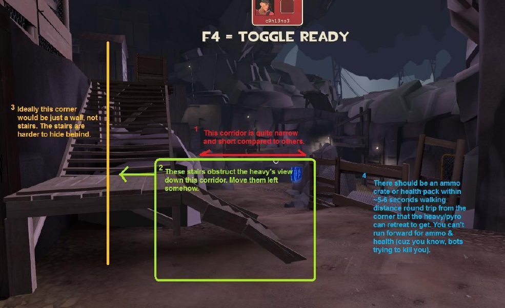
The "heavy/pyro corner" of this battle field is by the stairs, screenshot below with feedback. I've elaborated on some of the feedback if needed.


1 - The corridor is a little narrow, which makes money collecting as a spy hard, and it makes it very difficult for shorties (non-giant robots) to do anything. Widening this would allow hordes of shorties to have a fighting chance.

HqmqDhn.jpg


3 - Ideally this corner would be a wall. Maybe you could move the stairs behind the wall somehow?

4 - The ammo is a little far from this point. It doesn't have to be right on top of it. I can be good to force players into choosing "Do I leave my sentry exposed and run for the ammo? or do I hide it behind a corner and then grab ammo?". But you should at least have the ammo close enough where it's a choice.

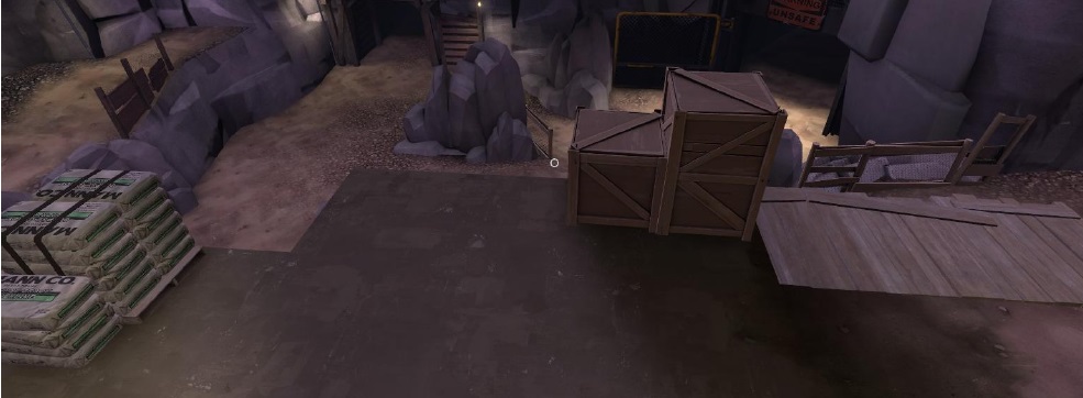
HQCuXex.jpg


As you can see, those crates are right in the way of where you want to shoot.

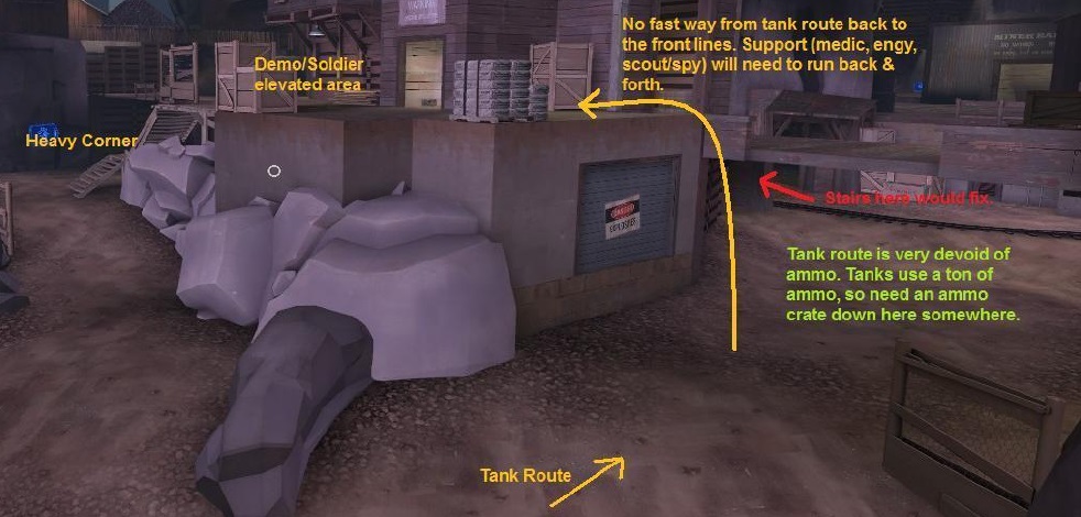
bML9XpZ.jpg


We talked about adding stairs, ammo would help too. Also an ammo crate down in the pit area where the bots spawn would probably be required in order for spy to function. Running back up to the heavy corner to get ammo for the dead ringer every time isn't going to work.


1) The left route, front lines

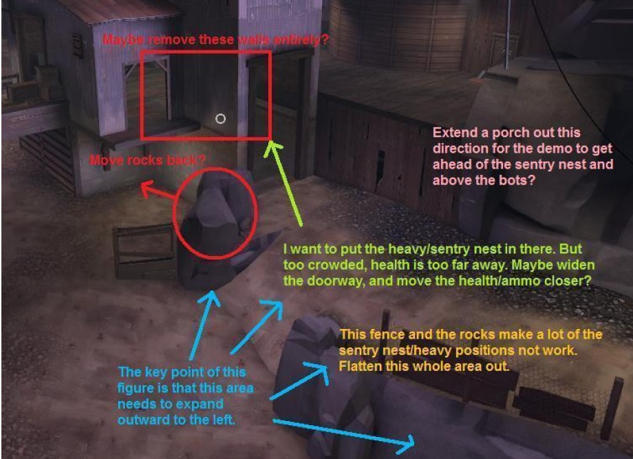
The left front, top route doesn't have a great sentry nest/heavy spot. There needs to be more room on this part of the map. It's actually kinda cramped, which is ironic given how expansive this map is.

NyKpOFd.jpg


These changes would make it more open. Also, there's no good way for a demo to get ahead of the sentry nest, because the battlefield here is too cramped. Think about the front lines of all the MvM maps, they're all big enough for the demo/spy/sniper to do their jobs before the bots overrun the sentry nest and the heavy.


A quick word on the waves:

1) Tanks are too hard, the bots are too easy.

2) The waves are very 1 dimensional. You shoot the bots, they die, you win. Good waves require more strategy. For example, on expert coaltown, in wave 6, they send giant medic'd heavies with super scouts at the same time. This requires your team to deal with the scouts while addressing the giant medics. It requires splitting the team up into groups to deal with each problem. Tanks are the easy way to do this, since they require splitting the team up to deal with them.
 

UKCS-Alias

Mann vs Machine... or... Mapper vs Meta?
aa
Sep 8, 2008
1,264
817
1) Tanks are too hard, the bots are too easy.
To note on his ammo comment. Note that on each map with a tank 2 players can constantly get to a large ammo pack near that path (or 2 medium ones). This means 2 people barely will run out of ammo.

This means that its best to focus ammo on the tank path. Too close isnt allways good - note that on coaltown on the side you have 1 ammopack in the middle with a longer walk and 1 on the side path on a longer walk aswel. Both are large though but the walk times compensate on them. That tank only has 3 ammo packs that are very close:
The first small shack on the side where you can get inside.
Near the pit when the tank goes down on the ramp. On the bot side there is 1 pack, and on the player side there is 1 aswel. And if you are behind the tank there is also 1 near the haystack the tank drives by. Thats how to have your ammo placed.
The worst thing to die to on tanks is by running out of ammo. It will only bring hate to the engy which simply (due to all the players taking ammo) cant even build a dispenser that fast unless they spend a canteen (which they then also can complain about). In the frontlines lack of ammo is less of an issue since the dispenser would be near usualy.
2) The waves are very 1 dimensional. You shoot the bots, they die, you win. Good waves require more strategy. For example, on expert coaltown, in wave 6, they send giant medic'd heavies with super scouts at the same time. This requires your team to deal with the scouts while addressing the giant medics. It requires splitting the team up into groups to deal with each problem. Tanks are the easy way to do this, since they require splitting the team up to deal with them.
Note though that the paths still decide on how effective it is.

But your issue i think would be the spawn of the bots itself. In all valve maps bots have 2 decent spawn exits or are instantly getting an open area once they left it (coaltown and bigrock). While in the meantime all spawns are very well visible.
In your case there you only have a good view on 1 spawn at once, and both are bottlenecked. I think the fences on both side of their main spawn exit are the problem. 1 side should have been open so the players are also pushed back a bit. And for that i would recommend the wall between the regular spawn and tank spawn. This would fix 2 thigns:
The spawn would be less of a bottleneck and the ideal camp spot that used to be too strong is instantly countered aswel.
You have a good view on the entire bot spawn rather than just 1 exit.

I also would split the tank and bot spawn inside that same area since to me it barely makes sense (but that also could be because none of the valve map actualy did that and i need to get used to that).
 

Potato Uno

L1: Registered
Jun 14, 2014
17
9
Compy (SandyD admin) and I have played on your map (both a1 and a2) and we have had some bad experiences with it thus far. To summarize, here is my score on the map (I won't speak for Compy on this one):

Map design: 10/10 (beautiful job)
Nav design: 5/10 (has some game-breaking issues)
Pop file design: 1/10 (.....)

Overall Score: 16 / 30 (5.33 / 10)

Now let's break this down:

Map design:

I don't need to comment. This is a beautifully made map and has a lot of eye candy. Kudos to you on this part.

Nav design:

The bots get stuck in quite a few places, hindering gameplay a lot. You seem to have fixed the issue where bots get stuck near the banana pit, but there are two other places they got stuck. One place they got stuck at was at the giant drop point in front of the pit (the giant shed that has a ledge where if you fall down you are right in front of the player spawn). Another issue was a giant heavy got stuck at the right side of the map underneath a wooden ledge. Lastly, the bots try to jump over the fence and straight to the bomb hole when the bomb goes down the left path (this was a problem in a1 - haven't personally seen it in a2 but it may still be there), instead of going down the stairs. Bots spend like 10 seconds trying to jump over the fence, making it a cheap camping spot for players. I have screenshots of a few of these (if you want more exact details) issues, but won't post them here (this page takes forever to load as-is with the other screenshots). I definitely like the improvement of the bots spawning from up top rather than at the tank entrance, so that is a plus.

Pop design:

This issue was so horrifically bad that Compy and I downgraded back down to a1 for this reason only, despite the much more worse nav in a1. The reason why I gave you a 1 here is because you actually made some pop file, but otherwise it would be a 0. The pop file was downright terrible. Like someone has mentioned, the difficulty spikes and crashes at each wave randomly. Wave 2 is like expert mode and wave 5 is normal mode (I don't remember the exact numbers, but one wave has 2x 60K HP tanks and the next one a few waves later had mostly punching heavies).

60,000 HP tanks are not something that you can just slap right into a map to make it harder. If you even have looked at how Valve makes difficult missions correctly (with mostly monotonically increasing difficulty), they only drop 60,000 HP tanks on BIGROCK (which is a huge map) at the 2nd to last wave (when players have already collected about $7000, if they did the money collection mostly correctly). You on the other hand decided to drop in 2 tanks of 60,000 HP each (let alone 1), about 1 minute within each other, when players only have about $1500 collected, in wave 2. Well now the mission is impossible, which is why we pulled a2 out of our servers.

Unless the players have $10,000 starting cash, there is no way they can ever pass wave 2. Seeing how we have done every advanced mvm (and a few, although not with a perfect streak) valve expert missions with just 4 people alone (yes, only 4 people - phlog, spy, engineer, soldier/sniper/demo), we do not suck at mvm. Ergo, this mission is downright impossible to the average mvm team. In this case, even with $30,000 cash, we barely smashed those two tanks and the bots on time with 2 all-time crit maxed beggar's bazooka soldiers. Valve also dropped the 60,000 HP tank near the end of bigrock adv1 and on the biggest Valve map in TF2 - your map is probably about 2/3 the size of bigrock and you dropped 2 of those tanks at the beginning (the opposite of what Valve did). I'm not sure what you were thinking when you were doing that.

There were some good parts about the mission, and we actually liked the SMG snipers so we were sad they were removed. However, overall, this pop file was poorly designed and is better off being completely scrapped and started over from the very top. The fact that at least a1 was beatable is the reason why we ignored a2. It was mostly 50% good, 50% complete garbage (the pop file). One of the waves (wave 3 I think) also broke for us midway, so we had to use the console to jump to the next wave.

----------

So overall, to make this map pretty much perfect, the pop file needs to be completely rewritten with a proper difficulty curve (don't even dare to salvage parts of your old pop file - start over completely), and the nav needs some minor fixing. You can probably find one of the very many eager mission makers out there to help you write a solid pop file for your map if you don't want to rewrite your current one. Keep the difficulty at normal mode. Yes, some mvm veterans and pros like myself will be bored with normal mode. However, do note that pro mvm players are an extreme minority of TF2 (probably 1% from my estimate from mann up & boot camp experiences). And a majority of them live entirely in mann up mode, so the number of pros who even look at custom maps is even lower.

Catering to a request of the minority to make a hard mission will be repulsive to the majority who can't even beat intermediate mode, since they will just ragequit from the map if they can't get past a wave. Keep it simple, keep it fun. If the pros want a hard mission, they can probably write one themselves or ask a mission maker to write one for them for your map. Let them deal with their own pro-related problems - you focus on the majority who will be playing your map. (A majority of mvm players in boot camp reside in normal mode anyway, with about 2% (20 / 1100) being in advanced or higher, and over 70% of that 2% are not even suitable for advanced from my boot camp experiences.)

Those are my 2 cents on this map. Good luck! Looking forward to a3.