- Nov 12, 2007
- 1,128
- 746
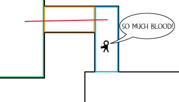
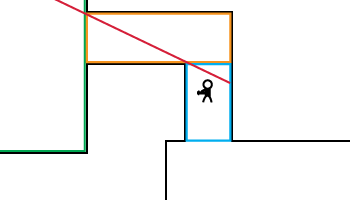
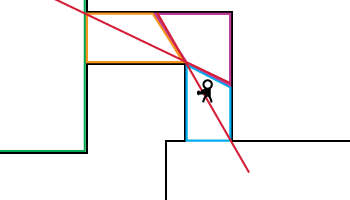
This tutorial aims to be a guide to basic visibility control using the structure of your map. Visibility is what players are able to see from any given location, and thus what the game has to render.
Visleaves
While an in-depth understanding is not needed for this guide, it helps to know how the game uses these invisible regions to determine visibility. Let's assume you are standing in visleaf A. If any point in A can see into visleaf B, everything in B is considered visible, and is rendered. The exact spot you're standing is less important than the general area in which you are standing.
Layout: Small vs. Large
Inside a building or other small area, you'll probably have rooms that look something like this:
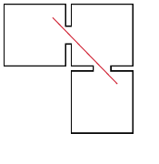
Notice the red line representing visibility, and how every room can see every other room. That's probably fine, because in a small indoor area, it's likely that there's not going to be enough detail or enough players running around to cause any performance issues. However, let's pretend those three squares aren't rooms inside a building, but distinct areas of action of a much larger scale. There may be buildings, boulders, cliffs, bridges, and other objects in those areas that provide a framework for the action, but for the most part it's an open space where you can easily see everything in that area. Now when we look at that red line we see a situation where three very busy, complex areas can all see each other, and so are all being rendered at the same time. That's bad news for most computers.
Hallways
So, maybe if the areas aren't quite so big or quite so complex, we can get away with using hallways/tunnels instead of doorways, like this:
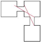
Now we see that the left area can't see the bottom area and vice versa. They each can only see the middle. However, standing in the middle you can still see both, so there's still the potential for performance problems. So instead of just making the connections longer, we want to bend them a bit to play with that line of visibility.
The most basic way is using a 90 degree turn, like this:
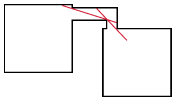
That only works if your areas aren't directly in line with each other though. Another common way is a zig zag:
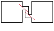
The third basic form is a switchback, which is the most twisty turny but is also practically a guarantee that your two areas won't be able to see each other:
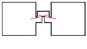
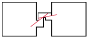
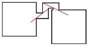
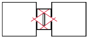
Of course, it's not the exact form of the tunnel that is the important thing, but the way the corners and walls prevent sight between areas. As long as you can't squeeze a straight line through from one area to the next, you can modify, mix, and match as you like. Here are a few examples:
Not enough space!
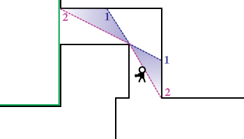
Sometimes there's just not enough room to give your hallway the right proportions to block visibility completely. Many times though you can place the hallway such that only a corner of the other area can be seen from the first area. Once you determine what's visible, you can then use a pyramid shaped hint to section off that small corner, like this (hint in blue):
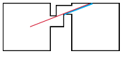
If you're in the left area, you'll only be rendering a small amount of the right area. If you're in the right area, there's only a small section where you will be rendering both areas. You can further improve performance by using an areaportal in the hallway, if possible.
Benefits
The benefit of carefully controlling player visibility is not just in-game performance. By using the map's structure to limit visibility from one significant area to another, you can also drastically decrease vis compile time, because you're decreasing the complexity of the bsp tree.
Creativity
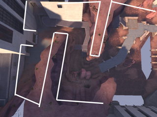
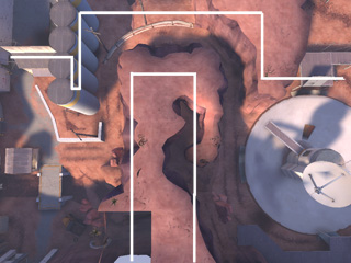
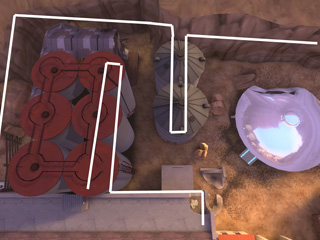
Don't let the above diagrams make you think that you need to have small tunnels or hallways between every area, however. Use your imagination, and take advantage of facades to make a vis blocking wall seem like part of the detail. Here are some examples:
Visleaves
While an in-depth understanding is not needed for this guide, it helps to know how the game uses these invisible regions to determine visibility. Let's assume you are standing in visleaf A. If any point in A can see into visleaf B, everything in B is considered visible, and is rendered. The exact spot you're standing is less important than the general area in which you are standing.
Layout: Small vs. Large
Inside a building or other small area, you'll probably have rooms that look something like this:

Notice the red line representing visibility, and how every room can see every other room. That's probably fine, because in a small indoor area, it's likely that there's not going to be enough detail or enough players running around to cause any performance issues. However, let's pretend those three squares aren't rooms inside a building, but distinct areas of action of a much larger scale. There may be buildings, boulders, cliffs, bridges, and other objects in those areas that provide a framework for the action, but for the most part it's an open space where you can easily see everything in that area. Now when we look at that red line we see a situation where three very busy, complex areas can all see each other, and so are all being rendered at the same time. That's bad news for most computers.
Hallways
So, maybe if the areas aren't quite so big or quite so complex, we can get away with using hallways/tunnels instead of doorways, like this:

Now we see that the left area can't see the bottom area and vice versa. They each can only see the middle. However, standing in the middle you can still see both, so there's still the potential for performance problems. So instead of just making the connections longer, we want to bend them a bit to play with that line of visibility.
The most basic way is using a 90 degree turn, like this:

That only works if your areas aren't directly in line with each other though. Another common way is a zig zag:

The third basic form is a switchback, which is the most twisty turny but is also practically a guarantee that your two areas won't be able to see each other:

Of course, it's not the exact form of the tunnel that is the important thing, but the way the corners and walls prevent sight between areas. As long as you can't squeeze a straight line through from one area to the next, you can modify, mix, and match as you like. Here are a few examples:


Not enough space!
Sometimes there's just not enough room to give your hallway the right proportions to block visibility completely. Many times though you can place the hallway such that only a corner of the other area can be seen from the first area. Once you determine what's visible, you can then use a pyramid shaped hint to section off that small corner, like this (hint in blue):

If you're in the left area, you'll only be rendering a small amount of the right area. If you're in the right area, there's only a small section where you will be rendering both areas. You can further improve performance by using an areaportal in the hallway, if possible.
Benefits
The benefit of carefully controlling player visibility is not just in-game performance. By using the map's structure to limit visibility from one significant area to another, you can also drastically decrease vis compile time, because you're decreasing the complexity of the bsp tree.
Creativity
Don't let the above diagrams make you think that you need to have small tunnels or hallways between every area, however. Use your imagination, and take advantage of facades to make a vis blocking wall seem like part of the detail. Here are some examples:


Last edited:

