The new UI is awful. I can only think of three improvements.
Just to mention a few of the bad things:
1. The Games list. It has been heavily categorised for no reason at all. I don't want to browse all games in a list which could hold three times more games in one page, or have a list of all my games as text instead of the small 15x15 icons. It takes more time to reach the game you want. The previous collapse/expand system was alot more user-friendly, as well as a better tool for easy categorization without adding more buttons. I'd really like to have a classic view option. Another thing about the game list, is the accessibility, which I will mention next.
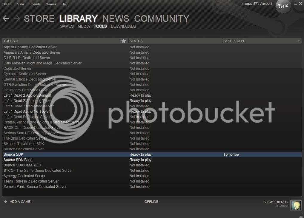
2. The categorization. Bunching together Games, Media, Tools and Downloads in another category forces the user to click more times than needed and combining that with the categorization of the games list, makes it even more unintuitive to get to it.
Right now you have to go through many more processes to reach the game you want.
Open Steam -> Library -> Games -> Scroll around to find the game you want -> Launch it
Whereas the previous layout was more straightforward:
Open Steam -> Games -> Launch it
3. Loads of unused space everywhere. The header and the footer of the main panel and the chat panel are just examples of added space. The text in the header of the main page is especially unnecessarily large. Having smaller icons both looks better and is easier to navigate through. And as a person who often multitasks, the compactness of the chat window and other panels is really important when you want to have chat windows compactly placed on the other monitor while doing something else.
4. The scanlines and gradients. They both contribute to unnecessary clutter in the background, where you shouldn't be focusing. The background should be as simple as possible, preferably a single color.
5. The store interface. The main advertisement on the main store page is now heavily cluttered as both the description and the price tag sits right on top of the picture. The image of the game becomes rather messy and you can't really get an overview of the whole picture since 25.5% of the image is overlapped by info that should go elsewhere. The horizontal scrollbar underneath the main game window is also rather unintuitive. There's no clear indication as to how many objects it can scroll to like the previous version had. The only way to find out is to click and drag that scrollbar, whereas in the previous UI you could simply click to get to the entry you want.
6. Friends list. Minor annoyance; clicking a friend once opens the chat rather than simply putting the window in focus. It's a bit harder to highlight the friends list and scroll through it, since you may accidentally open a chat window.
The good things:
1. They have finally fixed the bug where the text goes behind the localization icon (Keyboard layout, SV for the Swedish Keyboard layout, no icon when using the English layout) in the Steam chat window input field.
2. The recieve message sound is better. The old one seriously hurt my ears a few times. Allowing the user to specify a custom sound would be even better though!
3. Being able to see friends who own a specific game and/or is currently playing it


