Resource icon

CP Takeback B12b

Perry

L1: Registered
Jun 27, 2019
43
6
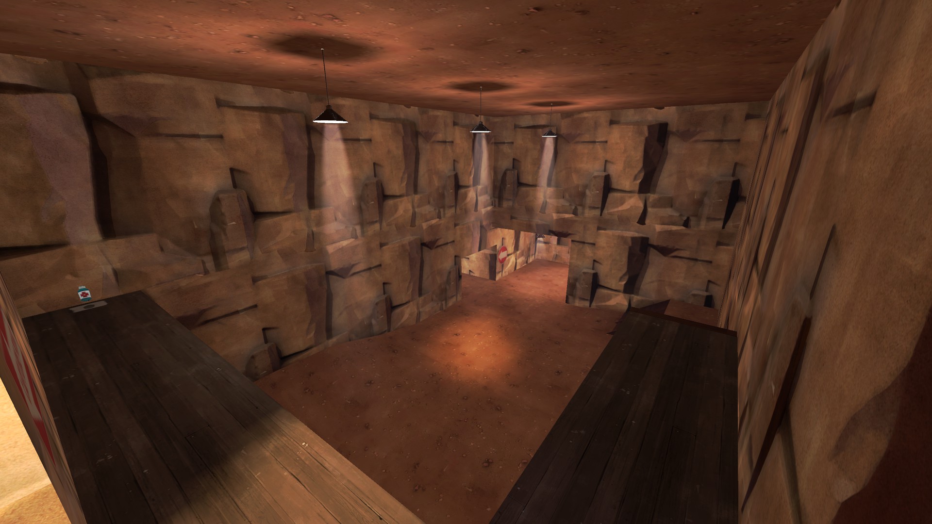
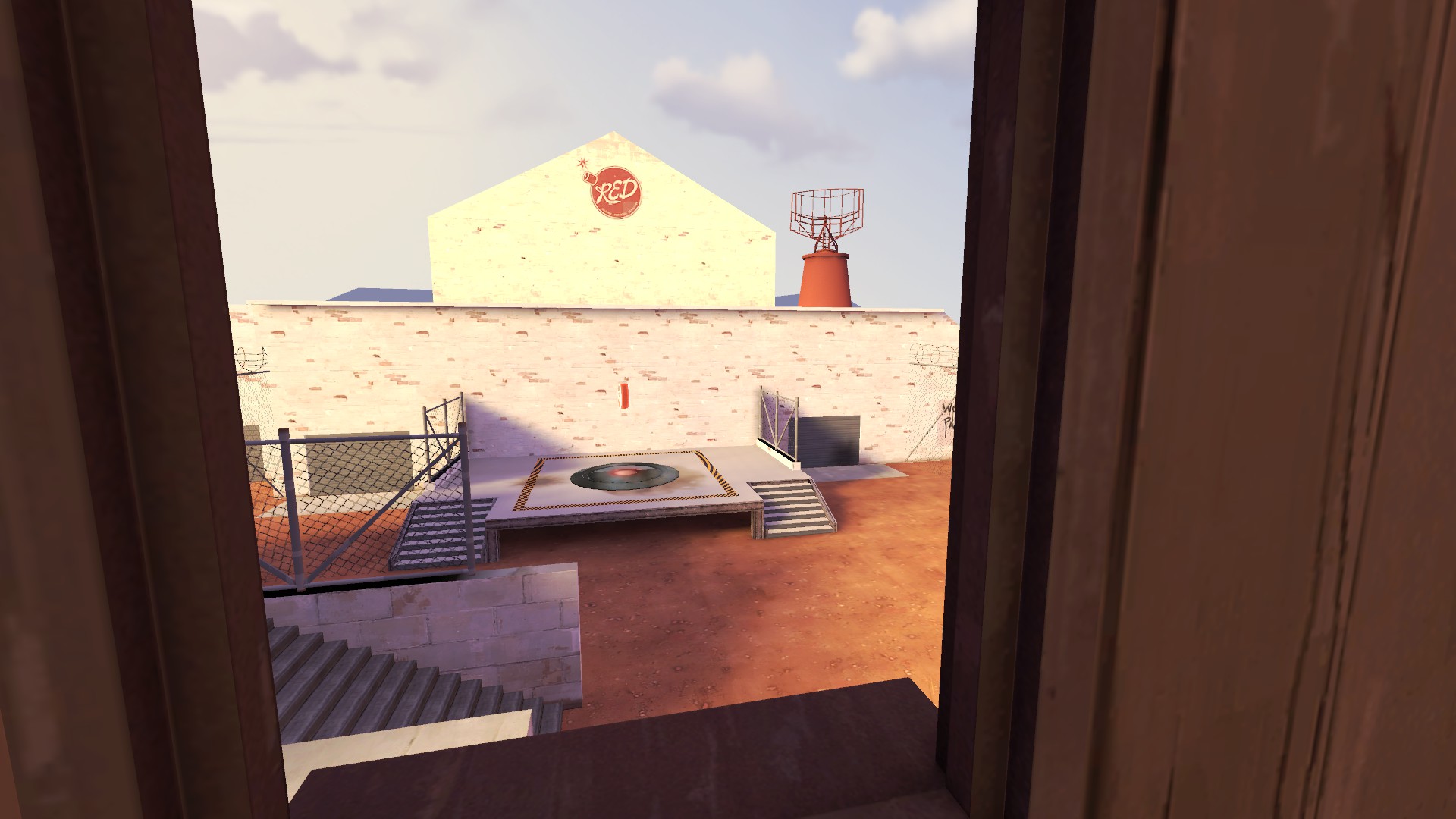
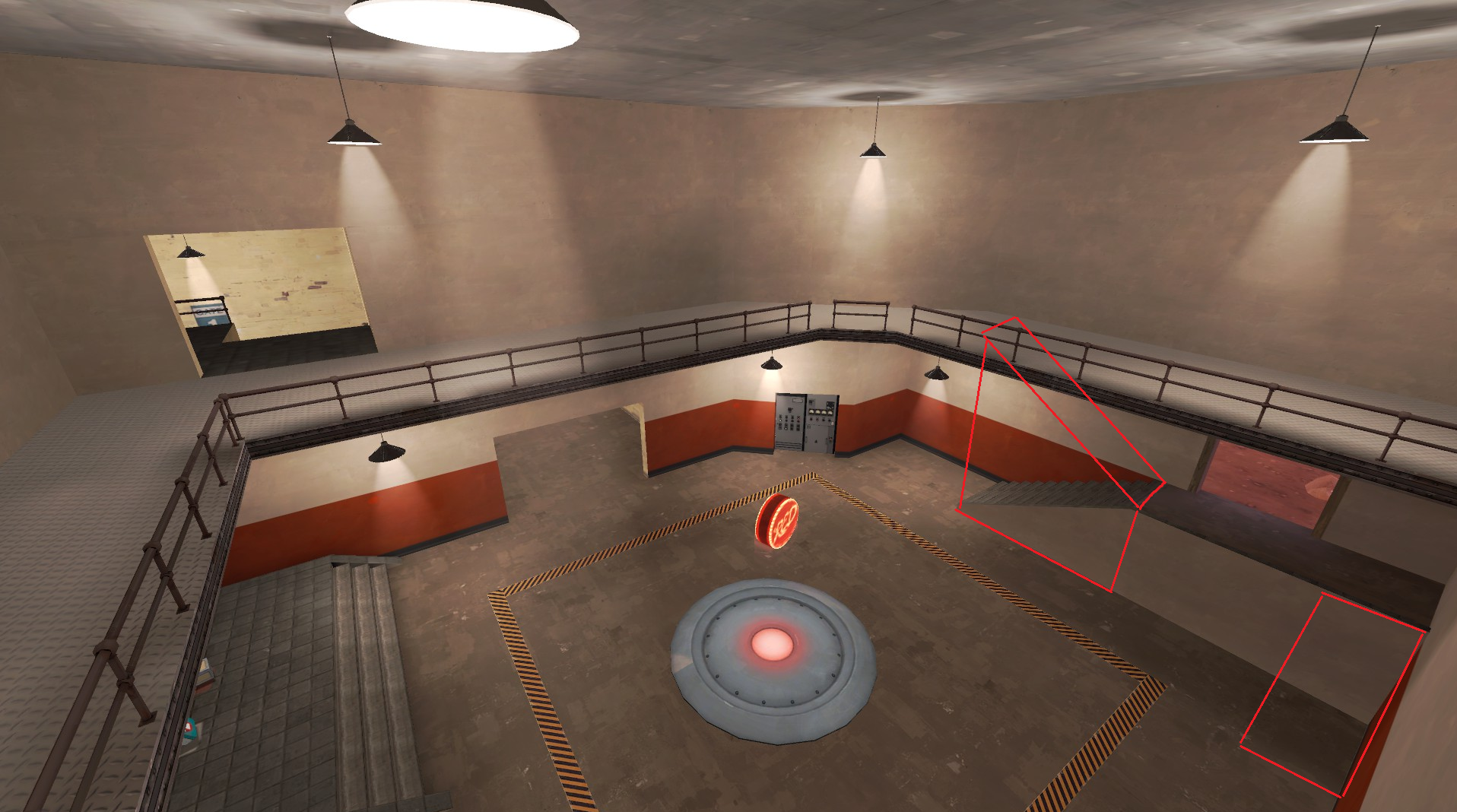
Takeback - Take back what was stolen from your team, and take their land while your at it.

In a previous encounter; Red has driven Blu back into a useless Garage. A plan to Take Back the whole cement mill from Red, and while they're at it, they will take Red's iron mine, and shipment center as revenge.


This map is currently in Alpha, and is mostly textured, it has been tested with bots, has been optimised, and is finally ready to be tested! Good Luck Have Fun.

View attachment 138692
 

Perry

L1: Registered
Jun 27, 2019
43
6
Changed Control Point 1 entrance
added new flank routes
Changed blue spawn height
changed a few soundscapes
removed shutter doors
fixed displacements
edited 3D Skybox
Adjusted Place Space Skybox
Added a window between Control Point 1 room, and Control Point 1 Entrance

Read the rest of this update entry...
 

Perry

L1: Registered
Jun 27, 2019
43
6
Fixed sightline
new path in cave
new entrance to shed
details added
details removed
widened Red Spawns
added new path to control point 1 upstairs
adjusted sound scapes
moved props infront of blue spawn
rotated spawn door on blue forward spawn
changed sky box
KYLE THE SECURITY COW
fake Joshua Tree Shadows
fake Cactus
more Spy Tech
removal of Dev Texture (WE ARE STILL IN ALPHA)
adjusted lights in cave

Read the rest of this update entry...
 

Perry

L1: Registered
Jun 27, 2019
43
6
Numberus Bug fixes
New Windows
changed outside upstairs path to new hallway
added clipping to stop camping in a single corner on point 2
added no build zone to the Capture Point 1, and 2
added one way door to cave next to capture point 2

Read the rest of this update entry...
 

Perry

L1: Registered
Jun 27, 2019
43
6
Added, and packed 1 custom texture (Try to Find it)
Optimizations
fixed one way door opening from wrong side
skybox change
changed tower outside Red Spawn
added staircase outside Red spawn
Changed Sniper_fence1.mdl to a chain link fence

Read the rest of this update entry...
 

Perry

L1: Registered
Jun 27, 2019
43
6
Closed Door across from first point
Prop Fading
roof to center building
new door way into First Point
new Red Forward Spawn (will adjust later, Just a place holder)
Added Displacements
If anyone ACTUALLY Reads these. say Jonny Boy in the Feed back please.

Read the rest of this update entry...
 

Wilson

Boomer by Sleep
aa
May 4, 2010
1,388
1,227
I have noticed that this map has had a big disconnect between the changes being made and the feedback in the system, what has been said in the demos and how the map generally plays. I decided to do one better than leave a phrase in the changelog in the system and make a big post explaining what I think are major fundamental flaws that this map has, because people are only going to start reacting more and more negatively when they have to repeatedly play a map that core issues are never truly addressed. It has genuinely felt like that the skybox has seen more changes than the rest of the map if you look past textures and detailing being added.
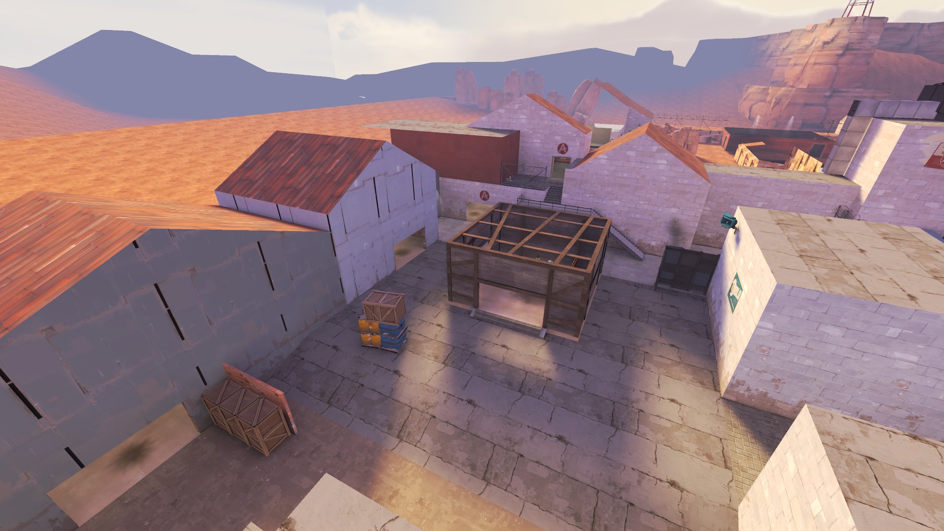
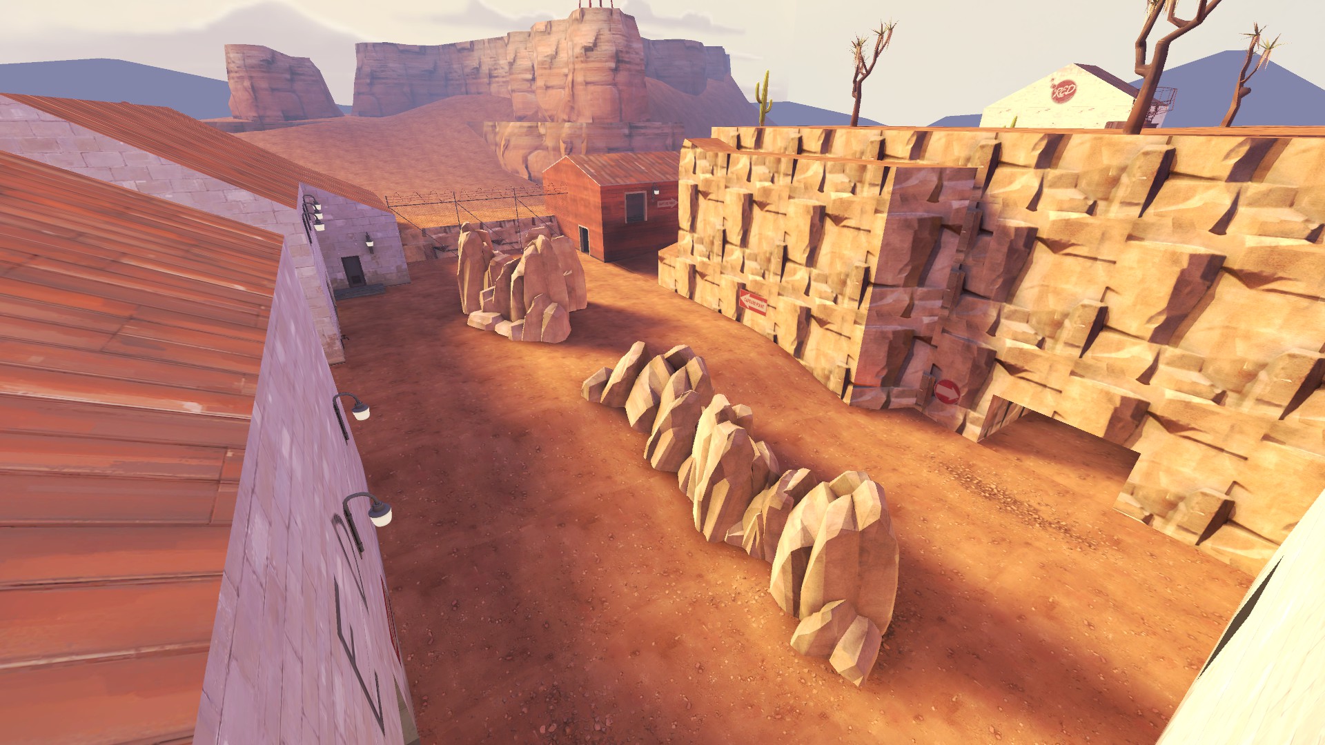
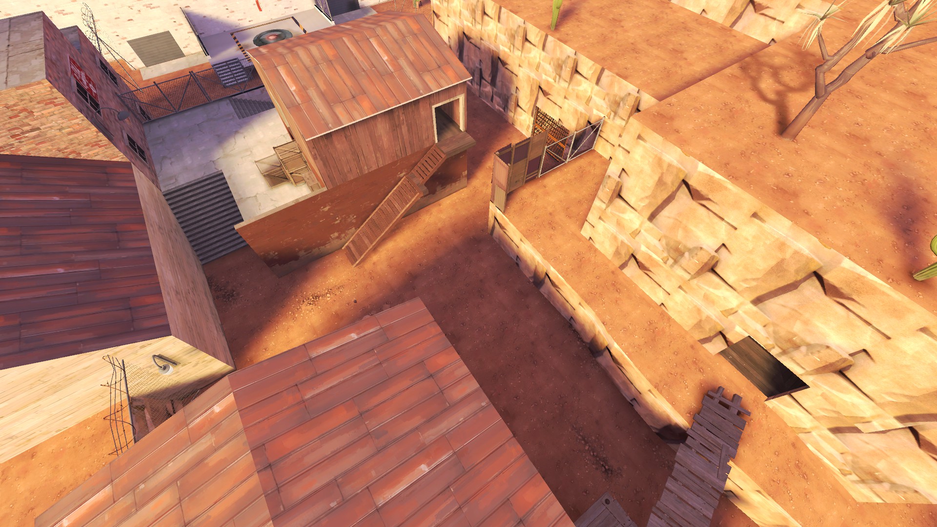
4D8A6E9C24A719D673D423F41BE09EBAF4EA8221

C120F07FD33AAFEAC88D79153782DAC6759B4AB4

E467BCC90F105517EECAD1266F056EDA7847C640

9834BAB8F617060CCD2D9F48E2815E7CCFB6B7DC


Let's start with the major areas of this map, all of them are essentially large boxes that have been filled with props and occasional buildings to break the sightlines, which result in large, flat and boring gameplay spaces that only really offer anything handful of nine classes in this game. Most of the height is very high and very absolute, there is little variation. If you look at the official layouts, they very rarely are fit into a specific shape and you can see that everything was built piece by piece, not filling a predetermined area. All the wide open flat space makes it hard to hold areas and the routing feel very spread out. Speaking of routing being spread out, there are a lot of hallways and long series of rooms on this map that don't really serve any purpose other than spreads the players out far and wide.

olaZGNn.png


Look at all these routes that more or less lead you to same area, all starting out in such spread out manner. More routes does not equal better gameplay, generally if you want there to be a lot of routes, there needs to be a bottleneck somewhere. Choke from which most if not all options start from so that attacking team is grouped up, offensive engineers have an area to set up in and acts as a barrier to prevent the defensive team from wandering too far out from the area they are supposed to hold once they lose control of the said area. This map doesn't really have any of that, which results in a chaotic and confusing flow where trying to hold an area feels next to impossible because people just get scattered everywhere.

In some cases the routes are their own entire area, far away from the "main" routes, making them either useless and liability because teams once again get spread out too much. Case and point, this entire area after A:

F4AE2F158CFBB98E955B7026B117236202B86FFB


Looking past these major issues, this map has a habit of giving blue very powerful high ground and areas for almost totally free with only play for red being putting all their eggs in one basket and holding that specific area. Case and point, these two areas below.

66ED0ED63799DFA0418A74480E5422DB8C16BB68

CDB1F4DB5F4EC98F7EBC601913B4A2F4499436D8


These areas give players in them almost complete overview of the points, the holding positions and the defensive entrances to the point, both of these areas also have multiple routes to them for the attacking team and no real route for defenders that don't require you to wander into blue areas to access. This totally negates the gameplay around the points and makes it all about controlling these specific areas, something this powerful should be earned through a fight. There is no reason, for example, the balcony on A point couldn't be like this.

pQAs9Y0.png


This would let the defenders easily rotate between the two heights without having to leave the point they are supposed to defend and make the gameplay feel much more natural.

I know this post pretty much implies that you need to massively rework large chunks, even entire segments of the map, but I don't think this map is salvageable in it's current state without some massive reworks to it's most base components. If it is any consolation, the first half of the map has some potential to work without having to totally rebuild every single thing but I would personally just redo the second half and take the previous iteration as a learning experience for the future. A lot of B right now is built on a house of cards, a wide variety of patchwork fixes to sightlines, scaling etc., that is going to eventually come tumbling down when the push comes to shove.

- Jonny Boy
 
Last edited:

Perry

L1: Registered
Jun 27, 2019
43
6
I have noticed that this map has had a big disconnect between the changes being made and the feedback in the system, what has been said in the demos and how the map generally plays. I decided to do one better than leave a phrase in the changelog in the system and make a big post explaining what I think are major fundamental flaws that this map has, because people are only going to start reacting more and more negatively when they have to repeatedly play a map that core issues are never truly addressed. It has genuinely felt like that the skybox has seen more changes than the rest of the map if you look past textures and detailing being added.
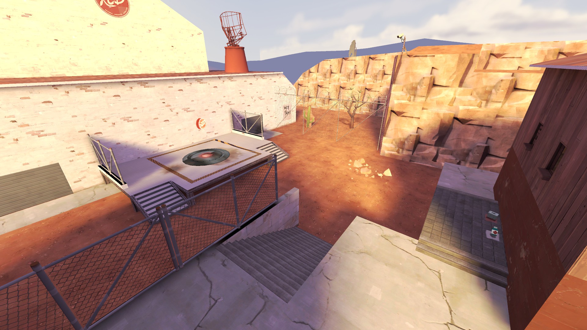

4D8A6E9C24A719D673D423F41BE09EBAF4EA8221

C120F07FD33AAFEAC88D79153782DAC6759B4AB4

E467BCC90F105517EECAD1266F056EDA7847C640

9834BAB8F617060CCD2D9F48E2815E7CCFB6B7DC


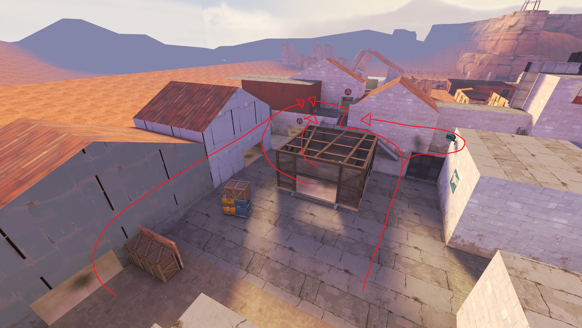
Let's start with the major areas of this map, all of them are essentially large boxes that have been filled with props and occasional buildings to break the sightlines, which result in large, flat and boring gameplay spaces that only really offer anything handful of nine classes in this game. Most of the height is very high and very absolute, there is little variation. If you look at the official layouts, they very rarely are fit into a specific shape and you can see that everything was built piece by piece, not filling a predetermined area. All the wide open flat space makes it hard to hold areas and the routing feel very spread out. Speaking of routing being spread out, there are a lot of hallways and long series of rooms on this map that don't really serve any purpose other than spreads the players out far and wide.
olaZGNn.png


Look at all these routes that more or less lead you to same area, all starting out in such spread out manner. More routes does not equal better gameplay, generally if you want there to be a lot of routes, there needs to be a bottleneck somewhere. Choke from which most if not all options start from so that attacking team is grouped up, offensive engineers have an area to set up in and acts as a barrier to prevent the defensive team from wandering too far out from the area they are supposed to hold once they lose control of the said area. This map doesn't really have any of that, which results in a chaotic and confusing flow where trying to hold an area feels next to impossible because people just get scattered everywhere.

In some cases the routes are their own entire area, far away from the "main" routes, making them either useless and liability because teams once again get spread out too much. Case and point, this entire area after A:

F4AE2F158CFBB98E955B7026B117236202B86FFB


Looking past these major issues, this map has a habit of giving blue very powerful high ground and areas for almost totally free with only play for red being putting all their eggs in one basket and holding that specific area. Case and point, these two areas below.

66ED0ED63799DFA0418A74480E5422DB8C16BB68

CDB1F4DB5F4EC98F7EBC601913B4A2F4499436D8


These areas give players in them almost complete overview of the points, the holding positions and the defensive entrances to the point, both of these areas also have multiple routes to them for the attacking team and no real route for defenders that don't require you to wander into blue areas to access. This totally negates the gameplay around the points and makes it all about controlling these specific areas, something this powerful should be earned through a fight. There is no reason, for example, the balcony on A point couldn't be like this.

pQAs9Y0.png


This would let the defenders easily rotate between the two heights without having to leave the point they are supposed to defend and make the gameplay feel much more natural.

I know this post pretty much implies that you need to massively rework large chunks, even entire segments of the map, but I don't think this map is salvageable in it's current state without some massive reworks to it's most base components. If it is any consolation, the first half of the map has some potential to work without having to totally rebuild every single thing but I would personally just redo the second half and take the previous iteration as a learning experience for the future. A lot of B right now is built on a house of cards, a wide variety of patchwork fixes to sightlines, scaling etc., that is going to eventually come tumbling down when the push comes to shove.

- Jonny Boy

I appreciate this. genuinely. not only did you provide some really decent material, you finally opened my eyes to what is wrong.
Right now, I am not worried about building Hight, that's something for beta and I start detailing properly.
I am working on A8, making some changes that where shown here. One of my biggest frustrations with this map; is the lack of useful feedback. most of the time, and you can look on the feedback page, is mostly just nitpicks, and not genuine feed back. Yes there is some here, and there; but it was not enough to make a major difference. So again. Thank you.
 

Wilson

Boomer by Sleep
aa
May 4, 2010
1,388
1,227
I appreciate this. genuinely. not only did you provide some really decent material, you finally opened my eyes to what is wrong.
Right now, I am not worried about building Hight, that's something for beta and I start detailing properly.
I am working on A8, making some changes that where shown here. One of my biggest frustrations with this map; is the lack of useful feedback. most of the time, and you can look on the feedback page, is mostly just nitpicks, and not genuine feed back. Yes there is some here, and there; but it was not enough to make a major difference. So again. Thank you.

I am not sure what I am supposed to be looking at here because the feedback pages for every version of Takeback look like pretty standard feedback pages to me, a lot of valid feedback about the same things multiple times, people wondering why nothing is changing and people touching upon the very same issues my post talks about. I don't see how all this feedback (Latest version got 41 annotations, that is a lot) is somehow not useful or genuine.

I hope you are not expecting people to just write paragraphs upon paragraphs into the system, detailing exactly how to change and fix the issues on the map. That is not feedback, that is other people making the map for you instead of you making the map yourself. Not to mention, players are going to be busy actually playing your map, they are not going to often stop playing to write something extremely detailed. You shouldn't expect feedback to give you exact solutions to problems barring some exceptions, instead you should ask yourself why people are saying these things, why do they feel the way they do about the map. Ask why players or certain classes are not having fun. You should watch demos and ask why something is playing the way it is, watch how certain players are trying to play the map and ask why, etc. Feedback and player experiences are a guiding post, not an absolute set of instructions on how to improve the map.

Attacking feedback you get and people leaving the feedback will get you nowhere, it will only discourage people from leaving any at all and is honestly a pretty dick thing to do overall. If you still want people to go more in depth or give you specific suggestions, you could just ask people who have played the map on discord. If someone who has played the map is online and sees the message, they are usually more than happy to give you their thoughts on things.
 

Perry

L1: Registered
Jun 27, 2019
43
6
Moved red forward spawn
added vertical detail hight
added more signage
adjusted staircase on point
added more med and ammo packs around the map
added detail to final set up room thing
added new flank rout to back of Red spawn on final point
changed some stuff around on final point
changed textures
removed rocks
to many changes to note down

Read the rest of this update entry...
 

Perry

L1: Registered
Jun 27, 2019
43
6
Replaced rocks with shed
added fence to block capping snipers from camping red forward spawn
adjusted cave
moved some fences around
made the hall between blue forward, and Capture point A wider
added lights close to the floor in barn past red spawn
added a light under shed by final capture point
adjusted prop locations
adjusted prop fading

Read the rest of this update entry...
 

Perry

L1: Registered
Jun 27, 2019
43
6
Yeah, I didn’t know how to
w4VjkTC.jpg


I'm going to be real with you as much as I can be. The respawn times are too long.
properly change the time, so I had the logic set to 10 and 20, and not 5 and 10 like it should have been.
 

Perry

L1: Registered
Jun 27, 2019
43
6
Removed upper cave entrance
turned first cave into a hall
Updated 3D skybox
Updated 2D skybox
Fixed Respawn Times
adjusted clips
shortened the
added a no entry door that closes on red forward spawn when blue caps
adjusted sun angles

Read the rest of this update entry...
 

Perry

L1: Registered
Jun 27, 2019
43
6
Adjusted Cave wall
changed blu forward spawn door
Moved Blue Forward spawn
adjusted wooden bridge
Adjusted skybox brushes
adjusted textures
Removed and Replaced the large shed in Blu starting area.
Added Custom props (Credits go to all the prop makers.)

Read the rest of this update entry...
 

Perry

L1: Registered
Jun 27, 2019
43
6
added new hall between cap and first hall
added kill trigger in Red Spawn that turns on after point is capped
added new flank path into yellow hall
added new door outside blue forward spawn
added new ramp to cliff
adjusted bridge from the barn to cliff
major changes to last cap
changed boxes from stairs
moved props around
added more props around
adjusted fade distance

Read the rest of this update entry...