Sweetwater Redux

CTF Sweetwater Redux b2

Micnax

Back from the dead (again)
aa
Apr 25, 2009
2,109
1,585
Sweetwater Redux - Capture the other team's chocolate bars.

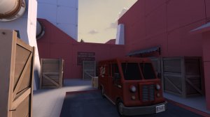
This is a redeveloped version of an older map also called ctf_sweetwater, as commissioned by its creator Left_4_Pillz. It's basically the same concept and story but with improved gameplay!

Story: Two Heavies each bought 50% percent of the Dalokohs Bar Chocolate Company and have split the factory's storage warehouses down the middle. After working hours, each team plots on stealing the other's bars in efforts to make the other go bankrupt. RED and BLU are pinned against each other, to see who can make who bite the dust (or chocolate bar).

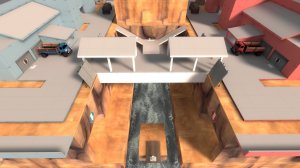
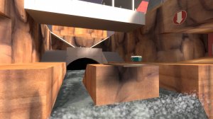
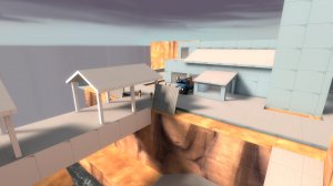
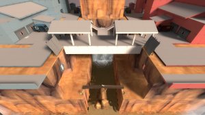
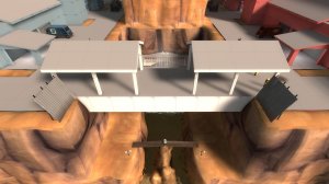
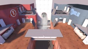
Gameplay: Capture the other team's flag of secret formula choclate (soon to be a crate of chocolate bars) back to your base three times and bankrupt the other team! Be wary of the fast flowing water through the middle of the map's gorge, and utilise narrow shortcuts and underground passages to make a quick escape!
 
Last edited:

Micnax

Back from the dead (again)
aa
Apr 25, 2009
2,109
1,585
Alpha 2 Changelog:
- Renamed map to Sweetwater Redux to avoid previous file conflicts
- Narrowed the middle of the map and moved bases closer
- Added some more cover on each side around the gorge
- Made the vents wider and easier to enter/exit
- Made it easier for all classes to access the outer vent exit
- Added ramps up from the lower area of the canyon to the upper
- Blocked off an unused route in the bases to see how it plays
- Added a ramp up from the flowing water so players have an opportunity to save themselves
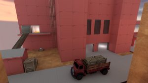
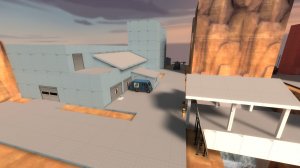
- Added a small building at the main exit of each base with a window to help ease sightlines
- Upgraded some health kits from small to medium
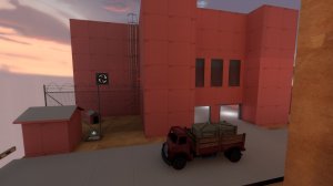
- Brought magical floating trucks back down to the ground
- Fixed areaportal issues

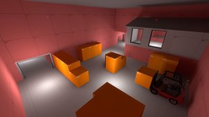
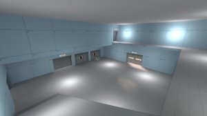
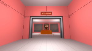
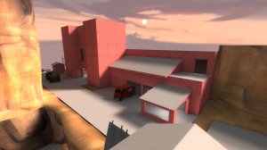
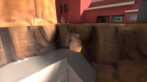
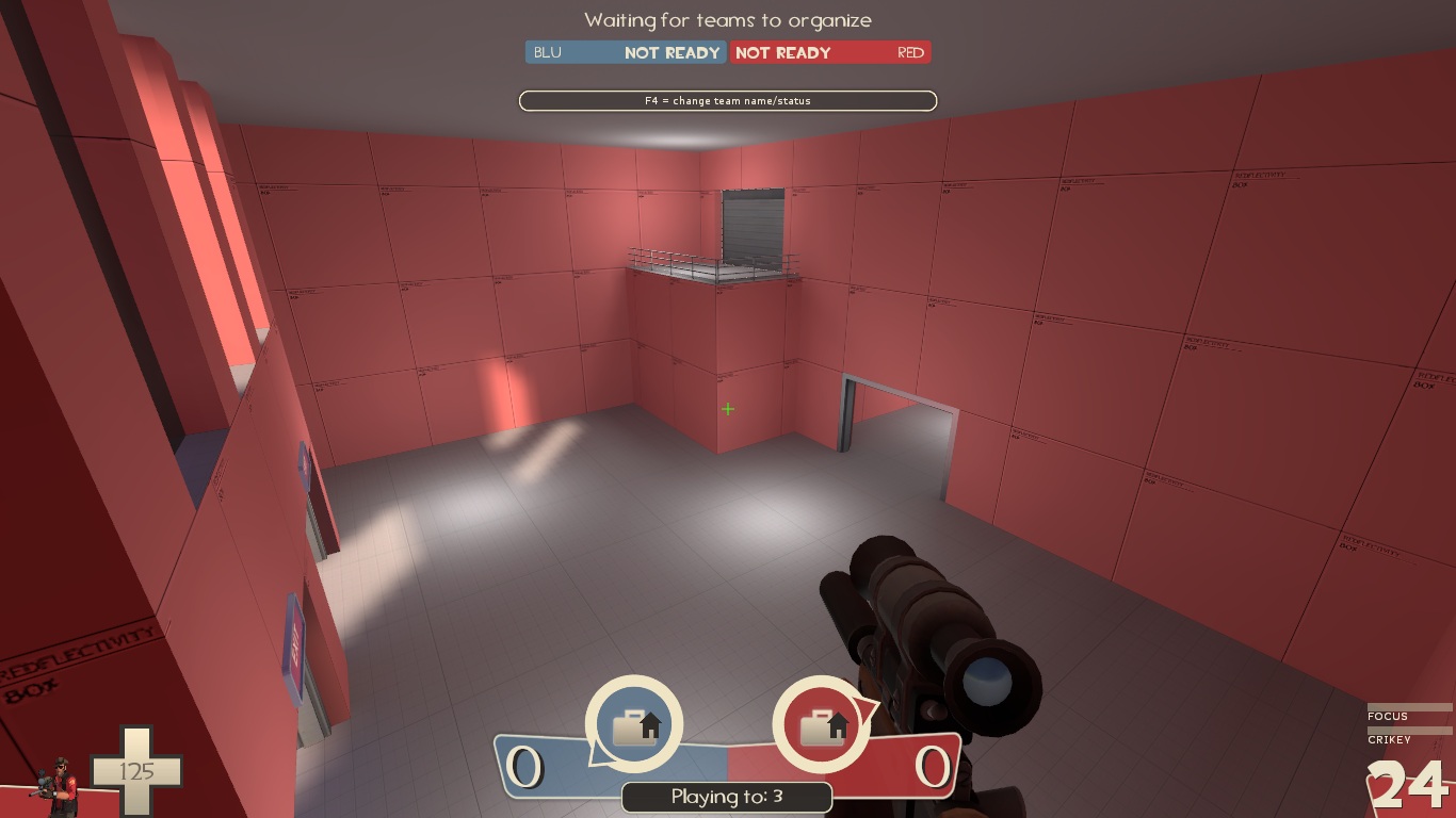
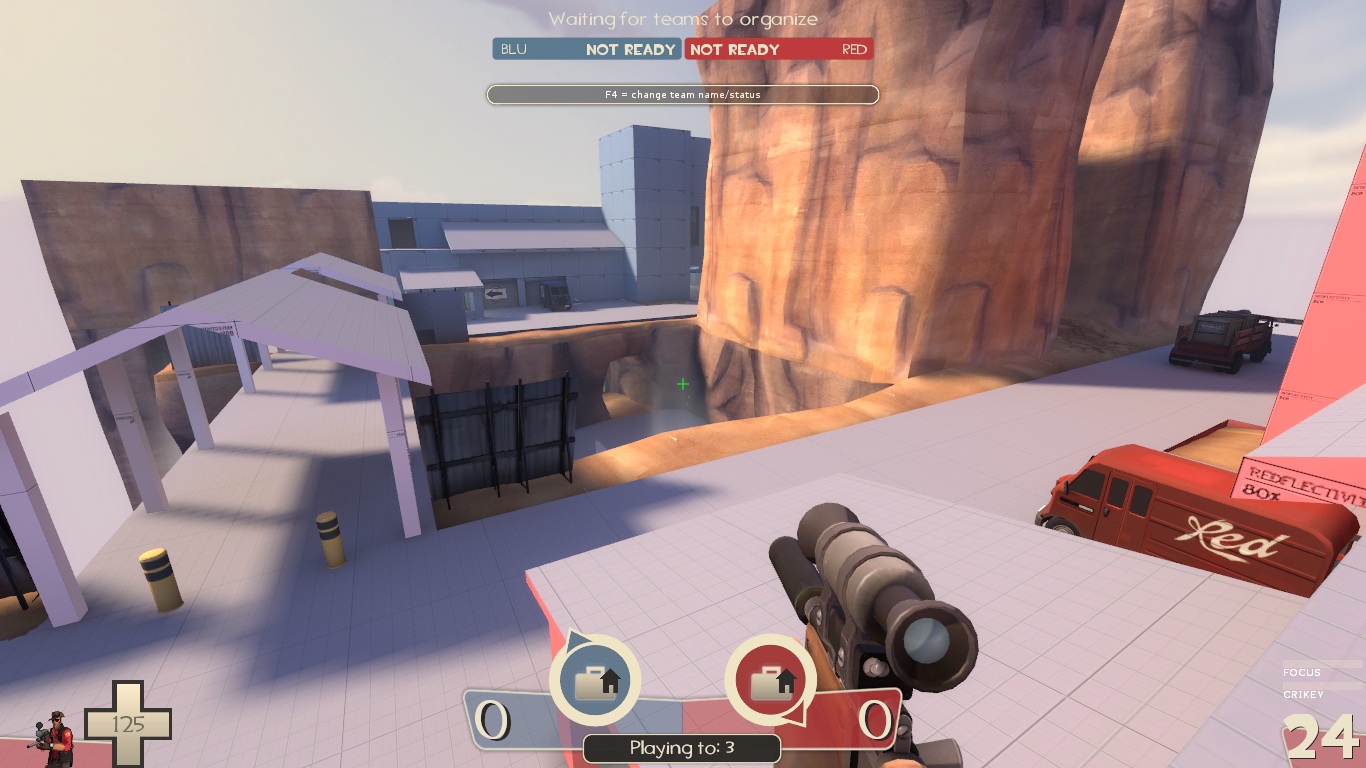
Screenshots:
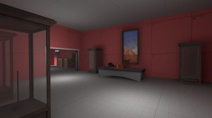
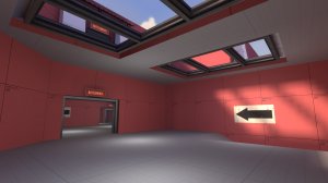
20170115212011_1.jpg 20170115212059_1.jpg 20170115212024_1.jpg 20170115212039_1.jpg 20170115211942_1.jpg

Read the rest of this update entry...
 

Micnax

Back from the dead (again)
aa
Apr 25, 2009
2,109
1,585
Alpha 3 Changelog:
- Redesigned the back layout of team bases to be less confusing and smaller in general
- Changed the lower gorge layout and design
- Moved bridge position slightly
- Removed the vent exit outside the team bases
- Added triggers to the deathpits to return intel if the carrier dies
- Reduced light brightness in the vents
- Added very minor detail props

Screenshots:
20170129010047_1.jpg 20170129010146_1.jpg20170129010205_1.jpg 20170129010255_1.jpg 20170129010326_1.jpg 20170129010353_1.jpg

Read the rest of this update entry...
 

Micnax

Back from the dead (again)
aa
Apr 25, 2009
2,109
1,585
Alpha 4 Changelog:
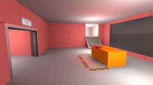
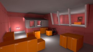
- Did a much bigger redesign of the back areas to make the intel room bigger and more accessible to players
- Moved spawn rooms to a better location with multiple exits
- Removed vents
- More changes to the gorge, including the location of the sewer openings
- Moved bridge position slightly
- Made the shed coming out of team bases have doors on both sides
- Blocked a few sightlines
- Changed skybox lighting and sky
- Displacements!

Screenshots:
20170202013758_1.jpg 20170202013839_1.jpg 20170202004316_1.jpg 20170202014017_1.jpg


Read the rest of this update entry...
 

Mess About

L7: Fancy Member
Jan 16, 2017
413
178
wow the map looks pretty neat now, but:

this spawn door
YFIDMhd.jpg


this balcony right in front of the spawn room, there's gonna be a huge - indestructible sentry nest that block this entry
eQ8zSiZ.jpg


huge mid area, it does nothing but slow the game down and becomes a sniper dm, i'm pretty sure you know how effective the Scout class in this map is
rAuHZ7Z.jpg
 

Micnax

Back from the dead (again)
aa
Apr 25, 2009
2,109
1,585
Alpha 6 Changelog:
- Complete redesign of the interior of the bases again, smaller and more compact
- More health/ammo kits
- Blocked off the shipping area, made it detail instead
- Sewer entrances moved back to original positions
- I didn't move the bridge this time

Read the rest of this update entry...
 
Last edited:

Phil

L1: Registered
Oct 11, 2015
11
8
I have some feedback after playing the last couple versions in imps:

The map feels a bit too void of height variation, while there are big highs and lows the majority of the fighting occurs on one plane (entrance to the lobby and middle of the map). I feel like the areas that actually put you above others aren’t too useful, the roofs at mid and the shipping area are only accessible by two classes, they provide a large height advantage but it’s difficult to make good use of it because the area is large enough that enemies can simply run away, fights between the bridge and sewer don’t progress much from chip damage because they’re too far apart.

My problem with mid is that’s it’s too large and open and it is pretty weak for a lot of the classes. There’s no real advantages to fight over since the area is just flat with a couple small health packs. I feel like access to the roofs and shrinking the entire area might help but I’m not sure how I’d go about it.

I really like that you readded the shipping area but it suffers a lot of the same problems as mid does, there’s a bit more cover and some roofs but I don’t think they add too much. Once again there’s no advantages to play for, there’s no hp/ammo, the only height advantage is standing on the crates and the area is too large for the roofs to serve much purpose. I think if a lot more height variation was added to the area, the plane was shifted up or down on the y-axis and if there was more brushwork/props near the middle that it could become more fun to fight on.

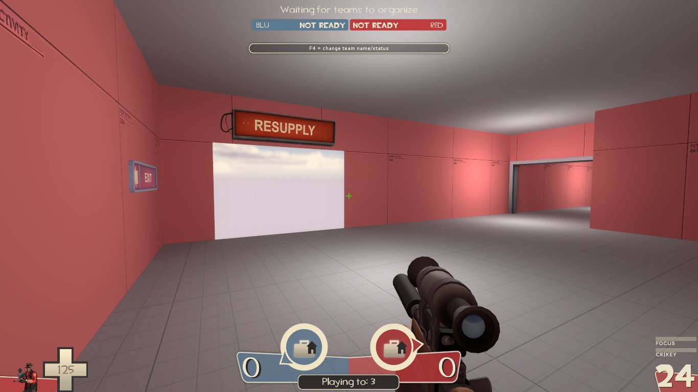
I found that the lobby was pretty disorienting, everything looks very similar, you did a good job putting signs all over but in the midst of gameplay I often went the wrong way since I’m not really focused on reading and all of the signs look the same at a glance. It would be great if there were some other indicators added like maybe a boiler in one room or some benches, just simple stuff that doesn’t have to affect gameplay but helps orient yourself. Also both spawn rooms look identical on the inside so a little change there would be nice.

This is a bit hard to explain but I feel like the areas are separate blocks that were attached to each other by doorways and that it doesn’t flow too well. When you look at mid, it feels isolated from the rest of the map because the other areas are hidden behind shutters and the only open access is through the windows. Same goes for the shipping area, it's a large gameplay space that’s connected to the rest of the map by two close by doorways at each end. I think that the sewer passage into the base and the area under the bridge does a really good job at transitioning through areas. I’m not sure how viable it would be but adding some connections between the middle of mid and shipping area, or some more “transition areas” could help out with this.

A lot of this is subjective so take from it what you will. I enjoy this map and hope to see further improvements :)
 

Micnax

Back from the dead (again)
aa
Apr 25, 2009
2,109
1,585
Alpha 10 Changelog:
- Minor adjustments of the interiors
-- Added some more shipping crates
-- Moved intel room a little further back from the centre of the map
- Fixed some clipping areas
- Minor texturing to the bridge
- Added a soundscape
- 2 easter eggs added

May start detailing in the next version if the tests come back happy with the layout.

Read the rest of this update entry...
 

Mess About

L7: Fancy Member
Jan 16, 2017
413
178
hey you're back

just one thing though, intel dropped down water doesn't immediately go back to the intel room