Lets review some of the parts in your map that i felt containing issues. Some can be part of the map design but some also prevent decent gameplay.
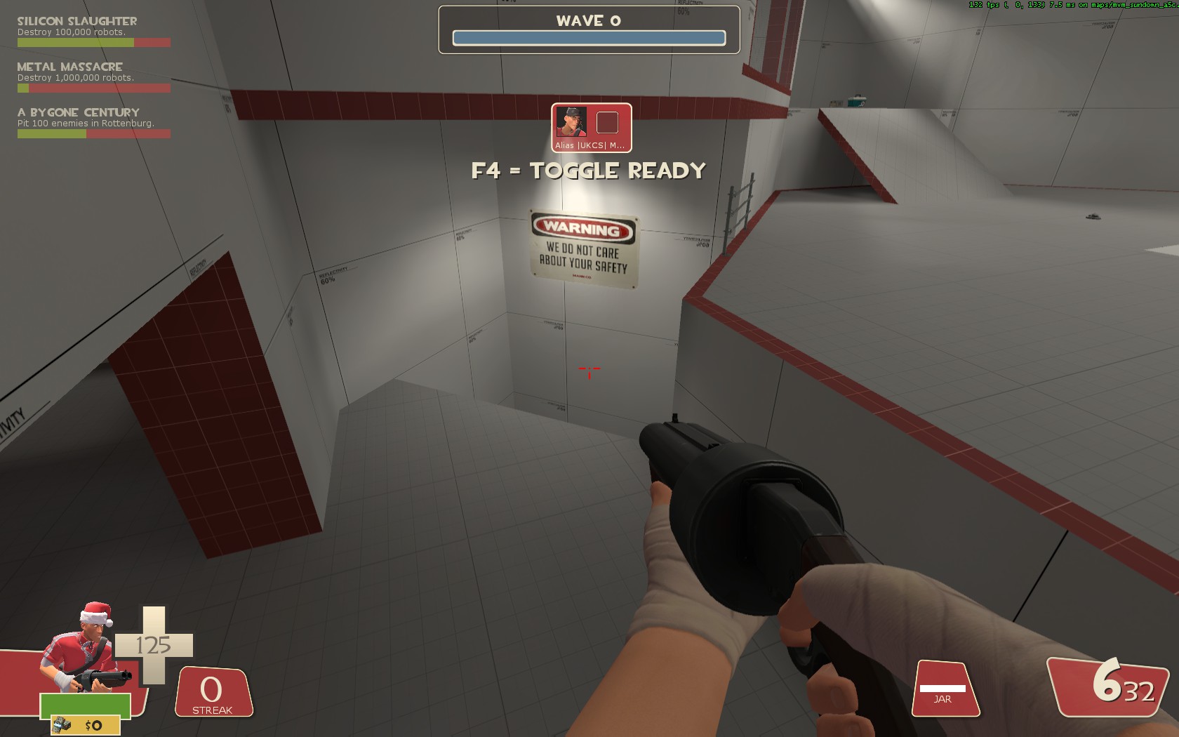
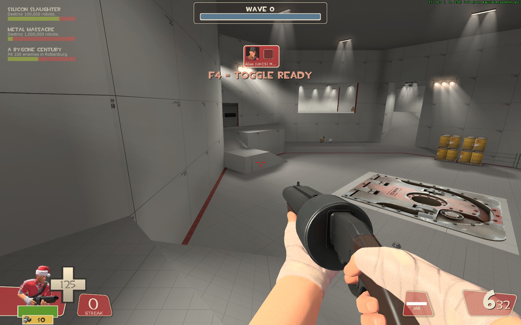
First, the spawn. It looks good. And it feels as a natural spawn area. However, the space between that first wall is a bit short and makes them a bit crowded. To me that also harms the extra spawn in the back there as it has no use to spawn any bots there. They mix up instantly after leaving.
Another issue, bots dont jump down that well. Something i have noticed before on skullcove aswel was that the nav on those 45degree parts quickly mess up. Make sure to clip it in such way that the bots would have no issues on jumping down. Alternatively put in a section that makes the jump part at 0 or 90 degrees instead of 45 although that could be hard. On skullcove the issue was that there was a little ledge on which they jumped down and the nav couldnt properly connect. Clipping the area below to match the edge fixed it for me.
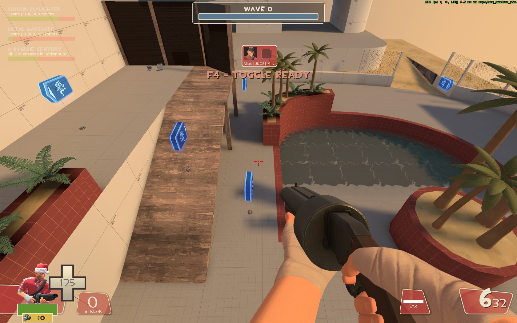
The next problem is this section. Its 1 narrow bottleneck and makes gamplay anoying there. Especialy scouts have no chance getting money there when bots are 90% of the time using that place. This becomes due to the area being angled at 45 degrees. That pillar below the wooden section isnt making it better either. That gives nav issues. This area needs some reworking to me. Best would be making them unable to walk under that wooden section and making it a bit wider to play on.
In earlier tests this section was used alot, last test it was barely used at all. Even if they had to use this path they still often used the bottleneck. Nav avoid areas should already be active just behind the spawn.
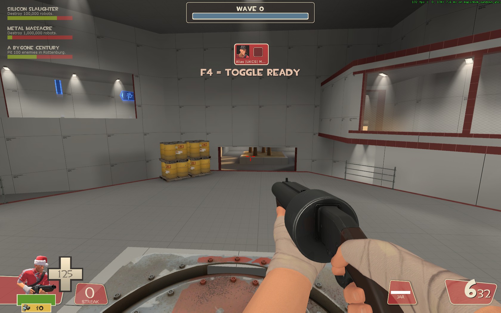
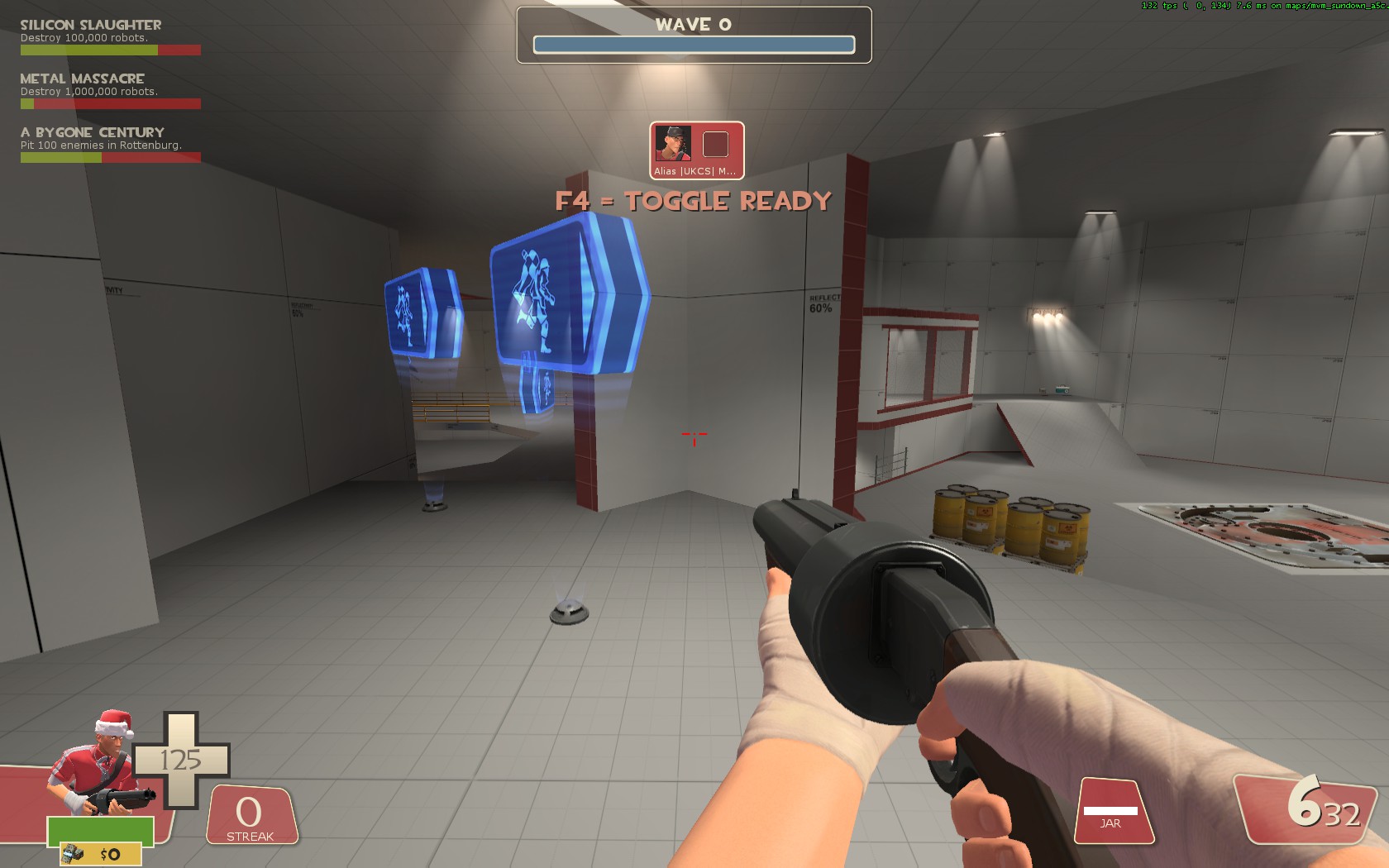
The pool itself also seems as a little issue since they use that one as main path. To me the bots should be spreaded a bit more often.
That the area is on 45 degrees shouldnt be an issue as long as you keep the paths wide. Thin 45 degree paths give nav issues and make bots get stuck.
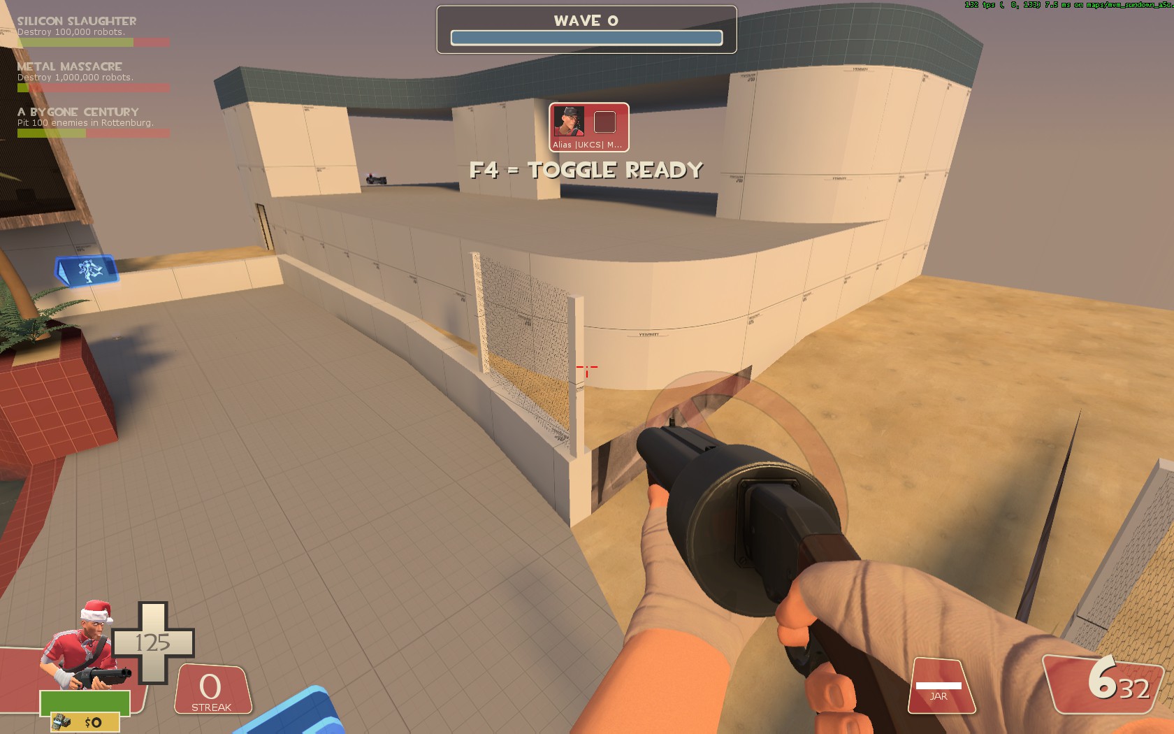
Another thing i noticed was that people found the map short. While in length it matches decoy. But what i also noticed was that the battles only took place on 2 sections. The one on the screen was barely used for battle. And i think it has the following issues:
There is barely any room to navigate. The only path you can use is the path the bots take. This is for both the upper and lower level.
Jump height also is an issue since the area is quite flat. To me this realy needs a flank.
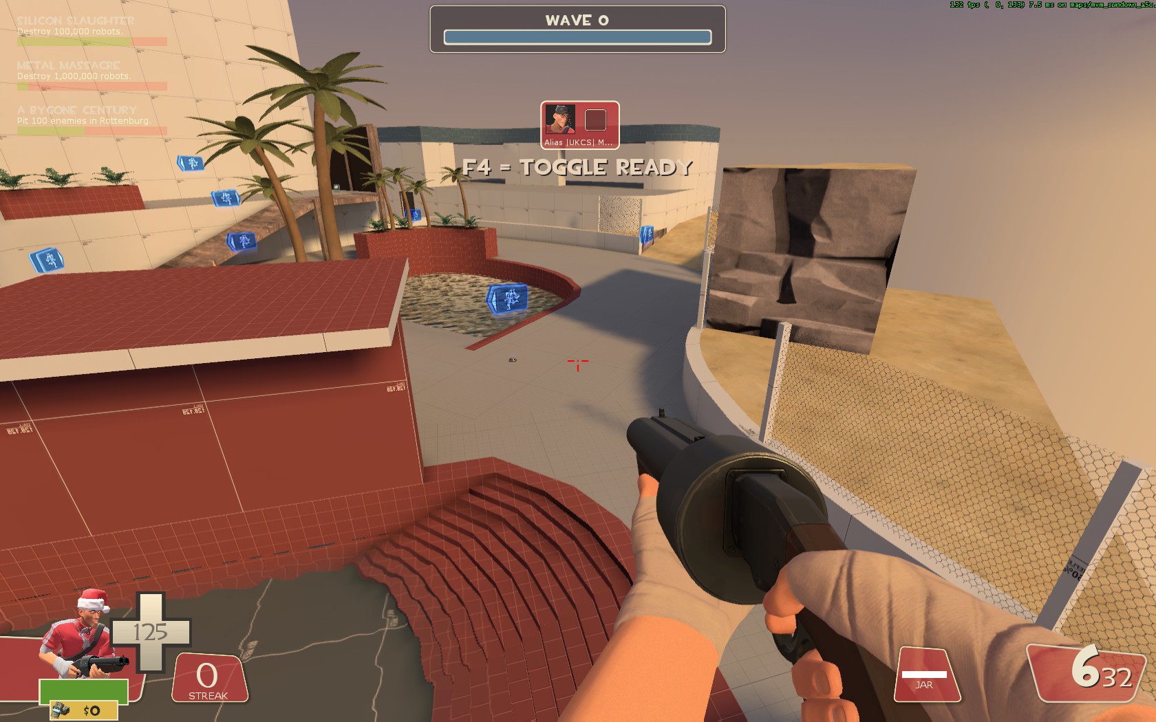
I like the placement of the deathpit, it doesnt hinder any gameplay at all. But it also has one issue. Its barely visible.
These are the 2 angles you approach the deathpit area usualy. But in both cases it isnt visible at all. I think that is a reason why it isnt being used. On the first screen it also doesnt give a good airblast position as the fence and upper hallway both block the bots from being pushed into it. Still, its good that they cant as otherwise resetting would be too easy. But it definitely should be made more clear that it exists.
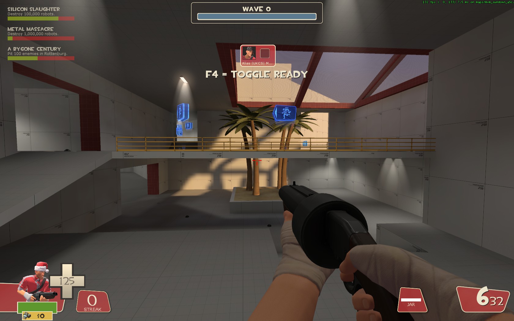
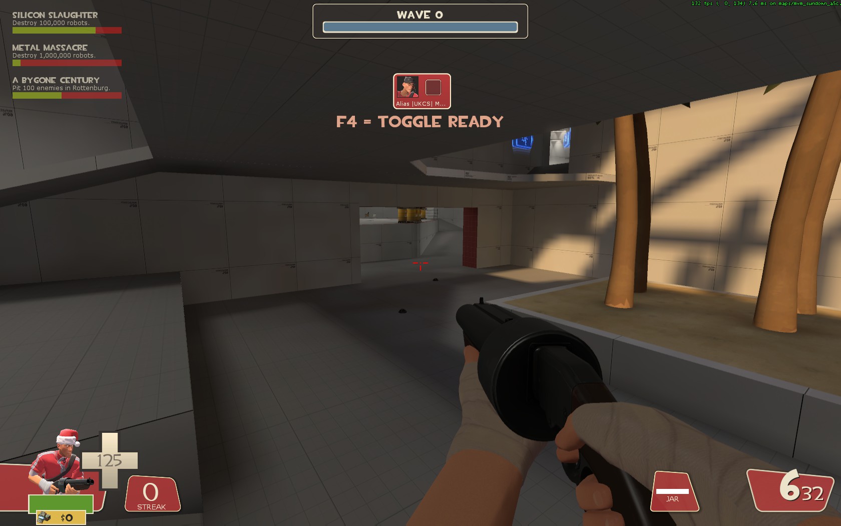
During gameplay i rarely see anyone using this tunnel. Its only used by bots.
It might be a flank, but to me the other flanks already have a better approach as you can counter them on both sides. Something barely possible on this path. I think that its also an issue similar to the indoor area.
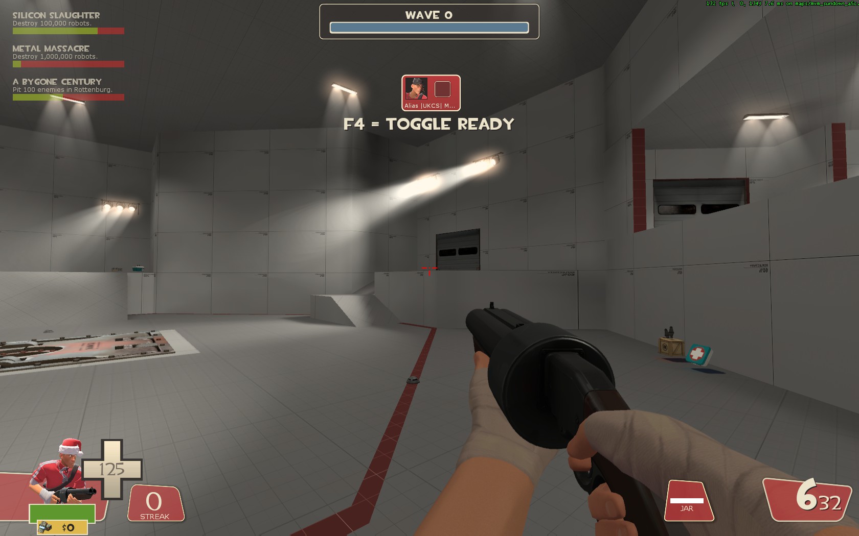
Once strong robots pass these points they will start spawnkilling into an anoying way. There realy needs to be better cover against it. The upper spawn might be better, but people arent being directed to it and natural behaviour makes them avoid that spawn. This means the inside of the spawnroom needs to promote the other gate aswel as alternative.
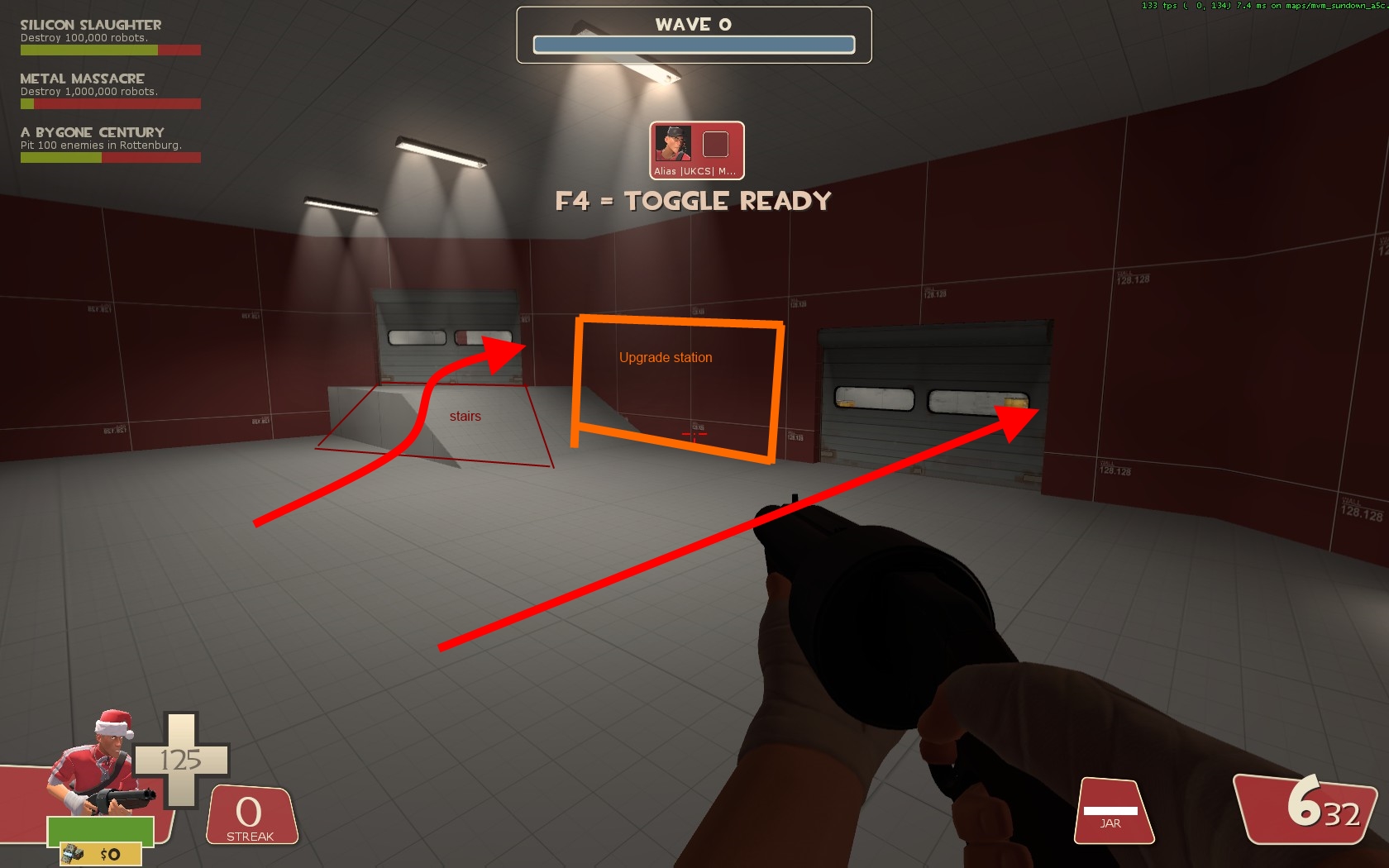
This is a layout i would suggest for the spawn. Both doorways will feel as more natural because the upgrade locker is between them. And since the staircase is aimed to allow walking on it from allmost any angle.
The right exit however could be moved more to the right if needed. This also could potentialy work for a fix on the spawnkill part.
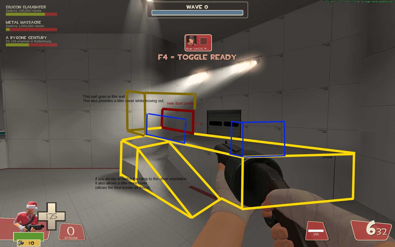
See this as an example of what the exit could be like when moving the door and changing the ramp.


") You only need about half of them so just delete every other arrow.
You only need about half of them so just delete every other arrow.