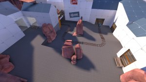
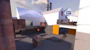
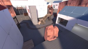
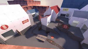
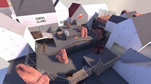
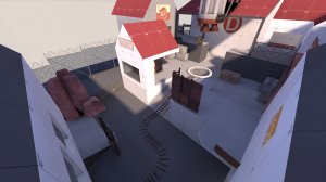
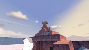
Staggering Rock

PL Staggering Rock a16c

Vert

L2: Junior Member
May 30, 2014
71
21

Vert

L2: Junior Member
May 30, 2014
71
21
Relatively minor update, mostly fixing bugs and the least balanced parts of the map. I would need more testing before I make any more substantial changes.

Changelog:
  • Fixed the roadblock from blocking bullets
  • Lowered point D slightly, so the final hill isn't nearly as punishing
  • Redid the staircase to the highest ground at D, to make it more friendly for Blu and less friendly for Red
  • Tweaked some spawn times
  • Tweaked some health and ammo at C

Read the rest of this update entry...
 

Vert

L2: Junior Member
May 30, 2014
71
21
Changes:
  • Fixed visual bug in the ceiling of blu's first spawn
  • Widened the playspace for A
    • Probably gonna do the same for C and D later
  • The roadblock can now be jumped over
    • I didn't originally want it to, but every playtester assumed it was jumpable so I've conceded
  • Removed one, but not both, of the rollbacks at C
  • Capturing C awards blu more time (4:30 --> 6:00)
  • Adjusted some respawn timers
  • Moved the 1-way gate so only blu can reach the highest ground at D
    • This will likely be too overpowered for blu

Read the rest of this update entry...
 

Vert

L2: Junior Member
May 30, 2014
71
21
Pretty big update, since a3 got a lot of good feedback.

Point A:
  • Widened area outside Blu spawn
  • Added a fence that prevents Blu from walking to A too quickly, but the fence lowers after A has been capped
  • Increased the size of, and added more cover to Red's high group at A to make it more defendable
Point B:
  • Removed the roadblock
  • Lengthened and widened the path between A and B
  • Widened Blu's holding area before B, and added another building for more cover
  • Turned one of the boxjumps into a ramp
  • Reduced the amount of metal
Point C:
  • Added another stairwell connecting the high and low flanks, so that Blu players are no longer forced to commit to the path they choose
  • Added health and ammo to one of the stairwells, as well as filled the dead space in the room
  • Turned a ramp into a boxjump so that Red can't reach the high flank as easily
  • Reduced the amount of metal
Point D:
  • Made the left route more viable for Blu by giving it a height advantage, and making it harder for Red to reach
  • Medium health kit on left route moved to the Blu side
  • Embiggened the high ground for Red
  • Gave Red more cover on their high ground
General Changes:
  • Initial timer reduced (4:30 -> 4:00)
  • A adds less time (4:00 -> 3:00)
  • B adds less time (5:00 -> 4:00)
  • C adds less time (6:00 -> 4:30)
    • Might reduce this further in the future, probably to 4:00
  • Updated/refined a lot of cover
  • Lowered the skybox to something sensible
  • Added some more signs
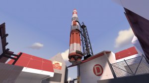
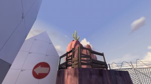
  • Added a c a c t u s
bluspawn.jpg
A.jpg AB.jpg B.jpg C.jpg D.jpg rocket.jpg cactus.jpg cliff.jpg

Read the rest of this update entry...
 

Vert

L2: Junior Member
May 30, 2014
71
21
Changelog:
  • Added a forward spawn for blue after capping B (finally)
    • This almost makes the existing forward spawn redundant, I will need to see how this works in practice
  • Made the right flank at B taller and gave it more cover
  • Made the left flank for B stronger for Blue, but harder to reach by either side
  • Closed off a staircase that never saw any use (might bring this back later)
  • Made the trench at C deeper and wider
  • Moved the upper flank at C farther from the action so to make it safer for Blue, as well as adding more cover
  • General quality of life fixes (more light, fewer shadows, etc)
And most importantly,
  • Completely rebuilt D
    • Takes inspiration from the previous version, but with very different implementation to make each route more fair and useful
    • Made the flanks stronger for Blue and harder for Red to use back on them
    • Rebuilt all Red spawns for Badwater-inspired spawn logic

Read the rest of this update entry...
 

Vert

L2: Junior Member
May 30, 2014
71
21
Changelog:

  • Minor tweaks to point B. Strong chance I will have to rebuild the point in the future, but for now I've just tried to make the current build better balanced.
    • Added health to the lower area of A, to help Blue as they push towards B
    • Removed cover from the right flank since it didnt help Blue much, and instead hindered their access to the cart
    • Made right flank slightly less friendly for Red by making it tighter to walk up
    • Readded stairs between choke and left flank to make it easier for Blue to reach
    • Added a small health kit to the left flank
    • Removed the rollback before the point itself
    • Made Red's respawn timer slightly longer
    • Made Red's spawn exit for A/B two-way

  • Rest of the map
    • Rotated 180 degrees so the light_environment hits more important walls
    • Raised cover in the trench so that it's still in the shadows
    • Made Red's spawn room cover the hallway as well as the main room
    • Added more signs
    • Slight health tweak at D

Read the rest of this update entry...
 

Vert

L2: Junior Member
May 30, 2014
71
21
Changelog:

  • A
    • Fixed a stuck spot in a rock (thanks PigPig)
    • Fixed stickies bouncing off of a fence (thanks r0nii for discovering and recording it, and thanks Tiftid for your unfortunate sacrifice)
  • C
    • Rebuilt the flank routes with the goal of reducing travel times for Blu, as well as making them more worthwhile. The aim is that they finally have a space to overtake Red's overpowered high ground
  • D
    • Made the upper balcony much more defendable
    • Blu now has a much longer walk to the balcony that puts them in Red's line of fire
    • Red has an extra door from respawn to the balcony
    • Increased health and ammo on the Red side of the balcony
    • Adjusted spawn times in Red's favour
  • General
    • Updated floor textures from dev's to a ground texture. Not strictly game-changing but it livens the map up a lot. No more dull grey endless expanses to walk upon

Read the rest of this update entry...
 

Vert

L2: Junior Member
May 30, 2014
71
21
Much bigger update this time, since there was a lot of rebuilding.

Changelog:
  • A
    • Rebuilt A to widen it in all directions
    • Added another staircase from the tracks to the balcony
    • Moved the point further forward, so ensure Blu can only cap once Red has been truly pushed out of the area
    • Added some much needed theming, specifically making the area a train station, including reworking the left flank into a train warehouse
    • Rebuilt Blu spawn to be more intuitive and to not encroach on space needed for D
  • B
    • Rebuilt B to give Blu a reasonable way to assault Red without stomping the entire server
    • Widened choke significantly
    • Removed path to the right flank from the Red side, but made it less effective for Blu
    • Reworked the left flank, so that any Red players attempting to use it get behind Blu will now be directed into the choke instead
  • C
    • No major updates
  • D
    • Widened entire area, specifically the C-D connecting area to give Blu more methods of entry into D, specifically to prevent Red from using the underpass as an earlier choke than intended
    • Gave Blu a better forward spawn so they can better pressure Red

Read the rest of this update entry...
 

Vert

L2: Junior Member
May 30, 2014
71
21
Small update

Changelog:

  • A
    • Added signage to the door that opens when A is capped to indicate that it is locked
    • Added a blockbullet to the fence
  • B
    • Added more health and ammo for Blu attackers
    • Cleared up signage for Red
  • D
    • Made the last hill less difficult for Blu by making it slightly shorter
    • Increased Red's respawn timer
    • Moved health and ammo in the Safe Structure from the Red side to the Blu side
  • General
    • Increased round timers for each point by ~30sec each
    • Fixed some broken/missing clips

Read the rest of this update entry...
 

Vert

L2: Junior Member
May 30, 2014
71
21
Changelog:

  • C
    • Added another route to the top level, coming from the cart path/choke
    • Added more signage to the basement, to encourage players to use it to travel to the top level (this route has been integral, but hard to find and few people ever knew it existed)
    • Made Blu's route to the top flank less convoluted
      • It now originates in Blu's lobby for C, rather than at B
  • D
    • Made it more difficult for Red to reach the Safe Structure
    • Extended some highish ground on the Blu side
      • This should make Blu's side of the area less invadable by Red, as well as giving Blu more chances to push forward
  • General
    • Shortened setup time
    • Fixed a door clipping at Red spawn
    • Adjusted spawn times for balance, as well as coordinating pushes.

Read the rest of this update entry...
 

Vert

L2: Junior Member
May 30, 2014
71
21
Small bugfix update

  • Fixed Red players getting into Blu's first spawn (oof cant believe i just missed one of the visualizers)
  • Adjusted one of Blu's spawn exits to be avoid a nasty sightline (though lofi did manage a beatiful machina shot through it)
  • Added health and ammo to one of the staircase rooms at D

Read the rest of this update entry...
 

Vert

L2: Junior Member
May 30, 2014
71
21
Changelog:

A lot of subtle balance tweaks, namely timers and respawn lengths.
Cleaning up of sketchy geometry.
Probably more things that I forgot

Read the rest of this update entry...
 

Wilson

Boomer by Sleep
aa
May 4, 2010
1,388
1,227
I really like this map's style and a lot of the gameplay spaces the map offers, but I feel like this map has some really deep fundamental flaws that really eat away at the experience, a lot of times this map is either a complete lockdown for A or B, or just a total roll because you have to defend this map in a very specific way.

It has now been twelve versions and the map hasn't really improved all that much in my eyes, so I thought I should go into in detail what I think is wrong with the map and suggestions how to potentially fix the issues without reinventing the whole map.

Let's start with A, where these issues right away raise their head.

yHHDBiw.png


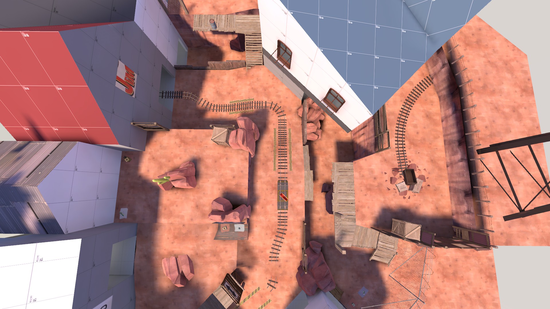
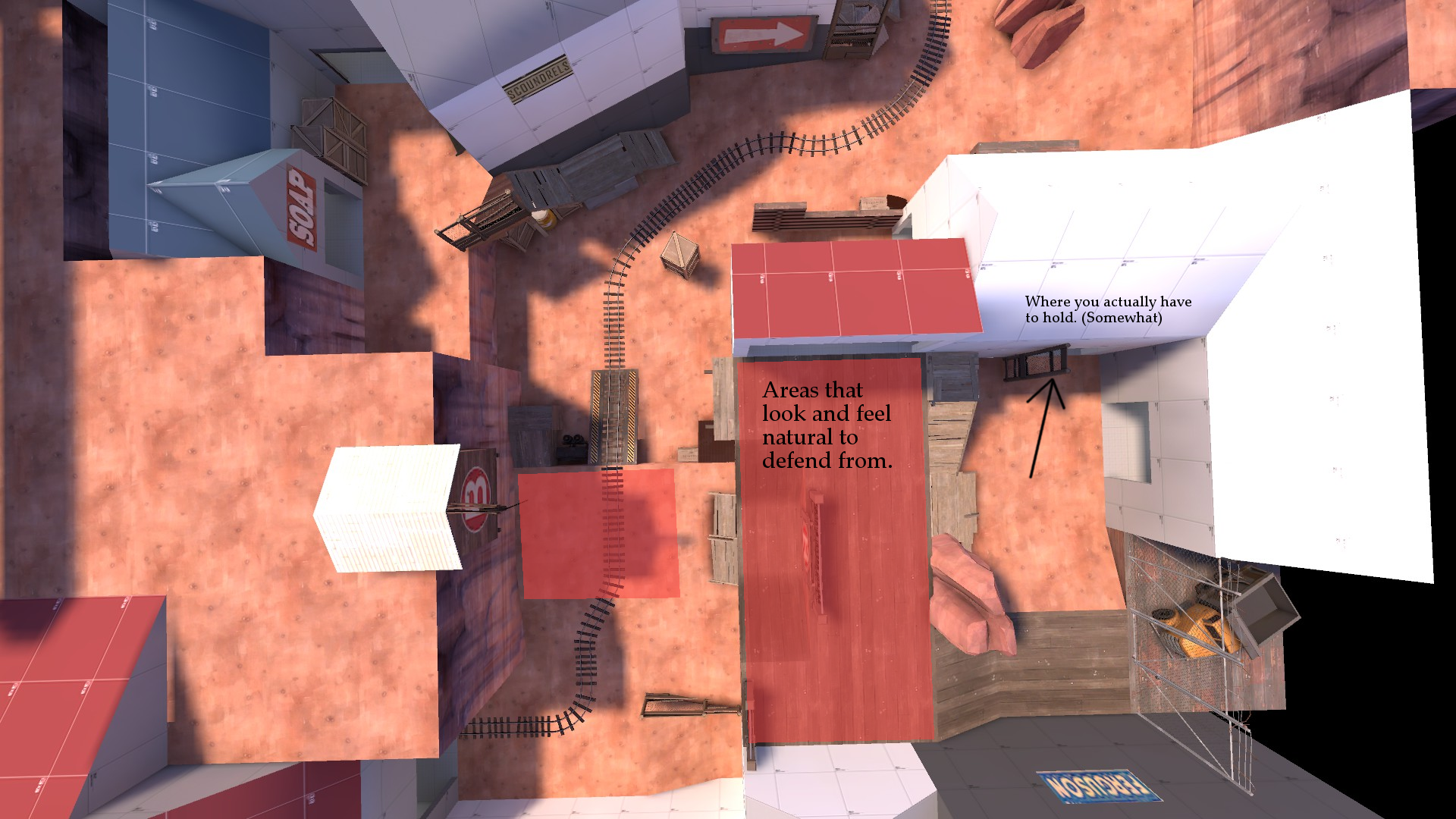
A has a really cool gameplay space to fight in and when you first enter the area as RED, you are right away greeted with spaces that seem natural to defend from once the forward hold falls. Unfortunately because of the way the map is currently, holding where all the ammo and space is, is actually almost always the worst way to defend. That is because blue has a route that entrance is disconnected from the area that goes all the way around the point.

GKt6ctC.jpg
SCIdpVx.jpg


Because slower attacking classes have very awkward rotation to the upper areas from the cart route and the flank is right here, holding the dev textured platform and the small room next to it feels like almost the only effective way to prevent BLU from overwhelming the defense and starting to roll. Since these are the only two routes BLU really has, this tactic also usually results in BLU being totally stonewalled from A in a very frustrating manner if the defending team puts all their focus in this area.

In the instance RED doesn't put all their eggs in this basket, this route is extremely broken if BLU chooses to abuse it. Not only does it place players using it out of the reach of the platform overlooking the point, it continues further and bypasses the A point entirely, effective allowing players to either get directly behind the defense or skip A and go to B and the enemy spawn.

Because of this, defending A doesn't feel very dynamic or fun, the map is basically forcing me to play one way and gives BLU a very annoying way to abuse the map if I do not. My suggestions how to fix this and hopefully make the point more enjoyable and varied experience are as follows:

V4yjleq.png
wTR83wU.png

klQjL8s.jpg


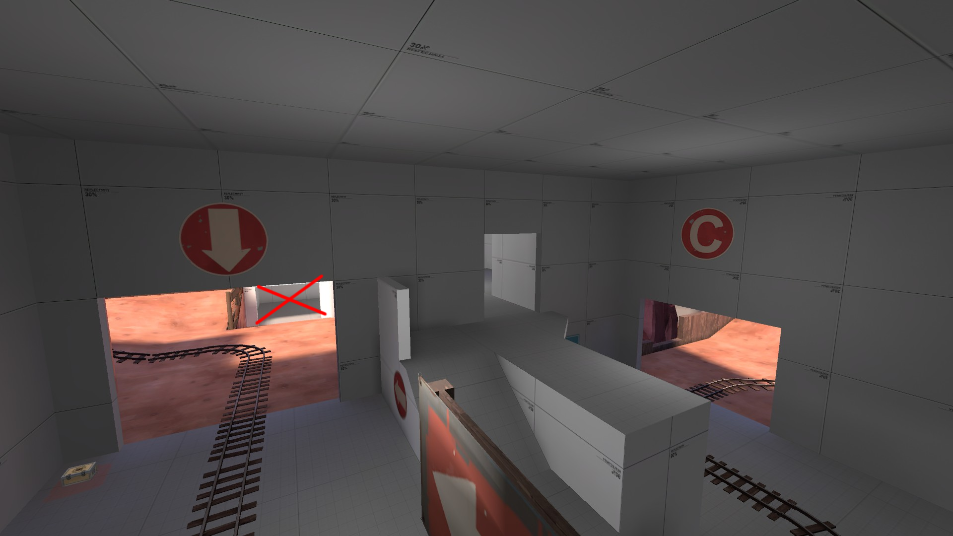
Improve the rotations from the cart area for BLU, right now it is very awkward to be in the area where the cart goes through and try to move to the higher ground or switch your positioning towards the flank. If RED pushes either route with an uber, you are usually forced to retreat in one direction and in a relatively straight line. Also make the wall in the tunnel chickenwire so this isn't such a blind turn for either team and you'll see the pushes coming as the attacker. These changes should make playing in this area less of a chore and nerf the dev texture spot moderately, so it isn't so shutout inducing and easier to play around if that is where RED chooses to hold.
N2WTLuq.png


In exchange, I think you should remove the big flank that goes around A entirely, it is a waste of space on best days and map breaking on the worst. I think it would be more dynamic if this area allowed blue to gain equal or relatively equal height to match red's on the other side of the point, a bit like C point but better. (I'll get to that later on.) In theory, this should focus the fighting around the point, prevent non-flanking classes from easily getting behind RED and be overall improvement over the current A.
HoLVJid.png


B has the same problem, although it is not as bad as it is at A and it just might be a byproduct of the flank at A and A usually being a roll when blue isn't totally shut out, but it is still something that bothers me. If RED doesn't get a forward hold right away after A, in many scenarios I have seen a medic combo flank around onto the high ground above B before RED has any real defense set up and are still recovering from losing A. Even in the event it doesn't happen, this area feels very awkward to hold and build sentries in. Often a demoman can sneak into the low ground and pipe the nest without being seen by it and it makes the area bit awkward to fight in, in general.

I wouldn't change much about B as it is right now, the two suggestions I have are as follows:

rgptGiV.png


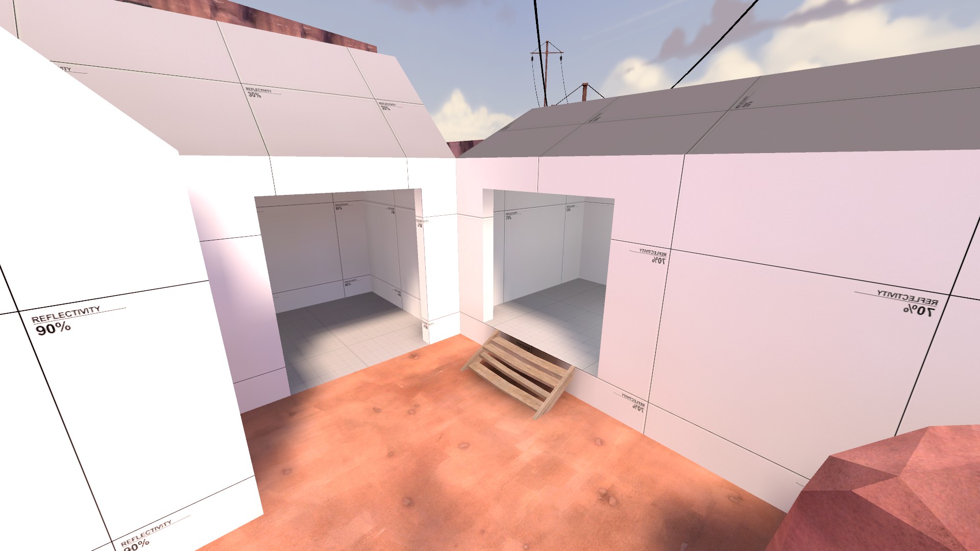
Even this area up and reduce the flank to the one of the two door (You might have to rearrange how the inside is laid out) to make it more specious to fight in, there is plenty height variance around already so this feels like a bit of an overkill, flat space isn't always bad.

BkaUsY1.png


This route is also really awkward for both teams, neither team has a very natural approach to it and I am not sure how RED is meant to hold it and it doesn't feel very good to approach for BLU through either route to B. I think a doorway would probably be simpler and better for the flow.

NRiFzXN.jpg


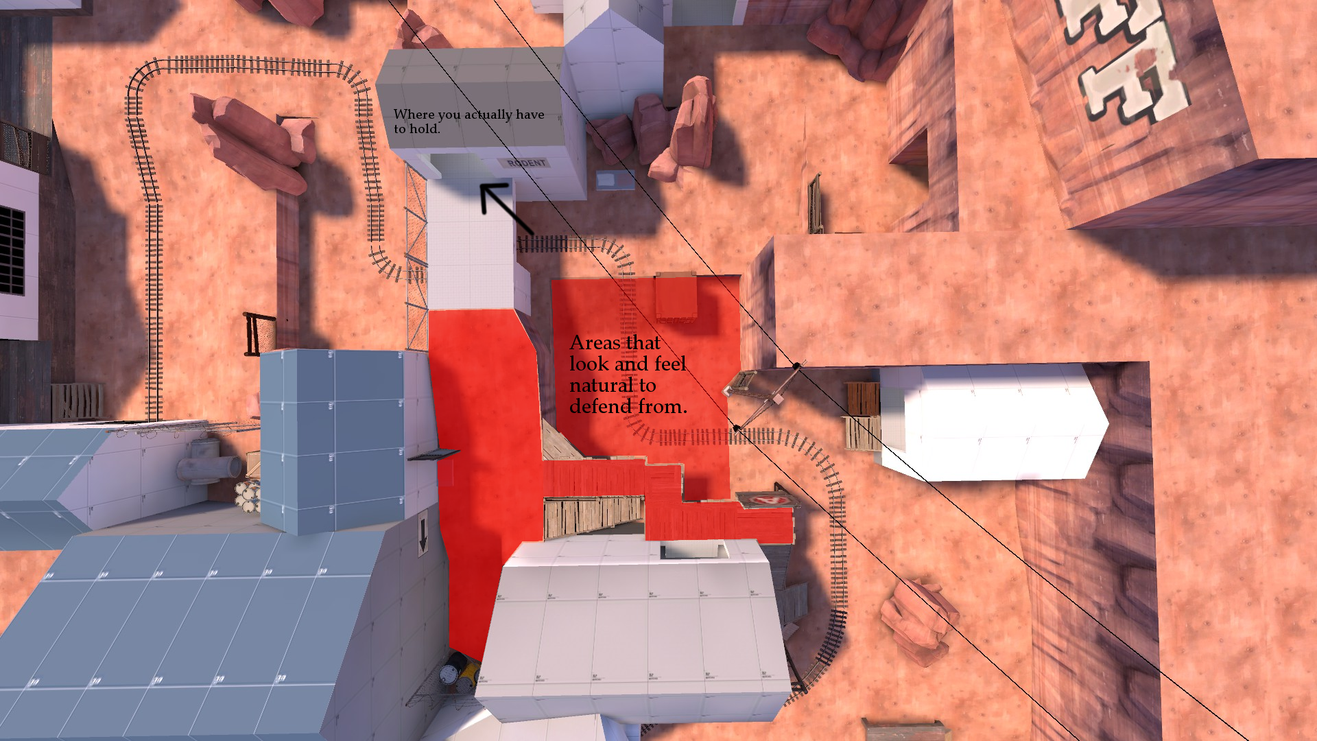
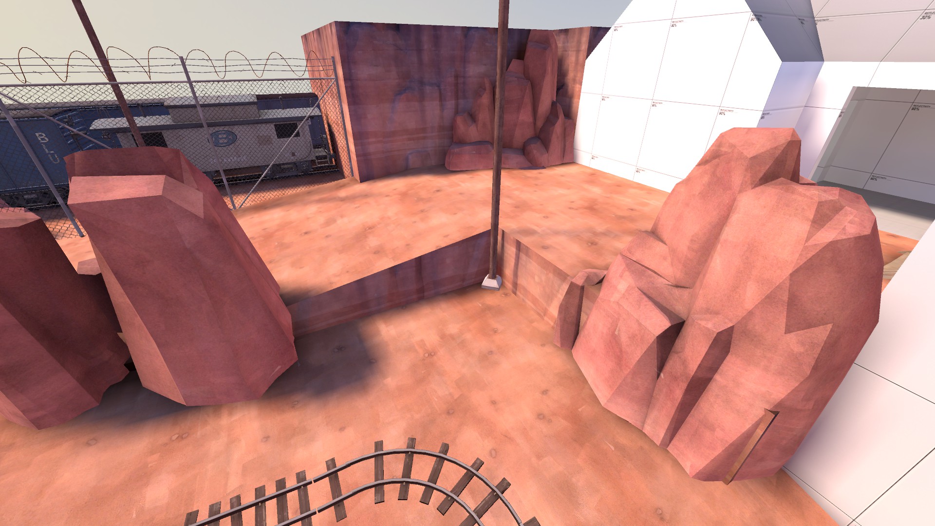
Now on to my both favorite and least favorite point on the map. I love C's general design, it looks cool, it seems like an interesting playspace on paper but most of the time RED loses control of this area before they can ever hope to get control of it because blue can access the highground over the point before RED has any form of concrete defense set up.

fHvEvjK.jpg


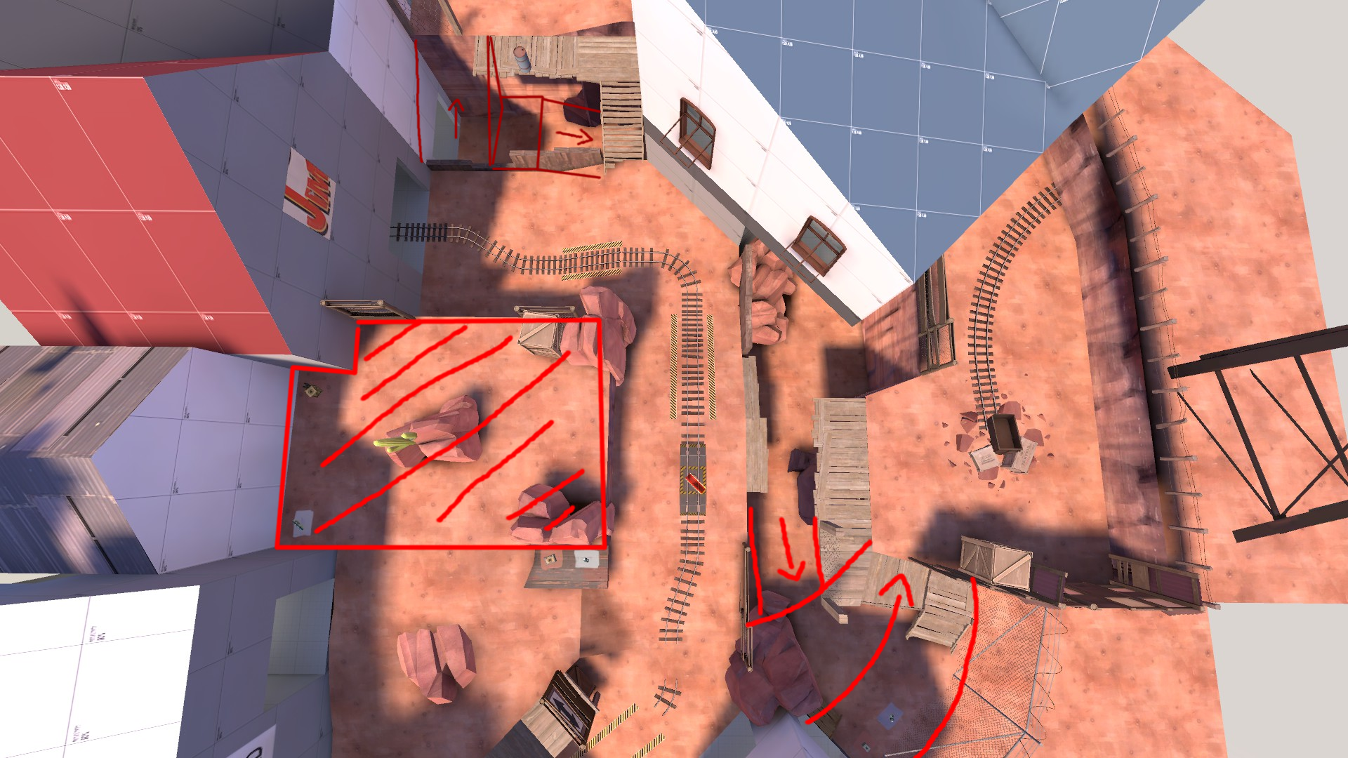
This is because the entrances to the flanks start far, far away from the point and only way for RED to control them is to either go the flanks themselves, which are not very good positions to defend from and usually takes too long, or push far away from the point almost back to B. I know these are set up the way they are because otherwise only way BLU has into the would be seen from cliff right above the doorway.

7HGtG8F.png

E7GIVrV.png


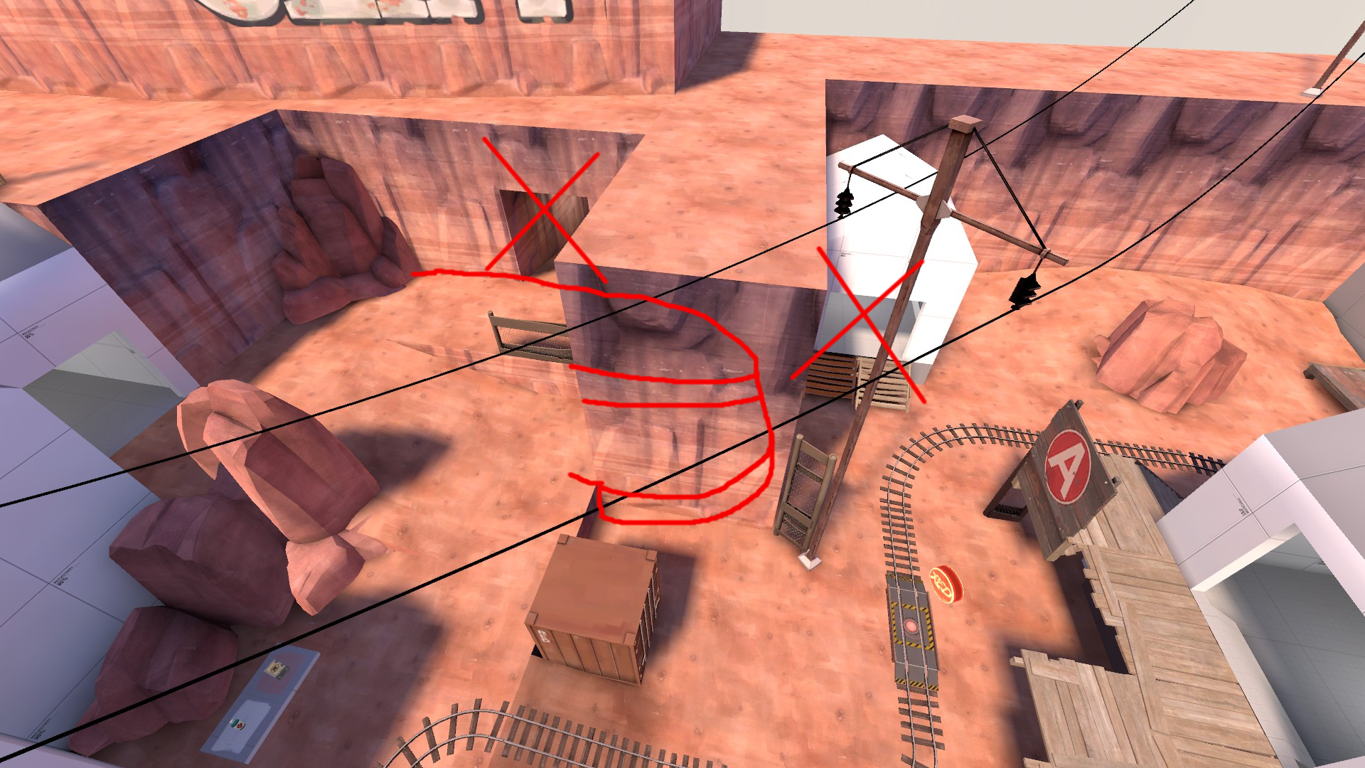
I would turn the current cliff opposing the cliff BLU likes to use into an inaccessible area (Cliff, building, whatever) and make the other cliff into the main defensive area RED uses, then close up the long flank to the lower path and bring all the routes closer together. This would be more cohesive and in theory give RED much better control over the area and make the point layout in general feel much less janky.

I had thoughts on D point also but I saw some of the changes there had fixed few of the problems I had with it in the past, so what I was going to say about it is now null and I'll have to play the point more to have an opinion on it again. Please keep in mind that you don't have to realize my suggestions exactly, they are just food for thought more so than exact directions on what to do, I hope this post has helped.
 

Vert

L2: Junior Member
May 30, 2014
71
21
Changelog:
  • A
    • Ground level fences at choke are now see-through
    • Added a path from blu spawn to the choke on the right side to allow better retreats for blu, as well as a more covered path to the choke
    • Cliff flank has been removed, replaced with a simpler path that stays closer to the main area
  • B
    • Made left flank for straightforward by removing the branching paths
  • C and D
    • No major changes, want to see how A and B go before I change too much

Read the rest of this update entry...
 

Vert

L2: Junior Member
May 30, 2014
71
21

Thank you very much for the feedback, Wilson. Apologies on how long it's taken to get around to implementing your ideas, it's mostly down to taking a bit of a mapping break. I incorporated basically all of your ideas for A, namely in cleaning up that leftmost flank, making that area actually support the main path rather than being too separate.

I took some of your ideas for B as well, but not all. I've made the left flank not have a split path to make it more straight forward, but I've kept the building entrance as is, at least for now. All the previous versions of that route had a major issue in that it was far too easy for Red to take the flank backwards and get ground on Blue. This version very purposefully dumps them back into the choke, making it deliberately ineffective for getting behind Blue.

As for C, I appreciate your feedback, but I am hesitant to implement it for two reasons. Firstly, I can see it becoming very similar to how A was; everyone will fight over the top path, and no one will have any reason to take the main level/cart path. Secondly, and this is far more subjective, but your version compromises the general idea behind the point. My main idea was to have three distinct levels on the same hill; high ground to defend from, main level for the cart, low level for a flank. This created the Staggered structure of Rocks that gave the area identity. Removing the high ground on the left just changes how the point will be played beyond where I want it to go. The area on the right, that you highlighted as where you think Red's defense should be, is what I want Blue's primary flank to be. Perhaps the current incarnation of it doesn't do a good job of supporting this particular gameplay, but it is the direction I want this point to go.

Anyways, thank you very much again for the thorough feedback. I had been in a rut with this map, getting very little feedback, so getting a massive response like this is incredibly welcome. I hope you enjoy this version more, and I eagerly await any and all other feedback you may have!
 

Vert

L2: Junior Member
May 30, 2014
71
21
Changelog:

Slight tweaks to a13, namely in making C playable again.

C has had a history of blue steamrolling Red, usually caused by having too many routes for free. So I've slowly been whittling down Blue's options to make them more predictable to aid C's defendability, but it seems I've gone a step too far. Hopefully this version strikes a nice balance, I've brought back Blue's shortcut to the highest level, but hopefully they won't be able to overuse it, so Red still has a chance.

Read the rest of this update entry...
 

Vert

L2: Junior Member
May 30, 2014
71
21
Changelog:

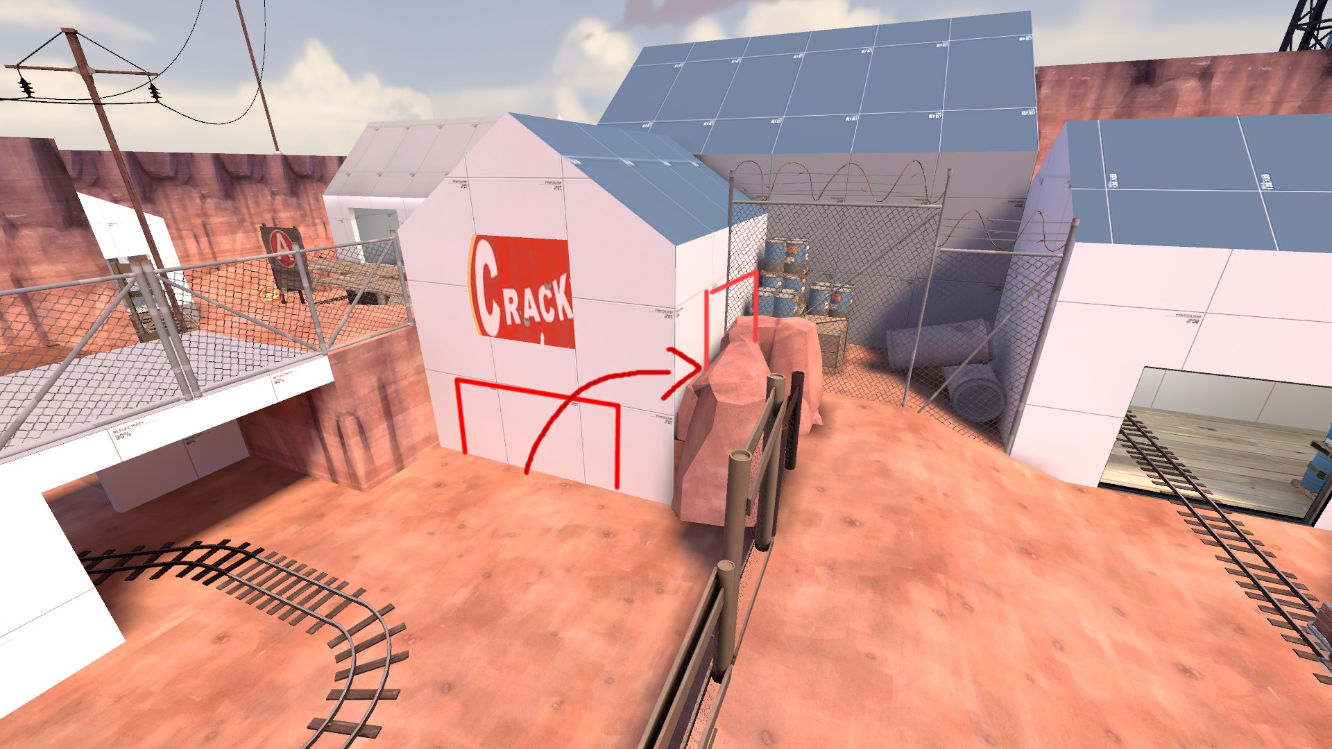
Heightened fence on bridge at A, it is no longer possible to jump over it now.

Cleaned up Blu's flanks into B. Left flank should flow better for attackers, and the geometry overall makes much more sense. Right flank was somewhat widened as well.

Many small visual improvements

Read the rest of this update entry...