Really beautiful map. Really fun map, too... unless you're on BLU team and they can't figure out how to get an uber in. Which is common, actually.
http://i.imgur.com/4dtEQR0.jpg
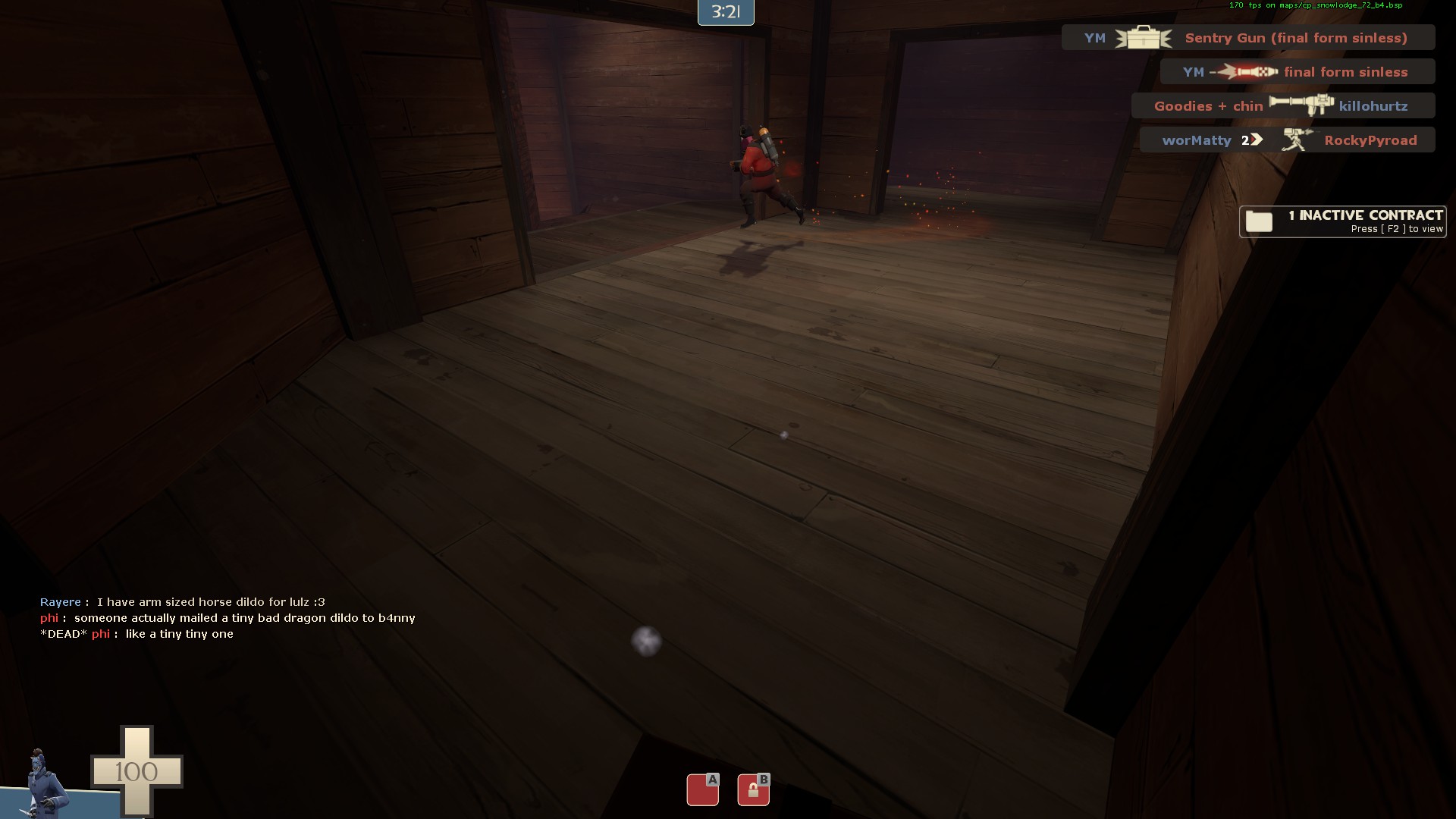
The problem (imo) is pushing this staircase seems like the obvious choice, but actually it's possibly the hardest? It's much better to come from either the far side (near the forward spawn door) or come up the back stairs. But no one knows the back stairs exist!
http://i.imgur.com/taosTOE.jpg
Part of the problem is the setup. Players see a big main route to the point and no indication there's another route near here. If you come in from
this side you're liable to miss the back stairs as well, because nothing draws or points you to it. The light on the main stair well is brighter, actually. A couple arrows might work. You might also want to get rid of the fireplace, since it doesn't make sense (where is the flume?) and move that detail piece somewhere else. Then you could either modify the column or just put a sign on it to help players realize there is a flank there. The back stairs themselves might need to be made better--bigger I think, maybe oriented differently?, maybe with pickups, I don't know. If RED occupies there it splits the defense a lot and makes pushes from the far right better; otherwise, BLU can use it to flank to great effect. Neat dynamic?
When players know about it, I think it's a lot easier to capture A. You just kind of have to remind them... I found that out a few times and finally confirmed it when we tested with alltalk off. Both points are defendable and that's very good, but I think people overestimate how hard A actually is because they don't know about those back stairs. It's such an important third route, yet no one knows about it.
http://i.imgur.com/b1TPX28.jpg
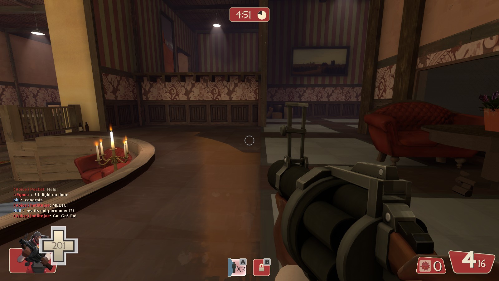
It annoys me how far to the side the forward spawn is. It makes it hard to reach (or want to reach) this far left door when playing slower classes. It's the far better route though, so I guess that's fair.
B feels a little simple to me. Every position kind of neatly outranges 2 others, so everyone is always getting crossfired on. I think it could stand to be a little more complex, maybe with more sightline blocking? A different layout? More interesting balconies? It's kind of tricky to fight around the furniture as it is now. Also, because the far left path into B is so far away, I frequently feel very separated from my teammates when attacking B. As RED, I kind of feel like BLU just filters in randomly a few at a time until they eventually filter in fast enough that we lose. It's weird. Potentially making one half of the lodge more unique in layout would help in creating a space BLU could inhabit. Then the other balcony could be changed accordingly, to offer some contrasting benefit.
I like your detailing, it's beautiful, but the glass doors going in/out of B feel off to me. I don't know that the main doors to a lodge would be supermarket doors, you know? And I find many of the walls to be quite plain. There aren't main overlays or paintings inside the lodge, or the building just after the blu forward spawn. And people are rendering
this whole room for no reason.
The lighting is a bit drab, which is a letdown, but that's the most time consuming thing to do so I can hardly blame you! I think it will be a fun map to light. Really embrace the Manor aesthetic!
This was my favorite map in the contest.
+ very unique points
+ very well put together a/d map
+ well thought out gameplay spaces
- B feels a bit too spread out and funky
- attacking A can be a big big challenge
8/10