KotH Shutdown [Deleted]

Status
Not open for further replies.

Svode

Take a Chance on Me
aa
Jul 31, 2016
166
471
Went and reviewed after the new update:

General concerns - focus on these first
Scale

the map's scale is too darn high. Work on an update to make things less overscaled, please?
Gaps and holes
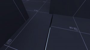
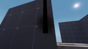
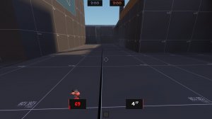
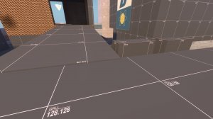
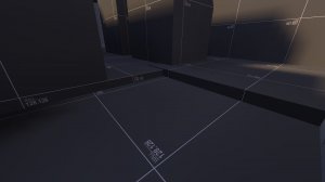
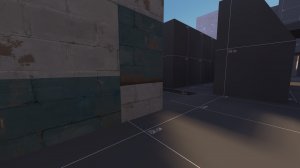
this map is full of them.
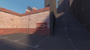
20170720140706_1.jpg 20170720140613_1.jpg 20170720140754_1.jpg 20170720141105_1.jpg 20170720140932_1.jpg (HUD visible in the last, whoops)
Try to fill these in, it isn't hard

Minor Concerns - fix these, but doing so isn't mandatory
20170720140556_1.jpg
This Supply Cabinet doesn't fit the wall. Maybe move it or widen the wall?
Alignment
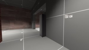
20170720140804_1.jpg 20170720140817_1.jpg 20170720140831_1.jpg 20170720140841_1.jpg20170720141043_1.jpg
Several things are misaligned. Although not impacting gameplay, it should be noted and fixed.
Rooftops
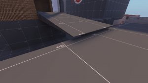
20170720141259_1.jpg

Work on getting some basic rooftops in. It would help this map greatly and make it look more presentable. Also, what is with the rooftop pictured?
This texture?
20170720141056_1.jpg

Fix it please.
Textures
Speaking of textures, several of the ones on this map (especially on the walls) are scaled improperly. Fix the scaling

Gameplay Concerns - fix these before the next update
20170720141136_1.jpg

These three exits aren't useful at all. Exits are supposed to provide pros and cons of usage, one may lead to a shorter distance to the point while giving up some cover while another is more secure but longer. These three are all in the same area, providing no diversity and alternate routes a player could take.
20170720140710_1.jpg
What is with this route? A player would take fall damage if they fall from it, which they would have to do. Shorten it and give it more cover, maybe make it branch into a separate path?
20170720140911_1.jpg (Whoops again :p)
What are these useful for? Cover? Replace them with a building or at least a fence, they are bulky and confusing
20170720141226_1.jpg
Most of all, your map is still a maze. Not as much as it was before, but it still is one. Allow players to go through buildings, have height differences, do anything to kill the confusion!
Also, what's with the lower area? Players can't access it, so you should take it out to clear things up

Just my two cents. You don't have to comply with my ideas, but I'd still like to share them to give you advice.
 
Last edited:

FishyUberMuffin

War Paints Everywhere
Apr 26, 2015
954
186
Went and reviewed after the new update:

General concerns - focus on these first
Scale

the map's scale is too darn high. Work on an update to make things less overscaled, please?
Gaps and holes
this map is full of them.
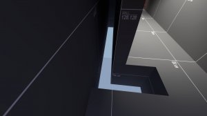
20170720140706_1.jpg 20170720140613_1.jpg 20170720140754_1.jpg 20170720141105_1.jpg 20170720140932_1.jpg (HUD visible in the last, whoops)
Try to fill these in, it isn't hard

Minor Concerns - fix these, but doing so isn't mandatory
Alignment
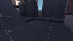
20170720140804_1.jpg 20170720140817_1.jpg 20170720140831_1.jpg 20170720140841_1.jpg20170720141043_1.jpg
Several things are misaligned. Although not impacting gameplay, it should be noted and fixed.
Rooftops
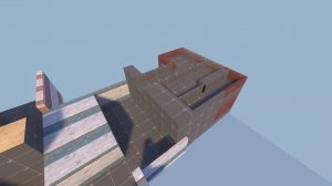
20170720141259_1.jpg

Work on getting some basic rooftops in. It would help this map greatly and make it look more presentable. Also, what is with the rooftop pictured?
This texture?
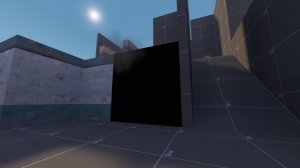
20170720141056_1.jpg

Fix it please.
Textures
Speaking of textures, several of the ones on this map (especially on the walls) are scaled improperly. Fix the scaling

Gameplay Concerns - fix these before the next update
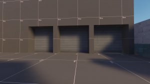
20170720141136_1.jpg

These three exits aren't useful at all. Exits are supposed to provide pros and cons of usage, one may lead to a shorter distance to the point while giving up some cover while another is more secure but longer. These three are all in the same area, providing no diversity and alternate routes a player could take.
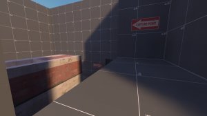
20170720140710_1.jpg
What is with this route? A player would take fall damage if they fall from it, which they would have to do. Shorten it and give it more cover, maybe make it branch into a separate path?
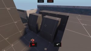
20170720140911_1.jpg (Whoops again :p)
What are these useful for? Cover? Replace them with a building or at least a fence, they are bulky and confusing
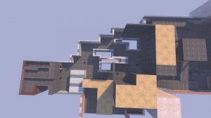
20170720141226_1.jpg
Most of all, your map is still a maze. Not as much as it was before, but it still is one. Allow players to go through buildings, have height differences, do anything to kill the confusion!
Also, what's with the lower area? Players can't access it, so you should take it out to clear things up

Just my two cents. You don't have to comply with my ideas, but I'd still like to share them to give you advice.

How is the scale wrong? I have the the space itself the scale to cp A area: 2240 by 2240, cp B area: 2752 by 1600 and the height for the doors is 192. The height for everything is 256. The lack of roofs are just cosmetics I dont worry about that. Those buildings are meant to be like those in cp_sunshine mid. The lower area is blocked off so it should not be touched,
 

Svode

Take a Chance on Me
aa
Jul 31, 2016
166
471
How is the scale wrong? I have the the space itself the scale to cp A area: 2240 by 2240, cp B area: 2752 by 1600 and the height for the doors is 192. The height for everything is 256. The lack of roofs are just cosmetics I dont worry about that. Those buildings are meant to be like those in cp_sunshine mid. The lower area is blocked off so it should not be touched,

Have you checked the vertical scaling? I felt ramps being WAY too large and fall damages being magnified.
 
Last edited:

FishyUberMuffin

War Paints Everywhere
Apr 26, 2015
954
186
Is the vertical scaling good also? I felt ramps being WAY to large and fall damages being magnified.
It is. I have done everything that the scaling told me to do.
 

killohurtz

Distinction in Applied Carving
aa
Feb 22, 2014
1,016
1,277
Most doors in the game are 128u high (see the doorframe props) and 192u is the standard ceiling height (256u for a little more head room). Players take fall damage starting at 270u, so 256 is a good maximum height difference to follow. Also, scaling isn't just about how much of the Hammer grid the map takes up; it's about how you use the space. Add plenty of cover and height variation to keep the map interesting and allow players to travel without feeling exposed.
 

FishyUberMuffin

War Paints Everywhere
Apr 26, 2015
954
186

FishyUberMuffin

War Paints Everywhere
Apr 26, 2015
954
186

Svode

Take a Chance on Me
aa
Jul 31, 2016
166
471
Could you try to gather your updates and release them in big chunks instead of pushing several micro-updates? It seems to be rather spammy
 

FishyUberMuffin

War Paints Everywhere
Apr 26, 2015
954
186
Could you try to gather your updates and release them in big chunks instead of pushing several micro-updates? It seems to be rather spammy
This update came out very quick due to there being a massive export we're in the door of the spawns I did not connect the two walls together and players could get out of the map. That is why I had to push out this update.
 

Svode

Take a Chance on Me
aa
Jul 31, 2016
166
471
This update came out very quick due to there being a massive export we're in the door of the spawns I did not connect the two walls together and players could get out of the map. That is why I had to push out this update.
Then you may want to make it a sub-update. Like "A7a" or something
 

FishyUberMuffin

War Paints Everywhere
Apr 26, 2015
954
186
Then you may want to make it a sub-update. Like "A7a" or something
Also I just found another glitch in my map were one of the spawns location in blue is red for some reason so I have to fix that as well.
 

FishyUberMuffin

War Paints Everywhere
Apr 26, 2015
954
186

Auwi

Certified in best in fun
aa
Dec 12, 2012
188
498
I've looked a lot at the map today and from previous images, I can tell from the holes and peaking brushes you might not be aware of the grid function hammer has?

You can enable grid by going under the "Map" tab at the top and clicking "snap to grid", alternatively you can press "shift + w"

You can also downscale or upscale your grid by pressing the bracket keys ( [ and ] ) or manually in the grid settings under the "Map" tab
DfRx5fb.png


Remember to always have your grid enabled when you're making brushes, it'll help you be more precise
 
Status
Not open for further replies.