respawn combat center beta1

ARENA respawn combat center beta1 .5

Dr.crazy

L1: Registered
Jul 28, 2016
21
2
respawn combat center beta1 - an arena respawn

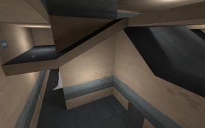
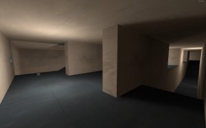
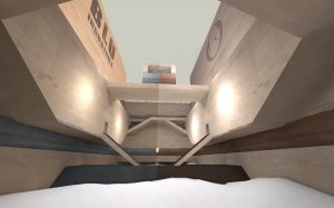
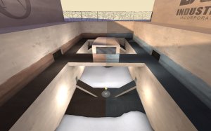
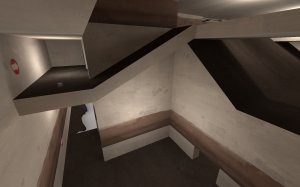
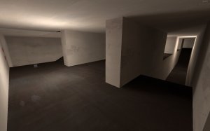
arena_respawn_combat_center is highly vertical map with very little detail (just some textures that will more then likely be replaced) I'm looking for feedback on the layout so I can start making it look pretty so any advice is appreciated.
The map uses the "arena respawn" rules without the need for a server mod thank to "YM" for help with the game logic, however at this time there are still crits when there are 3 or less players on a team as this is low on my priority list. Thank you so much in advanced to anybody who takes the time to critique my map. And another thanks to crash for his video tutorials to help plebs like me get past the wall of information that is starting to map for tf2
View attachment 26277 View attachment 26279 View attachment 26280 View attachment 26281 View attachment 26282
 

Dr.crazy

L1: Registered
Jul 28, 2016
21
2
I changed the layout because it felt a little too symmetrical, I also added arrows to indicate paths to the point. Screenshots are pretty inaccurate now, however I'll probably wait until I change the map again to update those.

Read the rest of this update entry...
 

Dr.crazy

L1: Registered
Jul 28, 2016
21
2
2/3 massive site lines at mid have been fixed, however I left the long site line from the bottom corner to the top corner of mid as you are very exposed when trying to take advantage of this site line thus rendering it much less of a problem.

Read the rest of this update entry...
 

Dr.crazy

L1: Registered
Jul 28, 2016
21
2
Thanks for the feedback! Do you think making more paths between the upper and lower section could help to alleviate some of that imbalance, and more importantly how can I avoid separating the upper and lower areas
 

Dr.crazy

L1: Registered
Jul 28, 2016
21
2
:( no.... idk why you spawned in the wall there are 20 spawn points for each team (excessive I know) and I just unchecked all my other vis groups to confirm they are all in the right spot
 

Necrσ

aa
Nov 16, 2015
198
488
Turned out I didnt spawn in a wall and was just in spectator so nvm,
anyway after flying around for a bit the main problem that suck out in the map was the large height variation. The best way to fix this would be to decrease the angles on your ramps (see the picture) and then bring the floors down
advice 2.png

You could also smooth out the displacements on the ground a bit as well.
advice 1.png

Last thing, change up the textures just a bit so you can tell which part of the map you are in or just add some signs to tell the player which way to go!

Hope this helped and I look forward to seeing the future versions of this map
 

Dr.crazy

L1: Registered
Jul 28, 2016
21
2
thank you very much for your input signs have been added and I'm currently working on the displacement, however I'm also trying to come up with another solution for the height variance though I do appreciate the solution you offered and I'm glad to have it to fall back on if I don't come up with something else (the only reason I don't just do it the way you suggested is I really don't want to change the geometry in a way that reduces height, but I may have to.)
 

Dr.crazy

L1: Registered
Jul 28, 2016
21
2
a lot has been changed on the interior areas of the map, hopefully its a step in the right direction to not have as many long halls or "soldier OP" areas. The displacement changes in mid where made on a user suggestion and should help to make slower moving classes (mainly hoovy) more viable.

Read the rest of this update entry...
 

Dr.crazy

L1: Registered
Jul 28, 2016
21
2
how is that constructive
i was fucking there if you don't have any input please don't post
 

Dr.crazy

L1: Registered
Jul 28, 2016
21
2
because of kids like you who cant articulate why they don't like something and resort to saying "nobody likes your map" please try and form an actual response if your going to bother to reply