You are using an out of date browser. It may not display this or other websites correctly.
You should upgrade or use an alternative browser.
You should upgrade or use an alternative browser.
Don
L2: Junior Member
- Jun 3, 2009
- 89
- 14
I hate how people are already taking less interest in other maps because they see one that looks good. There are 3 Months left, people!
Don't get me wrong, this is a beautiful map and all, but people like that annoy me.
Dont be afraid, I won't stop mapping for the contest.
It's only a way to say it's a very very very nice map.
i no way did i want to deter people from entering/continuing, that would be just plain awful and i would be a horrible person D:
i just thought that posting frequent updates and trying out new things/themes/models would fire up the contest and show that there is still so much to explore
and so far i love what i see incoming... tons of custom skyboxes/textures/intel-models/themes/ideas....the list is looong
to be honest, i doubted that what i started there would turn out very visually appealing, but when i fired up the new skybox and rounded the theme up by finetuning with some custom textures it just fell into place :blushing:
we´ll see next weekend how this will turn out gameplaywise, i hope good and i don´t have to shuffle the layout too much
Last edited:
CTF_Premuda_A1
Stages 1&2
Download
Don´t hit me for the filesize, massive custom content has its price
________


________
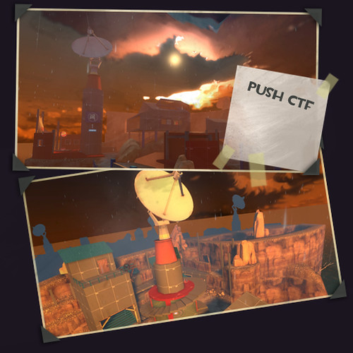
A community map created by eerieone
Objective Blu:
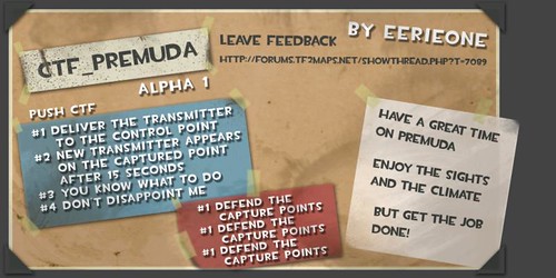
BLU wins by bringing the Transmitter to the Capture Points. After the initial Capture the new Transmitter appears after 15 seconds on the captured point.
Objective Red:
Stop BLU from delivering the Transmitter. Standing on the middle of the CP blocks the Capture. Transmitter returns after 15 seconds.
_________
thx to DBP, andysss456 and y´all
Stages 1&2
Download
Don´t hit me for the filesize, massive custom content has its price
________


________
A community map created by eerieone
Objective Blu:
BLU wins by bringing the Transmitter to the Capture Points. After the initial Capture the new Transmitter appears after 15 seconds on the captured point.
Objective Red:
Stop BLU from delivering the Transmitter. Standing on the middle of the CP blocks the Capture. Transmitter returns after 15 seconds.
_________
thx to DBP, andysss456 and y´all
28MB?
Ridiculous, let alone for an alpha.
sry man, that´s the way i roll, can´t work with bricks and placeholders
@ravidge:
i´m not one to push out 50 alphas and 30 betas
cashworks had dunno, 12 versions so far, i think thats acceptable
MungoKing
L3: Member
- Jul 12, 2008
- 148
- 47
Walking around, it seems like a pretty cool map, can't wait to see the setting fleshed out. Just a few graphical things, even though this is an alpha the map is too pretty to have such things 

There needs to be some blank sky under the current bottom of the skybox, as of right now it looks weird having the sea fade off into the distance and then clouds with weird square bottoms.

I'm sure you know about this, but I figured I'd post it anyways. Not sure how to fix it though

This is a screenshot of my view from being perched inside the rotating satellite dish above point 2-2. I don't think there'd be any real gameplay advantages too it, but you are completely hidden inside it, so just playerclip off the top of that.
Also, I forgot to take a screenshot, but when you are close to the water and down on the ground level you get this odd reflection type of thing on the right hand side of your screen, not sure what it is. Sorry I don't have a screen .
.
All in all it looks good, some real original stuff happening in here! Please remember to move your rain particles away from the buildings and playerclip those stairs! And one final thing, is that boat in the 3D skybox a custom model?

There needs to be some blank sky under the current bottom of the skybox, as of right now it looks weird having the sea fade off into the distance and then clouds with weird square bottoms.

I'm sure you know about this, but I figured I'd post it anyways. Not sure how to fix it though

This is a screenshot of my view from being perched inside the rotating satellite dish above point 2-2. I don't think there'd be any real gameplay advantages too it, but you are completely hidden inside it, so just playerclip off the top of that.
Also, I forgot to take a screenshot, but when you are close to the water and down on the ground level you get this odd reflection type of thing on the right hand side of your screen, not sure what it is. Sorry I don't have a screen
All in all it looks good, some real original stuff happening in here! Please remember to move your rain particles away from the buildings and playerclip those stairs! And one final thing, is that boat in the 3D skybox a custom model?
PMAvers
L6: Sharp Member
- Jan 29, 2008
- 389
- 142
Lookin' good, I gotta say. 
Ran around it a bit solo, and noticed a few bugs with the HUD.
There seems to be one where, after ending a round in victory for the attackers and the team swaps, the HUD will still be pointing at the intel at "Home" in the second stage, instead of the first-stage one.
Ran around it a bit solo, and noticed a few bugs with the HUD.
There seems to be one where, after ending a round in victory for the attackers and the team swaps, the HUD will still be pointing at the intel at "Home" in the second stage, instead of the first-stage one.
Tinker
aa
- Oct 30, 2008
- 672
- 334
A few things after running through:
If you melee while carrying the intelligence, you'll see the intelligence in front of you. In some cases this looks cool; Medics, Spies, Demomen, Snipers, Heavies, Pyros all have a little dish above their head. But for Scouts and Soldiers the whole thing barges through your back apparently, looking really awkward
You can also see the edge of the intelligence and the dispenser beams when looking down, although this doesn't look really bad.
You don't get any points for capturing.
Raindrops coming through most buildings.
Is the door up the stairs in the stage 2 blu spawn supposed to open? Because it doesn't.
You can go through the rotating radar dishes as Demoman or Soldier.
A problem that carried over from cashworks I guess: ledges that look like you can rocketjump or just jump to, but you can't. This is especially bad in Stage 2 cap 2 on the left in MungoKing's last screenshot, and stage 1 cap 1 where there's a ledge that looks like you can jump to on the right, but when you try to jump there it clips you and you fall to your death.
The bit between stage 2 cap 1 and 2 feels like it could be a horrible Hydro-like chokepoint, but I guess playtesting will see to that.
Every single cap says "You have secured Command Point 1". I'd just remove those ugly letters
I will probably get rid of the dispenser-thingy
the beam doesn´t bother me, but i got some reactions saying its disturbing,
.... is there a way to change the beam or turn the beam off?
_______
second, the dispenser glitches out on the server
locally everything works perfectly, but as soon as its played on a server, the beam and healing effect sticks to the person who had the intel, even though he is not carrying it anymore :/
_______
for the intel hanging into the players view, i saw that on the soldier and pyro, need to move the intel further away from the carrier even more
_______
for the clipping part, there are several buildings on goldrush and dustbowl that should be jumpable, but they ain´t, people learn that and then it doesnt bother them anymore, but maybe i can make it more obvious
_______
the boat in the skybox is the freighter from granary, just way closer then on granery
_______
the second door in blu spawn on top isn´t supposed to open, just forgot to give it the no-access skin after roundchange
_______
the roofs will be leaky, i will make some overlay that looks like a leaking spot in the ceiling etc.
_______
is there a way to turn off the "command point" messages?? they annoy me too
 thx for testing
the beam doesn´t bother me, but i got some reactions saying its disturbing,
.... is there a way to change the beam or turn the beam off?
_______
second, the dispenser glitches out on the server
locally everything works perfectly, but as soon as its played on a server, the beam and healing effect sticks to the person who had the intel, even though he is not carrying it anymore :/
_______
for the intel hanging into the players view, i saw that on the soldier and pyro, need to move the intel further away from the carrier even more
_______
for the clipping part, there are several buildings on goldrush and dustbowl that should be jumpable, but they ain´t, people learn that and then it doesnt bother them anymore, but maybe i can make it more obvious
_______
the boat in the skybox is the freighter from granary, just way closer then on granery
_______
the second door in blu spawn on top isn´t supposed to open, just forgot to give it the no-access skin after roundchange
_______
the roofs will be leaky, i will make some overlay that looks like a leaking spot in the ceiling etc.
_______
is there a way to turn off the "command point" messages?? they annoy me too
Fearlezz
L10: Glamorous Member
- May 4, 2008
- 787
- 476
Okay, running through this map right now, this is what I have to say about it:
First things first, the colors in this map attracted me to download it. Even though I dont like the red fog against the blue skybox texture at all. And I really hope you are gonna do something about that skybox btw, it looks really fucked up and I hope u know it.
Also I noticed this in Blus spawn, ugly red fog is ugly

First thing that I noticed when picking up the transmitter was the dispenser beam, very nice idea. I like that alot.
And also, when carrying the flag and moving on I was about to jump over here, but then jumped right into.. a invisible wall? And fell and died. Create something there so its noticed that you cant jump over there.

And speaking of falling into your death while carrying the flag, maybe you can use some kind of trigger or something that detects that if a player that carried the flag died in a area where other players can not pick up the flag again, the flag timer (how long until reset) should then change to 1 second or less. So players dont have to wait around to get back into the game. Not sure if its possible, but hey, its worth the try!

When on my way the second point, I saw this, and I didnt see the glass at first, so I was like, omg, ill fall unless I walk on those support beams! So, maybe change the glass texture?

Now lets talk about stage 2. I really admire how you designed this area, you did the displacement all right and everything, great work!

Now whats this little black thing in the sea? I guess you have no clue? Well, this is a bug when a player is too high above water, you cant do anything about it then lowering the areas where this appears.


Also, I got stuck here:


So overall, its a excellent start, but the visual problems I mentioned are critical that you adjust, unless this is something you really want.
Great work so far!
First things first, the colors in this map attracted me to download it. Even though I dont like the red fog against the blue skybox texture at all. And I really hope you are gonna do something about that skybox btw, it looks really fucked up and I hope u know it.
Also I noticed this in Blus spawn, ugly red fog is ugly

First thing that I noticed when picking up the transmitter was the dispenser beam, very nice idea. I like that alot.
And also, when carrying the flag and moving on I was about to jump over here, but then jumped right into.. a invisible wall? And fell and died.

And speaking of falling into your death while carrying the flag, maybe you can use some kind of trigger or something that detects that if a player that carried the flag died in a area where other players can not pick up the flag again, the flag timer (how long until reset) should then change to 1 second or less. So players dont have to wait around to get back into the game. Not sure if its possible, but hey, its worth the try!

When on my way the second point, I saw this, and I didnt see the glass at first, so I was like, omg, ill fall unless I walk on those support beams! So, maybe change the glass texture?

Now lets talk about stage 2. I really admire how you designed this area, you did the displacement all right and everything, great work!

Now whats this little black thing in the sea? I guess you have no clue? Well, this is a bug when a player is too high above water, you cant do anything about it then lowering the areas where this appears.


Also, I got stuck here:


So overall, its a excellent start, but the visual problems I mentioned are critical that you adjust, unless this is something you really want.
Great work so far!
Last edited:
I've noticed a few small bugs.
You can stand on this tiny ledge.
A bit weird imo.


If you look up you can see the dish, although not really a problem, I thought I'd point it out.

And the already highlighted melee problem.
The scout and his bat seems to clip through the worst.

VERY nice so far!
You can stand on this tiny ledge.
A bit weird imo.


If you look up you can see the dish, although not really a problem, I thought I'd point it out.

And the already highlighted melee problem.
The scout and his bat seems to clip through the worst.

VERY nice so far!


