pl_skyfortress

PL pl_skyfortress a15

Billo

aa
Feb 8, 2016
921
405
pl_skyfortress - skyfortress

welcome to payload skyfortress aplha 1 !
this maps has (almost) everything!
death , fun , random players fall to the cliff and many more!

This Map Is For the Skyfortress Project which will be released in a cuple months!

current version pl_skyfortress_a1

Special Thanks To : CrowBar For his help and feedback!
 

Urban

aa
Jul 27, 2009
212
354
Hiya, just had a quick run round and noticed a few issues.

The Far-Z clipping plane is very noticeable in the first area, this is a good indication that the area is too long and open, there is nothing to really break line of sight. Optimisation will suffer somewhat. See below for what I mean, you can see that large chunks of the map are not being rendered, and suddenly pop into existence as you walk forward. It looks really ugly and needs looking at, really it could do with some brushwork blocking the LOS so you don't see the effect. Speaking of brushwork it seems that most of the first area is just an open field with some rock props scattered around, I think it could do with a little more variety in both height areas to fight in. You could tie that in with a building to block some LOS perhaps?

20170129125911_1.jpg

20170129125907_1.jpg


Here is the view from the RED perspective at the other end of the area. You can see that a sniper here has a ridiculously good view of everything, this sightline really needs blocking off somewhat so it isn't quite so overpowering. You can also see the back-clipping plane again, realistically I should be able to see into the BLU spawn from here but I can't see what is coming out since the clipping plane is stopping it from rendering. There is another massive sightline when you stand on the payload ramp too, and probably some others I didn't see.
20170129125942_1.jpg

Here's another issue, vast swathes of the map is being rendered at once, if you are a jumping class you can see pretty much the entire map at the same time while up high in the air. I get that the theme is a floating island or something, but there needs to be something blocking you from seeing all the other areas at once. Having it all open at once can confuse the compile process, making it think the whole map absolutely has to be rendered at all times, which is bad. Any attempts at optimisation will be fruitless until things are separated into strict areas, I'll link the optimisation below somewhere so you can have a look at it.
20170129130012_1.jpg


Another major sightline issue, from this spot by the 3rd checkpoint you can see all the way to the 2nd one. A good sniper or two could make this painful to say the least. This is bad for optimisation too, it needs something in the middle there stopping the two areas being so visible from each other.
20170129130319_1.jpg

I recommend reading this to help with optimising the map. Some people think that optimisation comes much later in the mapping process, however you really have to lay the groundwork in the early stages so you don't have a massive problem on your hands later down the line. Most useful in your case will be the first part where it explains how the skybox brushes should be laid out and the map should be sealed into distinct areas so you can't see everything from one point. Hope this helps a bit, if you want me to go over anything in detail let me know.
 

Billo

aa
Feb 8, 2016
921
405
thanks for the help mate and i really appreciate it i will take notice and do the best i can
 

Billo

aa
Feb 8, 2016
921
405
current version pl_skyfortress_a2
in this version (a2)
added more light
added 2 new buildings.
fixed some visibility issues.
First Blu Spawn Is now bigger.
added more clip , hint
added bigger fences on the third point.
fixed some general issues.
now the damage dealt from the frozen water is decreased by half
20170130170033_1.jpg
20170130170025_1.jpg
20170130170013_1.jpg
20170130170005_1.jpg
20170130165957_1.jpg
20170130165950_1.jpg
20170130165941_1.jpg


Read the rest of this update entry...
 

Billo

aa
Feb 8, 2016
921
405
current version pl_skyfortress_a3
in this version (a2)
fixed some general issues with the map for instance you could able to go to some places that you shouldn't.
added more clip , hint
added at first blu spawn a new building having health and ammo (replaces the small cliff.
added more brushes to the cliffs.
the first point's cliff is now changed a bit.
added 2 arrows telling the players where to go. for instance then the blue team caps point two on the second blu spawn a arrow will pop up showing where the team should go.
same for red spawn one.
a few glass textures were changed so now its more obvious that its a glass.
added 2 new props to the last point near the deathpit.
Added A new skybox ( but its temporary so it will be changed in the future)
20170202154201_1.jpg
20170202154222_1.jpg
20170202154245_1.jpg
20170202154249_1.jpg
20170202154300_1.jpg
(but temporary but it will be changed a bit )

thanks for the feedback guys! i tried to fix as many issues as i could.

Read the rest of this update entry...
 

obodobear

L4: Comfortable Member
Mar 15, 2016
172
32
Quick question, are the big rocks with snow on them you have throughout the map props or brushes?
 

Billo

aa
Feb 8, 2016
921
405
there is only one prop (rock) the others are just brushes. but if you mean one other place please make it more obvious or give me a screenshot if i haven't answered your question.
 

obodobear

L4: Comfortable Member
Mar 15, 2016
172
32
No, you answered it for me, I have to say that your brushwork looks great! Much better than what I can do. I was just curious if they were props because I am making a winter map so snowy rocks are something that would go well with the theme of the map
 

Billo

aa
Feb 8, 2016
921
405
oh there are if you are curious just search to an entity for cliffwall or cliff_wall and then go to skins
 

Billo

aa
Feb 8, 2016
921
405
current version: pl_skyfortress_a4
in this version:
added more clip , hint , more skybox texture.
lag is now reduced.
fixed some textures.
the pipes on the first blue spawn are no longer no solid.
fixed some general issues.

+thanks for the feedback guys!

Read the rest of this update entry...
 

Billo

aa
Feb 8, 2016
921
405
20170209155547_1.jpg
20170209155556_1.jpg
20170209155602_1.jpg
20170209155615_1.jpg
current version: pl_skyfortress_a5
in this version:
added more clip and area portal
lag is reduced.
some general fixes and improvements.
added and changed some things-features on the last point.
red base is now changed a bit.
the window on the last point is now more easy to understand that you cant go through there.
added some props and walls to prevent spam.

Read the rest of this update entry...
 

Billo

aa
Feb 8, 2016
921
405
current version: pl_skyfortress_a6
in this version:
biggest changes:
*Redone Third Point And Last point of the map
the third point is a bit further away.
the tunnel is bigger and longer.
last point red spawn is now completely changed and moved to another place.
added more area portal and hint.
fixed some issues.

Read the rest of this update entry...
 

Billo

aa
Feb 8, 2016
921
405
well yesterday i was testing the map with some friends of mine and we spotted some small but yet important issues.
i tried fixing them and i hope i succeded.
in this update added more clip.
fixed some issues.
added more props.
added more snow.

Read the rest of this update entry...
 

Billo

aa
Feb 8, 2016
921
405
in this version:
fixed some general issues with the map.
added more areaportal.
fixed being able to get out of the map.
Added some textures to the floor and walls.
changed the time when blue caps and red's spawn change so red have higher chance of defending second and third point.

Read the rest of this update entry...
 

Hyperion

L16: Grid Member
aa
Jun 8, 2015
840
659
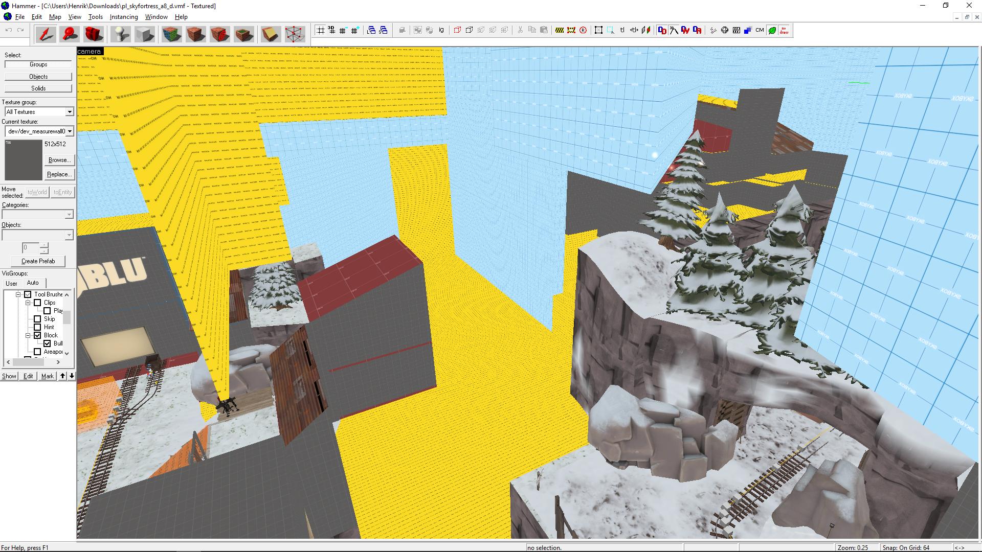
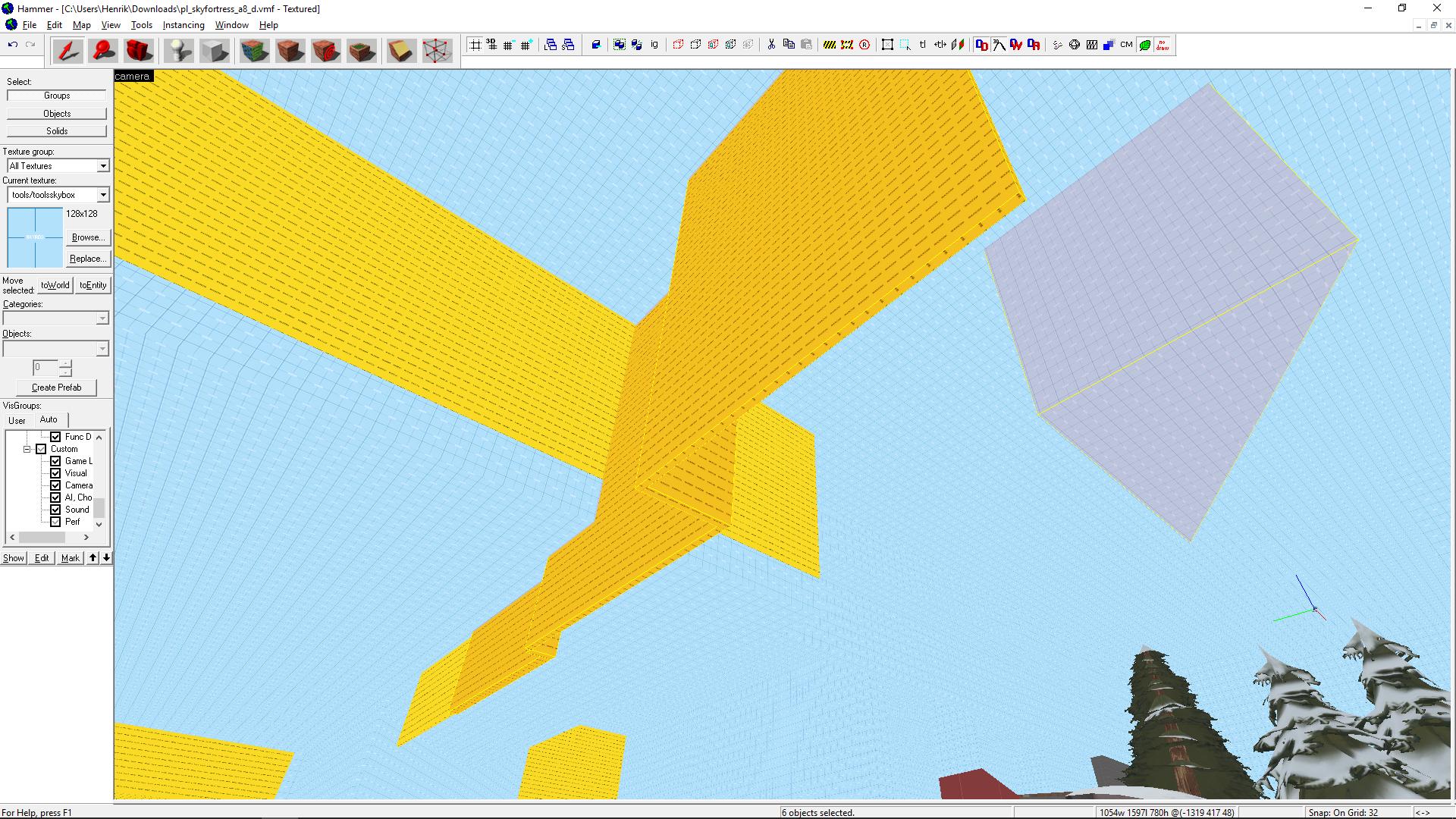
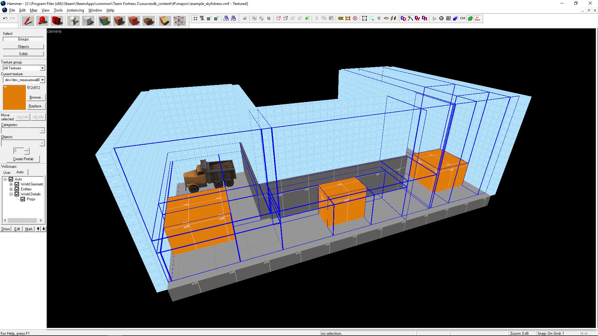
So, you have have serious problems with optimization and fps. I wanted to find out how fps can be so low and shamelessly decompiled your map. What I found wasn't very nice.

Simplest and most common problem first: sealing the map. Here is how you have done the middle area of the map
3etl2Mm.jpg

There is a lot of useless space inside the map and you see the starting are from the right side. I won't edit your map to show what you should do but here's simplification:

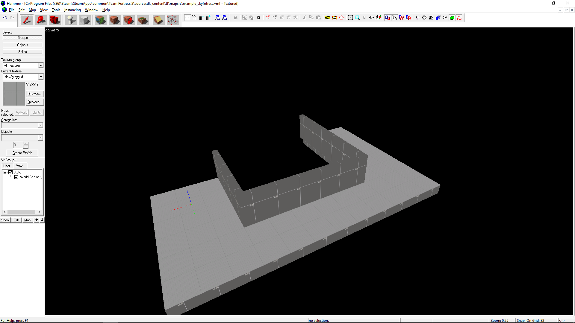
Here is the basic shape of your map
38q3JN1.png


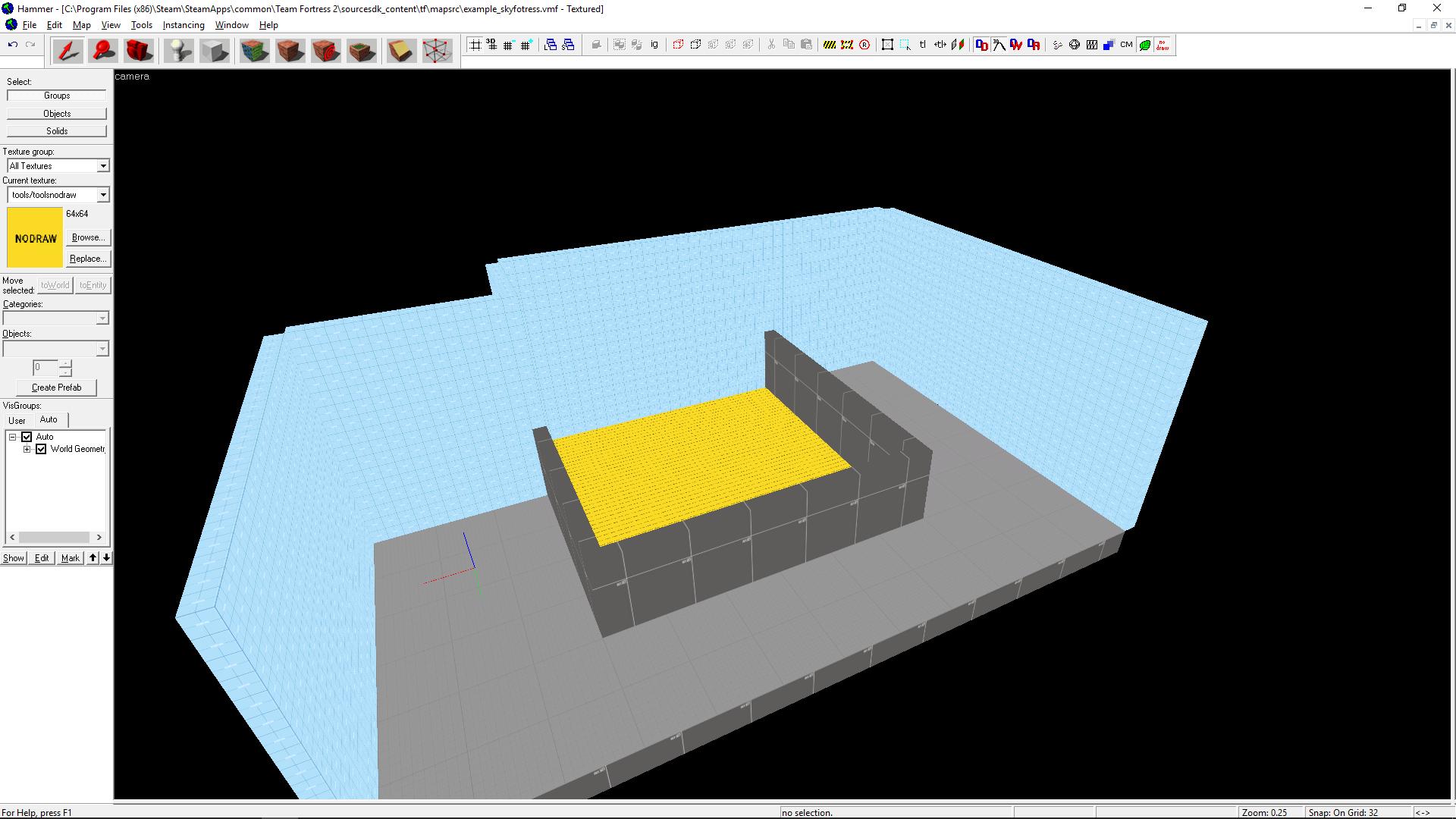
Here is how you have sealed it (removed ceiling and the one brush that would block the whole view)
hxk86hz.jpg

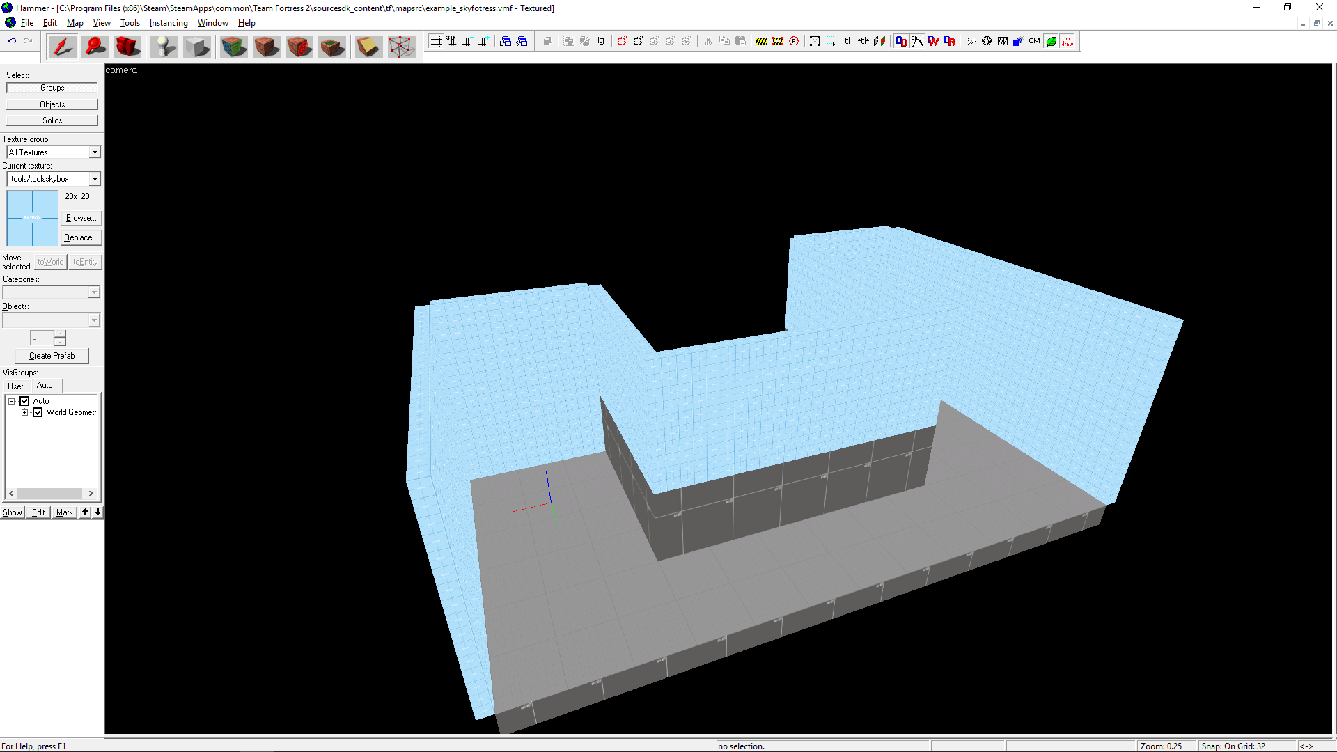
That's far from optimal and it makes whole map load at once. Here is how you should make it
DT8AIXT.png

Hugging the borders of the map with sealing will really improve the fps in your map. Also, there is no reason to make random brushes like these
dNKO5jH.jpg

Keep the brushwork as clean as you can. And actually that leads to the next, a lot more serious problem.

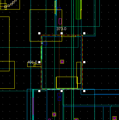
You have built everything in 1hu grid. Everything. Close to all brushes are weirdly sized like this
U1UKsqB.png

Usually maps are built in 16hu grid that makes all brushes to be multiples of 16, for example 256x128, 320x192 and 64x48. Using 1hu makes shit ton of visleaves when compiling ( I assume your vvis takes ages too).

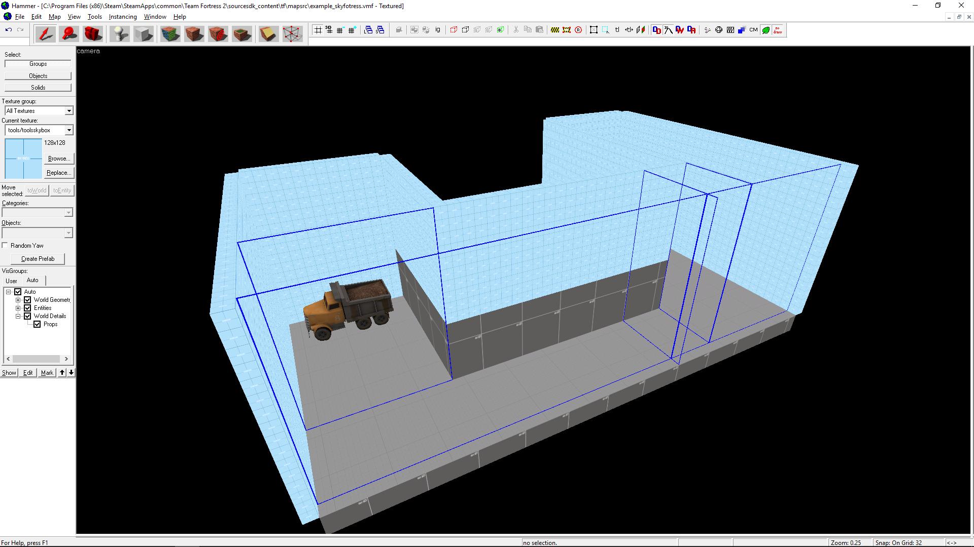
Here is the example map that is built with 32hu grid. As you can see, there isn't many visleaves and they are pretty clean
ZCvwwb7.jpg

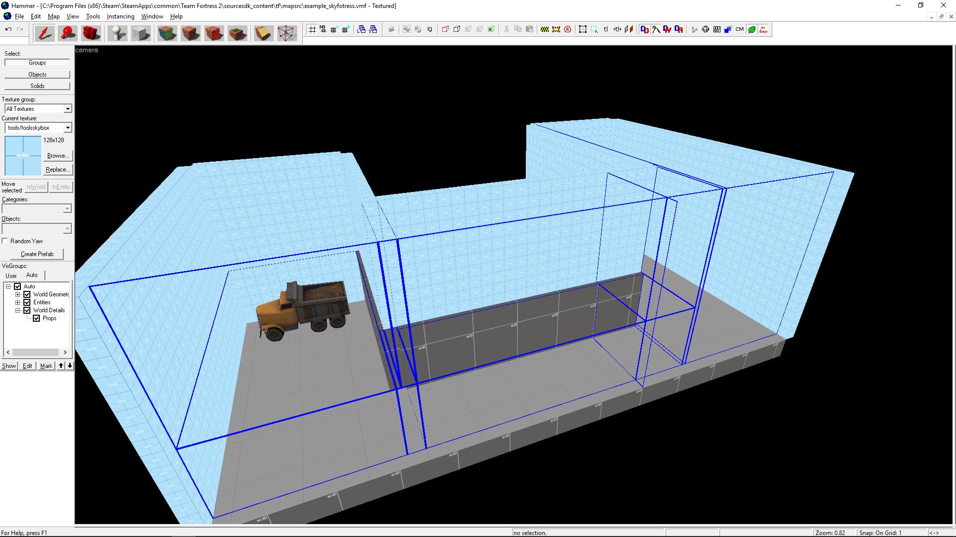
If I now build the same thing without being careful about snapping brushes to sensible sized grid I get this mess
21RTfaB.jpg

It doesn't look too bad yet but when you add more horizontal brushes and more complex structures the effect will be huge, like butterfly effect.
xWo8Jl3.jpg

Also your map is so big and complex that I imagine it being painful to even make brushes line together with 1hu grid. Bigger grid will make that a lot easier too.

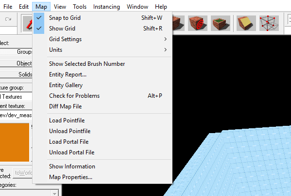
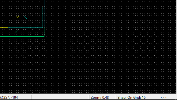
Here is how you can enable snap to grid and where you can see the current gridsize
oV7nQp4.png

ykLMi4O.png

(that's bottom right corner)

When you build smaller details, like stairs, you can use 8hu and 4hu, maybe even less but always use as big grid as you can practically.

This isn't nice thing to say but I'm not too nice person anyway so it doesn't hurt: You have to delete every single brush and remake the whole map. There is no way around it. (Don't actually delete the map file, make a new one and copy the same idea by hand to the new vmf.)

Personally I like the layout and it has real potential but the mapping behind it isn't acceptable and has to be fixed. If you have trouble understanding optimization later on, here is a good read to begin with. If you have more problems, TF2M is always willing to help.


For other readers and more experienced mappers, let me know if there is something missing or wrong in this post.

After all the serious talk, here's a final relief from a train I'm currently travelling in http://i.imgur.com/oI94Sff.jpg
 
Last edited: