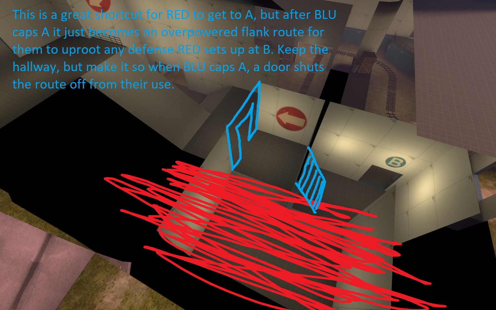
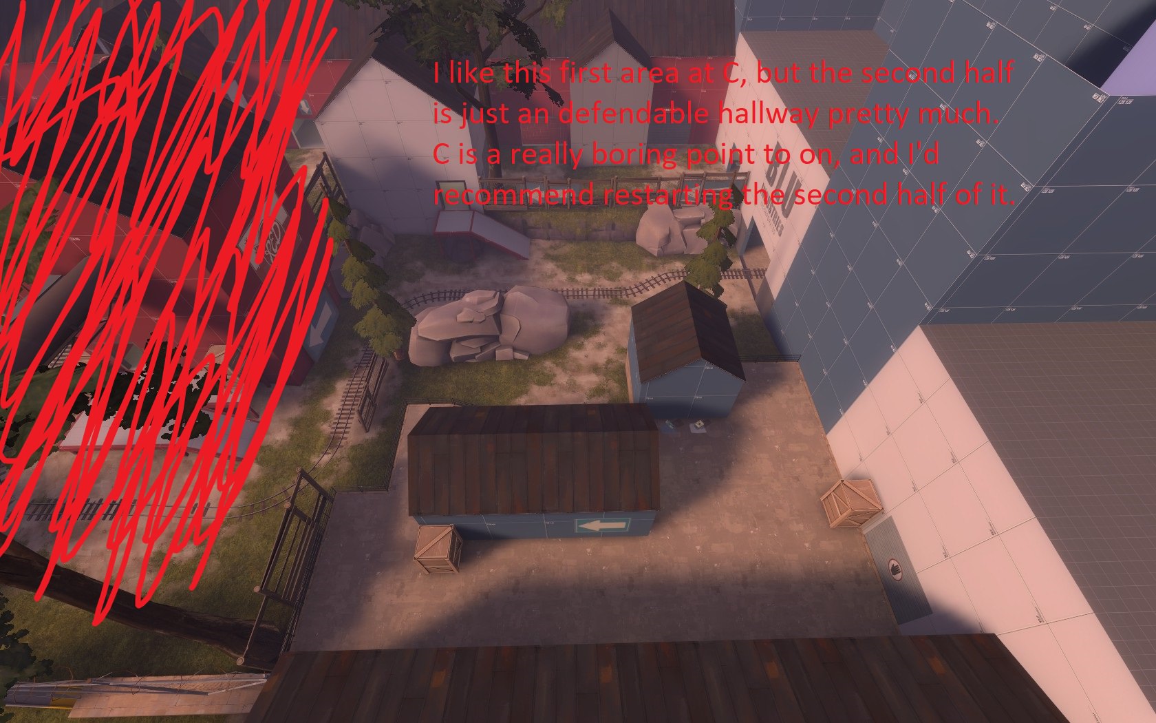
When I first saw this map in screenshots, I thought it looked too small and cramped. Judging a book by its cover, because after playing it today I can say its a pretty fun map. So I got a few suggestions that might help you.
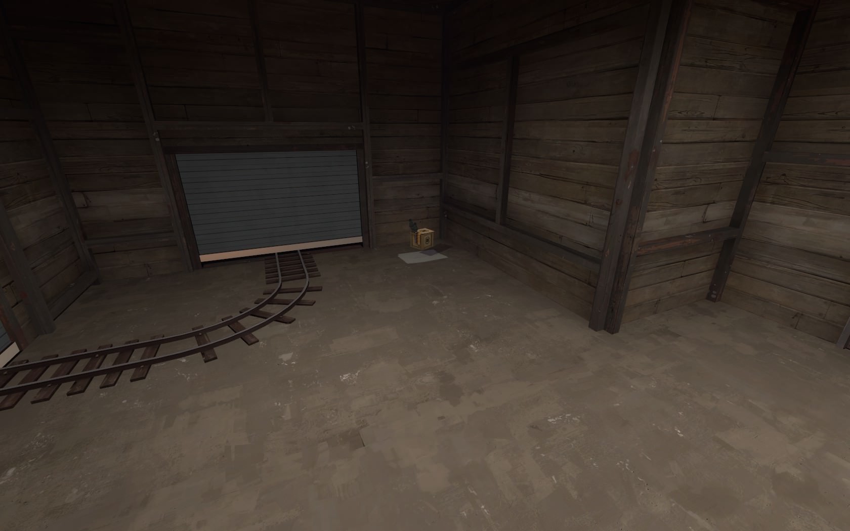
Also remove this kit so A is slighty harder to set up a Sentry on
Finally, I don't think the current final point is very fun. I think the idea of it being under the bridge is really cool, but the point itself is pretty boring, and easy for BLU to cap on. It doesn't feel like a final point.
Now, for the good stuff, A is pretty great! It honestly feels like a Valve map, with options for all classes to play on, and Engineer nests that can actually be sustained, which is something I feel a lot of community maps miss the mark on. B is also pretty fun to play as well, I enjoyed the skirmishes in its corridors. The first half of C is a pretty cool area, and its a shame it isn't integrated into the point are more, being separated by a building.
Though I have to really give you props for the first half of this map. If you remade the second half of C and the final point I could see this map being unbelievably fun to play on.
P.S. those chrome trims on those doors in the last screenshot don't look like they belong there, change the texture to something dirtier that fits the wood and concrete around the area.


