Nightflower

KotH Nightflower A1

G.bo

L4: Comfortable Member
Sep 24, 2017
180
195
Nightflower - a connect 5 map with various issues

Night Flower
In 1941, before the Fat Man was born, but after Fat Domino was born,
There was a small shop in New Orleans that the locals called Night Flower.
It was a small brewery, rumored to hide a chest full of Australium.
One day, the owner was assassinated by the Mann Co Secret Police died mysteriously.
Hearing about the property's secret stash,
Redmond and Blutarch quickly set up shops equally as far apart from the building.
Now, it is up to you to fight tooth and nail to claim this property for your own!


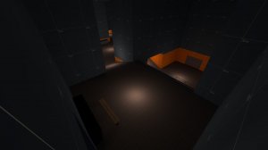
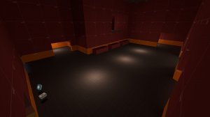
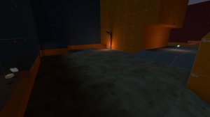
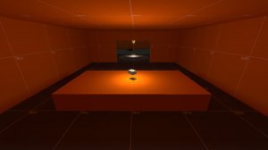
20180313223127_1.jpg 20180313223147_1.jpg 20180313223207_1.jpg 20180313223221_1.jpg 20180313223227_1.jpg 20180313223523_1.jpg

Why would they even want this place? There's no parking, the value is down 17%, and the water smells of sewage.
 
Last edited:

G.bo

L4: Comfortable Member
Sep 24, 2017
180
195
I did it: I finally uploaded A1 after a month of extremely on and off work (mostly off).
 

Mess About

L7: Fancy Member
Jan 16, 2017
413
178
the screenshots are duplicated though

i know it's a night map, but you might want to lit it up more
it would be better if the Capture Point is on the bridge, instead of on the low ground; because of all the annoying rocket, sticky, pipe spam would make re-cap a nightmare

also for the light poles, lamps and stuff... I recommend download this Lighting Library, super useful, you can mess around with different value for your map
https://tf2maps.net/downloads/lighting-library.666/
 

G.bo

L4: Comfortable Member
Sep 24, 2017
180
195
the screenshots are duplicated though

So they are: Welp, gonna go fix that up. Thanks for letting me know!

i know it's a night map, but you might want to lit it up more
it would be better if the Capture Point is on the bridge, instead of on the low ground; because of all the annoying rocket, sticky, pipe spam would make re-cap a nightmare

As much of a good idea as that is, there's the factor of this being a connect 5 contest entry with the following line:
connect5.PNG

On top of that, I don't think that the point is too easily spammable: while it is a bit easy to drop down and cap the point, I'm planning on putting a sign on the side of the bridge to help prevent both that and sightlines for snipers from low ground. The most I plan to do to the point itself is expanding it just a little more, but we'll see what I can do to help people on the point.

also for the light poles, lamps and stuff... I recommend download this Lighting Library, super useful, you can mess around with different value for your map
https://tf2maps.net/downloads/lighting-library.666/

This, however, is a huge help. I am not great with working lighting, so having this is going to make my life far easier. That being said, I did change the map to be brighter after I had taken the screenshots, but before I uploaded the map, so it should be at least somewhat brighter. My biggest concern for the map currently is having it be fun to play, so I may change lighting more as I get into it. Thank you for your feedback.
 

G.bo

L4: Comfortable Member
Sep 24, 2017
180
195
Intended Changes For A2
(These changes are pre-feedback, but are changes I had in mind in case the poo hits the fan.)

+ Adding flank route from useless hallway to rollout balcony.
I'm doing this because (on top of the fact that I need that hallway to have purpose) the lobby feels a bit too chokey, and adding this room should help lobby be less of the mapping issue that it is. Which reminds me...

-Shortening Lobby
After doing tests, it took Heavy 23.5 seconds to reach mid from spawn, and it took Scout 13 seconds. This is not only way too long, but for the maps I did the same test for (Lakeside, Lazarus, and Viaduct), they all had shorter times, with Lazarus being the slowest of them with Heavy taking 20 seconds and Scout taking 10. This is still too long, and I think the issue is that Lobby is way too big for its own good. The shrinkage of lobby will probably also make soldier/demo rollouts a bit less comfortable, so that should increase the skill required to nail the jumps.

+Adding Balcony
This one is less likely to happen, since Sniper already has a 2500HU sightline across the bridge. If it were to happen, I'd probably have it be a route from Upper Lobby (the section that drops down to the lowest door to mid) that goes over Lower Lobby. This would mostly be to add another route to leave lobby through, incase the current 3 shutter doors weren't enough.

-Alter Pickup Locations
This is almost guarenteed: This first version, the pickups are way too frequent and are in weird locations. Next version, I plan to shrink the amount of pickups as well as put them in much more favorable locations. This mostly applies for mid, but I'll also do some changes to lobby in this regard.

+Rework spawnroom
The spawn is not only boring in this version, but it's lazily over sized. I looked over my original sketch of the spawn and decided to tweak it to be a bit more like Viaduct, and a lot less like Kong King.

+Rework lighting
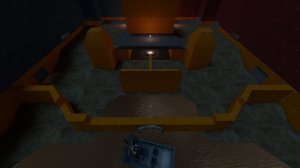
As you can see, the lighting is kind of awful right now, so I plan to fix it using the link kindly shown to me by Messing Around. The other issue, however, is that the environment lighting feels too bright in my opinion, so I'll try and find a healthy middle ground where I can figure out more ways to light up the map while still keeping it reasonable.

These are just some ideas that will probably make this map more fun to play on. Hopefully, once playtesting is done, I'll have more ideas of what changes need to be made to improve gameplay.

EDIT: I may end up just updating it to A2 for playtesting, since it fixes most the issues I saw in A1. The balcony idea is also pretty bad, since I've shortened lobby in general, making it even less possible to add a balcony.
 
Last edited:

G.bo

L4: Comfortable Member
Sep 24, 2017
180
195
Update
Not an actual update to the map, but things I thought I'd say for the few people who give a heck.

First off, Lobby (and the areas around it) have been greatly shortened. This should help the huge distance between the point and spawn be, at the very least, about a second shorter for Heavy to walk. That's still not a whole lot, but I'm sure that the street outside of spawn can be shortened to get another half second. I think mid is still okay, but the amount of walking distance still could use improvement, since it's still (from what I've tested) one of the longest walks from spawn to mid.

Second, I reworked spawn. In the previous version, I had a visibility issue where, when you spawn, you could only see the front door. This is an issue that occurs in maps like Nucleus, Doublecross, Powerhouse, and a couple of other maps. This doesn't make it any more reasonable for me to do it, but I thought I'd give popular examples of where this takes place. Anyway, with the new spawn, it features three doors: two doors in front, and one on the side with a bit of highground. This should make the spawn easier to get out of and harder to camp, but time will tell.

Third, I added a new route to both compensate for Lobby being smaller, as well as give a bit more purpose to a pretty useless hallway I had. This change should not only improve the rollout for jumping classes, but also prevents Lobby from becoming a choke point for overly aggressive defenders. Plus, changing the hallway to be a bit deeper hopefully will promote using it as a flank instead of a minorly different route to mid.

In terms of minor stuff, I have a small list of things. I changed the packs on mid so that there's not like seven packs. There is six now, but the way they've been placed is far different. I added actual lighting to the map where my old lights were to help. I still need to test how it looks, but it should be alright for the most part. Readjusted brushes to have correct texture alignment.

I'll upload pictures at some point during the week. I don't know when, but before Friday is all you need to know.
 
Last edited:

G.bo

L4: Comfortable Member
Sep 24, 2017
180
195
Alright, another...not-an-update post...

So, today I finally got a chance to look at the feedback from the imp, and I'm glad to get it. In order to make sure I don't forget about any of these things, I've taken a few quotes that talk about the key issues in A1 and I am going to reply to them here.

"iit's weird for the point be below where most people would want to fight"
This is true, but due to the line I selected (and since I don't want to make this a cave based map), there isn't much I can do the point itself. I originally did think about having the bridge be something worth fighting over, but I can see this was a bad idea (especially thanks to it being one huge sight-line generator). On the subject of the control point though...

"needs more signs to tell where to go, no one knows where the point is at first"
I will admit, in A1, the point was a bit hidden, and not in the good way. That being said, I've been working on mid to help solve this problem. First off, the middle of the bridge now has a metal grate in it, so if you are fighting on the bridge, you can tell where the control point actually is. Not only this, but the mid building has been remade to help focus on the point, as well as block a nasty sight line that was just...stupid. The room was just stupid.

"eh. not a fan of so many doors in gameplay space on koth"
This is something that is a big issue with my experimental koth layout. Being that only one building is between spawn and the middle point, I need to find ways to add more entrances to mid. While I assume you meant shutters, I still feel like the three doorways are a bit boring to enter mid through. That being said, I'll try to make at least some of them a bit more open.

"Its really dark"
I know...this map's lighting is pretty shit in the first version. That being said, I believe I've already fixed a ton of lighting in A2, so I do believe a lot of the map is going to look brighter. There is still work to be done, but for the most part, I've done a lot of relighting to make sure the map isn't a dim mess.

"overscaled"
Don't worry: I've already started working on shrinking the map to a comfortable point. Not only have I already shrunken the lobby a bit, but spawn is 192HU closer to the next building, and the transition building is about 256HU closer to the middle building. I want this update to help fix the extremely long and boring sections of the map and generally help heavies not take 23 seconds to reach the control point. (Yes, this will also hopefully help the 5 scouts issue mentioned as well.

"doors don't really fix sightline problems. If you feel like it needs a door you proably need to rethink the design."
...And so I have! After removing the shutter doors on mid, I decided to make sure the sniper sight lines aren't as long and broken. These things include (but are not limited to):

  • Remaking mid building to help focus gameplay around the control point
  • Reworking main door into mid to have a wall behind it (not enough room)
  • Making mid windows one-way (nobody mentioned how you can see across the map through that window in feedback.tf2maps, but I still know it's a huge issue that needed to be fixed)
  • Resizing brushes to help block possible sight lines
Hopefully, I don't nerf sniper into the ground, but I still sniper is pretty good on mid regardless.

I plan to fix a lot of these issues next week, but unfortunately (besides tonight somewhat), the soonest I can work on Nightflower will be the 26th, since I'm going to be on a break from the 23rd through the 25th. Believe me when I say I'm trying to fix this mid's . Sorry this is another like 5 paragraph essay on how I make my mediocre map, but I like getting to post as much information for people as I think they will need.
 
Last edited:

nᵗʰSonata

Takes way to long to make and update maps
aa
Jun 11, 2015
433
436
The map currently seems a bit flat, especially around the spawns; I'd suggest looking at the spawn areas from viaduct, or possible sawmill, for inspiration. Also, if you're having trouble with environment lighting, this is a huge help
 

G.bo

L4: Comfortable Member
Sep 24, 2017
180
195
The map currently seems a bit flat, especially around the spawns; I'd suggest looking at the spawn areas from viaduct, or possible sawmill, for inspiration. Also, if you're having trouble with environment lighting, this is a huge help

I wish I had posted screenshots earlier for A2, but I'm still not happy with the final result. Rest assured, I redid the spawn already to be much less flat, and made the map (for the most part) at least somewhat more vertical. I've also improved in terms of lighting, but that's thanks to the lighting library prefab, as well as the fact that I changed my brightness settings from the brightest to the darkest (to accommodate for those who have it at that point.) As for other parts of the map, I think the matter of me down-scaling should definitely help the map feel at least a little less like koth_orange (a nickname for the map, given by my friend who this map was named after.) I'll post screenshots of the new spawn right now, but I'll post other locations if requested.

Spawn Outside (Inspired by Viaduct for the most part)
20180326221326_1.jpg

Spawn Inside (Inspired mostly by Viaduct, but a little by Kong King)
20180326221346_1.jpg


I really wanted to make spawn as enjoyable as possible in this version so I could improve other parts of the map (such as the new route, new mid building, and the sniper lines into lobby). I hope this spawn works for you, and thank you for your feedback!
 
Last edited:

ϺΞΤЯΘΉλϺ

L3: Member
May 8, 2017
126
107
Just wondering in your little description , it says In the 1940s, back when communism was still looked down upon, isn't it still looked down upon and also communism wasn't as big in the 40s more hated a dictator ship/monarchy. The 60s-70s was when things got really heated with the communist before Russia fell. My dates could be off but that doesn't seem right to me but hey I could be wrong lol
 

G.bo

L4: Comfortable Member
Sep 24, 2017
180
195
Just wondering in your little description , it says In the 1940s, back when communism was still looked down upon, isn't it still looked down upon and also communism wasn't as big in the 40s more hated a dictator ship/monarchy. The 60s-70s was when things got really heated with the communist before Russia fell. My dates could be off but that doesn't seem right to me but hey I could be wrong lol

That is true, however...

...actually, I don't have an excuse. I just straight up don't remember history very well. Description may change in A2 (both for this change, as well as to accommodate for detailing things.)

EDIT: I've adjusted the description to something a bit more factual. Hope you enjoy!
 
Last edited:

G.bo

L4: Comfortable Member
Sep 24, 2017
180
195
Alright, so here's where I'm at on this map:

Currently, I don't have the file that I was working on before I had to reset my laptop, but I have it backed up on a disc if I'm correct. That being said, I'm thinking about putting out the A2 file once it's not full of leaks so that it doesn't go to waste; however, after that, I'm thinking about starting from scratch and redesigning the map to cut off the somewhat awkward transitional building between spawn and mid. I'm not sure how I'm going to rework the map at this point, but I feel like trying to work with a new file rather than trying to salvage the old one is what's best for this map. It could become entirely indoors, or it may become rotationally symmetric instead of mirrored: I don't know. All I know is I want to try and work on this map a little more so that it's not just seen as the admittedly poor A1 stage of the map.

Anyways, just thought I'd get this quick message out during some free time, as I've been thinking about this off and on.