You are using an out of date browser. It may not display this or other websites correctly.
You should upgrade or use an alternative browser.
You should upgrade or use an alternative browser.
- Apr 19, 2009
- 4,460
- 1,724
I-Fling-Poo
L1: Registered
- Aug 15, 2009
- 18
- 10
Just put this map on my server. Game ends immediately as soon as someone touches the enemy intel for the first time.
Is this build broken?
Poo
Is this build broken?
Poo
I-Fling-Poo
L1: Registered
- Aug 15, 2009
- 18
- 10
- Apr 19, 2009
- 4,460
- 1,724
Stick as much as I like th game mode idea. I really think you are better off with normal ctf. :S
- Nov 25, 2008
- 664
- 647
I think i'm better off getting all my entities to work >.<
I-Fling-Poo, yeah it's the red intel, I left a trigger around it. A fixed version is on it's way shortly.
TPG, I want to keep it with this capping system, it's so much more dynamic than the traditional system, and I like how it's completely different to other conventional maps.
I-Fling-Poo, yeah it's the red intel, I left a trigger around it. A fixed version is on it's way shortly.
TPG, I want to keep it with this capping system, it's so much more dynamic than the traditional system, and I like how it's completely different to other conventional maps.
Walker
L2: Junior Member
- Oct 22, 2009
- 85
- 86
nitpicking time

Obvious (and probably fixed by now) cubemap problem aside, the pipes in the back right wall seem awkwardly lit, the top seems unnaturally bright and the bottom unnaturally dark.

RED must have one big budget for polish on those pipes on the walls there. It also seems a bit odd for there to be a wooden shelf of random junk in a spytech room.

Like I told you in chat, that stack of crates seems awkwardly large. Consider replacing it with the bigger crates, and have a novint crate lying near them. Also, why would there be a poster for falcon soda and a light switch inside a furnace? It'd probably make more sense for a DANGER KEEP OUT sign to be on the door rather than inside the furnace too.

The grain of the wood on the board leading up to the point is going the wrong way. Other than that, I've got to say that I love the detailing in this shot.

Obvious (and probably fixed by now) cubemap problem aside, the pipes in the back right wall seem awkwardly lit, the top seems unnaturally bright and the bottom unnaturally dark.

RED must have one big budget for polish on those pipes on the walls there.

Like I told you in chat, that stack of crates seems awkwardly large. Consider replacing it with the bigger crates, and have a novint crate lying near them. Also, why would there be a poster for falcon soda and a light switch inside a furnace? It'd probably make more sense for a DANGER KEEP OUT sign to be on the door rather than inside the furnace too.

The grain of the wood on the board leading up to the point is going the wrong way. Other than that, I've got to say that I love the detailing in this shot.
- Nov 25, 2008
- 664
- 647
The shiny pipes were from lack of cubemaps when I took the photos, the shelf is there because it felt empty :/
As for the furnace, I thought i'd throw a little humour into the map with a door leading right into a furnace :3
There's a "Keep out" sign on the other side of the door aswell though.
Thanks
As for the furnace, I thought i'd throw a little humour into the map with a door leading right into a furnace :3
There's a "Keep out" sign on the other side of the door aswell though.
Thanks
Knight-Errant
L3: Member
- Mar 12, 2010
- 131
- 36
Since this is B1, there are a few issues to address. Mostly lighting and awkward props or textured. Overall, the layout isn't that bad. I only got lost once in the map, otherwise I was fine.
Pic #1:
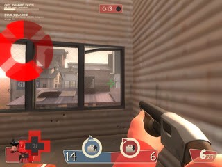
Note #1: The frame of this window on the right is broken, as was the intention of it being in 2fort. I rather see something done about it. Either the window is completely broken and was boarded up, or a tiny crack was made in the window where the frame bent out. Otherwise, its fine.
Pic #2:
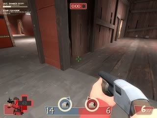
Note #2: The problem here is a seam issue. If you notice here, where the concrete meets the wood. I'm sure it did it on Blu's side as well.
Pic #3:
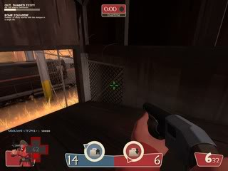
Note #3: Fence prop goes through the building only on this side of the map. Also this ramp area feels a little dark.
Pic #4:
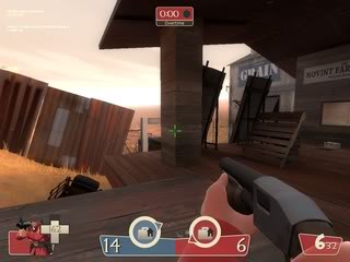
Note #4: This beam, I do not like the direction of the texture. Make it more vertical if you can.
Pic #5:
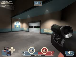
Note #5: This was the only area of the map that I felt lost in. There's no sign indicating that this isn't a path to the resupply.
Pic #6:
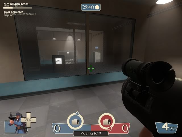
Note #6: This picture, and I left it larger on purpose, has a lot of problems that I don't like over all. There are three things going on here:
A. The room is pitch black. Which is fine for the room, this doesn't need to be lit as it could be a distraction, but the window in the door is glowing. Which indicates there is light on the other side. Get my drift?
B. On side of the door should be forward, the other reverse. Mostly the inside, the words should be backwards as not only are the letters are for the people to go inside, but the window for the room is glass, and it should be that they're only printed on direction. Something easily overlooked, I'm sure. Easy solution is to hollow out the door for the glowing glass and just force a window inside the door instead. Otherwise, use another door.
C. The sparkle - not needed. Why, might you ask? Simple, you have a lot going on in each side of the base already. Not only does each base contain a sparkle in the dark room, it has a furnace on the opposite side, and in the middle containing the broken glass. It feels like a lot of effects going on. I would limit it down to one, probably only the furnace.
The glass could be replaced by a hallway. The only reason the glass is a bit bothersome is because it never breaks. It should be a stationary non-solid if best. I feel that as a part of game play, its a distraction to have players run around and chance the moving glass shards rather than defend the Intel. Of course I only speak of public game play.
Pic #7:
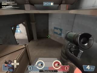
Note #7: Awkward corner lighting not only on this side but in the red as well. There's no transition between the lights on this spot, so its a sharp cut off at the angle wall.
Pic #8:
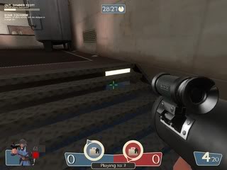
Note #8: Obvious nodraw spot.
Pic #9:
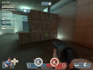
Note #9: I have to agree with Walker on this one. The repetitive box stacking is annoying. Since you aren't intending to remove it, my suggestion is to recreate the gorge prop of the barrels on the pallets, by using the pallet with the stack near the wall.
Pic #10:
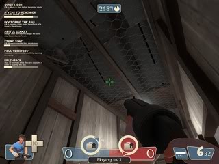
Note #10: Empty storage area could use something up there. Not a lot, but something, anything.
Pic #11:
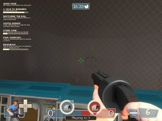
Note #11: Light up the rocket room.
Pic #12:
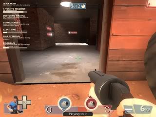
Note #12: Reflection on the floor comes off awkwardly to the person coming in the front entrance. Happens on both sides of the map.
Pic #13:
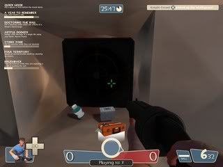
Note #13: Lighting issue with fan in vent.
Pic #14:
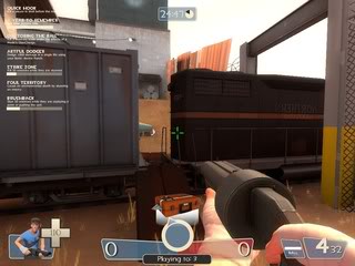
Note #14: There is a clipping issue with this train. At some times while passing through it I get stick either because there isn't enough room to pass through or that there isn't any clips at all. Please remedy this for easier traveling.
Pic #15:
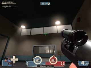
Note #15: This window looks like it has two different types of glass on either side of the window. Since it isn't in play area, doesn't need to be transparent, so use a non-transparent texture to fix it.
Pic #16:
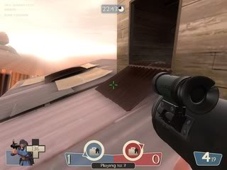
Note #16: A lot of the metal covering on the top of the center as issues with the lighting. Also, in this picture, the metal going through the window, actually sticks through the frame.
Pic #1:

Note #1: The frame of this window on the right is broken, as was the intention of it being in 2fort. I rather see something done about it. Either the window is completely broken and was boarded up, or a tiny crack was made in the window where the frame bent out. Otherwise, its fine.
Pic #2:

Note #2: The problem here is a seam issue. If you notice here, where the concrete meets the wood. I'm sure it did it on Blu's side as well.
Pic #3:

Note #3: Fence prop goes through the building only on this side of the map. Also this ramp area feels a little dark.
Pic #4:

Note #4: This beam, I do not like the direction of the texture. Make it more vertical if you can.
Pic #5:

Note #5: This was the only area of the map that I felt lost in. There's no sign indicating that this isn't a path to the resupply.
Pic #6:

Note #6: This picture, and I left it larger on purpose, has a lot of problems that I don't like over all. There are three things going on here:
A. The room is pitch black. Which is fine for the room, this doesn't need to be lit as it could be a distraction, but the window in the door is glowing. Which indicates there is light on the other side. Get my drift?
B. On side of the door should be forward, the other reverse. Mostly the inside, the words should be backwards as not only are the letters are for the people to go inside, but the window for the room is glass, and it should be that they're only printed on direction. Something easily overlooked, I'm sure. Easy solution is to hollow out the door for the glowing glass and just force a window inside the door instead. Otherwise, use another door.
C. The sparkle - not needed. Why, might you ask? Simple, you have a lot going on in each side of the base already. Not only does each base contain a sparkle in the dark room, it has a furnace on the opposite side, and in the middle containing the broken glass. It feels like a lot of effects going on. I would limit it down to one, probably only the furnace.
The glass could be replaced by a hallway. The only reason the glass is a bit bothersome is because it never breaks. It should be a stationary non-solid if best. I feel that as a part of game play, its a distraction to have players run around and chance the moving glass shards rather than defend the Intel. Of course I only speak of public game play.
Pic #7:

Note #7: Awkward corner lighting not only on this side but in the red as well. There's no transition between the lights on this spot, so its a sharp cut off at the angle wall.
Pic #8:

Note #8: Obvious nodraw spot.
Pic #9:

Note #9: I have to agree with Walker on this one. The repetitive box stacking is annoying. Since you aren't intending to remove it, my suggestion is to recreate the gorge prop of the barrels on the pallets, by using the pallet with the stack near the wall.
Pic #10:

Note #10: Empty storage area could use something up there. Not a lot, but something, anything.
Pic #11:

Note #11: Light up the rocket room.
Pic #12:

Note #12: Reflection on the floor comes off awkwardly to the person coming in the front entrance. Happens on both sides of the map.
Pic #13:

Note #13: Lighting issue with fan in vent.
Pic #14:

Note #14: There is a clipping issue with this train. At some times while passing through it I get stick either because there isn't enough room to pass through or that there isn't any clips at all. Please remedy this for easier traveling.
Pic #15:

Note #15: This window looks like it has two different types of glass on either side of the window. Since it isn't in play area, doesn't need to be transparent, so use a non-transparent texture to fix it.
Pic #16:

Note #16: A lot of the metal covering on the top of the center as issues with the lighting. Also, in this picture, the metal going through the window, actually sticks through the frame.
Last edited:
Knight-Errant
L3: Member
- Mar 12, 2010
- 131
- 36
- Nov 12, 2007
- 1,128
- 746
Played it for a bit on the server just now, and found two things:
Parts of the train clearly don't have their collision enabled, and/or don't have a manual collision created using nodraw/blockbullets, because it was possible to fire through them, which was pretty bad in conjunction with a sentry.
Also, when the server time limit ran out, it did not end the map.
Parts of the train clearly don't have their collision enabled, and/or don't have a manual collision created using nodraw/blockbullets, because it was possible to fire through them, which was pretty bad in conjunction with a sentry.
Also, when the server time limit ran out, it did not end the map.
LateLJ
L7: Fancy Member
- Nov 27, 2009
- 408
- 157
Pic #1
Sentries can't shoot through the railing but heavies can. Bit confusing.
#2
The water here seems very deep. Might want to make it a little more transparent so you can see the floor is right there. I jumped in it thinking I could escape but it was so shallow I got killed off instantly :facepalm:
#3
The lights on the arrows are unnecessary. You run past signs all the time and you need to see what is on them in an instant, and with the lights there it's hard to see wich way the arrow points when running past it.
#4
This wall in the back needs a grating model with some toolblack behind it. It just looks weird to have such a space (with no use) in an otherwise perfectly straight vent.
Apart from that, liked the gameplay. Although it is very 2forty with the '1 lvl 3 sentry in the intel room will break 90% of the attacks'.
@Tyker:
regarding Pic #1, the Heavy actually gets his bullets traced from his head rather than his gun. I think it's to make first-person more consistent, but it means that other players see the Heavy as shooting through walls, like in that side cabin's window in Goldrush stage 1 point 2. If that's what's happening here (which I think it is) there may not be anything that can be done about it.
regarding Pic #1, the Heavy actually gets his bullets traced from his head rather than his gun. I think it's to make first-person more consistent, but it means that other players see the Heavy as shooting through walls, like in that side cabin's window in Goldrush stage 1 point 2. If that's what's happening here (which I think it is) there may not be anything that can be done about it.
- Intel rooms are bit too engineer friendly
- The battlements really turn into sniper fights, rise the roof, make battlements more of a place to attack the incoming attackers.
- The bases are nice, but maybe too many flanking routes, instead middle lacks flanking routes
- Move small health somewhere more obvious, i died to fire twice because i didn't know there was actally health ontop of train carts
- In detailing wise, the room with rocket launch pad makes no sense what so ever. D:
- There is still lightning issue on airduct
- Make the second lower path to intel more bright for Red, the team colors can be bitch to see at times there


