Chemical Alia
L2: Junior Member
- Jul 22, 2010
- 98
- 52
I have a few suggestions, in terms of optimization and aesthetics.
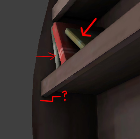
It would be rare to never that a player would be viewing the bookcase from this upwards angle, and up this close. While you see this shape in wooden shelving a lot, I don't think that the inclusion of this lip adds any benefit to the look of the model, and removing it will save tris. And echoing a earlier remark, I think the shelf would look nice a little thinner as well.
Also, is that a chamfer on that book edge? Do they all have that? If so, I'd get rid of all of them and delete backfaces if you haven't already. Book stacks should also probably be one object and normal maps used to separate them if it needed, can't tell if that is the case or not from the screenshot.
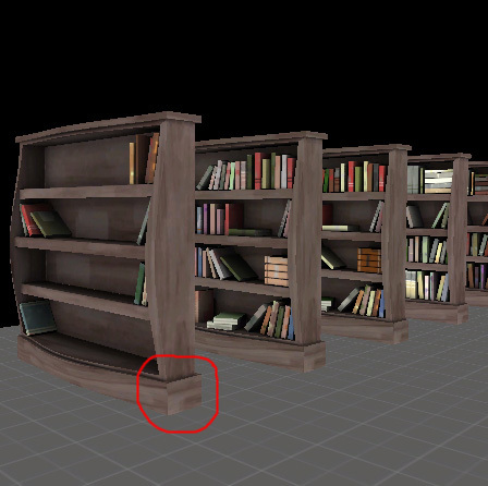
Big seam showing here.

And that's a freaking awesome table. I like the grey one the best, but the red paint on the other one isn't reading quite right to me. It looks like it has broad brush strokes that are recolored from the other, but the way it's faded looks like the paint would have been applied as a color wash. That could look really nice, and having it fade out where the table naturally gets more wear, (sort of like illustrated below), since right now it's not really following any believable wear patterns.


It would be rare to never that a player would be viewing the bookcase from this upwards angle, and up this close. While you see this shape in wooden shelving a lot, I don't think that the inclusion of this lip adds any benefit to the look of the model, and removing it will save tris. And echoing a earlier remark, I think the shelf would look nice a little thinner as well.
Also, is that a chamfer on that book edge? Do they all have that? If so, I'd get rid of all of them and delete backfaces if you haven't already. Book stacks should also probably be one object and normal maps used to separate them if it needed, can't tell if that is the case or not from the screenshot.

Big seam showing here.

And that's a freaking awesome table. I like the grey one the best, but the red paint on the other one isn't reading quite right to me. It looks like it has broad brush strokes that are recolored from the other, but the way it's faded looks like the paint would have been applied as a color wash. That could look really nice, and having it fade out where the table naturally gets more wear, (sort of like illustrated below), since right now it's not really following any believable wear patterns.

Last edited:

