koth_retro

KotH koth_retro a2

RetroNuva10

L1: Registered
Dec 9, 2014
41
6
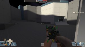
koth_retro - WIP sci-fi moonbase KOTH map.

Sci-fi themed moonbase KOTH map with an unconventional design layout. This is my first legit map, and I think it's coming along nicely - ALL feedback is welcome!

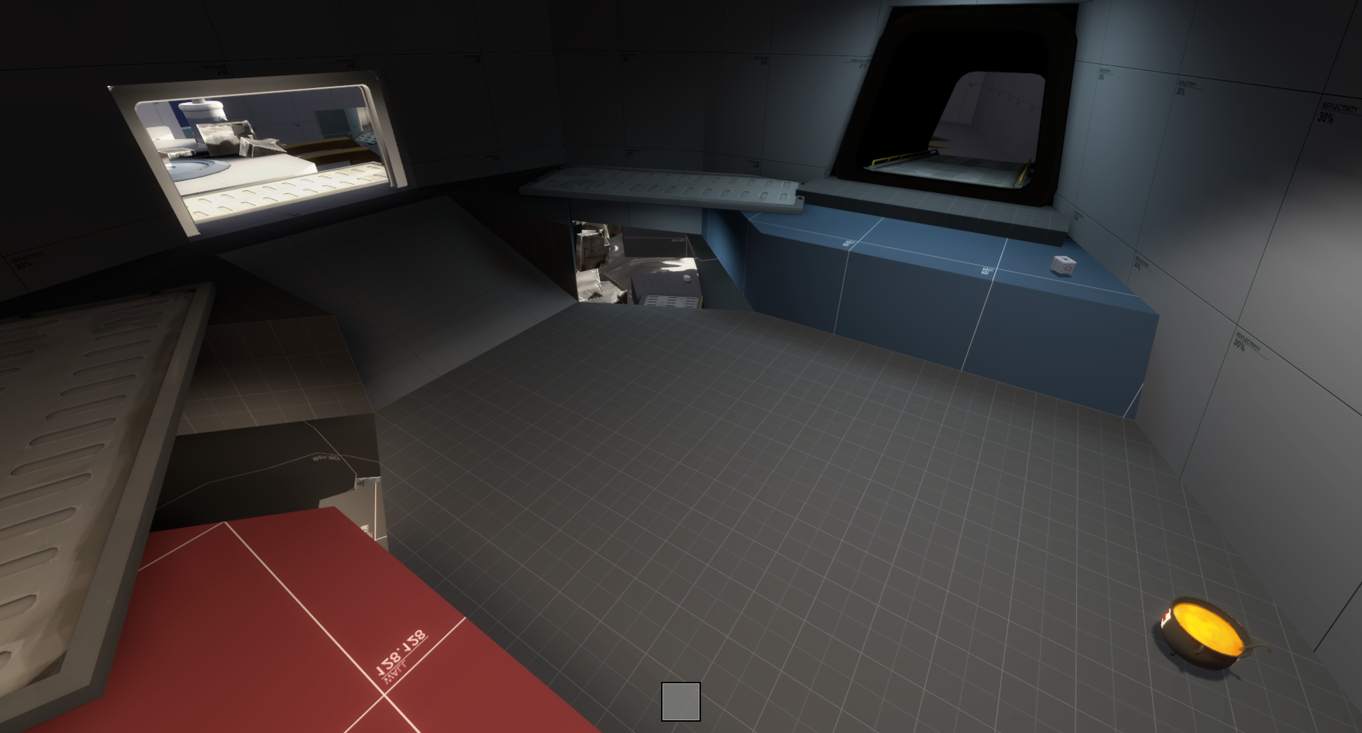
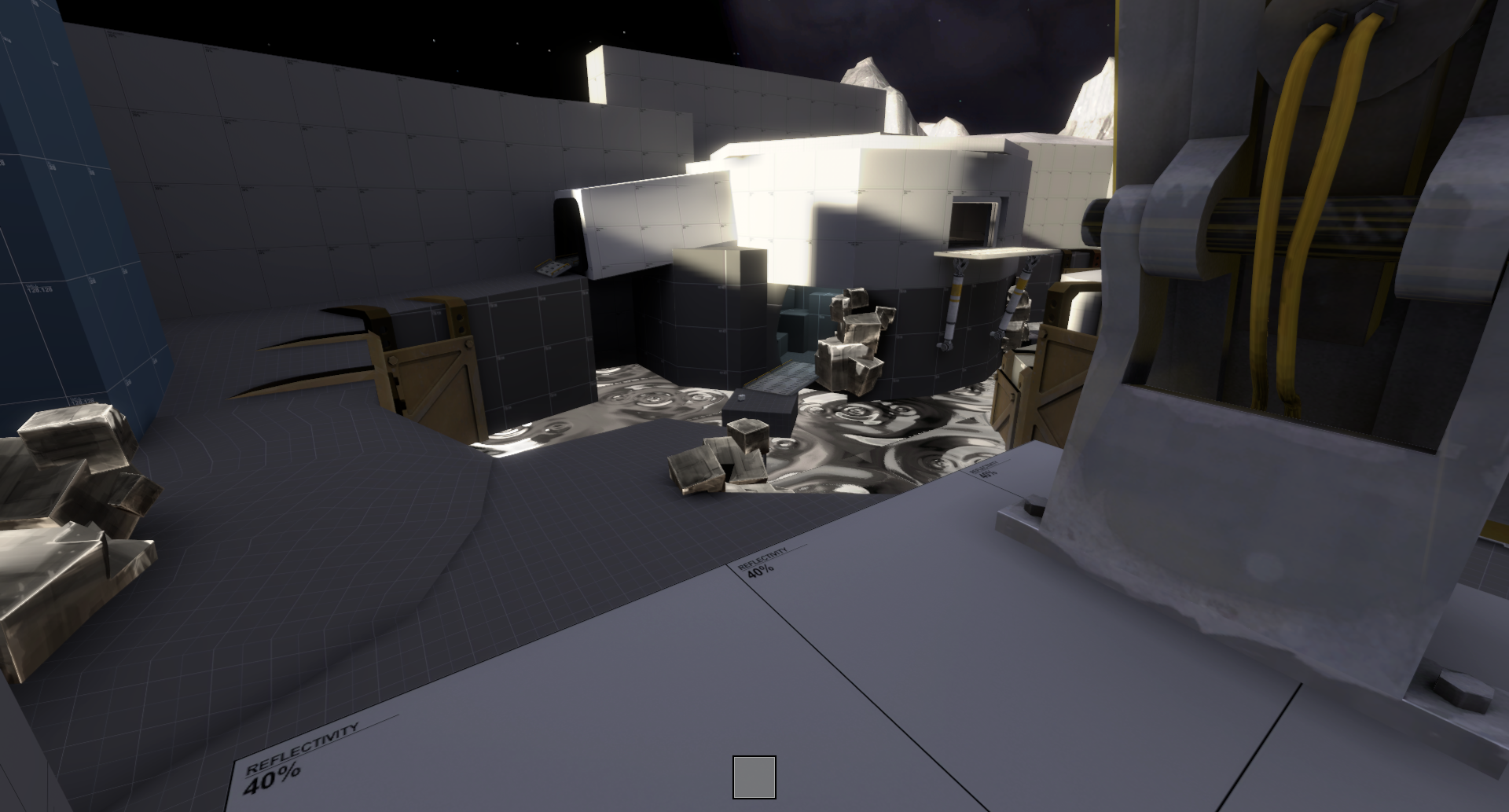
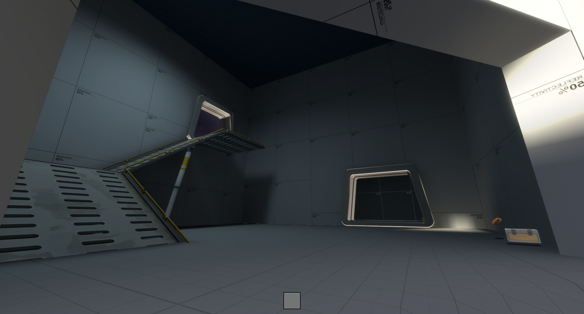
screenie_0.png
screenie_1.png
screenie_2.png
screenie_3.png
 

Billo

aa
Feb 8, 2016
921
405
judging only from the screenshots this map looks so cooool. I love what you did with the point and the theme of the map.
 

G.bo

L4: Comfortable Member
Sep 24, 2017
180
195
i'd like to say that i enjoy the space theme and you've used it fairly well so far. keep up the great work! ;)
 

RetroNuva10

L1: Registered
Dec 9, 2014
41
6
judging only from the screenshots this map looks so cooool. I love what you did with the point and the theme of the map.
Thank you!! I'm planning on making a few custom props/textures for it to expand what resources rd_asteroid left us. I think it'll make it stand out even more.
 

RetroNuva10

L1: Registered
Dec 9, 2014
41
6
i'd like to say that i enjoy the space theme and you've used it fairly well so far. keep up the great work! ;)
Thanks! I'm attempting to have a good thematic balance with it, and that'll come into play even more once I start detailing full-on.
 

Billo

aa
Feb 8, 2016
921
405
Hey there, I got some feedback for your map koth_retro_a1 and I would like to share it with you.
Before I say anything I want to note that I really like the map so far, It looks pretty promising and I cant wait to play it whenever I can. Until then here are a few suggestions of mine on how to improve your map.

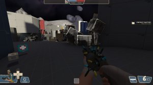
This is one route to take if you want to reach the point right? it offers you some health and ammo as well.
20190220170750_1.jpg
20190220170800_1.jpg
The main issue of this route is 1) that its too long compared to the other options and 2) there is a massive sightline exactly where it leads. So as you can expect you are really exposed.

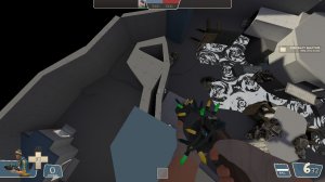
My solution is that:
20190220170809_1.jpg
I flew above the map and I noticed that this area is completely empty. so it can be an easy fix to shrink it down a bit.
20190220170828_1.jpg
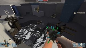
and In general this area is pretty masive so making it smaller wouldnt hurt the map at all. + it will help this bridge area over here so as more classes could jump across. Whereas only scout is able to jump in and out of that drop.
20190220170851_1.jpg
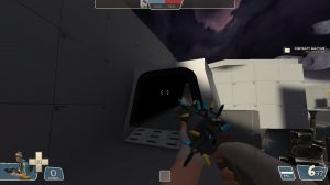
I like this area a lot but I think it could use some cool lighting cause its really dark.
20190220170921_1.jpg
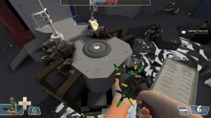
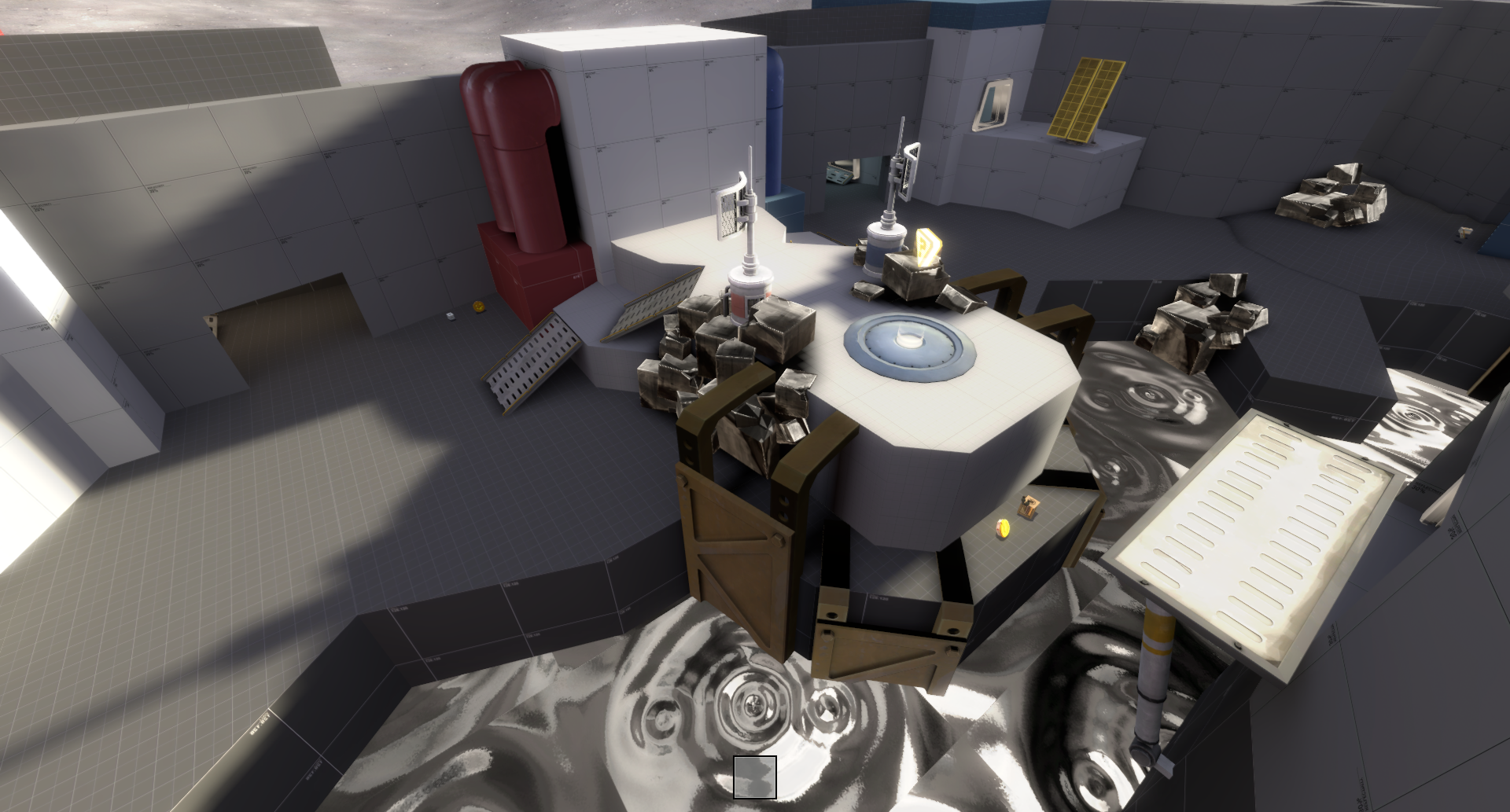
Lastly, other people have pointed this one out but, the Control point trigger is really small. I would extend it if I were you further. ( i got some bullet holes exactly where I believe it should be enough. What is more, the rock props around the point are all solid. I dont advise you to make them non-solid but either moving some of them or clipping them more would help the situation a bit. ( I say that cause that some small rocks clip out the ground and you can get stuck on them. its not something major but still )

Anywayz. I hope you found that piece of feedback helpful enough. Good luck with your Map.
 

RetroNuva10

L1: Registered
Dec 9, 2014
41
6
Hey there, I got some feedback for your map koth_retro_a1 and I would like to share it with you.
Wow! Thank you so much for the detailed feedback. Even though these had crossed my mind to fix at some point, having someone confirm them more extensively definitely helps.

Yeah, I tried raising the incentive to go that pathway by having the big health, but I guess it's not good enough. Right now, my plan is to offset the spawn to be closer to that route, make said route slightly smaller, or at least have more height variety and design (as well as the surrounding area), make the CP trigger+platform bigger (I'd like it to be a more frequent battle area), and fix up some little things here and there. I also want to have more landmarks of interest in that pathway area, because right now I only have ones for the main area.

I'm also working on adding custom props to accentuate the theme and uniqueness of it, so I hope to finish A2 sometime soon and put it on the IMP server for you to play - thanks again!
 

Billo

aa
Feb 8, 2016
921
405
no problem mate !
I am really happy to see such a respond and I am looking forward to seeing what you can make. If you need any help with the models one friend of mine makes models for tf2. He made the shark model that I am using on my map sharkbay.
 

RetroNuva10

L1: Registered
Dec 9, 2014
41
6
A2 map version is up, with the following changes:

Additions:
- Repositioned spawnrooms
- Added high-ground flank route
- Added temporary soundscapes

Improvements:
- Fixed spawnroom doors
- Improved? Sightlines
- Updated health/ammo pack placement/sizes
- Fixed mercury pond jump distance

Read the rest of this update entry...