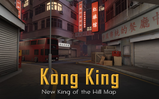
Introducing Kong King

tf2.com

L13: Stunning Member
Jun 16, 2010
1,186
712
kongking.jpg


Were you thinking, "I really like playing TF2, but I wish there was a King of the Hill map set in a Chinese cityscape"? Well, your oddly specific and scarily prescient dreams have come true! Introducing Kong King - TF2’s first city-themed map! - created in collaboration with Sleeping Dogs and community member Valentin Levillain, aka 3Dnj.


We’re a little disappointed that Valentin is spending all of his time making TF2 maps and not fulfilling his true destiny as a roguishly handsome super-villain, but it gives us a chance to finish our costumes for our inevitable battle atop a snowy mountain where we will fight for the love of Cassandra Prosciutto.


You may be able to capture her physical form with your hyper-advanced laser-traps, Levillain, but you will never capture…her heart!


Source: TF2.com
 
Mar 23, 2010
1,874
1,699
another map that couldnt be made in the "creativity killers" themselves, tf2maps.net.
 

Sel

Banned
Feb 18, 2009
1,239
2,570
Looks like a failed dystopia map that got ported to tf2 at the last possible minute.
 

Trotim

aa
Jul 14, 2009
1,195
1,045
koth_king0000.jpg


Getting some low FPS. Can't really say much about the theme yet but the layout is really small, narrow and thus spammy.
 

Trotim

aa
Jul 14, 2009
1,195
1,045
koth_king0001.jpg


I think that pic sums up what's wrong with this theme's textures. Compare the normal TF2 spawn door to this map's garage door.
 
Feb 14, 2008
1,051
931
When's the map workshop going to come, that's what I want to know :(

edit: map looks really nice, bit confusing at first with all the detail everywhere

edit2: man this is so nice looking, must've taken ages to detail
 
Last edited:

The_Ulf

L6: Sharp Member
May 26, 2009
399
115
It's so beautiful... ;__;

Seriously, it is.

Unoptimized, for now, but downright beautiful. 3Dnj's done it again.
 
Mar 20, 2012
391
806
6EE423A839C56A7FA1227BEDA9105570251D1484


For anyone that wanted an overview shot (although, because of all the skyscrapers, it's not really that helpful).

My thoughts -
Aesthetics: It's a nice looking map - a lot of detail and nice usage of angles. Immediately though, and I sort of expected this: it doesn't look like a TF2 map at all. The textures, narrow design and general vibe screams Half-Life 2 much more than it does TF2. I feel like they should have designed a new set of health/ammo models because they look so out of place.

Gameplay: It's very small in some areas. Almost all the high traffic areas heading to the point are going to be 128-192 wide. There's almost no height advantage in the map - only height disadvantage (by that, I mean there's the mid-ground and anything else is lower than that if you want to take a side-route). The map is definitely on the longer side - the shortest route to mid takes 10-11 seconds as a 100% class. The side routes take about 15-18 seconds as a 100% class.
 

The_Ulf

L6: Sharp Member
May 26, 2009
399
115
I dunno, I'm super impressed with how well the theming does manage to fit TF2. I think in here we may all have been staring at TF2 textures for too long, because while compared to the very first art assets from the very first maps released with Orange Box TF2, sure they scream HL2.

But compared to textures actually from HL2 or any more recent gritty fps, they scream TF2.

I was particularly stunned by the gorgeous main plaza containing the point, and how the environment settings wonderfully blend the level geometry of the surrounding and distant buildings into what almost looks like skybox.

I'm impressed by the map, maybe I r nub.
 

Deodorant

L6: Sharp Member
Oct 31, 2011
263
214
I haven't had a chance to play it yet, just to watch a demonstration video. My preliminary opinion is this: Probably quite decent, licking* in certain areas but excelling in others.

It does indeed look a bit cramped and spammy, and all the detailing and faux-alleys seems to make it a bit confusing to navigate. It does however pull off the Hong Kong theme in a significantly more fitting way than I expected, and the use of height levels around the hill is pretty brilliant.

*lacking
 
Mar 20, 2012
391
806
BA765291D1E05712A6C8069BC0B553341E67F670

3F90BE883E7A4E152965C4F928A3E4FA5582F70D

228E4121BC86F5068241320F52F7E7542119C62D


Oh yeah. Totally looks like TF2.

Had I known nothing about this, I wouldn't have guessed TF2 if it wasn't for the distinct HP/ammo packs. The textures (especially the god-awful garage door ones), lighting and layout don't remind me of TF2 at all.

But hey, at least it isn't Doomsday.

EDIT: Also, the optimization is pretty awful.
 
Last edited:

Verno

L2: Junior Member
Jul 17, 2010
80
34
I like the map. Very beautiful, but I a little distracting because of it. Frame rate issues, too, but I'm sure that will get fixed. Also, wish there was more SpyTech hidden around the map.
 
Last edited:

The_Ulf

L6: Sharp Member
May 26, 2009
399
115
The textures (especially the god-awful garage door ones), lighting and layout don't remind me of TF2 at all.

But hey, at least it isn't Doomsday.

EDIT: Also, the optimization is pretty awful.

Seeing as most of the textures in those screenshots aren't actually new, and are in fact stock TF2 textures, that might be a personal problem.

But hey, it is in fact, not Doomsday, and indeed, the optimization is totally miserable at the moment.
 
Mar 20, 2012
391
806
Seeing as most of the textures in those screenshots aren't actually new, and are in fact stock TF2 textures, that might be a personal problem.

But hey, it is in fact, not Doomsday, and indeed, the optimization is totally miserable at the moment.

There's 58 new textures in the SDK and many of them are being used in those three screenshots. What?

Obviously, it's going to be a love/hate relationship. I don't think this map fits the style that TF2 became famous for. Disagree with me all you want.

But certainly don't say it's because it's some problem with me. Look on Reddit, Steam forums and some of the members in this thread. It's not just me.