- Sep 10, 2016
- 532
- 399
On this fine day, 28/08/2023, I do declare that I have artpassed the following six maps:
Cool!
But why am I telling all this to you?
Well, it's because lately it's felt like no matter how many maps I artpass, none of them will ever surpass cp_bruhstbowl.
Therefore, I'm writing this not only out of the hope that it will be helpful to people wanting to artpass their own maps, but also to help me get out of this funk; by understanding exactly how and why I artpassed that map.
In April 2022, I decided that my map cp_bruhstbowl was ready to artpass.
I have a very strict metric for when a map is ready; in the case of cp_bruhstbowl, I decided that there were no more changes I could make to the map that would make it objectively more fun than a8g.
There were changes I could make that could fix a8g's issues, but those would create other issues, and the net percentage of people who would enjoy playing the map would go down.
So, the map was ready. But I was on guard, because my previous (and, at that time, only) map I'd artpassed, pl_roofrack, had been a massive disappointment.
The map was underdetailed, poorly lit (everything was bathed in hideous pinkish sunlight) and very inconsistent with reality.
I had read YM's amazing nodraw.net guides before artpassing that map, but clearly they alone were not enough for me.
Separately, I had the goal of solving the following problem:
But after giving it a few seconds, I realised that, well... computers were weaker in 2009.
In other words, maps at the time had to make the heaviest use of Source's optimisation techniques that they possibly could.
It was then that I realised the sheer extent to which maps nowadays are limited.
If you're thinking "well, I can get away with not skyboxing off this roof, it's not 2009 anymore, people can run it fine", you're right to some extent, but you're also massively hampering the amount of detail you can put in any given scene without people getting low framerates.
But I'm a man of the '20s. I didn't just want to make my map look like something out of 2009, I wanted to make it look even better, so I could prove that the 13 year time gap was actually worth something.
There they are! The evil lightmaps Tiftid is trying to psyop you into using!
It's a well-known fact that you can adjust the luxel size on a per-surface basis (with the default being 16).
Well, it was well-known in 2009, at any rate.
A smaller number gives you sharper, prettier shadows that better represent the shape of the object casting them.
(Quick side-note: Luxel sizes smaller than 16 look REALLY bad with the usual SunSpreadAngle of 5. Use a SunSpreadAngle of 0.5 instead if you wish to use these luxel sizes.)
However, this feature shouldn't be overused, as trying to load a map with too many low-luxel-size surfaces will crash with the error message "Engine hunk overflow!"
As such, I quickly developed a set of rules for my use of this technique:
Unlike other engines, the shadows aren't calculated in real-time - they're precalculated and saved in the map file for players to load at runtime.
Therefore, sharper shadows actually have virtually no effect on the user's framerate.
However, a good incentive to not use this technique very much in 2009 was the fact that you have to load the shadows into your texture memory - in 2009, you had maybe 256 or 512 MB of VRAM.
But it's 2022, and even my old laptop from 2017 had maybe 2 GB of VRAM - enough to easily handle up to the "Engine hunk overflow" limit of lightmap information.
So, shadows are the major way you can make your maps look better then even the most competently made maps from before the '20s.
However, every detail has a price.
Higher-quality lightmap textures are larger in size, and they're saved into the map file, so your map's filesize will increase, making it take longer to download.
How much is this in practice?
Well, the average map has an LDR and HDR lightmap lump of maybe 4 MB each.
pl_boatload, which has lightmaps going up to just below the engine limit, has 16 MB each.
So, the most this technique will ever inflate your filesize is by around 24 MB.
That's really not much when you consider that some people choose to pack 60-80 MB worth of custom content into their map.
Ultimately, in cp_bruhstbowl's case, I decided that it was well worth it to increase the filesize a little to massively improve the amount of detail while also keeping a high framerate.
Another factor I wanted to take into consideration is how Valve details their maps.
I think no one ever detailed a map as good as YM, but Valve got pretty damn close.
While replaying Half-Life 2 at the end of 2021, I liked the look of the Canals area the best. And I narrowed the reason why down to one thing:
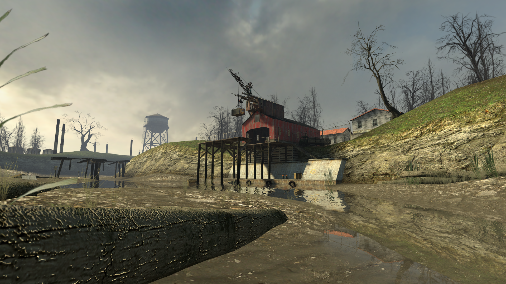
The barn is set on top of a hill, seen from side-on and silhouetted against the sky.
It is the tallest object in the scene other than a few trees, and if you take this from a better direction than I did, its perfect, real-time reflection is carefully tailored to be visible in the water.
The barren, almost devoid of detail displacement surfaces are masked by a careful selection of low-poly objects on top of them, their lack of definition hidden by the fog and them being set against the sky.
This also touches on another thing I wanted to talk about:
You tend to find that TF2 scenes are characterised by excellent framing, vibrant colour schemes and deliberate exaggerations (making something slightly too large or too flat, repeating the same kind of object several times into the distance).
These are exactly what a painter might do to a scene they saw, if they wished to represent it as "larger than life".
Gravelpit comes to mind, with its bold grey-purple sky and its distant vista of grain conveyors and gravel mound seen through the fences at the edge of A.
Making a map accurate to real life, or accurate to TF2's 1960s setting, is definitely good - but that alone does not actually make it feel like TF2.
You need to look at your map, and see it as though it were a painting hung on a wall, and what would be in it if it were.
That's what will help you decide which prop will feel at home in a room, or what kind of framing will make a scene unforgettable to the player.
So, armed with all this knowledge:
I developed a process which I call "going down the SLiDe".
It stands for "Shape, Light and Detail", in descending order of importance.
It's because I started to consider a wall as not a wall, but as a canvas which I could cast shadows across.
Recall that shadows have virtually no performance impact in Source, so if I can place a wall detail that also casts an awesome shadow, I've essentially placed two details for the performance cost of just one.
Another reason to place details after you've paid careful attention to your lighting is that wall details which are placed in very dark areas will often go unnoticed.
You shouldn't solve this by placing the details first and then lighting them up if they're too dark, because then your map will fall victim to overlighting, and when everything is lit, it becomes even more visually boring then when everything's dark, because there's no contrast.
That was one of the reasons pl_roofrack was so bad.
I understand if this seems a bit esoteric.
So let's do this with an example building.
This seems like a good place, since the skyline is pretty flat and boring:
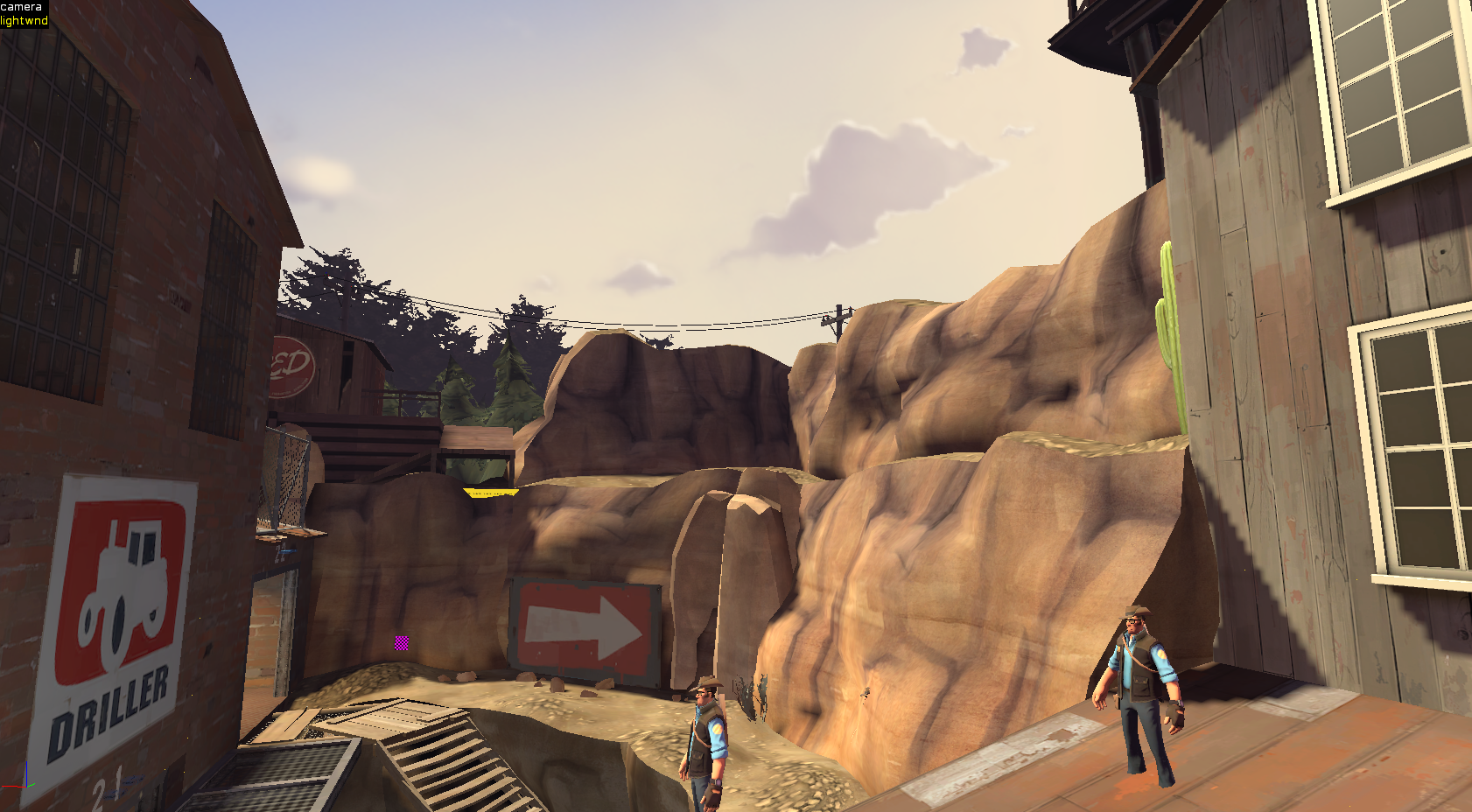 Let's block out a quick building and choose its materials:
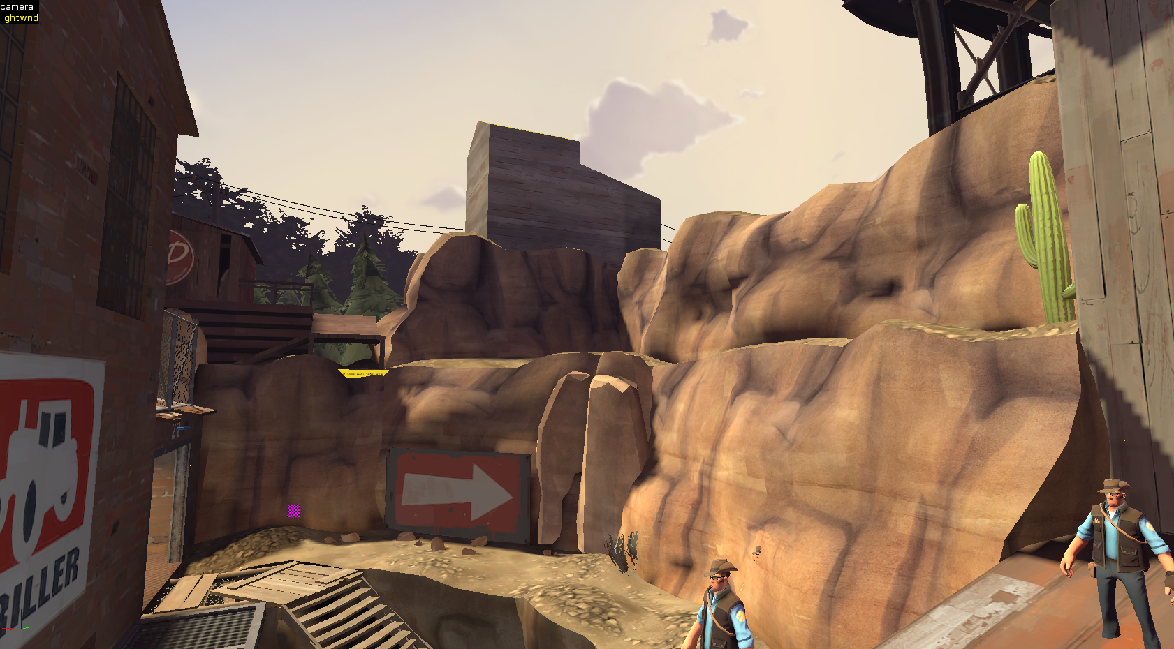
Not a bad start, but we could make that a lot more charismatic.
Let's instead build it on a 45 degree angle with supports extending down the rock face:
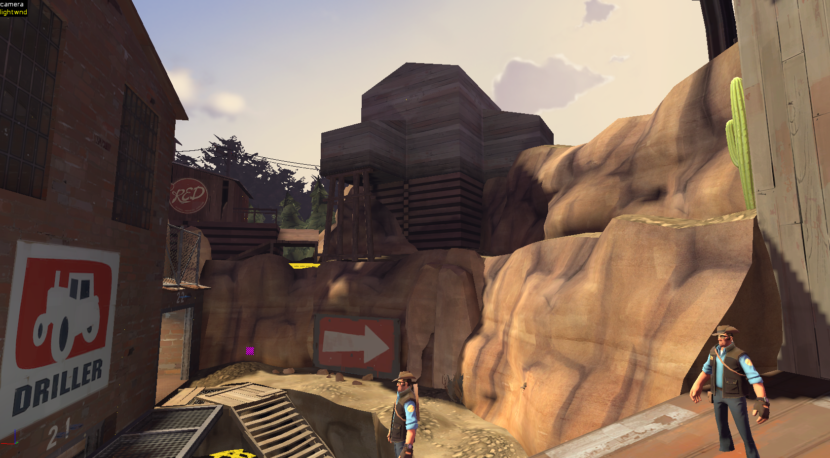
Looking good! But the light isn't really hitting it, so any wall details we place are gonna be lost. And the shape of the little protruding buildings is hard to make out. Let's fix that:
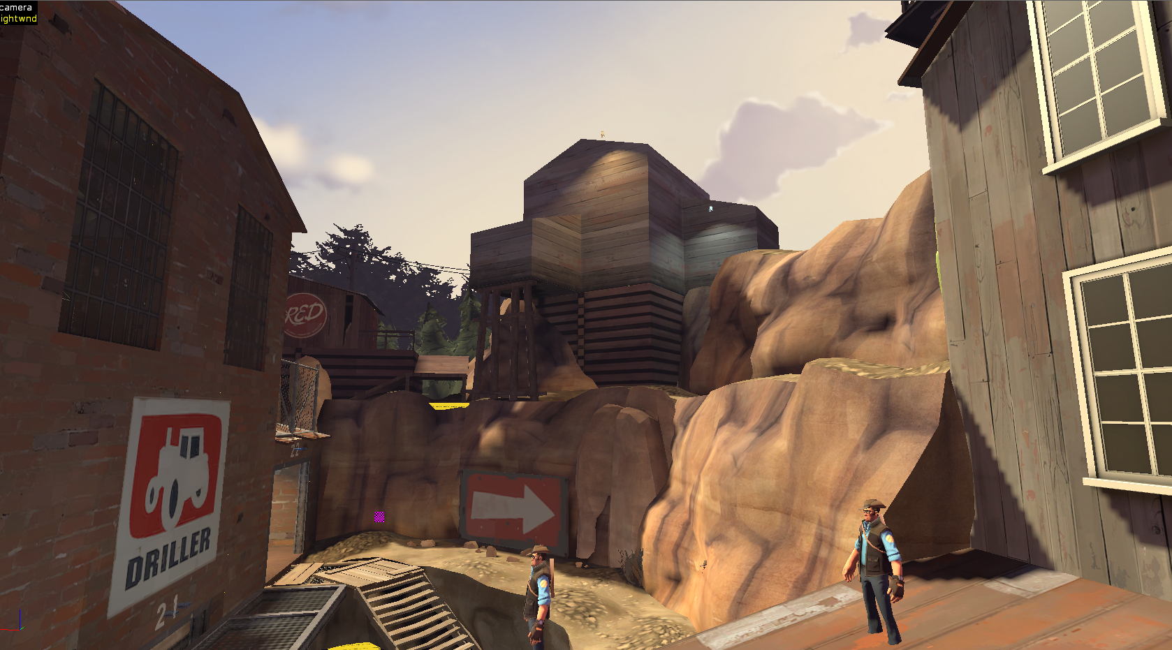
This is a little more intense than any building would be lit by artificial lights in the daytime; normally I would leave more or even all of this building in shadow, but this illustrates the principle I'm trying to communicate. Also, this part is where we choose the luxel sizes. See if you can spot which faces I've lowered the size on!
Now, the fun part: We get to place lots of little detail props/brushes to improve the framing and cast pretty shadows!
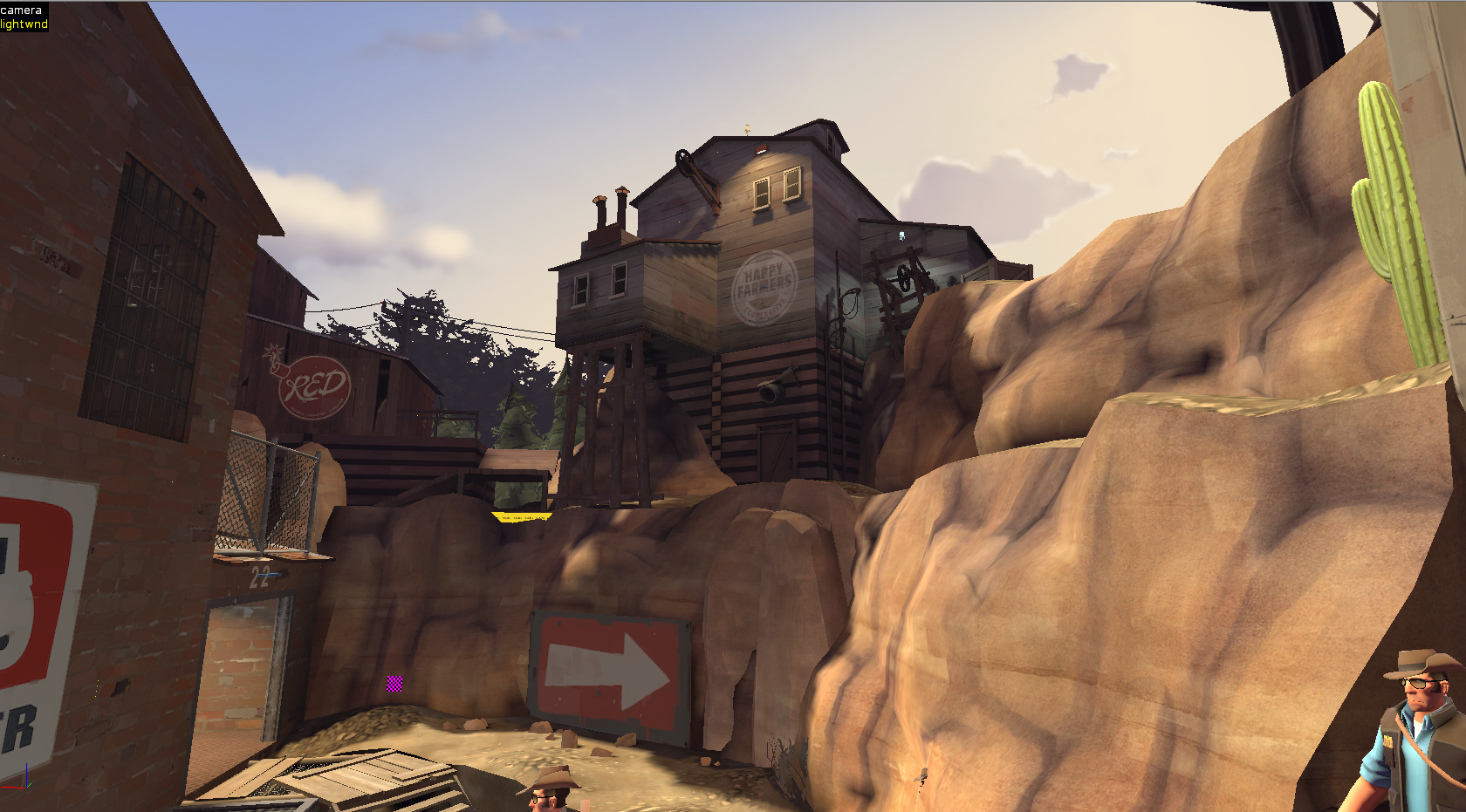
And there it is! I wouldn't call it perfect, but I think it's a hell of a lot better than the empty cliffside we started with.
So that's the SLiDE. But that's not all I did in cp_bruhstbowl.
Since it's a multi-stage map, I wanted to have visual continuity between Stage 1 and Stage 2. But I built the stages separated from each other, so I can't just make it so that BLU can turn around from their Stage 2 spawn to see Stage 1, like they can in Dustbowl and Goldrush.
... Or can I?
Thinking about it for a while, I decided that a potential solution could be to set the map in a quarry, and have Stage 2 at the top and Stage 1 at the bottom, that way BLU could look down in Stage 2's setup time and see all that they'd conquered, but the distinct physical separation of the stages would remain (i.e. I wouldn't have to barbarically merge RED's spawn for Stage 1 and BLU's spawn for Stage 2).
Here's some early "napkin art" for the concept:
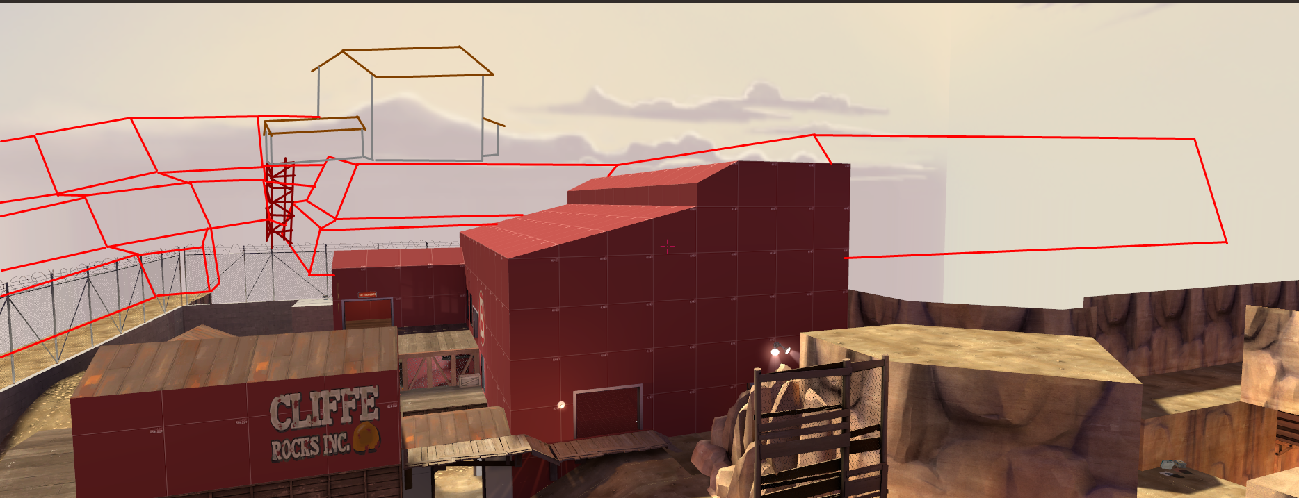
And here it is in the final product:
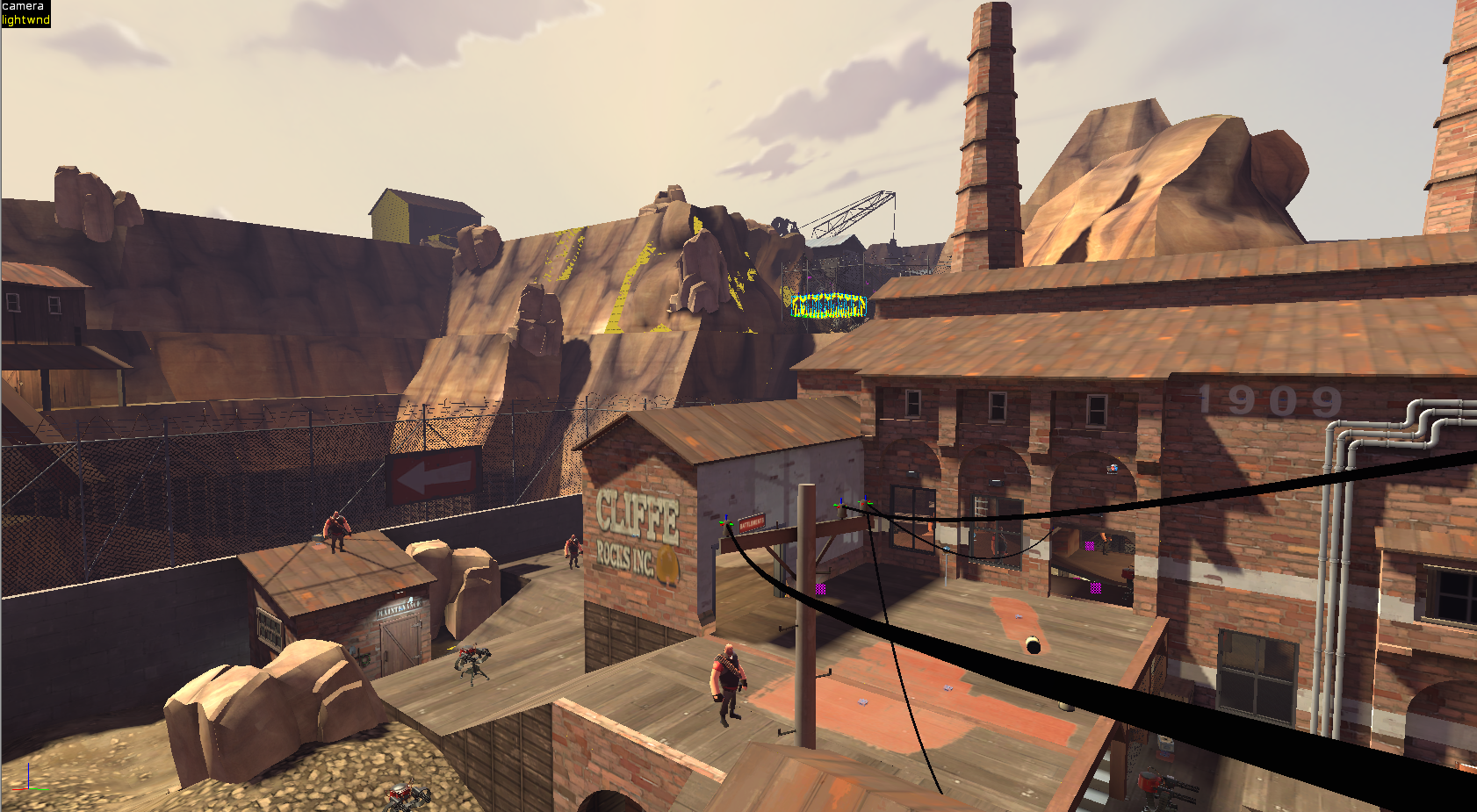
This also partially influenced my decision to have the 1-B building be brick with a couple of smokestacks, since its size and unmistakeable material would leave BLU in no doubt as to what they were looking at, and it would let me cull most of Stage 1 so BLU's framerate wasn't being needlessly reduced.
This quarry theme gave me perhaps the most important thing that makes cp_bruhstbowl better-remembered by me than my other maps; the fact that I had a distinct goal for each control point.
I had learned at some point that you can skybox off a building's roof, then make the actual roof brushes a func_illusionary.
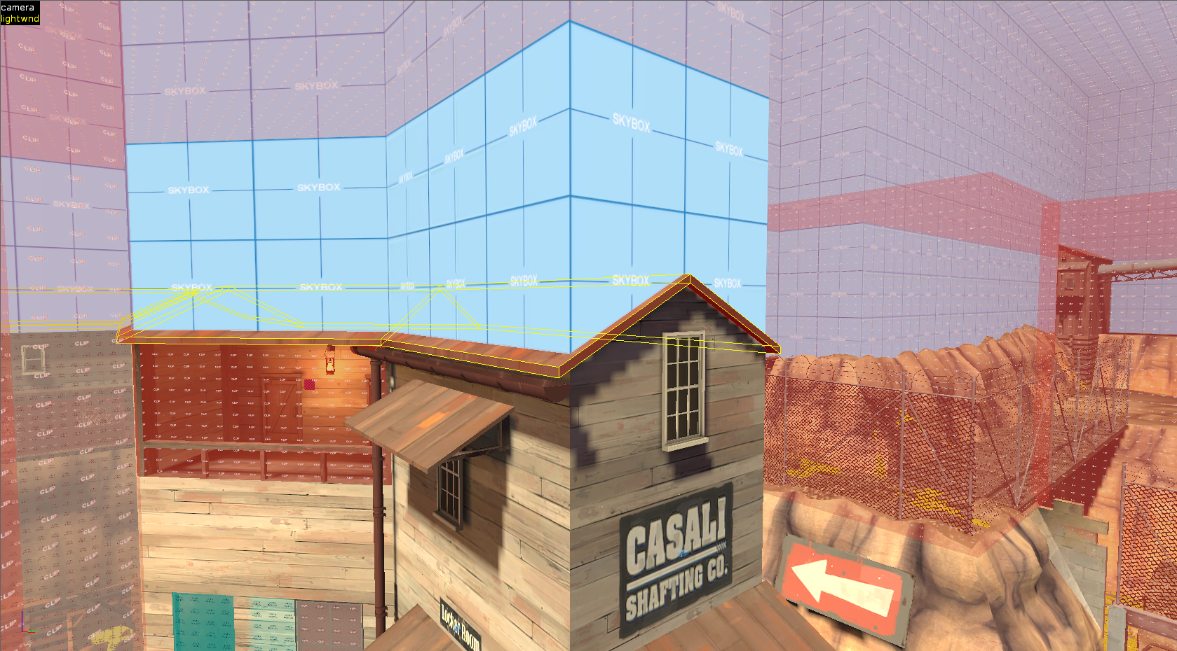
The skybox brushes won't cut these func_illusionary roof brushes, and they'll also be nonsolid, so you'll get a roof that looks like it isn't skyboxed off, but in reality it is, so you'll get perfect optimisation with no visual bugs and a lot of clipping work saved.
You will need to ensure the "Disable Shadows?" keyvalue in the func_illusionary is set to "No", since it defaults to "Yes".
This building over here is an example of the same technique - it looks like it's cut in half here:
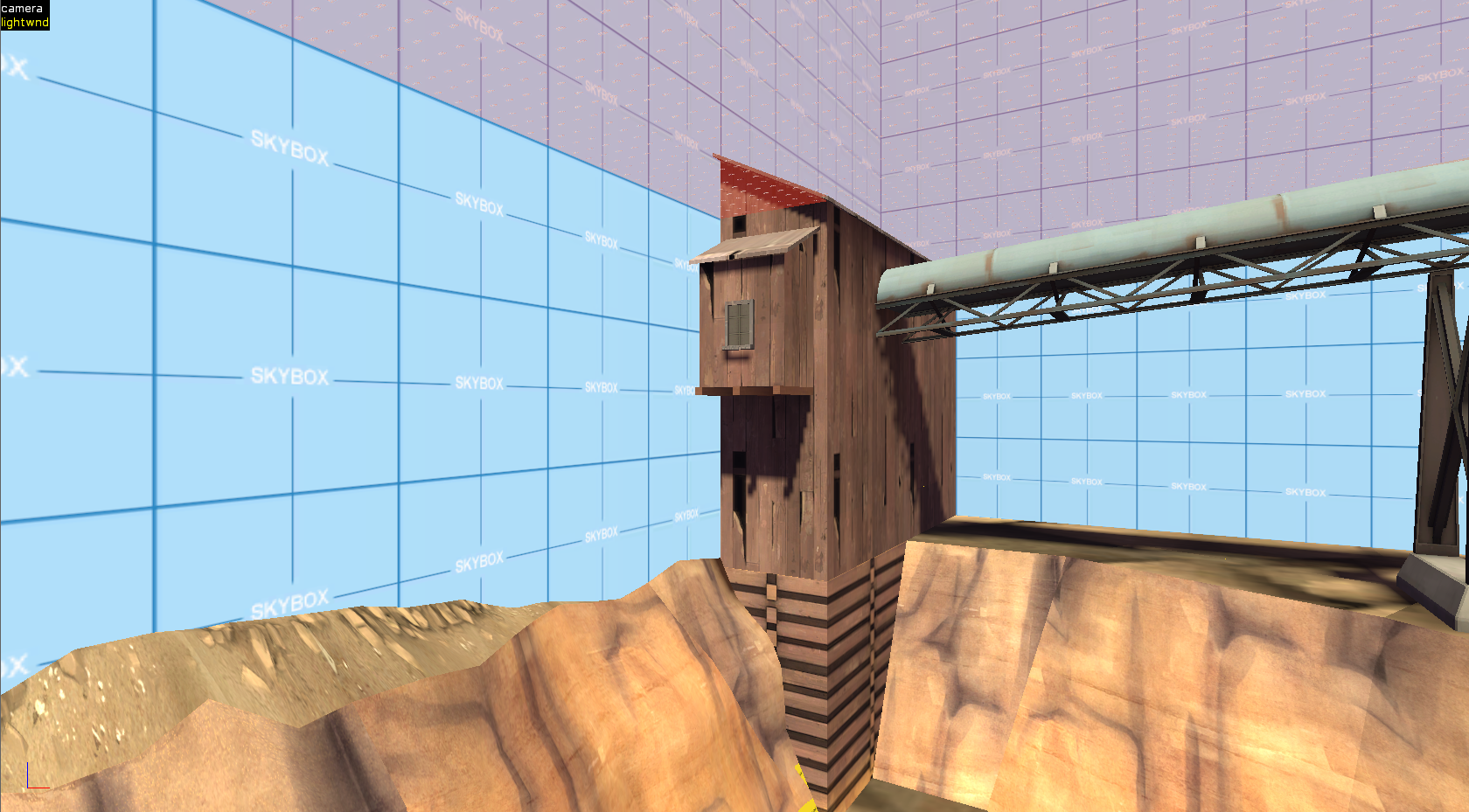
But in game it looks like this, because nearly the entire building is a func_brush:
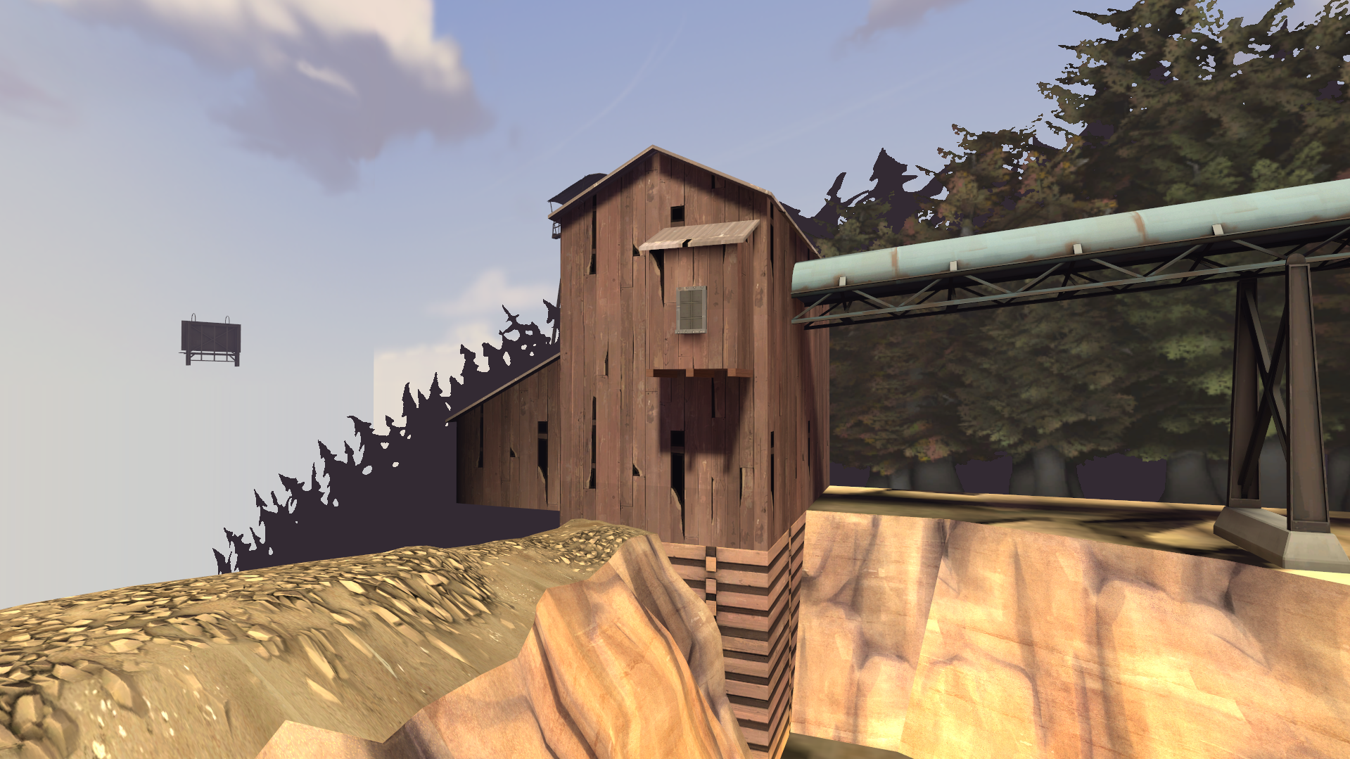
You may notice that the shadows get cut off where the building intersects the skybox brush in Hammer. Any part of a building that is completely contained within a skybox brush will not be able to receive shadows, so be careful.
Also, if your optimisation is working well, props that are visible on one side of the skybox brush won't be visible on the other:
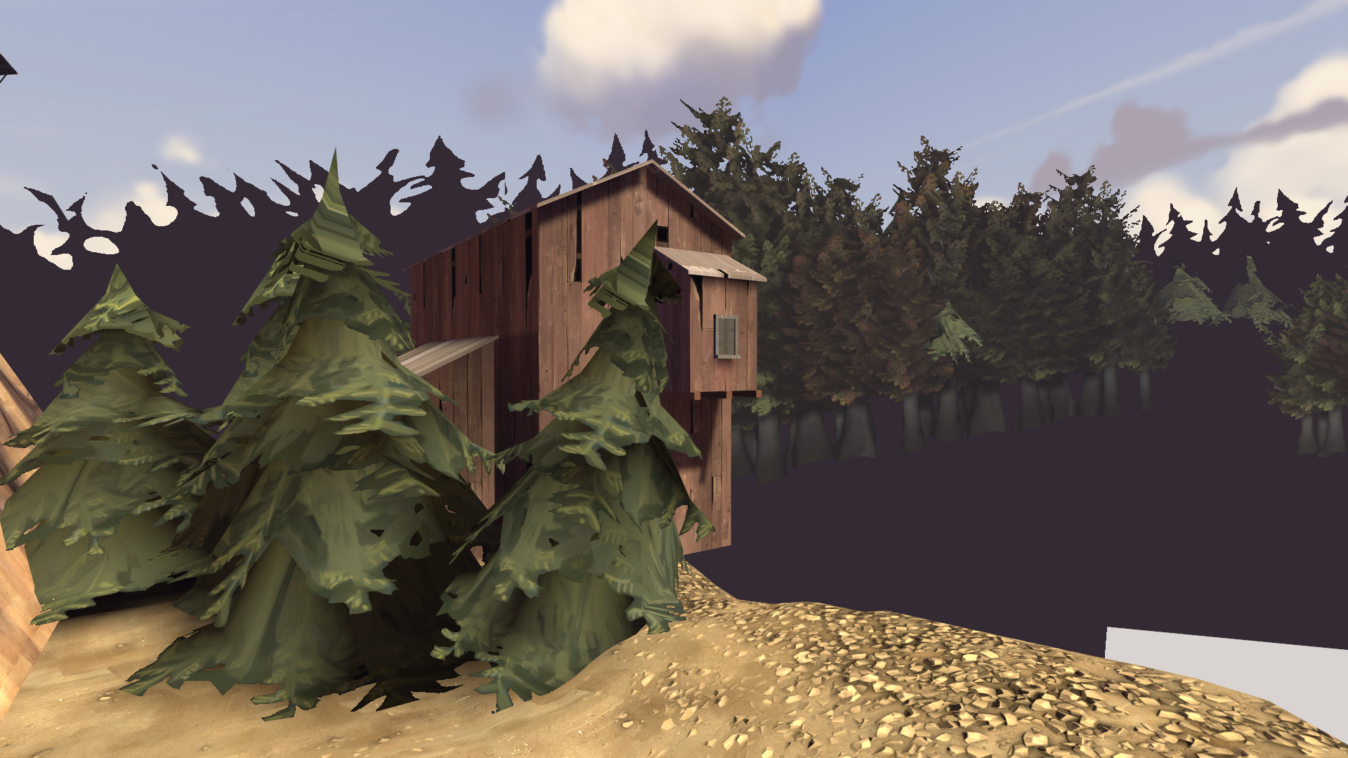
Notice how these trees in the foreground weren't visible before, and the grain conveyor that was visible before is now invisible.
Armed with these techniques, I relentlessly partioned the map's different areas with skybox brushes.
Once I had done this, I discovered some surprising things:
VVIS compiled lightning-fast, and after checking with mat_wireframe 3, I barely even needed to add any hints to control which areas were and weren't being rendered.
This is because VVIS will slow down massively if there are lots of visleaves in one massive area - cp_bruhstbowl has lots of visleaves, but because it's so well-partitioned, they're in lots of little areas.
This allowed me to actually keep a lot of the massive quarry vista in the main map and still have a fast compile time, which I wasn't expecting:
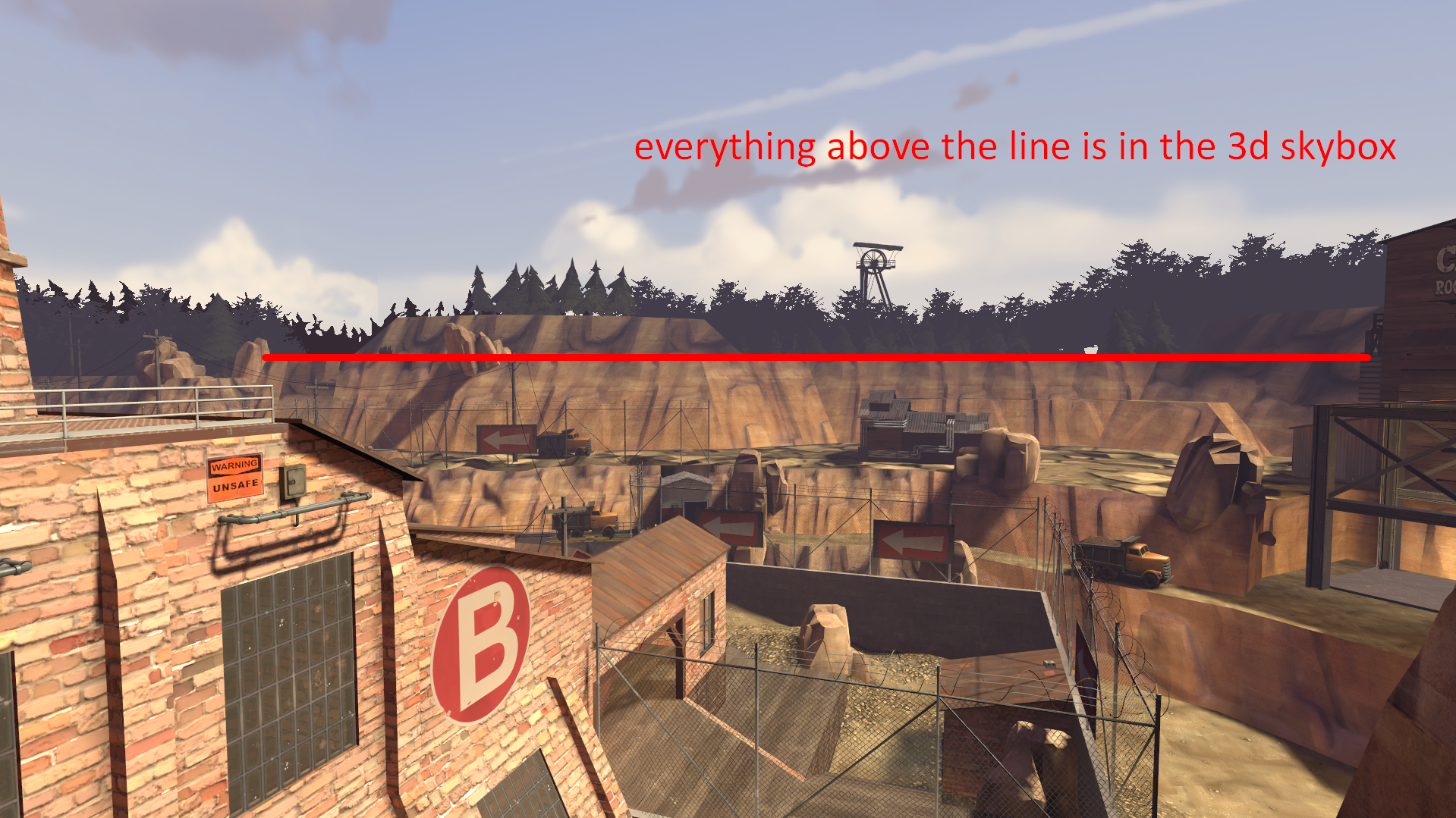
This is fantastic, because having to put an object in the 3D skybox is bad for multiple reasons:
There are some cases where the 3D skybox is great, though. If you need a prop or displacement to render on both sides of a skybox brush, you can't make it part of a func_brush or func_illusionary, so you have to either make it so that the skybox brush is thin enough for the bounding box of the prop to be visible on both sides, or you have to put the prop in the 3Dsky.
Honestly, I could talk about cp_bruhstbowl for hours and hours, because I spent hours and hours artpassing it - around 4 hours a day for around 3 months.
But this post is already long, so I'll end with two statements:
After that, I added more and more detail until it got narrowly close to the brushside and lightmap limits.
pl_boatload and koth_slums are both very, very near the brushside and lightmap limits, and the overlay limit as well!
To me, there's nothing more satisfying than ending an artpass not because I think the map's perfect, but because I literally can't add more detail.
Thinking the map looks perfect is deceiving yourself, but knowing for sure that there's nothing more you can do is definite closure.
| Map | Image | Version B1 release | Steam Workshop release |
| pl_roofrack |
| 15/08/2021 | N/A |
| cp_bruhstbowl | 15/05/2022 | 23/10/2022 (5 months after B1) | |
| sd_offload | 09/12/2022 | 04/03/2023 (3 months after B1) | |
| pl_boatload | 15/03/2023 | 05/04/2023 (1 month after B1) | |
| arena_exhaust | 23/04/2023 | 24/04/2023 (1 day after B1) | |
| koth_slums | 20/06/2023 | 10/10/2023 (4 months after B1) |
But why am I telling all this to you?
Well, it's because lately it's felt like no matter how many maps I artpass, none of them will ever surpass cp_bruhstbowl.
Therefore, I'm writing this not only out of the hope that it will be helpful to people wanting to artpass their own maps, but also to help me get out of this funk; by understanding exactly how and why I artpassed that map.
Chapter One: The Why
In April 2022, I decided that my map cp_bruhstbowl was ready to artpass.
I have a very strict metric for when a map is ready; in the case of cp_bruhstbowl, I decided that there were no more changes I could make to the map that would make it objectively more fun than a8g.
There were changes I could make that could fix a8g's issues, but those would create other issues, and the net percentage of people who would enjoy playing the map would go down.
So, the map was ready. But I was on guard, because my previous (and, at that time, only) map I'd artpassed, pl_roofrack, had been a massive disappointment.
The map was underdetailed, poorly lit (everything was bathed in hideous pinkish sunlight) and very inconsistent with reality.
I had read YM's amazing nodraw.net guides before artpassing that map, but clearly they alone were not enough for me.
Separately, I had the goal of solving the following problem:
"Why do high-profile maps from 2009 look better and run faster than high-profile maps from 2022?"
At first, it didn't make any sense.But after giving it a few seconds, I realised that, well... computers were weaker in 2009.
In other words, maps at the time had to make the heaviest use of Source's optimisation techniques that they possibly could.
It was then that I realised the sheer extent to which maps nowadays are limited.
If you're thinking "well, I can get away with not skyboxing off this roof, it's not 2009 anymore, people can run it fine", you're right to some extent, but you're also massively hampering the amount of detail you can put in any given scene without people getting low framerates.
But I'm a man of the '20s. I didn't just want to make my map look like something out of 2009, I wanted to make it look even better, so I could prove that the 13 year time gap was actually worth something.
Chapter Two: The How
There they are! The evil lightmaps Tiftid is trying to psyop you into using!
| Luxel size 4 | Luxel size 16 |
Well, it was well-known in 2009, at any rate.
A smaller number gives you sharper, prettier shadows that better represent the shape of the object casting them.
(Quick side-note: Luxel sizes smaller than 16 look REALLY bad with the usual SunSpreadAngle of 5. Use a SunSpreadAngle of 0.5 instead if you wish to use these luxel sizes.)
However, this feature shouldn't be overused, as trying to load a map with too many low-luxel-size surfaces will crash with the error message "Engine hunk overflow!"
As such, I quickly developed a set of rules for my use of this technique:
- Only use a value smaller than 16 on surfaces that are actually at the edge of a shadow - faces fully in shadow or fully in sun don't get any benefit from increased shadow definition
- Divide large faces up so that you're only using a smaller size on the portion of them which has the edge of a shadow
- Use the largest size that will still accurately depict the shape of the shadow (usually 4 or 8)
- Be very careful with displacements, since if they're bigger than about 256x256 they won't accept a luxel size of 4 (it literally gets changed to 5)
Unlike other engines, the shadows aren't calculated in real-time - they're precalculated and saved in the map file for players to load at runtime.
Therefore, sharper shadows actually have virtually no effect on the user's framerate.
However, a good incentive to not use this technique very much in 2009 was the fact that you have to load the shadows into your texture memory - in 2009, you had maybe 256 or 512 MB of VRAM.
But it's 2022, and even my old laptop from 2017 had maybe 2 GB of VRAM - enough to easily handle up to the "Engine hunk overflow" limit of lightmap information.
So, shadows are the major way you can make your maps look better then even the most competently made maps from before the '20s.
However, every detail has a price.
Higher-quality lightmap textures are larger in size, and they're saved into the map file, so your map's filesize will increase, making it take longer to download.
How much is this in practice?
Well, the average map has an LDR and HDR lightmap lump of maybe 4 MB each.
pl_boatload, which has lightmaps going up to just below the engine limit, has 16 MB each.
So, the most this technique will ever inflate your filesize is by around 24 MB.
That's really not much when you consider that some people choose to pack 60-80 MB worth of custom content into their map.
Ultimately, in cp_bruhstbowl's case, I decided that it was well worth it to increase the filesize a little to massively improve the amount of detail while also keeping a high framerate.
Another factor I wanted to take into consideration is how Valve details their maps.
I think no one ever detailed a map as good as YM, but Valve got pretty damn close.
While replaying Half-Life 2 at the end of 2021, I liked the look of the Canals area the best. And I narrowed the reason why down to one thing:
"Valve are masters of framing a scene."
Here's a screenshot from the canals that demonstrates this:The barn is set on top of a hill, seen from side-on and silhouetted against the sky.
It is the tallest object in the scene other than a few trees, and if you take this from a better direction than I did, its perfect, real-time reflection is carefully tailored to be visible in the water.
The barren, almost devoid of detail displacement surfaces are masked by a careful selection of low-poly objects on top of them, their lack of definition hidden by the fog and them being set against the sky.
This also touches on another thing I wanted to talk about:
"A scene from a TF2 map should look like a scene from a painting."
Valve's artpasses are heavily derived from their own concept art, but what is that concept art derived from? In Valve's own words, "early 20th century commerical illustration".You tend to find that TF2 scenes are characterised by excellent framing, vibrant colour schemes and deliberate exaggerations (making something slightly too large or too flat, repeating the same kind of object several times into the distance).
These are exactly what a painter might do to a scene they saw, if they wished to represent it as "larger than life".
Gravelpit comes to mind, with its bold grey-purple sky and its distant vista of grain conveyors and gravel mound seen through the fences at the edge of A.
Making a map accurate to real life, or accurate to TF2's 1960s setting, is definitely good - but that alone does not actually make it feel like TF2.
You need to look at your map, and see it as though it were a painting hung on a wall, and what would be in it if it were.
That's what will help you decide which prop will feel at home in a room, or what kind of framing will make a scene unforgettable to the player.
So, armed with all this knowledge:
Chapter Three: I Artpassed That Map
I developed a process which I call "going down the SLiDe".
It stands for "Shape, Light and Detail", in descending order of importance.
- Shape - Describes the aspect of the building and the general framing of the scene.
- Light - Describes the angle at which the sun hits the scene - which surfaces are illuminated? Which surfaces are in shadow? Which artificial lights will we place for the right effect?
- Detail - Describes the placement of posters, windows and other wall/floor/ceiling details.
It's because I started to consider a wall as not a wall, but as a canvas which I could cast shadows across.
Recall that shadows have virtually no performance impact in Source, so if I can place a wall detail that also casts an awesome shadow, I've essentially placed two details for the performance cost of just one.
Another reason to place details after you've paid careful attention to your lighting is that wall details which are placed in very dark areas will often go unnoticed.
You shouldn't solve this by placing the details first and then lighting them up if they're too dark, because then your map will fall victim to overlighting, and when everything is lit, it becomes even more visually boring then when everything's dark, because there's no contrast.
That was one of the reasons pl_roofrack was so bad.
I understand if this seems a bit esoteric.
So let's do this with an example building.
This seems like a good place, since the skyline is pretty flat and boring:
Not a bad start, but we could make that a lot more charismatic.
Let's instead build it on a 45 degree angle with supports extending down the rock face:
Looking good! But the light isn't really hitting it, so any wall details we place are gonna be lost. And the shape of the little protruding buildings is hard to make out. Let's fix that:
This is a little more intense than any building would be lit by artificial lights in the daytime; normally I would leave more or even all of this building in shadow, but this illustrates the principle I'm trying to communicate. Also, this part is where we choose the luxel sizes. See if you can spot which faces I've lowered the size on!
Now, the fun part: We get to place lots of little detail props/brushes to improve the framing and cast pretty shadows!
And there it is! I wouldn't call it perfect, but I think it's a hell of a lot better than the empty cliffside we started with.
So that's the SLiDE. But that's not all I did in cp_bruhstbowl.
Since it's a multi-stage map, I wanted to have visual continuity between Stage 1 and Stage 2. But I built the stages separated from each other, so I can't just make it so that BLU can turn around from their Stage 2 spawn to see Stage 1, like they can in Dustbowl and Goldrush.
... Or can I?
Thinking about it for a while, I decided that a potential solution could be to set the map in a quarry, and have Stage 2 at the top and Stage 1 at the bottom, that way BLU could look down in Stage 2's setup time and see all that they'd conquered, but the distinct physical separation of the stages would remain (i.e. I wouldn't have to barbarically merge RED's spawn for Stage 1 and BLU's spawn for Stage 2).
Here's some early "napkin art" for the concept:
And here it is in the final product:
This also partially influenced my decision to have the 1-B building be brick with a couple of smokestacks, since its size and unmistakeable material would leave BLU in no doubt as to what they were looking at, and it would let me cull most of Stage 1 so BLU's framerate wasn't being needlessly reduced.
This quarry theme gave me perhaps the most important thing that makes cp_bruhstbowl better-remembered by me than my other maps; the fact that I had a distinct goal for each control point.
- 1-A - must be the most beautifully detailed area of the map, since this is what the teams attack or defend first every time the map is loaded or resets
- 1-B - must have an expansive out-of-bounds quarry vista to show off the theme
- 2-A - must feel supremely 2009-y since it's my personal favourite point of the map
- 2-B - must be well-framed and Valve-y, with distant buildings on top of the quarry and set against the sky
I had learned at some point that you can skybox off a building's roof, then make the actual roof brushes a func_illusionary.
The skybox brushes won't cut these func_illusionary roof brushes, and they'll also be nonsolid, so you'll get a roof that looks like it isn't skyboxed off, but in reality it is, so you'll get perfect optimisation with no visual bugs and a lot of clipping work saved.
You will need to ensure the "Disable Shadows?" keyvalue in the func_illusionary is set to "No", since it defaults to "Yes".
This building over here is an example of the same technique - it looks like it's cut in half here:
But in game it looks like this, because nearly the entire building is a func_brush:
You may notice that the shadows get cut off where the building intersects the skybox brush in Hammer. Any part of a building that is completely contained within a skybox brush will not be able to receive shadows, so be careful.
Also, if your optimisation is working well, props that are visible on one side of the skybox brush won't be visible on the other:
Notice how these trees in the foreground weren't visible before, and the grain conveyor that was visible before is now invisible.
Armed with these techniques, I relentlessly partioned the map's different areas with skybox brushes.
Once I had done this, I discovered some surprising things:
VVIS compiled lightning-fast, and after checking with mat_wireframe 3, I barely even needed to add any hints to control which areas were and weren't being rendered.
This is because VVIS will slow down massively if there are lots of visleaves in one massive area - cp_bruhstbowl has lots of visleaves, but because it's so well-partitioned, they're in lots of little areas.
This allowed me to actually keep a lot of the massive quarry vista in the main map and still have a fast compile time, which I wasn't expecting:
This is fantastic, because having to put an object in the 3D skybox is bad for multiple reasons:
- It will ALWAYS render, even if it's not necessarily visible to the player
- Not all props have a 3D skybox variant (although you can get around this by using a prop_dynamic with its scale set to 0.0625)
- You can't build anything too complex out of brushes because of the danger of creating microbrushes
- Because the 3D skybox takes the geometry and scales it up by 16, a luxel size of 16 in the 3D skybox is essentially the same as a luxel size of 128 after being scaled up - not ideal
There are some cases where the 3D skybox is great, though. If you need a prop or displacement to render on both sides of a skybox brush, you can't make it part of a func_brush or func_illusionary, so you have to either make it so that the skybox brush is thin enough for the bounding box of the prop to be visible on both sides, or you have to put the prop in the 3Dsky.
Honestly, I could talk about cp_bruhstbowl for hours and hours, because I spent hours and hours artpassing it - around 4 hours a day for around 3 months.
But this post is already long, so I'll end with two statements:
- This song is the official soundtrack of cp_bruhstbowl.
- You shouldn't think that the only thing limiting your ability to place more detail is framerate. You can optimise your map to let you place more detail, and you can use shadows to place detail with the price being filesize instead of framerate. With these in consideration, an artpass becomes a beautiful balancing act, where you're trying to maximise the amount of detail, the optimisation and the filesize of the map without compromising each other or running into engine limits.
After that, I added more and more detail until it got narrowly close to the brushside and lightmap limits.
pl_boatload and koth_slums are both very, very near the brushside and lightmap limits, and the overlay limit as well!
To me, there's nothing more satisfying than ending an artpass not because I think the map's perfect, but because I literally can't add more detail.
Thinking the map looks perfect is deceiving yourself, but knowing for sure that there's nothing more you can do is definite closure.
Last edited:

