You are using an out of date browser. It may not display this or other websites correctly.
You should upgrade or use an alternative browser.
You should upgrade or use an alternative browser.
- Apr 19, 2009
- 4,460
- 1,724
Phobos
L3: Member
- Feb 22, 2009
- 130
- 50
Ahhhh.... I see. I tried to imagine what they could look like in the end, the best thing I came up with was gigantic chimneys.yeah, I change my mind a lot
Those towers probably won't survive the detailing process. I just like big tall things that can't possibly exist.
Did you see the mixed (half red/half blue) B sign in the sneak peak of Nucleus? As if Valve made it just for Grinder. Hopefully they didn't forget to include a mixed A sign.
Tinker
aa
- Oct 30, 2008
- 672
- 334
Did you see the mixed (half red/half blue) B sign in the sneak peak of Nucleus? As if Valve made it just for Grinder. Hopefully they didn't forget to include a mixed A sign.
What seems strange to me is that it says B while it's an arena map.
Psyphil
L3: Member
- Nov 6, 2007
- 125
- 60
I ran through the alpha 7 and I think the looks of the HQs are stunningly nice looking
though as I tend to think of maps in a competive point of view I noticed the lack of higher ground as a defender, my proposal is to bring the upper level above the entrances into play and maybe even put an/two entrances up there.
I also think A & B are too close to the HQs, it's just a feeling but that will probably be noticed in playtests if it needs any fixing. I think this gametype could be really interesting in 6v6 as it requires the team to split up in order to not lose a point behind their back as they move on to the last point.
I noticed that too but I don't think this is the thread to discuss it inTinker said:What seems strange to me is that it says B while it's an arena map.
Phobos
L3: Member
- Feb 22, 2009
- 130
- 50
I like it how it is now. This gives the heavy a chance to shine without being dependent on teleporters.I also think A & B are too close to the HQs, it's just a feeling but that will probably be noticed in playtests if it needs any fixing.
Just thinking: A sentry on your suggested ledge (in front of the banner) would be brutal. Overlooking all entrances.
[Offtopic]I think the B sign in Nucleus is there to create the illusion that the chamber of the doomsday device is part of larger facility.[/Ofttopic]
- Sep 10, 2008
- 2,245
- 1,210
Updated to Alpha 8!
Download from TF2Maps

-Removed the 2nd floor on B
-Increased capture time on HQs
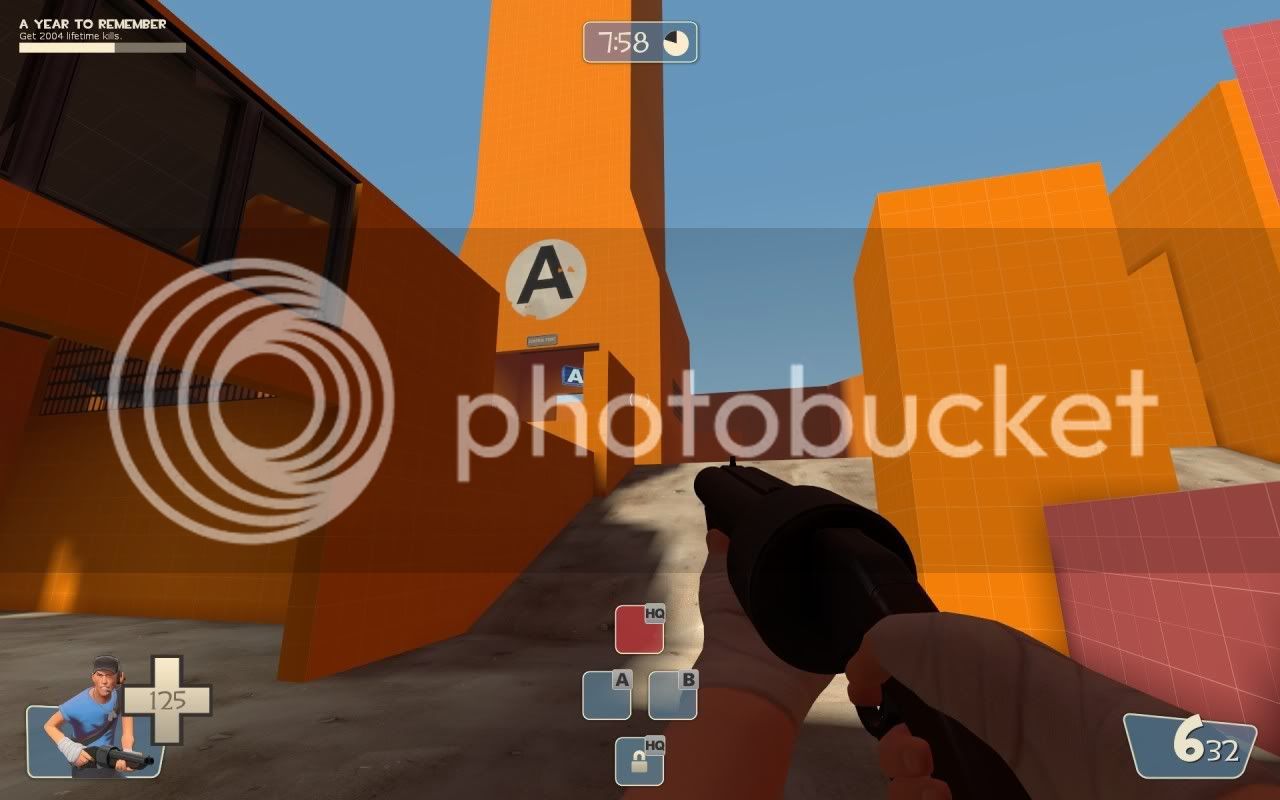
-Detail pass over existing areas
-Added detailing to spawn rooms
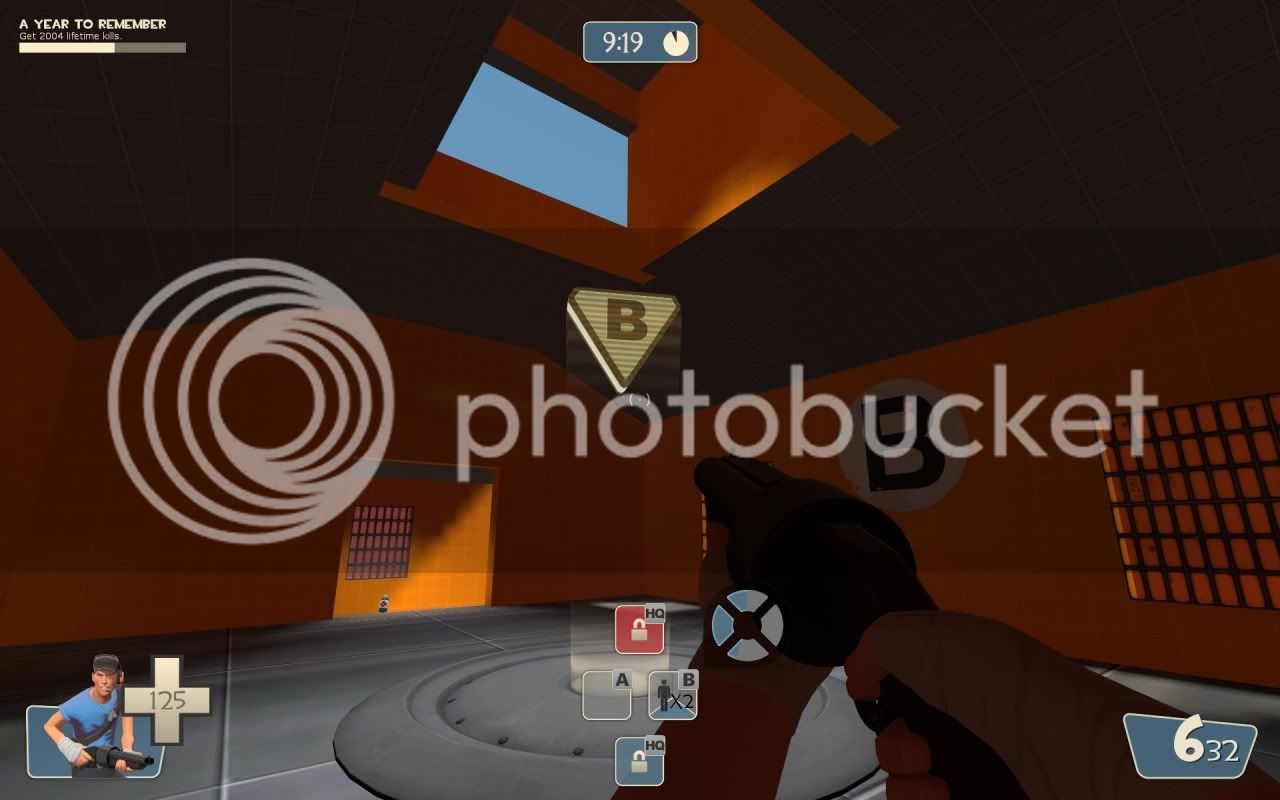
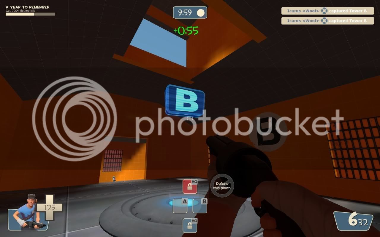
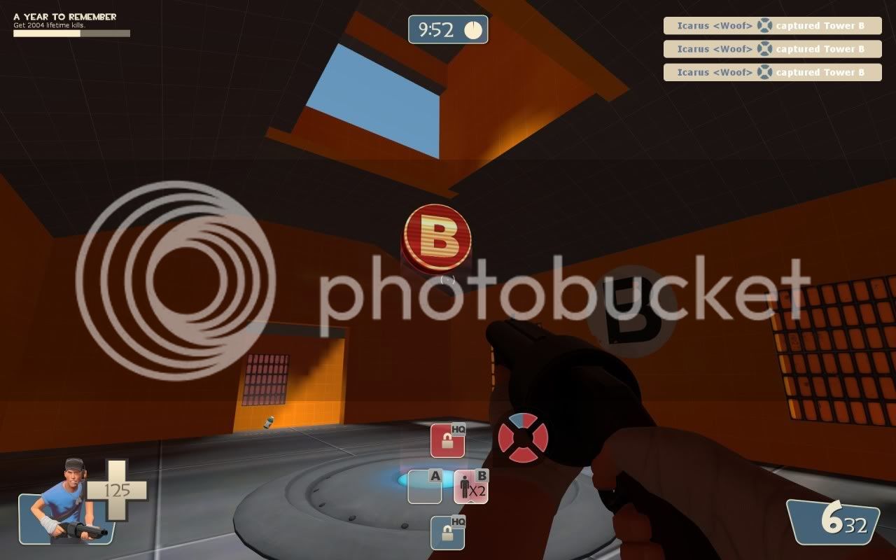
-Added new CP holograms
-Added Cubemaps
Download from TF2Maps

-Removed the 2nd floor on B
-Increased capture time on HQs
-Detail pass over existing areas
-Added detailing to spawn rooms
-Added new CP holograms
-Added Cubemaps
- Sep 10, 2008
- 2,245
- 1,210
[Offtopic]I think the B sign in Nucleus is there to create the illusion that the chamber of the doomsday device is part of larger facility.[/Ofttopic]
Maybe they're hinting that it is a part of something bigger in the future.... (cp_nucleus)


