gladstone

KotH gladstone b8

FunkEdge

L3: Member
Jan 14, 2017
143
59

Gravidea

L6: Sharp Member
Apr 17, 2017
261
108
This map is designed quite nicely! It's definitely unique for a KOTH map. I honestly can't wait to see what this looks like fully detailed and textured. Keep up the good work!
 

FunkEdge

L3: Member
Jan 14, 2017
143
59
his map is designed quite nicely! It's definitely unique for a KOTH map. I honestly can't wait to see what this looks like fully detailed and textured. Keep up the good work!

Thank you so much ^w^
 

Gravidea

L6: Sharp Member
Apr 17, 2017
261
108
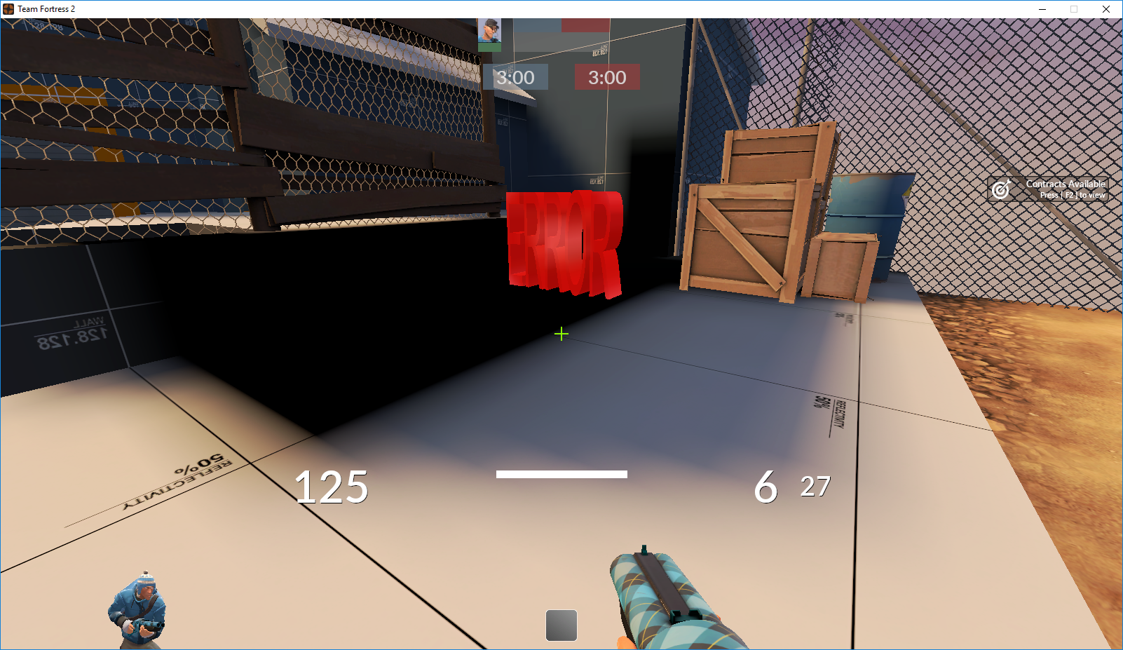
Oh, I forgot to mention one thing actually. There's a model at this part in the map that seems to be an error... Maybe you didn't custom compile properly? Other than that, loving it so far! Great layout.
7f3V3sg.png
 

FunkEdge

L3: Member
Jan 14, 2017
143
59
Oh, I forgot to mention one thing actually. There's a model at this part in the map that seems to be an error... Maybe you didn't custom compile properly? Other than that, loving it so far! Great layout.
7f3V3sg.png

I have fixed that issue now and an update will be released soon hopefully.
 

FunkEdge

L3: Member
Jan 14, 2017
143
59
Thank you so much to all that gave feedback on this map!
I am forever grateful

CHANGES:
-Added some new props over the loading doors to avoid confusion
-Removed the small health by cap
-Added new clipping to block off pointless roofs
-Blocked the OP sightline from cap to spawn
-Optimized the map more
-added new textures
-Sped up cap time from 12 seconds to 10
-Replaced the broken error prop.

Read the rest of this update entry...
 

FunkEdge

L3: Member
Jan 14, 2017
143
59
Heya, it's been a while since I last updated the map.
Anyway, here's the changes

-Changed the lighting
-New clipping
-added new textures
-Blocked off some long sightlines

enjoy!
~Funk

Read the rest of this update entry...
 

FunkEdge

L3: Member
Jan 14, 2017
143
59
Heya, it's been a while since I last updated the map, this is due to school and other issues. but I'm back!
Anyway, here are the changes:

-Made the distance between the battlements and mid longer
-Moved the spawn further back to increase the time it takes to get to mid
-changed and added some props to shut off sightlines
-completely reworked the spawn courtyard
-changed and overhauled the clipping
-moved the boxes at the back of the battlements for ease of movement

hope you enjoy
-Funk

Read the rest of this update entry...
 

Gravidea

L6: Sharp Member
Apr 17, 2017
261
108
Continuing to look great! I like that you've given players the ability to stand on certain roofs, such as the building that the capture point is in. There is a specific door that is available on both sides of the map that has its "No Entry" texture looking a little bit stretched, but I imagine that's something you'll be able to fix easily.
upload_2020-6-11_17-45-2.png

As well as that, I believe there are a few doors that would benefit the players by allowing them to see through it one way, but not through the other. The specific door model that I'm talking about is "windowed_door.mdl", and it would essentially allow players to feel more safe moving through some of the doors you have being able to see some of what's on the other side. This one in particular near the team's spawn could make good use of this door model, but I'll leave that up to you!:
upload_2020-6-11_17-49-9.png

Other than that, it's looking good! Can't wait to see where you go with the detailing process of this map!
 

FunkEdge

L3: Member
Jan 14, 2017
143
59
Thank you so much to all that gave feedback on this map!
I am forever grateful and can't thank you all enough!

Changes:
-removed the sun as it was blinding players
-lowered the roof of mid
-removed some useless props in the bases and mid to reduce noise
-removed some unused walkways
-changed the doors into the battlements to try and help with visibility
-changed the placement of some health packs to try and make them easier to find
-changed some of the textures to improve overall looks.

Read the rest of this update entry...
 

Gravidea

L6: Sharp Member
Apr 17, 2017
261
108
Looking good! I like the changes you made to the roof of the capture point building. It seems you took my suggestion for the no entry doors, however it looks like you forgot to center them. This one especially haha.
upload_2020-6-12_22-16-34.png


As well as that, it seems you took my suggestion for the windowed doors on both sides of the map. I believe it would be more beneficial if they were flipped however so that the window is on the side facing spawn. This way the team members heading to the point can feel safer advancing in case there are enemies behind the door, or a sentry set up, but it's completely up to you. Basically, it would make enemies think twice before trying to spawn camp as they wouldn't be able to see out the door.
upload_2020-6-12_22-19-24.png


Another suggestion I wanted to touch on was the capture point. Moving between the flatbed and the platform feels a little awkward because there is nothing connecting them, and it feels like your player should fall right through. For suggestions, you could add something like planks of wood connecting the platform to the flatbed, you could add small crates or other things between the flatbed and the platform, or you could inch the platform a little closer to the flatbed.
upload_2020-6-12_22-24-26.png


What you do with this feedback is completely up to you though! I won't tell you how to make your map, but I feel like these changes could help players a little! Keep up the good work, and sorry for the large images! If I post screenshots in the future, I'll find a method to make them a bit smaller.
 

FunkEdge

L3: Member
Jan 14, 2017
143
59
just a small change due to some very helpful feedback.

-changed the direction of the doors to battlements
-fixed a few textures
-added a ramp to the midpoint (from the flatbed to the platform)
-blocked projectiles from going under the point to stop hidden sticky traps.

Read the rest of this update entry...