Took a look around. Here's some feedback:

-gap in the pipes here

-visable nodraw texture in the back of blu spawn here

-makes me sad that none of the bottles on this map are physics props :/

-incorrect cubemap. reflecting outside while inside

-this door is very bland and square. Do something more to fancy it up and make it more interesting

-being able to get inside this prop at mid just looks odd. I'd suggest just getting rid of it in general. There's more than enough detailing in that area and it doesn't add much.

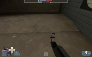
-the metal plates prop through the door there fades out at this distance

-clip this prop smooth

-These stairs could use another side railing. Just having them go into the wall looks odd with the rest of the supports around.

-these steps are tiny and steep and awkward.

-would be neat if these whistles went off for whichever team capped the point.

-can see inside the cable of this prop

-The shadow here between the ground and ramp can be fixed by having the brush under the ramp have the nodraw texture on it from what I remember.

-black texture here

-The clip ramp on this pipe is just weird. I'd suggest replacing the pipe with a board ramp or something like that.

-these are less weird than the previous one but still look kind of awkward.

-this is a weird use of this prop. I like it.

-I get why there's that raised concrete section there in order to cover up the tracks but the doors in that room don't make sense with it being there. There's gotta be a better way to detail this area that looks less awkward and weird.

-your coal piles could benefit from a blend texture under them between the coal and concrete.

-It's very strange that both sides of the map have these brick walls where the walls have fallen out in the exact same pattern.

-Red Ir

-misaligned textures on this brush for both sides

-ALL of this detailing on the wall here not only looks kind of overdone for the small space it's in, but has nothing on the other side of the wall to match up to or explain what it does. I'd suggest greatly simplifying to get across the same idea with less clutter.

-even though this texture is a door texture, it's generally not used as a door texture and I'd recommend using the other kind of metal door texture

-this bright red texture paired with the maps lighting is very bright and hurts my eyes


-I feel like these barricades could be more visually interesting.

-boring square door. Could use some fancying up

-there's a paint can prop in the corner by that door that disappears at this distance.
That's all I got for now. Pretty much just detail and visual focused feedback but I hope it helps. Forge is a fun map from what I've played of it.