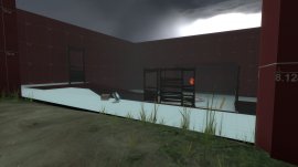
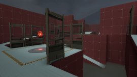
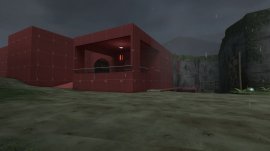
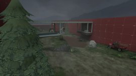
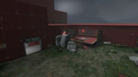
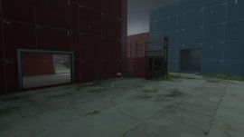
First of all the map looks great! Perhaps even a bit too detailed for alpha. The dark, sawmill(ish) aesthetic works really well and gives the map a rather somber feel. Besides a few graphic, texture alignment bugs your brush work looks good.
Unfortunately I found a few major flaws in the layout that will need some attention. Firstly... the sight lines. <Ominous Music Plays> Having even one or two large sight lines can be a problem. Not only for game play reasons but for optimization reasons as well. If I look down towards the second point from the first point I can see all the way to the far cliff wall. I'm having to load half the map at once when I don't really need too. The same goes for long hallways. So having one large sight line isn't the end off the world it doesn't help anything, it just makes things worse. Your map has several of these sight lines.I would suggest looking at other large maps to see how they handle long sight lines like the ones on your map.
The other thing I'd like to mention is your spawns and pacing. Firstly, BLU spawns right on top off cp 1. It's then just a short walk to cp 2 and then a huge walk(relatively speaking) to cp 3, even with the forward spawn. Also, I'm not sure if the forward BLU spawn is entirely necessary, only play testing will tell. At the pace Blu will easily take control of A, after an short walk and period take B, then be slammed into a brutal choke point at C. That doesn't sound like fun for RED or BLU. Note: this is all educated speculation on my part.
A couple solutions too this problem would be too 1) (Not recommended) deleting cap A and making it 2 cp map. 2) (recommended) Moving cap B closer to Cap C and moving Blu Spawn farther away from Cap A. Take a look at official maps like Mountain Lab or Gorge to see how they pace there Cap points.
Also, most of you Spawn exits lead into narrow, cramped corridors or ramps, making it extremely difficult to get anything short of an Uber to get though all the Demo and Soldier Spam which dominate small enclosed areas like this with splash damage. Lastly, RED spawn feels like it's in the middle of no where, making you walk quite a while to get to the action.
As for Cap C, I agree it needs some work. I'd suggest trying to make it more unique and dynamic. Make it that point where everybody will recognize your map just from a screen shot of it. Look at the final points on other maps and see how they look and play. Make it Big, Make it Grand, Make it say "this is it" or "Here we are," "The end." Make it memorable.
Well, I hope this helped a bit, and don't forget to Play Test!
~Cyto


