PL Enclosure 2024_rc3
- Thread starter AsG_Alligator
- Start date
-
This map is featured! Our best maps, all together in one place for your viewing pleasure.
You are using an out of date browser. It may not display this or other websites correctly.
You should upgrade or use an alternative browser.
You should upgrade or use an alternative browser.
There's gonna be an animated model that smashes through the door on final when blu wins, theres no rex death pit tho.
>Stage 1
-Door on the payload track now opens once, and stays open afterwards.
-Added lighting to room inside the building next to last point
Note: for unknown reasons skipping stage 2 may occur randomly when stage 1 is skipped (i suspect the cart teleporting through the button triggers it somehow). Stage 2 is then skipped before capture zone is active so the cart will just teleport to the last point without capturing anything. This has a very small chance of happening, but can happen nontheless. Keep that in mind.
Read the rest of this update entry...
>Stage 1
-Partially artpassed BLU spawn area.
-Changed area around "Mines" point (removed steep slope and replaced it with a higher flat area)
>Stage 3
-Reworked electric fence foundations
-Removed non-electrified protective grate from raptor pit fence
-Reworked red spawn, red now have forward spawn exit open untill "Raptor pit" point is capped.
Read the rest of this update entry...
Cynder loves Portal
L420: High Member
- Jan 9, 2016
- 434
- 103
No, fences are made by me, and are placeholders still (They will be replaced with models later on)
Cynder loves Portal
L420: High Member
- Jan 9, 2016
- 434
- 103
>Stage 1
-Added additional exit from blu spawn leading to the other side of the river
-Added rock bridge over the river.
-Added additional side route from BLU starting tunnel to towers at last point
>Stage 2
-Reworked mid point (deleted the warehouse, opened up the area)
Read the rest of this update entry...
>Stage 1
-Reworked entrance to brick building from indoor tunnel
-Added additional exit from BLU spawn (leads directly to cage unloading room)
-Added hallway from within first building to pathway along the ledge on opposite side of the river
>Stage 3
-Changed boundary electric fences from instakill to 50 damage per touch.
-Replaced barbed wire textures on 3 out of 4 fences (fences will be switched to models soon so these are temporary anyway)
Read the rest of this update entry...
Foot
L2: Junior Member
- Aug 6, 2016
- 64
- 12
Here is my review of pl_enclosure_a15.
I'm just going to run through the map and point out the major flaws with screenshots.
This will be VERY nit picky.
Stage 1:
This ramp seems really steep.
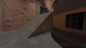
You can shoot out of spawn through the side of the fence.

This entire area feels really cramped mainly because of the insane prop spam.
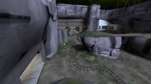
Blocking a 4000+ sightline by putting a bunch of props in the middle of it is not a very good or fun to play way of building a map.
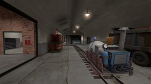
Than after going through a cramped spam fest you come to this chokepoint. If you have a good demo and engie the enemy team will be out of luck.
The only flank route comes down right infront of the sentry spot, and the flank itself has more than 256 height advantage so you take fall damage and it is openable from the defenders by any kind of jumping class.
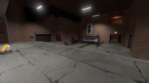
Why does this room even exist? It only has 1 entrance and it is pretty boring.
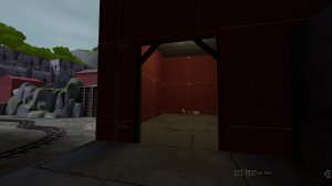
This displacement has a hole.
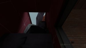
Why are there well doors that are always open and just let people sit on top of them and ambush? Imo they are pointless and hurt gameplay.
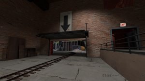
This last point is so defender sided, First off its really cramped and small. and gives a major height advantage to the defenders. The flank routes are not well marked and give so much height advantage to such a small area, effectively removing the advantage.
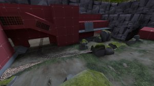
When red comes out of spawn they should be able to breathe, with this area you come out of a small exit into a prop filled room where if you have a demo or a solly with more than 2 braincells will camp this.
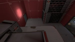
This rock blocks an already terrible sightline and makes the map feel even more cramped than it already is.
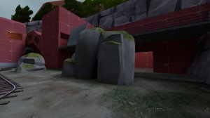
This entire route is so small, scouts have no chance of running from a solly or demo.
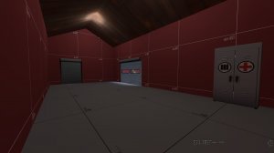
Red spawn feels really small, And it only has 2 exits, one of them being small.

Stage 1 conclusion: Really cramped and not fun to play on.
Stage 2:
Please unclip this or make it more obvious it is clipped, Everyone falls down the death pit.
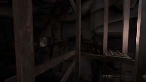
All the spawn exits come out at the same side of the spawn and you have very little choice.
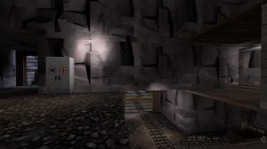
This sightline is so long and has almost no cover.
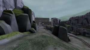
This once as well.
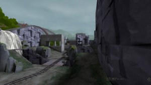
& this one.
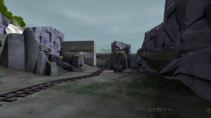
The prop spam is strong with this one.
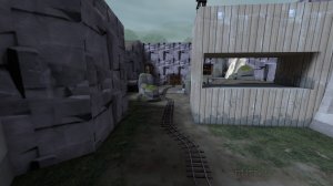
This sightline is so longgggggg.
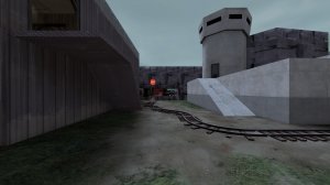
Too much height variation with almost no wiggle room.
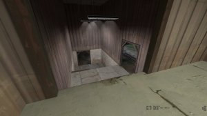
This entire last area feels really uninspired and like a box filled with props and displacements.
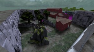
This point is so cramped its like 1/4 of the size of most pl lasts.
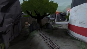
Stage 2 conclusion: Way too many long sightlines, really cramped in a ton of places.
Stage 3:
Same with stage 2, The spawn has 3 exits but the 3 exits are very close together and have very similar height.
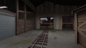
The first area is really small with tons of prop spam making it impossible for snipers to get a good angle.

What's with the well doors that are always open? they don't add to gameplay and make the map feel even more cramped.
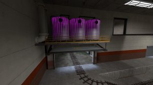
Spiral staircases suck.
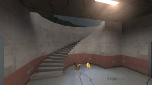
This area is so cramped and has no decent sniper sightlines at all.
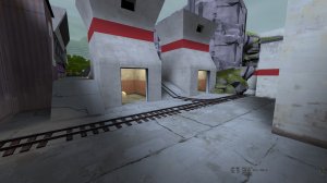
Why so many electric fences and death pits? they just make for really annoying gameplay.
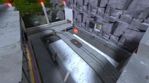
Super tiny choke point, not fun to play.
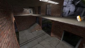
I really hate this area, it is so small and has no flanks around this center choke, and the height is over 256 so damage falloff and fall dmg are annoying.
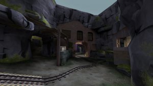
This rock gives more cover than is required and makes this area feel even smaller.

First and only good sightline on this stage, and most of it is blocked by the rock.
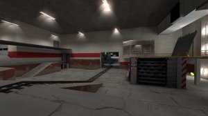
Last is very small and has a terrible spammy vent entrance.
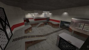
Stage 3 conclusion: Overdetailed and very small.
I hope this helps highlight the problems with this map.
I'm just going to run through the map and point out the major flaws with screenshots.
This will be VERY nit picky.
Stage 1:
This ramp seems really steep.

You can shoot out of spawn through the side of the fence.

This entire area feels really cramped mainly because of the insane prop spam.

Blocking a 4000+ sightline by putting a bunch of props in the middle of it is not a very good or fun to play way of building a map.

Than after going through a cramped spam fest you come to this chokepoint. If you have a good demo and engie the enemy team will be out of luck.
The only flank route comes down right infront of the sentry spot, and the flank itself has more than 256 height advantage so you take fall damage and it is openable from the defenders by any kind of jumping class.

Why does this room even exist? It only has 1 entrance and it is pretty boring.

This displacement has a hole.

Why are there well doors that are always open and just let people sit on top of them and ambush? Imo they are pointless and hurt gameplay.

This last point is so defender sided, First off its really cramped and small. and gives a major height advantage to the defenders. The flank routes are not well marked and give so much height advantage to such a small area, effectively removing the advantage.

When red comes out of spawn they should be able to breathe, with this area you come out of a small exit into a prop filled room where if you have a demo or a solly with more than 2 braincells will camp this.

This rock blocks an already terrible sightline and makes the map feel even more cramped than it already is.

This entire route is so small, scouts have no chance of running from a solly or demo.

Red spawn feels really small, And it only has 2 exits, one of them being small.

Stage 1 conclusion: Really cramped and not fun to play on.
Stage 2:
Please unclip this or make it more obvious it is clipped, Everyone falls down the death pit.

All the spawn exits come out at the same side of the spawn and you have very little choice.

This sightline is so long and has almost no cover.

This once as well.

& this one.

The prop spam is strong with this one.

This sightline is so longgggggg.

Too much height variation with almost no wiggle room.

This entire last area feels really uninspired and like a box filled with props and displacements.

This point is so cramped its like 1/4 of the size of most pl lasts.

Stage 2 conclusion: Way too many long sightlines, really cramped in a ton of places.
Stage 3:
Same with stage 2, The spawn has 3 exits but the 3 exits are very close together and have very similar height.

The first area is really small with tons of prop spam making it impossible for snipers to get a good angle.

What's with the well doors that are always open? they don't add to gameplay and make the map feel even more cramped.

Spiral staircases suck.

This area is so cramped and has no decent sniper sightlines at all.

Why so many electric fences and death pits? they just make for really annoying gameplay.

Super tiny choke point, not fun to play.

I really hate this area, it is so small and has no flanks around this center choke, and the height is over 256 so damage falloff and fall dmg are annoying.

This rock gives more cover than is required and makes this area feel even smaller.

First and only good sightline on this stage, and most of it is blocked by the rock.

Last is very small and has a terrible spammy vent entrance.

Stage 3 conclusion: Overdetailed and very small.
I hope this helps highlight the problems with this map.
Attachments
>Stage 1
-Reworked the aviary area (part of the track now goes over the river on wooden scaffoldings, removed most of the rock prop spam)
-Moved red spawn to a building behind the one that housed spawn before (so cart no longer goes directly in front of red spawn exit)
>Stage 2
-Reworked second half of the stage
-Moved red spawn backwards (again, no more pushing cart in front of active spawn)
>Stage 3
-Remade stage 3 almost completely from scratch, it is a lot bigger then it used to be and is currently the largest stage of the 3
Read the rest of this update entry...
>Stage 1
-Blocked access to flank exit from the tower on last
-Minor prop tweaking to reduce sightlines
>Stage 2
-Red team now has a stairway to access upper area (instead of previous one-way dropdown flank for BLU.
>Stage 3
-Redesigned BLU spawn
-Prop and geometry tweaks to reduce sightlines
Read the rest of this update entry...
>Stage 1
-Removed a few long sightlines in the aviary area
-Fixed getting stuck in displacement when riding on the cart under the rock bridge
>Stage 2
-Clipped some stuff
>Stage 3
-Added missing lights in several buildings
Read the rest of this update entry...
-Removed a few long sightlines in the aviary area
-Fixed getting stuck in displacement when riding on the cart under the rock bridge
>Stage 2
-Clipped some stuff
>Stage 3
-Added missing lights in several buildings
Read the rest of this update entry...
>Stage 1
-Lowered the highground at 2nd point, added roofed balcony there
-Began fully artpassing stage 1
>Stage 2 & 3, fixed numerous issues based on feedback
Read the rest of this update entry...
-Lowered the highground at 2nd point, added roofed balcony there
-Began fully artpassing stage 1
>Stage 2 & 3, fixed numerous issues based on feedback
Read the rest of this update entry...
A Moderately Priced Shoe
L1: Registered
- Sep 8, 2015
- 45
- 18
Maybe for the cart, instead of a bomb, why not use a drill? That way it doesn't have to explode. And yes I know you would have to find a way to get it modeled.


