Preface
Gonna try my best with this feedback, I haven't gotten to playtest this nor is PLR a gamemode I super like but I'd like to make the attempt to help.
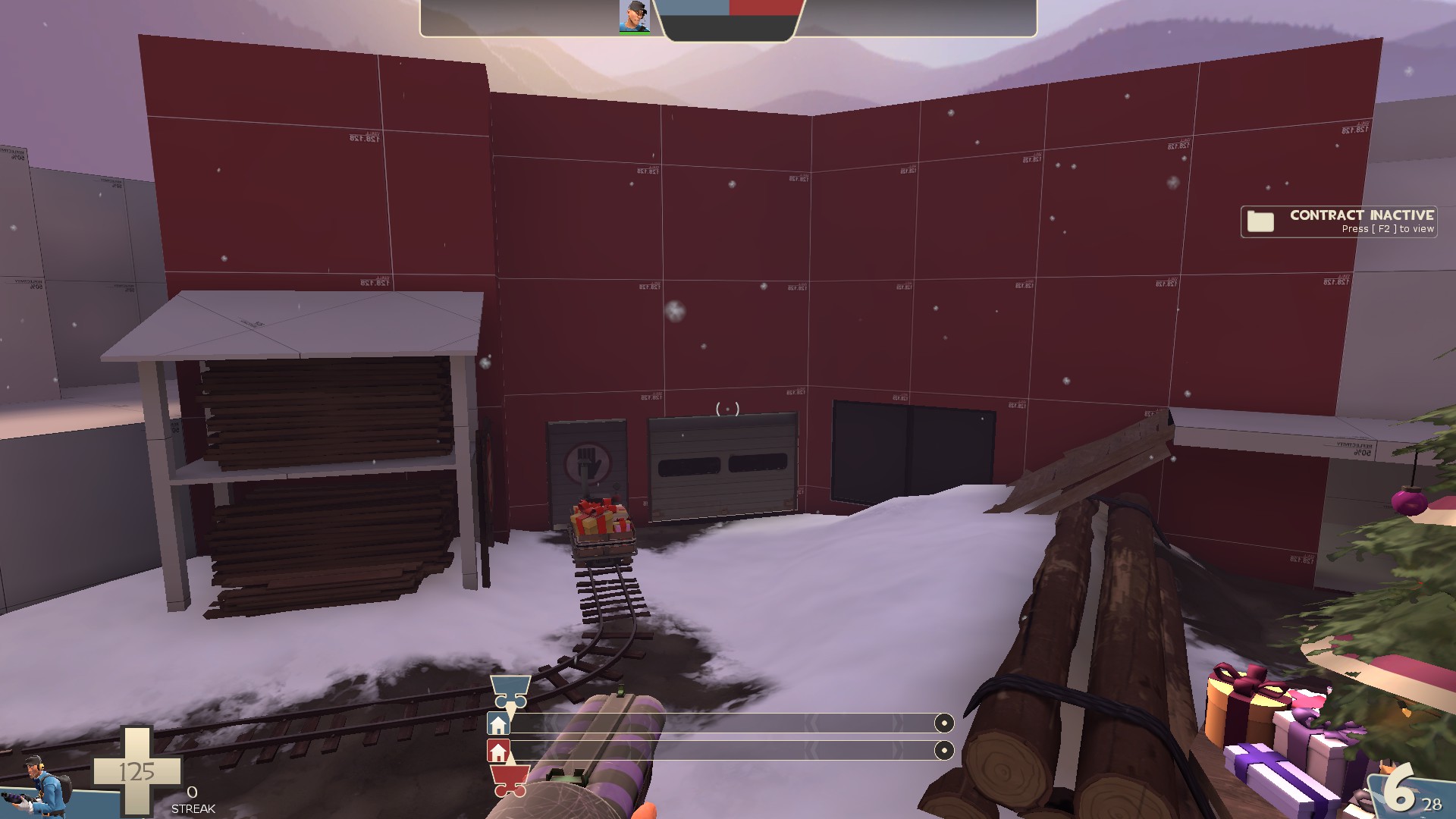
This area directly outside the high ground of spawn feels really awkward to navigate at the moment. I think with shaving a tad bit off of spawn building (that ~125 degree angle you see in blue at the roof of the building) as well as removing that presumed-to-be Sightline blocker would make it feel a lot less strange to walk around.
I know this is meant to make sniper less powerful but a sniper on the battlements should be able to defend the cart from being capped. It's a reasonable sightline to have, given it's at the BLU spawn. I
will say I like the Christmas tree serving as a dynamic sightline block. It works really well.
Could afford to thin the staircase up a bit by widening the area where the cart travels. Always good to have a decent-sized area so players are actually able to move around the cart comfortably.
Combining these windows into a singular window would be fine imo. Makes this area feel less cramped.
These rollback and roll forward zones are really unnecessary. Having it be a normal cart path in the team's own area is fine.
Put simply, I think the sightline blocker here is irrelevant. The rock here covers more than enough, as well as the already-established wall that you can see in the upper-right area. The blocker can also be completely negated by just crouching and *then* sniping. Meanwhile, if it is or is not there, a cheeky player from the opposite team can just hug the rock and not need to worry.
Just stick with the dropdown here. The staircase is really janky.
This rolldown zone will end up making it harder to defend last, as you basically just have a free 2-second push of the cart. Please remove it with a2.

On a second looking at your spawn, I feel like it doesn't have the kind of flow that puts people in the right direction of the cart path. (Stay with me here) Your main spawn entrance, which in terms of the inside spawn design, is actually really smart! I like it, I think it's good. However upon leaving, your first inclination is to look forward, right? You're coming right out of spawn, you're no sure where to go. But then you see a doorway! That doorway eventually leads players to the flank of the map, which is the 2nd bridge that does not have the payloads crossing it. This eventually will lead to a bottleneck of sorts (or I guess more accurately, a choke) as you're funneling players into the flank, where you're not meant to have a lot of players moving around. i feel like that is a major flaw and I think if you just re-adjusted the direction of where your players leave from the
MAIN spawn door, it could be a lot better.
Overall, while I have my gripes with your map, I do believe it has a lot of potential to be a good Single-stage PLR map. I do not say this lightly, as most single-stage PLR maps that I have played have suffered with a major lack of clarity in their design. With these changes, along with some potential future changes down the road, I believe you can make it to RC status in a relatively simple amount of time. I really like how you've set up the christmas tree aspect of your map; It fills a good niche in your cover, and it looks nice in the play space. Your main hub area feels really creative and I like the little docks you have with an ice path going between them. I, additionally, like the waterfall at the back of the dock area, as it adds a unique kind of atmosphere to the map. I am excited to see this map be continued, and I hope that you can see what I see in the map and have the motivation to continue development of this map in the future. The world needs more good PLR maps.
I hope you have a good day,
Minty "Katsu! :3" Aulenrose


