You're welcome.  My first time playing the map, so those are just my first impressions. I would advise against making areas accessible by only certain classes, especially a major route like this, but I guess the best way to figure it out is to continue play testing. Looking forward to seeing where this map goes.
You are using an out of date browser. It may not display this or other websites correctly.
You should upgrade or use an alternative browser.
You should upgrade or use an alternative browser.
After running some tests in lobbies some major design issues with the map became apparent. This update should fix most of the issues, especially the excessive highground on 2nd/last and the mid to 2nd short rotation times. Mid has a new layout, again. It will probably need more iterations before its solid.
A12 Changelog:
* Moved the glass dome thing from last to 2nd
* Reduced available highground near last
* Lowered 2nd point and cleaned up its basement
* removed highground from bridge and lobby area
* merged tunnel and 2nd-mid connector entrances
* increased the size of mid and changed its layout
Travel time from Mid to 2nd should be longer now.
Read the rest of this update entry...
The mid in a12 was way too large, although the walk times were still short, this update cleans up the areas between mid and 2nd alot to make mid feel smaller and the areas more fightable.
Mid going some layout tweaks as well.
A13 Changelog:
* removed the pipe overlooking mid
* adjusted connecters to be more choke like
* removed the shutter in upper
* added buildings to mid
* compressed mid's height varience
* changed a few other minor things
* updated signs
Read the rest of this update entry...
This update removes uneeded paths and improves mid and chokes for better gameplay.
A14 Changelog:
- removed lobby to gravel route on last
* added a shutter to last highground
* lowered eleveation of the entire mid
* changed the shorter B-mid route to be less viable
* added ramp from B to main connector
* added pillars in mid to make some fight space
* relocated forwardest forward spawns
* many medium hp packs are now small
Read the rest of this update entry...
The detail pass is still a work in progress, but most of it is there
Layout Changes:
- expanded last a little and added a box
- added a branch to the vent route for main choke
- adjusted the main choke a little bit
- added some cover to mid
Detail Changes:
- made all remaining brush terrain real terrain
- expanded skyboxes
- added a base layer of detailing
Read the rest of this update entry...
Updated the detailing for my contest entry
It still isn't 100%, but its much better than B1, i'll be updating this later to improve it further.
Read the rest of this update entry...
It still isn't 100%, but its much better than B1, i'll be updating this later to improve it further.
Read the rest of this update entry...
* increased gap between mid point and pillars so snipers cannot jump onto them (a regression caused by raising midpoint in the previous update)
* fixed missing clipping by the large fan
* added collisions to the small fan props near 2nd (you could jump through them previously
* lowered cubemap resolution to lower filesize (didn't make a big difference)
* changed the skin of the radio tower on red side so it is red instead of blue
* updated the lighting origin on the rocks near blue spawn
Read the rest of this update entry...
Fixed many clipping issues and improved the lighting/compile quality
changelog since b2
- Removed the large high-ground connector.
- Added a new catwalk to last
- The dropdown near 2nd has been expanded
- Added a new route from 2nd to Mid
- New shutter near the lower 2nd-Mid route
- 2nd point raised a bit
- buildings in mid are now enter-able
- brighter lighting
- many small bug fixes and clip adjustments
Read the rest of this update entry...
Most of this feedback is on detailing since that's what I can mostly focus on without playing in a server, so some of it may not be useful at this point.

-The reflective texture on this door frame not only looks awful, it also uses improper reflections. I first thought it was a no draw till I looked closer. Also the texture under the catwalk is misaligned.

-I really dislike all this plastic you use. It doesn't look that great and is very repetitive
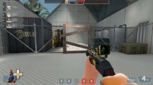
-the wood on this fence doesn't look right. It should all be wood or all be metal. I get that it's supposed to show some kind of gate but there has to be a better way
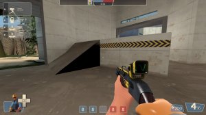
-ramp wall is black for some reason
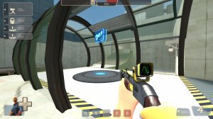
-I like the sort of greenhouse thing going on here but it's difficult to tell which of the panels have glass and which don't at a glance without being up close to it or already knowing
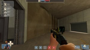
-Why is there a rock wall all on it's own inside here? There aren't any other rock walls nearby so it seems out of place and rather lonely. All the other rock walls got to hang out together, the jerks
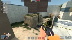
-These dirt blocks look awful. Ground isn't naturally shaped anything like that. It needs rounded out but, if you want to keep that shape, you should probably make it a building
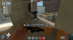
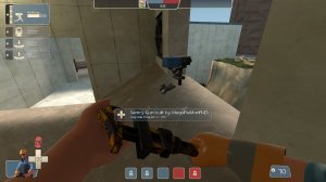
-I can build a sentry here but the animation for it gets all messed up due to the angle. It's finicky to build here so I don't think it's something done on purpose
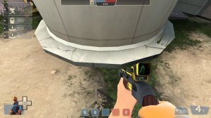
-MORE ANGLES. It should be rounder
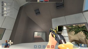
-This geometry is very weird and stands out a lot due to the texture used opposed to the ones around it.
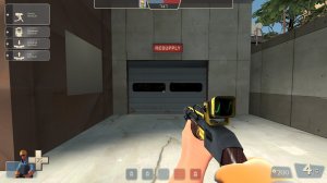
-no visualizer
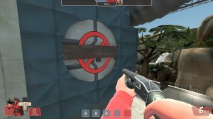
-Does this open? It's got a visualizer on it but I couldn't figure out how to open it
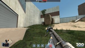
-Walking out of the forward spawn here needs to give better direction. I'm drawn to the doorway on the left which leads backwards instead of the area on the right while the arrow billboard is mostly blocked by that rock.
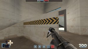
-What is going on with this hazard tape? Is it feeling OK?
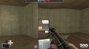
-I see that the angled wall here is to block a sight line but it not only looks weird but is annoying to have to move around. There's gotta be a better way
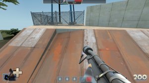
-vas ist das? Why is the roof like this? It looks like an invalid brush got fixed incorrectly
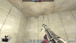
-It's seeping through the walls
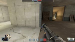
-z fighting with this door. It needs to go back farther into the wall
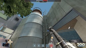
-The ladder is taller than the silo
Lastly but not leastly the maps overall lighting is pretty bland. Everywhere outside looks the same and there's hardly any shadow. It just doesn't look right and almost feels fullbright at times.
That's all for now, I hope any of this helps.

-The reflective texture on this door frame not only looks awful, it also uses improper reflections. I first thought it was a no draw till I looked closer. Also the texture under the catwalk is misaligned.

-I really dislike all this plastic you use. It doesn't look that great and is very repetitive

-the wood on this fence doesn't look right. It should all be wood or all be metal. I get that it's supposed to show some kind of gate but there has to be a better way

-ramp wall is black for some reason

-I like the sort of greenhouse thing going on here but it's difficult to tell which of the panels have glass and which don't at a glance without being up close to it or already knowing

-Why is there a rock wall all on it's own inside here? There aren't any other rock walls nearby so it seems out of place and rather lonely. All the other rock walls got to hang out together, the jerks

-These dirt blocks look awful. Ground isn't naturally shaped anything like that. It needs rounded out but, if you want to keep that shape, you should probably make it a building


-I can build a sentry here but the animation for it gets all messed up due to the angle. It's finicky to build here so I don't think it's something done on purpose

-MORE ANGLES. It should be rounder

-This geometry is very weird and stands out a lot due to the texture used opposed to the ones around it.

-no visualizer

-Does this open? It's got a visualizer on it but I couldn't figure out how to open it

-Walking out of the forward spawn here needs to give better direction. I'm drawn to the doorway on the left which leads backwards instead of the area on the right while the arrow billboard is mostly blocked by that rock.

-What is going on with this hazard tape? Is it feeling OK?

-I see that the angled wall here is to block a sight line but it not only looks weird but is annoying to have to move around. There's gotta be a better way

-vas ist das? Why is the roof like this? It looks like an invalid brush got fixed incorrectly

-It's seeping through the walls

-z fighting with this door. It needs to go back farther into the wall

-The ladder is taller than the silo
Lastly but not leastly the maps overall lighting is pretty bland. Everywhere outside looks the same and there's hardly any shadow. It just doesn't look right and almost feels fullbright at times.
That's all for now, I hope any of this helps.
Changelog (since B3):
- Removed Lower 2nd
- Added a new route from main lobby to above 2nd
- Catwalk near 2nd has been raised
- Mid to Catwalk route has been enlarged
- Mid Hoodoo has been changed significantly
- Healthkits on mid have been adjusted
- Reduced respawn times by 30%
- Fixed the Silo Perch
- Other minor fixes and adjustments
Read the rest of this update entry...
Changelog (since B4):
- New entrance from upper lobby to last
- Jungle building has been expanded
- Mid houses now have ledges
- Mid shutter room simplified and expanded
- Vent geometry streamlined
- Many other minor improvements.
Read the rest of this update entry...
- New entrance from upper lobby to last
- Jungle building has been expanded
- Mid houses now have ledges
- Mid shutter room simplified and expanded
- Vent geometry streamlined
- Many other minor improvements.
Read the rest of this update entry...
Changelog:
The launchdoor is now unlocked.
Did a massive detail pass across the whole map.
- Let me know if anything looks off,
gets in the way, or causes performance issues.
- I'm aware of some issues with the 3Dskybox
Removed the large window near spawn.
Added a wall near mid forward spawn.
Various bug fixes and optimizations.
Read the rest of this update entry...


