[Contest Entry] pl_frontier

MangyCarface

Mapper
aa
Feb 26, 2008
1,626
1,325
Ah, cool suggestions by grazr and Chilly both; I happen to think grazr's fits in better with the area, but due to the building's inside geometry I'm not sure how possible it is...

My status on the map is that I'm currently on Thanksgiving break and away from my computer D: I'm going to be working on it right away when I return on Saturday. Exterior detailing is at about 70%; interior is a lot less than that. I'll be finishing as fast as I can :S

Arhurt's got somethin special for the map he's been cooking up, hope to show you all when beta drops
 

Chilly

L6: Sharp Member
May 3, 2008
326
127
Ah, cool suggestions by grazr and Chilly both; I happen to think grazr's fits in better with the area, but due to the building's inside geometry I'm not sure how possible it is...

My status on the map is that I'm currently on Thanksgiving break and away from my computer D: I'm going to be working on it right away when I return on Saturday. Exterior detailing is at about 70%; interior is a lot less than that. I'll be finishing as fast as I can :S

Arhurt's got somethin special for the map he's been cooking up, hope to show you all when beta drops

Good news. :) Have a great Thanksgiving, everyone (those of you that celebrate it, anyway). As for the "something special" from Arhurt, if it's what I saw pictures of, people will love it. :D

For grazr's suggestion, you could keep what he has on the left (the top part) and make a kick-out section on the lower part like I have in my barn sketch. That would give more depth to the building while allowing you to keep the inside the same. It'd also allow more surfaces/rooflines on the outside so you don't end up with giant boring walls.
 
Last edited:

TheDarkerSideofYourShadow

L10: Glamorous Member
Apr 12, 2008
792
286
Alright, so I screwed around in paint a little today, took at look at a13 to see whats inside of the building, and I came up with this. Sorry for my crappy graphic arts skills, I'll try my best to explain everything.

pl_frontier_a130001b.jpg


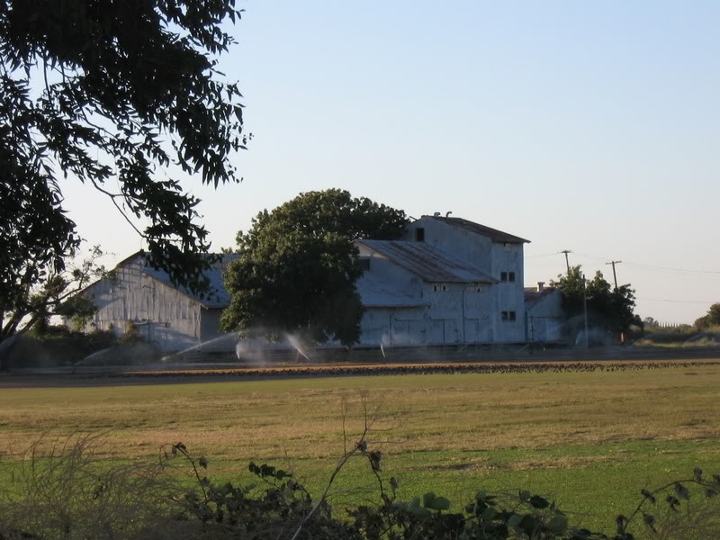
Going for the 3 tier approach, and roughly based off of this building:
IMG_0148.jpg


The tallest area (red) has windows and those rotating heat thingys on top. Also has a ladder access from a path that comes from the far right.

There is an opening from the red area onto the green section, which should have a flat and possibly railed off area along the top of the ridge. It also has some of those air intake models set into the side (I believe someone posted a version on this site that actually spins, extra bonus).

The blue area is split in half, one part is more angled roof, while the other is a flat platform, akin to what grazr posted. Its got railing and that's how where the platform to the ladder which goes up onto the red section starts. The half roof has a vent on the side that is pumping out steam/smoke. There's the ladder onto the green section.

On the left by the door you have, make it look like it should slide over, which requires a small overhead rectangle (metal), and then what looks like it would have been the door to the right. Personally I would put the "Trespassers will be violated" sign on it.

On the bottom right you have a little projection from the building. The right side, by the stairs, has no wall, just a few posts supporting the roof. The roof is just a few beams with metal models covering in some places (but not all, if you want people to be able to shoot in there.
 

laghlagh

L6: Sharp Member
Jul 15, 2008
389
53
Inspired by well:
frontier1zn7.jpg
 

Chilly

L6: Sharp Member
May 3, 2008
326
127
Stats from 11/16 to now:
Code:
pl_frontier_a13:
  CP1                                      7 (9%)
  CP2                                      5 (6%)
  CP3                                      6 (8%)
  CP4                                     31 (39%)
  None                                    31 (39%)

That looks a bit too much "all or nothing", doesn't it?

Somewhat. You'd expect each one to be around 20% with perfectly balanced teams and map. Of course, when teams are very unbalanced, you'll see the None/CP4 items having a lot higher percentages. It does show that the middle of the map probably doesn't get as much gameplay as the beginning and end, but a heatmap would probably show that even better.

My personal opinion is that it should decrease as the map goes along, like...
CP1 90%
CP2 70%
CP3 50%
CP4 30%
None 10%

Something like that, where it's easy to go a short way and gets harder as it goes along. Of course, Mangy has had tons of revisions to tweak the balance, so I'm not sure if he'd want to adjust it any more.

A weird possible solution that might work would be to have the train slow on the uphill sections of track. The two hills are on the parts that could probably use more play. It would look and feel pretty natural as well. Having it roll backwards faster on hills would also multiply the effect. Just an odd possibility.
 

MangyCarface

Mapper
aa
Feb 26, 2008
1,626
1,325
Well, remember those percentages are equivalent to how often the time ran out or the round ended with that respective point being the last one capped. A good distribution might be None: 10 CP1: 10 CP2: 15 CP3: 15 CP4: 50; Meaning that the map gets to the last point's fight 65% of the time (although I'd be satisfied with higher percentages for this) and that Red and Blu win the map an equal percentage of the time.

When I say playtesting has effectively ended during the alpha stage, I mean that geometry will remain more or less unchanged in the future. There will be a definite effort to further smooth out the CP cap percentages via a variety of methods such as resource placement, trainspeed, CP location, spawn times etc (all soft, rather than hard changes.) I think another factor in those percentages is that often players, or more specifically pubbers, are unfamiliar with the map layout and this quite frankly means the difference between winning and losing on Frontier. The current none percentage is unnacceptable, but I think it would be reduced if players took full advantage of the one-way gate that leads to the high ground. Still, it will see balance changes. I will need everyone's active feedback on beta to help me smooth these things out :)
 

Chilly

L6: Sharp Member
May 3, 2008
326
127
Holy crap... that's incredible! I'm in awe of how well you guys detail your maps. It's so impressive.
 

laghlagh

L6: Sharp Member
Jul 15, 2008
389
53
Looks good, but are you sure about the change og sky? i like the ligthing and such better in the last one :(
 
Aug 19, 2008
1,011
1,158
gotta love you detailing, looks really great

only thing that bothers me is that at the building on the right, where "jenkin coal & co" and "happy farmers" share the same building. kind of hard to imagine those two industry branches together in one house.
plfrontierbeta0008yu6.jpg
 

Chilly

L6: Sharp Member
May 3, 2008
326
127
I like what you did with the gray gravel building (the warehouse). I think your checkpoint 3 building could use some additional detail work since right now it looks slightly bland. The exposed beams on the warehouse add a lot... perhaps you could do that on the checkpoint 3 building as well? It doesn't need much... just something like the beams or some signs by the doors.
 

MangyCarface

Mapper
aa
Feb 26, 2008
1,626
1,325
Ah, I agree Chilly. I will definitely reshape the building a little and more detail will be added.
Eerie you bring up a valid point... I'll look at it, I think from player eye sight level, it won't be noticeable at all, but with the addition of the cart+tracks underneath the one sign, perhaps it isn't aesthetically necessary.

Notoorjus, I am unsold on any one skybox at the moment. I will be compiling 3-4 different ones when I'm done detailing and I'll be looking for input on each before -final. Which particular sky were you mentioning? The alpha's?

Thanks for the comments!
 

YM

LVL100 YM
aa
Dec 5, 2007
7,158
6,081
Bah I managed to write a big long responce the otherday but refreshed the page by mistake and lost it, now I can be bothered to re-write it, here it is:

-You've got some vertical textures on slanted edges of some metal rooftops, rotate the texture so it matches
-Add some more of the diagonal support beams in on the big wooden buildings. Especially the chickenwire fence needs some diagonal beams
-Some of the balconies high up look a little high to have no kind of railing, even for common sense never mind health and safety :p
-The small wooden brush at the bottom middle of the tall wood buildings screenshot looks very odd, the striped texture looks very strange without lots of support beams holding it up and that little bit doesn't have any support beams of any kind.
-The grain conveyor needs a hole in the wall for it to fit into rather than just sinking into it
-The pile of stuff in one of the mine carts is waaaaaay to pointy, use a displacement and round it off a bit.
-Imagine this area at night with people working there, they'd not be able to see a thing, add some light fixtures where they might logically go if it was set at night, of course you don't have to add a light entity underneath as well.
-With the more recent screenshots I can see they're more unfinished, the only thing I can fault at the moment is the I beams sticking out at the top which just look plain wrong.

But don't get me wrong, what you've done so far looks stunning, really nice work :thumbup:

Edit: damn you! ninja! :p
 

Chilly

L6: Sharp Member
May 3, 2008
326
127
the only thing I can fault at the moment is the I beams sticking out at the top which just look plain wrong.

I wish I could find a picture of a frozen custard place a mile away from me. It's got exposed I beams that look very similar to that. It's got a very industrial feel and is pretty cool looking. :)