You are using an out of date browser. It may not display this or other websites correctly.
You should upgrade or use an alternative browser.
You should upgrade or use an alternative browser.
- Status
- Not open for further replies.
drp
aa
- Oct 25, 2007
- 2,273
- 2,628
looks good. the dropoff in the first pic makes me a little scared. falling in to the water seems like it would be a nightmare to get out of as i didnt see any stairs, ramps, etc to exit.
the hydroish theme looks spectacular. hopefully this stays in beta a little longer than your previous map so it gets a better polish.
the hydroish theme looks spectacular. hopefully this stays in beta a little longer than your previous map so it gets a better polish.
Mexican Apple Thief
L3: Junior Member<br>LEAD FARMER
- Aug 23, 2008
- 345
- 60
Nice looking architecture, but consider putting the intel on a table or something so that players know where exactly it respawns. Loving the use of the hydro theme here.
I'm assuming that though we can't tell from the static angle the intel is hovering above the middle of the cross, in which case it's a sufficient landmark on it's own.
However the intel pedestal would work nice right there.
EDIT: Actually looking back there's no way that's in the center. It should be though. That's a nice eye attracting point that would make it feel really symmetrical and nice.
- Sep 28, 2009
- 3,075
- 2,778
Just want to give a few tips about things that clashed with the theme:
http://forums.tf2maps.net/geek/gars/images/2/4/4/8/ctf_biomass_b10001.jpg
The wooden supports on the concrete building look out of place. Use something else. I'm not aware if this is an owned base, but I can't tell whose it is. Place a logo or two around and use some color.
http://forums.tf2maps.net/geek/gars/images/2/4/4/8/ctf_biomass_b10002.jpg
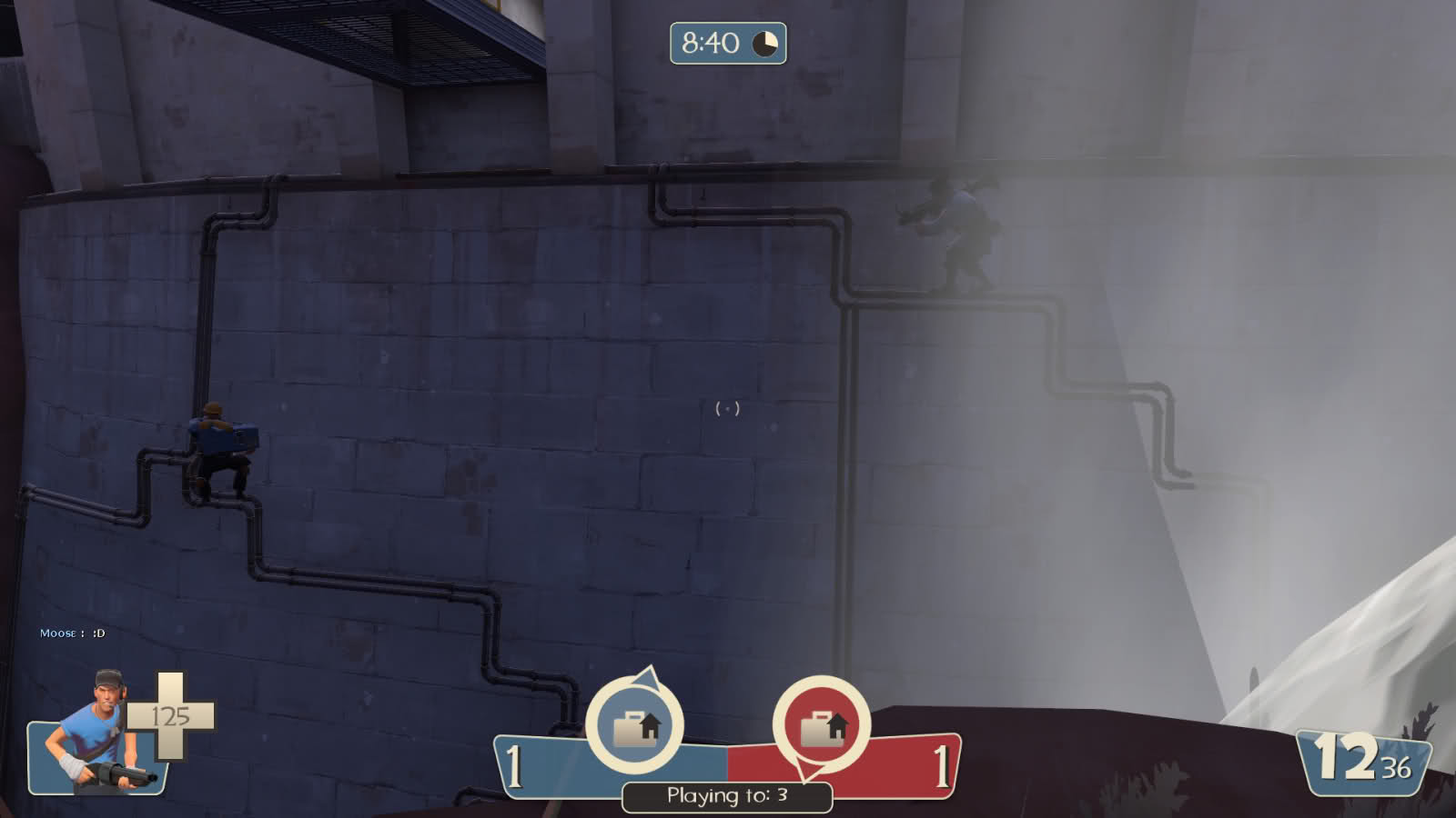
Hydro's cliffs are usually flat topped, not lumpy like these ones. The drop-off looks great but I think a fence would help keep gameplay more contained.
http://forums.tf2maps.net/geek/gars/images/2/4/4/8/ctf_biomass_b10005.jpg
I love this screenshot. It uses Valve's theory of revealing the goal early on while still keeping sightlines down. The angled railings make it look awkward though. Consider talking to a modeler to get custom versions for your ramps. The water also looks cheap.
http://forums.tf2maps.net/geek/gars/images/2/4/4/8/ctf_biomass_b10007.jpg
The window frames here are too large compared to the windows. You should reduce them in size. It also seems silly to have the intelligence in the middle of this room with no surface below it. A round desk or table would bring the center of this room to life.
http://forums.tf2maps.net/geek/gars/images/2/4/4/8/ctf_biomass_b10009.jpg
Again, a little color would help determining whose base this is. The only way right now is between the red loudspeaker and below the intel room.
Still, it's not always apparent. A table or desk would make it more logical to the player and theme.
http://forums.tf2maps.net/geek/gars/images/2/4/4/8/ctf_biomass_b10001.jpg
The wooden supports on the concrete building look out of place. Use something else. I'm not aware if this is an owned base, but I can't tell whose it is. Place a logo or two around and use some color.
http://forums.tf2maps.net/geek/gars/images/2/4/4/8/ctf_biomass_b10002.jpg
Hydro's cliffs are usually flat topped, not lumpy like these ones. The drop-off looks great but I think a fence would help keep gameplay more contained.
http://forums.tf2maps.net/geek/gars/images/2/4/4/8/ctf_biomass_b10005.jpg
I love this screenshot. It uses Valve's theory of revealing the goal early on while still keeping sightlines down. The angled railings make it look awkward though. Consider talking to a modeler to get custom versions for your ramps. The water also looks cheap.
http://forums.tf2maps.net/geek/gars/images/2/4/4/8/ctf_biomass_b10007.jpg
The window frames here are too large compared to the windows. You should reduce them in size. It also seems silly to have the intelligence in the middle of this room with no surface below it. A round desk or table would bring the center of this room to life.
http://forums.tf2maps.net/geek/gars/images/2/4/4/8/ctf_biomass_b10009.jpg
Again, a little color would help determining whose base this is. The only way right now is between the red loudspeaker and below the intel room.
I'm assuming that though we can't tell from the static angle the intel is hovering above the middle of the cross, in which case it's a sufficient landmark on it's own.
However the intel pedestal would work nice right there.
Still, it's not always apparent. A table or desk would make it more logical to the player and theme.
Mexican Apple Thief
L3: Junior Member<br>LEAD FARMER
- Aug 23, 2008
- 345
- 60
Still, it's not always apparent. A table or desk would make it more logical to the player and theme.
A desk in the middle of that room would be unnatural. People are smart enough to identify it by a pedestal if he puts one in.
Could use some more logo-age for the respective teams.
Your Cliffs look a little too... I dunno, round. Too wavy. They're kind of going everywhere possible.
Not sure how your comp friends are going to take that watery deathpit. From what I've read, they aren't too keen on that concept, and those railings won't stop an airblast.
Your Cliffs look a little too... I dunno, round. Too wavy. They're kind of going everywhere possible.
Not sure how your comp friends are going to take that watery deathpit. From what I've read, they aren't too keen on that concept, and those railings won't stop an airblast.
Last edited:
This has to be the weirdest, most randomly-detailed, bug ridden, overlapping brush filled set of corridors I have ever seen, which is riddled with bizarre vertex editing/carving which causes cracks all over.
Not to mention the TOTAL lack of player clipping in playable space and lighting errors out the wazoo.

Not to mention the TOTAL lack of player clipping in playable space and lighting errors out the wazoo.

Last edited:
- Apr 19, 2009
- 4,460
- 1,724
- Aug 11, 2008
- 947
- 560
Our job at tf2maps.net is to provide feedback, despite how much of a dick the author is. If the author doesn't want to take our feedback, it is his own decision. If he does, than he can. Without any feedback supplied, the author has no ability to choose, which is what we want him to be able to do.
- Apr 19, 2009
- 4,460
- 1,724
Leminnes
aa
- Jan 20, 2010
- 1,317
- 902
I understand that. I am not saying we stop just because he refuses to take it. I am saying instead of showering the person with feedback, give at least a little bit to someone else who will take it seriously.
Like meeeeeeee? *Or TPG, maybe >_>*
Also, uh, nice map SWATY. Very detailed, as usual.
honorum646
L6: Sharp Member
- Oct 9, 2009
- 335
- 67
honorum646
L6: Sharp Member
- Oct 9, 2009
- 335
- 67
- Status
- Not open for further replies.


