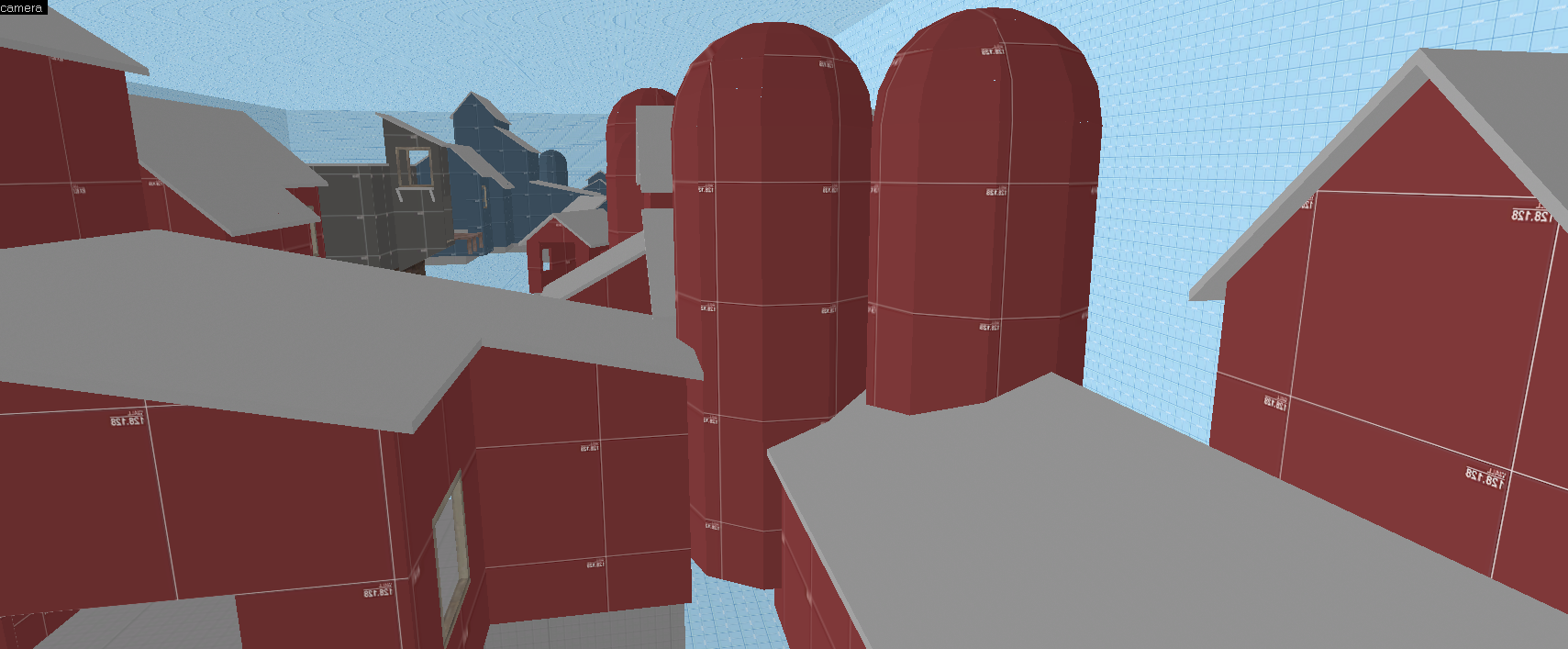
Barn City

KotH Barn City A3

Twist.vmf

L420: High Member
Jul 29, 2016
439
208
Barn City - another koth map, but with a loto silos

Barn city is the product of an existential crisis. And i think it turned out pretty good.


This is one of my most polished maps i have worked on, altho extremely flawed i made shour nothing went without use, almost all rooftops are excisable, and provide great jump spots for soldier.

Now i realise it is a pretty small map, so ammo and heath was used in every key locations to regular game play and allow for faster point triads.


Future testing will help me refine and polished this map to make it as good as it can be.

So (like usual) All feedback is welcome.
View attachment 71516 View attachment 71517 View attachment 71518 View attachment 71519
 

Twist.vmf

L420: High Member
Jul 29, 2016
439
208
once again, not much.

+player clip on stairs
+bullet clip on stairs
+clipped spawn roofs (demo no camping)
+raised water level
+widened and moved stars over by large HP and AMMO

thats all.

Read the rest of this update entry...
 

G.bo

L4: Comfortable Member
Sep 24, 2017
180
195
The name "Barn city" reminded me of an old song from 1988 known as "Cowtown": they both are two syllables, they're both about farming (kind of), they both are...ummm...they're...uhh...
...you know...
...th-they're...uhh...
...whatcha call it...
...the-OH now I remember: I like them both.
 

Crash

func_nerd
aa
Mar 1, 2010
3,346
5,520
Okie dokie, you passed me the VMF for this to sort out why you have such a long compile time. I definitely see why.

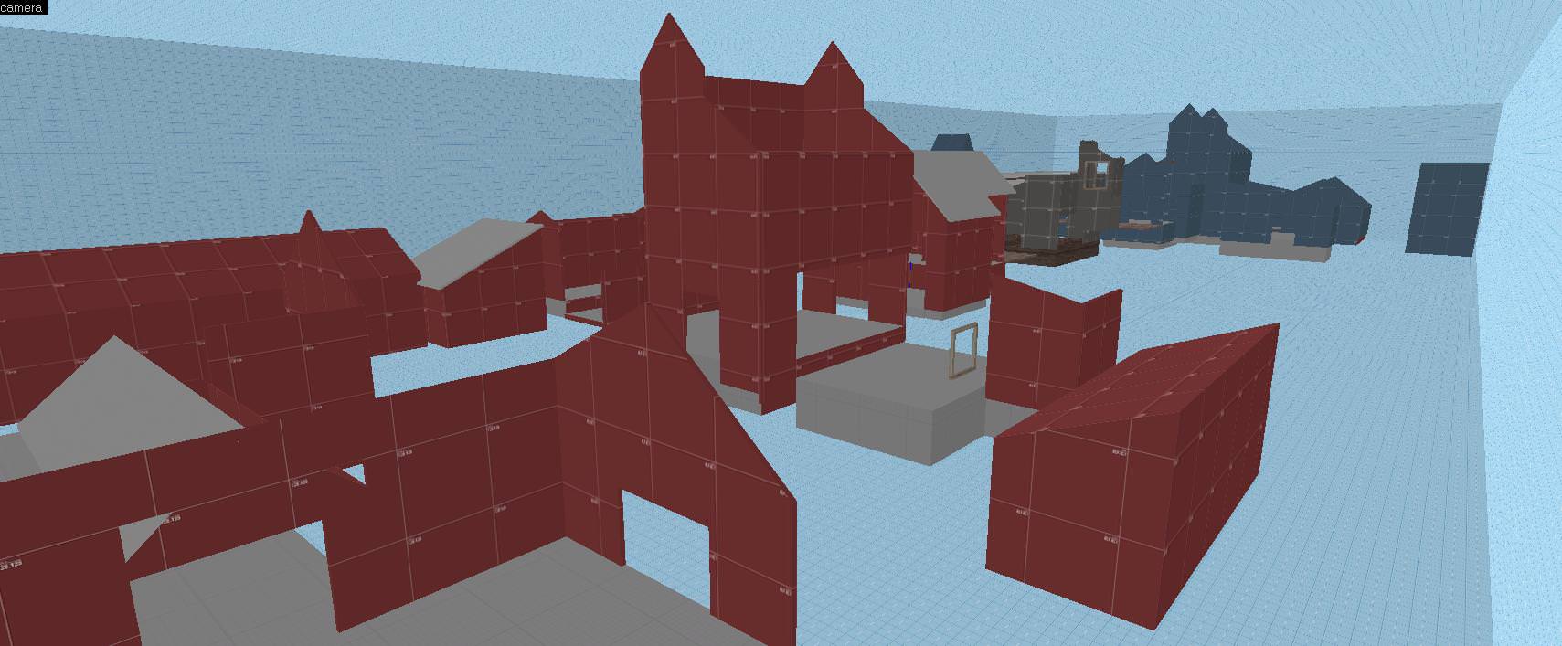
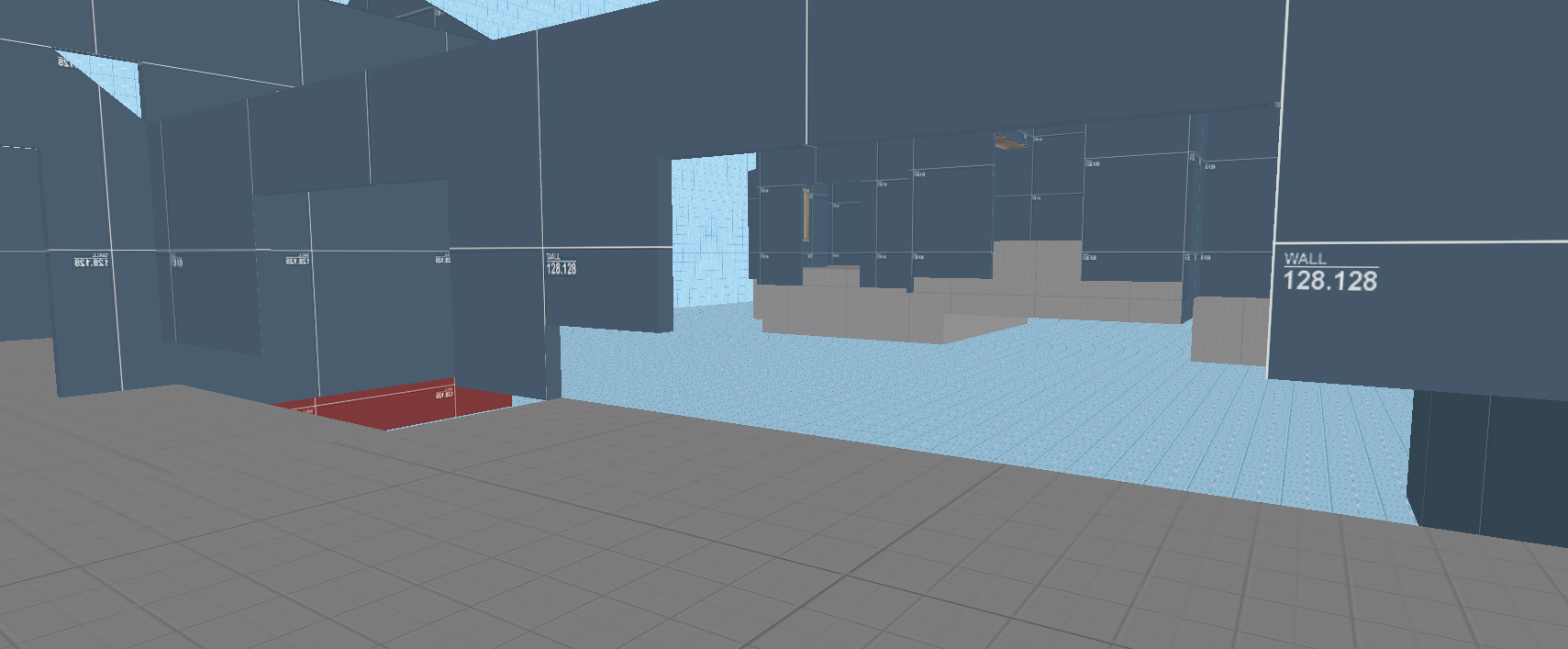
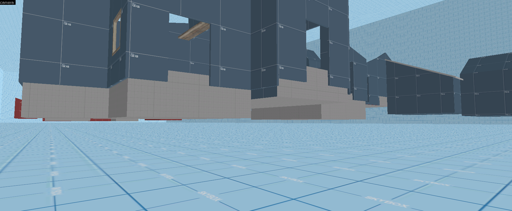
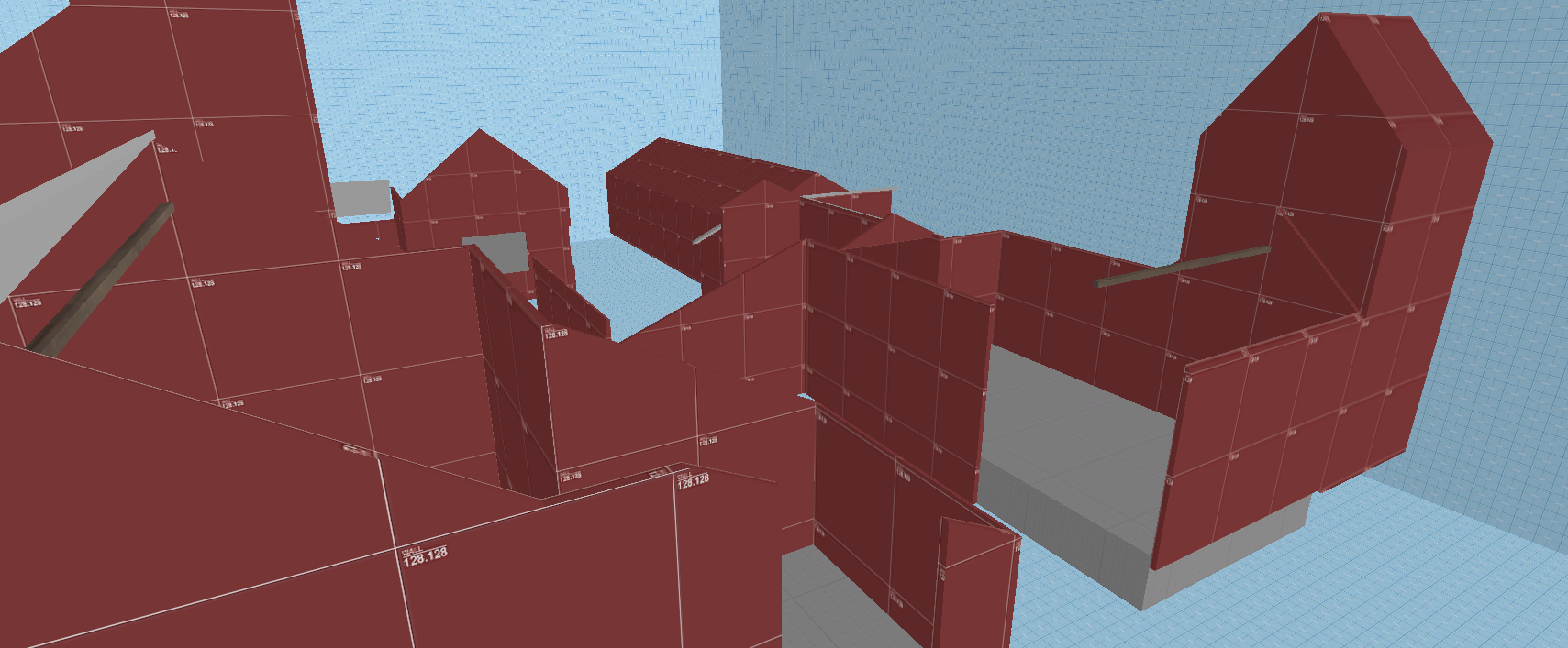
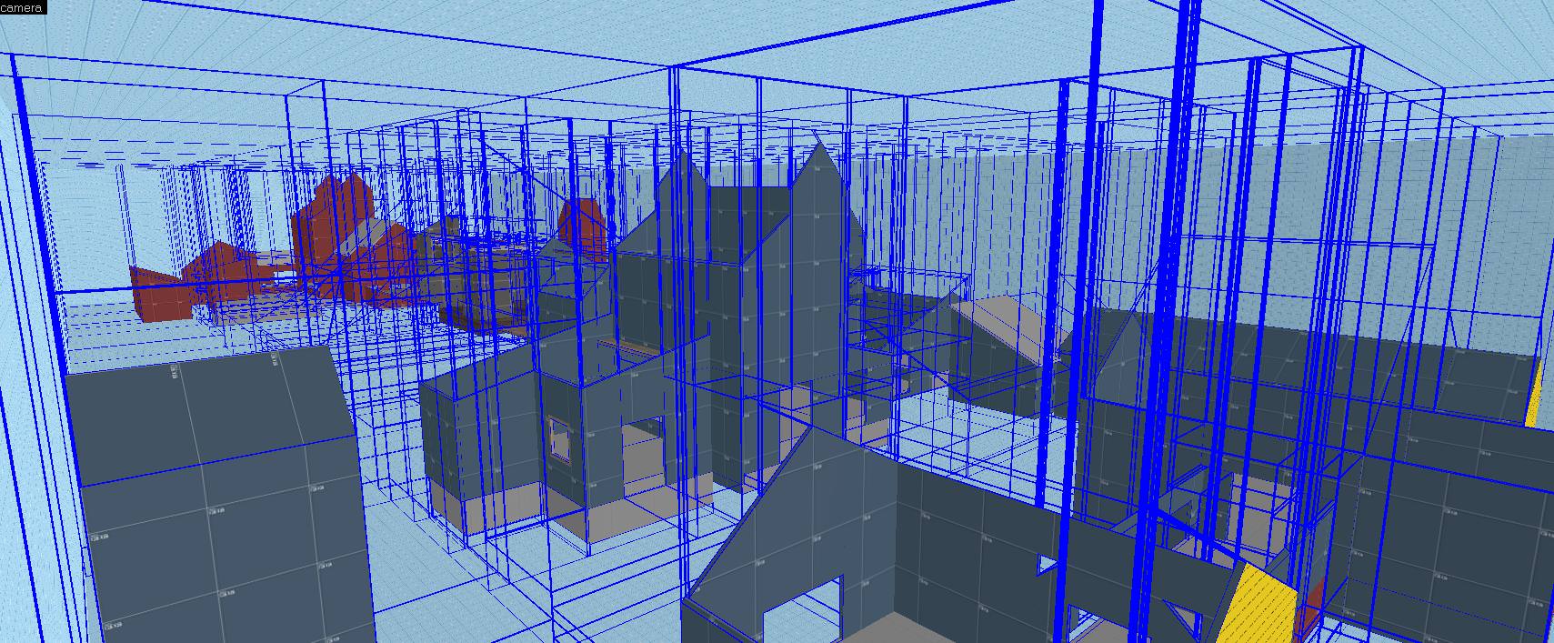
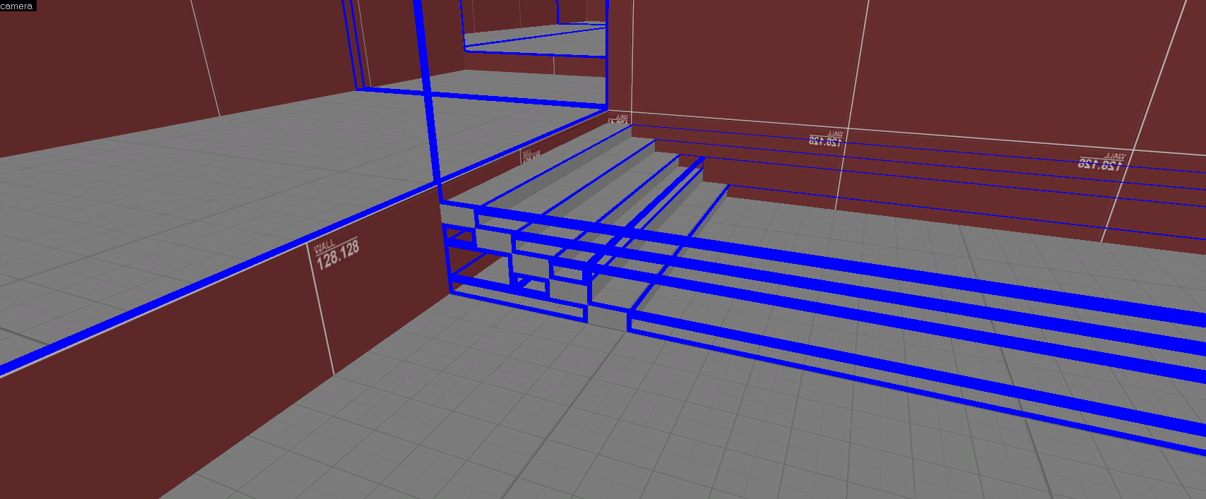
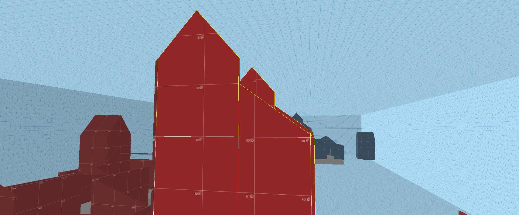
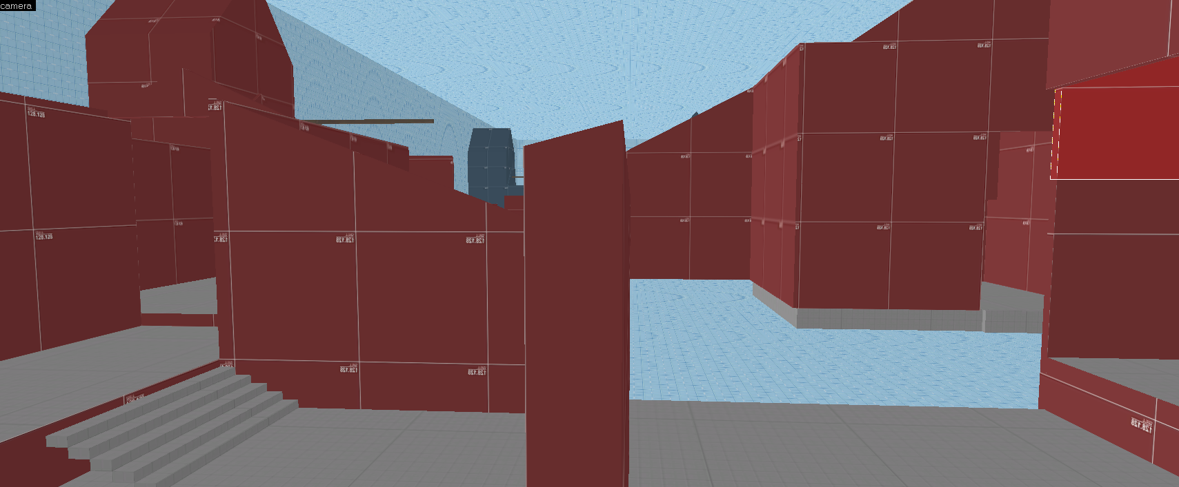
This is what you map is taking into account when it cuts up your map:
PNdjZJW.jpg

wlE3ibQ.png

pd1ejUq.png

CmKeiE0.png


Which makes your visleafs look like this:
kyqIrCe.jpg


Because it's all in a big open box, and has tons of holes in everything, basically everything is seeing everything, so your vis calculation is having to figure out how to make sense of all that, doing the calculations for everything seeing everything else.

The #1 issue is is that you surrounded it in a big box with gaps around your geometry. Take the time to do your skybox proper and that will help a ton. At the very least dragging the foundations of all the buildings to the bottom flush will help some, but I still highly recommend doing things the right way first.

Next, a big issue is that everything is just so cut up and open. I unfortunately think the layout itself is really not conducive to proper optimization. You have *most* structures where you can see a sightline through them entirely, which makes everything "see" everything else, and therefore render/ need to be calculated in your compile.

But, a few things you can do to help reduce your cuts:
Vy1FQWH.png

Missed these

xFg3WRs.jpg

Cutting off angled structures like this and func detailing the top will reduce all the extra unnecessary cuts in higher areas where players aren't as likely to interact with.

iPkdZlb.png

A lot of your walls have angles like this to support your roof shapes. These are all adding extra cuts at weird angles you don't need.

2m8MApO.png

You can hide nodraw/ skybox brushes inside func detailed structures like these, making a straight line to help cut up visibility. I do think you overall actually func_detailed too many walls.

You've got some really cool shapes for detailing in here, but you haven't given yourself enough "solid" structures for purposes of optimization. Keeping this stuff in mind early is really important. But it can be a tough thing keeping this pretty abstract concept in mind always. I think you sort of shot yourself in the foot starting your map with a big box and filling it in rather than dividing it off into separate chunks as you went.

I highly recommend giving this guide a read if you haven't. If you have, read it again and again. I still go back time to time and give myself a refresher on it. And if you aren't sure how to see what the compiler is seeing when it factors in visibility, set your vis groups to this:
s69fkoO.png


I highly recommend checking out some decompiled official maps like this and see how they cut things up for optimization.

Hope this helps.
 

YOYOYO

47 crashes and counting
aa
Jul 10, 2017
620
556
Ok, so some info about the actually visual look and game-play of the map.
1: the map seems WAY too bright, and the HDR could be brought down. This seems to also make the very murky dark water look.. strange. Too much contrast between the two.
2: So this ones a bit more complicated. You know the opened roof on the capture point? well it seems to be only accessible by jumping classes, which isn't a good idea. You should have some way to navigate to the roof, like plank ramps or such. A prim example of this would be Suijin, which has an opened roof above the cap which is most easily accessed by the jumping classes, but isn't impossible for most other classes. This gives player more freedom to strategies.

You don't have to add and plan all this right now, since it seems your busy with technical problems, but just FYI.
 

Twist.vmf

L420: High Member
Jul 29, 2016
439
208
Ok, so some info about the actually visual look and game-play of the map.
1: the map seems WAY too bright, and the HDR could be brought down. This seems to also make the very murky dark water look.. strange. Too much contrast between the two.
2: So this ones a bit more complicated. You know the opened roof on the capture point? well it seems to be only accessible by jumping classes, which isn't a good idea. You should have some way to navigate to the roof, like plank ramps or such. A prim example of this would be Suijin, which has an opened roof above the cap which is most easily accessed by the jumping classes, but isn't impossible for most other classes. This gives player more freedom to strategies.

You don't have to add and plan all this right now, since it seems your busy with technical problems, but just FYI.
thanks for the feed back! i will work on this, the map has got my hands tide do to it's very bad layout for optimization. as for the jumping class advantages, the map was made with low down roofs, and i thought it would feel strange if players could not clear it. as of now, the map will need a very heavy redesign.