CP Artpass GoobaTheViking
- Thread starter Gooba
- Start date
You are using an out of date browser. It may not display this or other websites correctly.
You should upgrade or use an alternative browser.
You should upgrade or use an alternative browser.

Eyce
L6: Sharp Member
- Jan 13, 2010
- 370
- 225
Well, there aren't many space props, so I had to use other things that would possibly be in a place like that. Propane tanks for welding seems plausible to me. The intel on the other hand...
I sort of meant the bit where you used a blu texture in a red base >_>
The propane tank has only the blue skin.... lol. This much fuss over a propane tank, heh.
If you want to have a reason for the tank to be there, just break off a panel right next to it and add a couple sparks or pipes or something.
")
@Gooba: For starters placing some dirt overlays in corners and such could help to counteract the cleanliness, but that could be a bit too much force. Huckle does come up with a nice idea though, leaving several open panels across the place with a much dirtier pipe-infested area behind the clean front.
It could simply be that your base textures that you are use are a bit too clean for tf2. they're not noisy enough, and white walls just look like monochrome walls without any detail or noise in them from a distance. Most of the white brick, wood, and concrete walls have a certain amount of dirtyness and discolouration in them.
Those textures obviously don't really fit your theme because they're too dirty, but the flit side is that your current map feels too clean. not just hospital clean, but utterly spotless clean.
You could obviously use it as a sort of super-spytech theme contrasting to the 'normal' outside area. However, as a super-spytech theme, it still needs slightly more noise. not much, but a little bit.
Hope that helps somehow.


- Jul 24, 2010
- 72
- 66
Jealous of me? Oi. I kind of get stuck in this semi-realistic style. The problem with that is that its not very tf2-ish. It might just be that I'm not the greatest at lighting yet, but I'm getting there
I've been optimizing in most of the areas yeah, but I haven't gone into FULL-SCALE-OPTIMIZE-MODE yet.
I've been optimizing in most of the areas yeah, but I haven't gone into FULL-SCALE-OPTIMIZE-MODE yet.
Last edited:
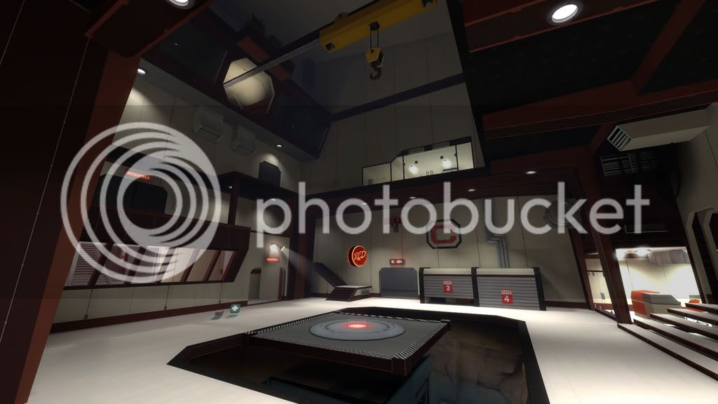
Much much much better, especially around CP C, it feels much more TF2ish instead of operation room sterile. I also like how you went from the outside style to the new interior style. subtle with a strong "we're working here/unfinished" hint in areas.
Having said that, much of the inside lighting is a bit too high in contrast. I'm also not a fan of the white "capture point" overlay.
Having said that, much of the inside lighting is a bit too high in contrast. I'm also not a fan of the white "capture point" overlay.
Scotland Tom
L6: Sharp Member
- Jan 19, 2008
- 332
- 64
The entire area around C is looking really fantastic. It has much more of a 'lived in' feel while still maintaining some of that clean, high-tech look. The floor still seems a little on the bright side to me and the lights in that little computer room are extremely bright (might be partially due to HDR), but overall I really like how it looks.
- Jul 24, 2010
- 72
- 66
Thanks for the kind words fellas.
I actually don't like the floor in the main area at all, I just haven't found a way to make it look any better yet. If anyone has an idea on how to make it look better, I'd definitely be willing to try it out.
The floor still seems a little on the bright side to me.
I actually don't like the floor in the main area at all, I just haven't found a way to make it look any better yet.
If anyone has an idea on how to make it look better, I'd definitely be willing to try it out.Ashy Knuckles
L2: Junior Member
- Aug 15, 2009
- 58
- 13
How about making parts of the floor see-through glass like on point B of Freight? You could show off your detailing skills (not too much though, make sure the interest stays on the playing area) and it'd look a lot more interesting.
Thats actually one of my ideas for C also. Not sure how it'll look on my map, but it'll fit the space theme of this one pretty nicely.
Scotland Tom
L6: Sharp Member
- Jan 19, 2008
- 332
- 64
Instead of glass you might also try some kind of high-tech metal floor grating. Might be tricky because it's easy to make grating look too industrial, but I've always found grating, rather than glass, a bit more believable as a combat surface -- even if the glass is ten inches thick and "bomb proof".