CP Artpass GoobaTheViking

Gooba

L2: Junior Member
Jul 24, 2010
72
66
Wow, I didn't realize this would cause so much controversy. I think you guys have shown, the purple isn't gonna work because there is no purple in the game besides broken cubemaps. It makes people wince when they see it. :p I also think Nineaxis' idea would work pretty well, especially because it would make the crystal almost neutral in color (which would solve the team color problem):D I dunno, we'll see.

Does anyone know if its possible to have a model translucent and self illuminated? I've been looking around and it seems its not possible, but it would make my life a lot easier if it was.

Thank you for your comments folks, it really does help a lot.

Here's a couple screens of newer stuff for your troubles.

artpass_valvebase720002.jpg


artpass_valvebase720001.jpg

There will be smoke coming out of the hood of the camper. :p
 
Last edited:

Mr. P. Kiwi

L5: Dapper Member
Nov 22, 2009
244
95
Looking good!
I wonder if the sniper will move...
And why is he out there, when he should be fighting?
Anyway great "not in playable area" detailing!
I'm looking forward to go ona trip in your map.

+ I'm not sure, but the "Red Barn"'s roof seems to have HL2 textures. (Correct me if I'm wrong)
 

Gooba

L2: Junior Member
Jul 24, 2010
72
66
Well, the sniper's camper broke down, so hes trying to fix it. :p He moves a little, but its just a kind of idle sway. The barns roof is a custom texture, which I still need to work on( the bump map is too prominent, too dark, too grey). Thanks fellas.
 

Draco18s

L9: Fashionable Member
Sep 19, 2009
622
136
+ I'm not sure, but the "Red Barn"'s roof seems to have HL2 textures. (Correct me if I'm wrong)

Nope, its a metal wall texture in blue. The sniper fence model uses a similar texture--or would if you compressed the corrugated metal into a 2D image.

The texture itself might have have come from HL2, as its pretty detailed, but even a simple corrugated metal texture is pretty detailed just due to the implied shadows.

I wish there was a way in the texture browser to tell if a texture came from HL2 or TF2, like there is for models. :-\
 

Gooba

L2: Junior Member
Jul 24, 2010
72
66
Hey guys, I need your help for this one. I'm trying to decide whether I should keep the final point the way it is now, or should I change it into this?(picture below) The reason for the change would be because I don't have much of a theme progression from point A to point C. Its kind of all the same.... The new look would have a very space station feel, hidden inside the main facility. I would probably still keep the idea that they are mining the special mineral going with the death pit and stuff. I dunno, let me know what you guys think!

I can show you more paintovers if you like them. :D
After:
NewpointC.jpg


Before:
NewpointCbefore.jpg
 

Mr. P. Kiwi

L5: Dapper Member
Nov 22, 2009
244
95
Nice drawing there!
But I'm pretty sure that space-ish facility doesn't fit the theme you already chosen... Although being pretty. But if you do want to change the theme around point C I think that a more "Point C of Gravel Pit" theme will work out. Or maybe even a nice "spytech ground extraction base" thing will work.
Keep that in mind
 

Gooba

L2: Junior Member
Jul 24, 2010
72
66
Well, I really wanted to use as little spy tech stuff as possible, but still be high tech and fit the style of Tf2. What if I made it a shuttle launch base? That would be pretty logical I think. I know that if I had to launch a secret spaceship, hiding it in the middle of nowhere, inside a coal mine would sound like a pretty good idea.
 

Scotland Tom

L6: Sharp Member
Jan 19, 2008
332
64
I've always enjoyed the TF2 universe, in part due to it's use of the "everything up to the last cap point/intel room/bomb cart terminus is a front for what's really going on" theme.

From what I've seen so far, Gooba, your theme outside of C is extremely cohesive and well detailed, but I agree that the theme right around C could be altered into some kind of super secret facility. The idea of a space type theme is pretty bold. I like it, so long as you think you could transition well from the mining theme outside. An easier transition to pull off would be going from mining to spytech, but that lacks that bit of originality that I think you're searching for.

My suggestion: Save a new copy of the map (that way you have your original to go back to) and give the new theme around C a try. Maybe these new glowing gem thingeys can be utilized as a power source for some space-age rocket or doomsday device. Who knows? If the spacey theme doesn't quite work out you can always go back to spytech or to your original theme.
 

Gooba

L2: Junior Member
Jul 24, 2010
72
66
Alright, here we go! This is what I've got so far on the space theme idea, I think it fits in with the old spytech/tf2 stuff pretty well, but is also something completely fresh. :D Let me know what you guys think about it.

Here's a comparison to the paintover. As you can see, it changed quite a bit, because I had to make a boatload of new textures. Also several areas are not finished, as this was more of a test to see if liked the idea or not.
artpass_valvebasec40007.jpg


NewpointC.jpg


artpass_valvebasec40006.jpg


artpass_valvebasec40002.jpg


artpass_valvebasec40001.jpg


The red florescent sprites will not be staying btw. :p

artpass_valvebasec40000.jpg


artpass_valvebasec40003.jpg


artpass_valvebasec40004.jpg
 

TerabyteST

L4: Comfortable Member
Aug 18, 2009
181
82
The strong contrast and the shadows make it look awesome, and the shadows make it even better, but my concern is that there's not much of a "link" between the exterior and the interior. I mean, you're out in a goldrush style environiment and then you find yourself into this awesome futuristic base.. just saying, it might look perfect instead! :p
 

Scotland Tom

L6: Sharp Member
Jan 19, 2008
332
64
I like where its going a lot, but the stark black and white palette seems overly modern to me. It also feels very... plastic, which is a material that doesn't seem to fit TF2 at all. I feel like the design aesthetic from the NASA space shuttle was plastered all over the room.

I don't think you should scrap the idea yet, but I would suggest the following to see if you could still make it work:

1. Color. Part of the reason the original design concept worked was because of the splashes of red on the back wall and the various shades of gray scattered throughout. They helped make the room look a little less sterile. Even altering some of the whites to be a bit off-white would help to neutralize the extremely sharp contrasts that really clash with the general TF2 design aesthetic.

2. Different materials. If you could do a bit more texture work to make things look more Star Wars Death Star and less NASA Space Station that would probably help keep things in line with TF2 aesthetics. This goes hand in hand with the color suggestions. Making some gunmetal gray floorplates or wall panels would make a huge difference.

3. The architecture looks shockingly modern in the TF2 universe. The sharp angles and clean lines seem very out of place. Part of this is the high amounts of black/white contrast because it highlights those lines and angles. I think it might be worth taking a look at some 60's/70's retro tech (think Moonraker, Buck Rogers and even some Star Wars) and seeing if you can incorporate some of those styles into your design. Even TF2 itself has some fantastic examples of retro-tech design. Just look at the various computer consoles for cryin' out loud. Now that's what the future looked like in 1976.

Overall, just keep plugging away at it. The heavy sci-fi theme you've got going is a good start, it just needs a little more work to fit it well within the TF2 universe. Also, keep in mind your transitions from the rest of the map. Going from the mining theme to this sci-fi area is going to be a jarring visual change if not handled carefully.
 
Last edited:

Gooba

L2: Junior Member
Jul 24, 2010
72
66
Ugh, this is gonna be tough. I have to make it look worse? j/k :p

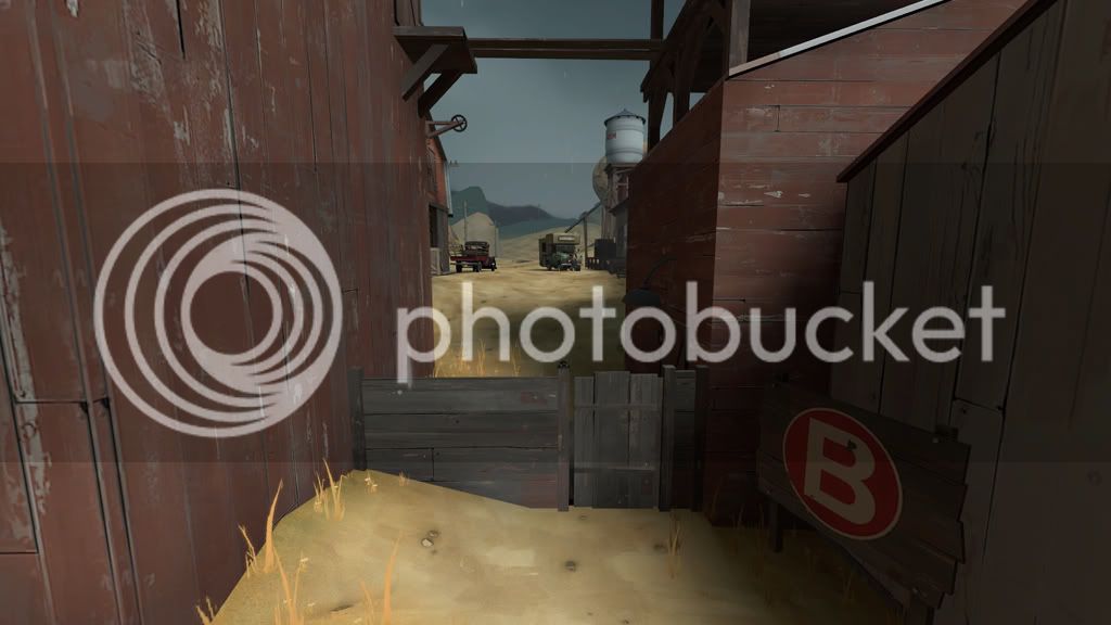
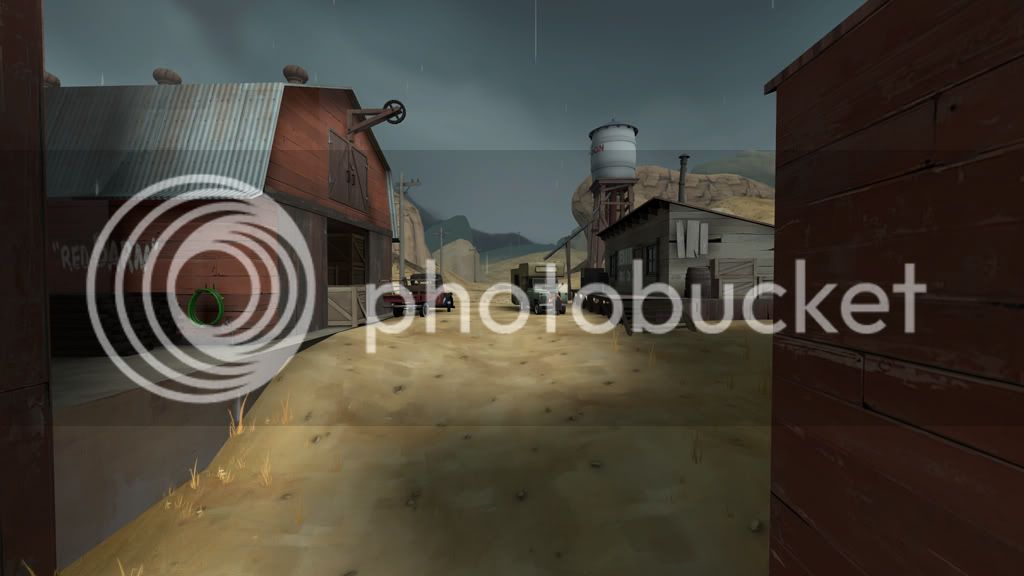
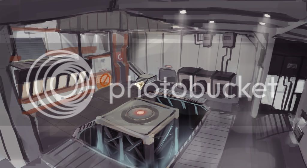
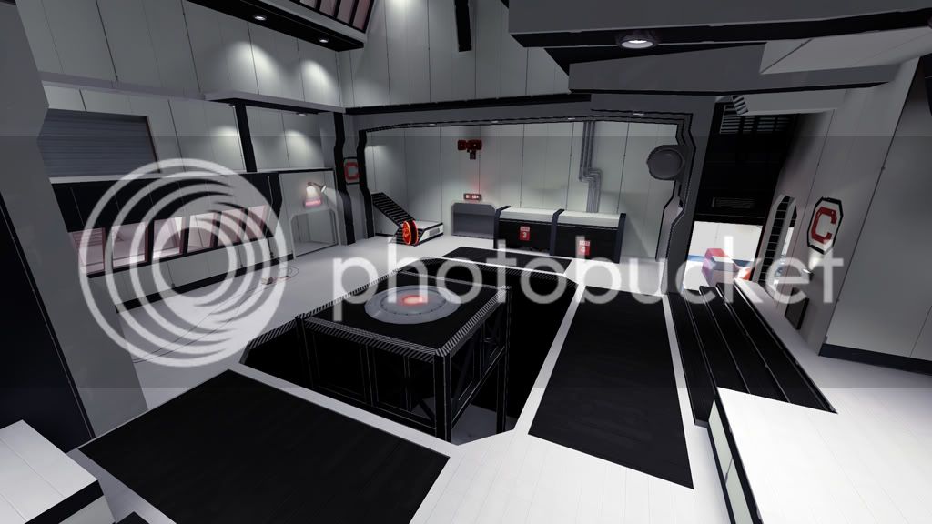
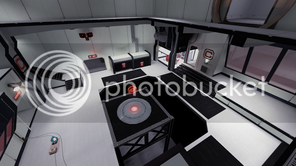
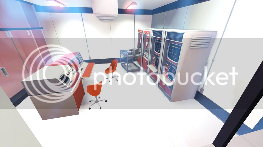
I agree with you on the color thing. One reason I don't have more color variation and such is because I just haven't gotten that far yet. I made this entire area yesterday, and with all the custom textures I had to make it was kinda crazy. However, I did want to make it have a very sterile feel because I feel that the final point on maps like Well are very run down and dirty which is more like a missile silo than a space station. A space station to me would be very clean, especially in the 1970s. It also gives the idea that people are there if it is clean, as opposed to the exterior where it is very decayed as if it was abandoned for a long time. If you think the screenshots look like a NASA station, then I would say I did pretty well because thats kind of what I was going for. :D

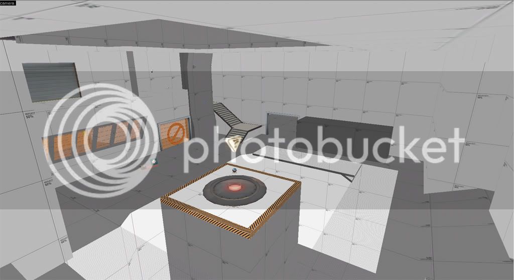
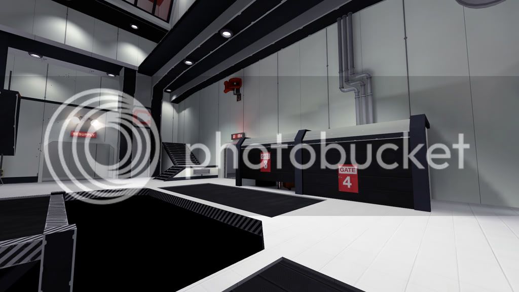
Different materials, definitely. As I said up there---^ I just haven't gotten that far. In my initial idea of the area, there was suppose to be very little black, but I had no other textures to use so I just plopped the black down instead.

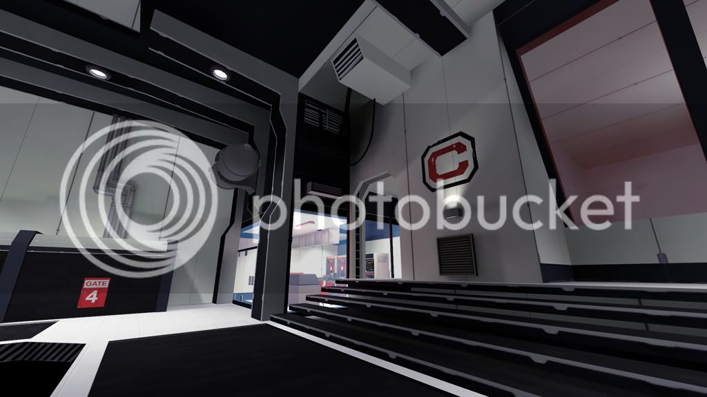
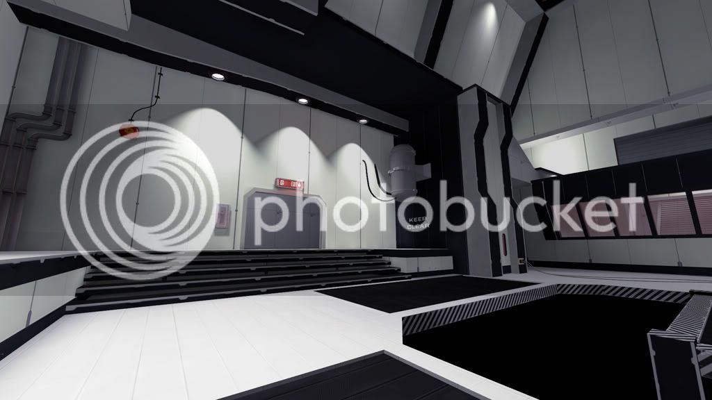
I think the architecture only needs slight changes, as the modern look is more due to the textures than the architecture. As I said before I also wanted to stay away from the clichéd spytech stuff as much as possible.

I shouldn't have problem blending the exterior/interior, heck, I might even avoid it. It might add to the effect of the facade if your suddenly transported from a coal mine into a space station.

I still have a lot to work on. But it'll definitely get there. If any of my reasoning sounds ridiculous, feel free to point it out.
 
Last edited:

lucky

¯\_(ツ)_/¯
May 25, 2009
583
145
I really liked the paintover look you had - I think making things more greyed like so and having the red computer wall parts was the right way to go.
 

coagulated

L1: Registered
Aug 12, 2010
26
13
Yeah, you kind of did make it worse in a way lol. But now it's a lot more original, and will stand out a lot better if you pull it off.

Anyways, thanks for reading my mind, I've always waited for a space themed map. The problem with your map though is that it seems too Aperture Science and not TF2 Industries. I agree with what Scotland Tom says about the coloring, but you have to watch out in order to make it not too colorful. Since it is a space themed map, you do want it to look pretty sterile, so I'd say have a lot of white but plenty of pastel red and blue as well. Stay away from the typical off-white coloring of the bases, or save that kind of stuff for the spaces between CPs. Nothing black either. If you're looking for inspiration I'd say take it from stuff like the space needle, LAX, or even the Gorillaz' Plastic Beach album cover. GIS "Googie", "Raygun Gothic" and "Populux" for more ideas. Anyways, I'm looking forward to seeing this map in completion and I hope it has lots of big outwards facing windows so we can see the awesome lunar landscape!
 

Acumen

Annoyer
aa
Jun 11, 2009
704
628
moonraker has tons of that very white/cremish textures that are already used.
did you do all this nice custom work so far ?
I'd love to get to see some of these textures (if not all of them :D) in a 2d version in here.
that be possible ?
because space is awesome :D